Lionel Rebranding
An updated look for Lionel Trains
An updated look for Lionel Trains
The Lionel Rebranding is to update the look and feel of the brand. The new look has a classic, but modern look.
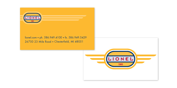
The front of the card bleeds off the page and shows motion from the left to the right. The contact information is laid out easily and the location corresponds to the logo on the top.
The back of the card is simple and only contains the logo. The logo uses colors that are typically seen in real world train paint schemes. The circular shape shows the original track shape when model trains were introduced. The wings show power, motion, and speed.
The back of the card is simple and only contains the logo. The logo uses colors that are typically seen in real world train paint schemes. The circular shape shows the original track shape when model trains were introduced. The wings show power, motion, and speed.

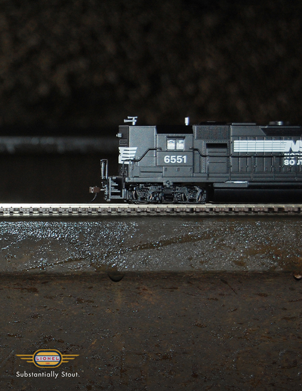
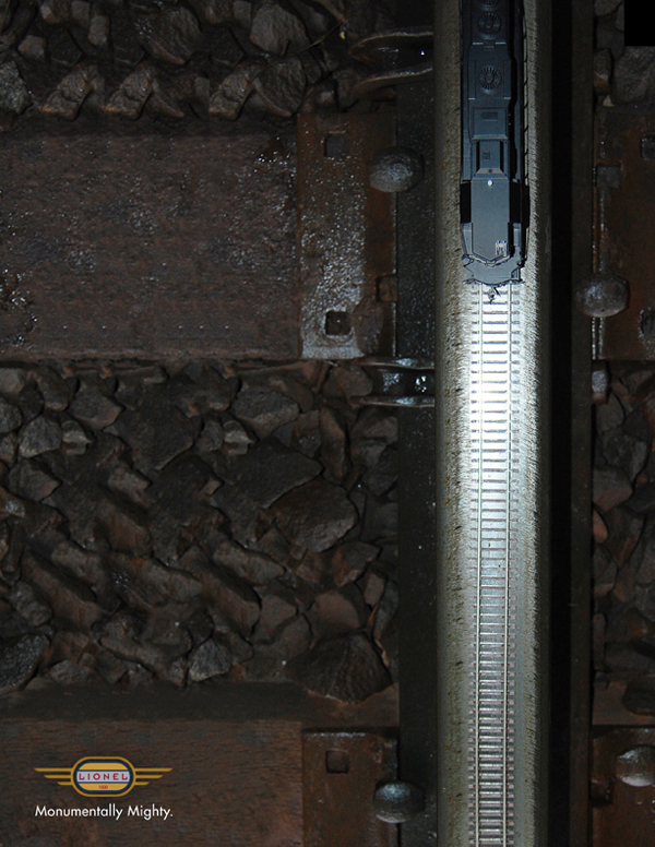
The three ads in the series the differences, as well as the similarities between model trains and real trains. The ads also describe how the models are much like their larger counterparts. The look is gritty and gives the real feel.

The packaging is simple and to the point. The product inside can speak for itself and the packaging does not get in the way of the product.

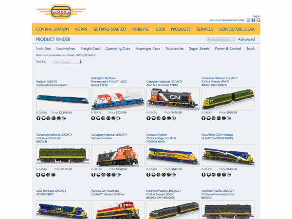
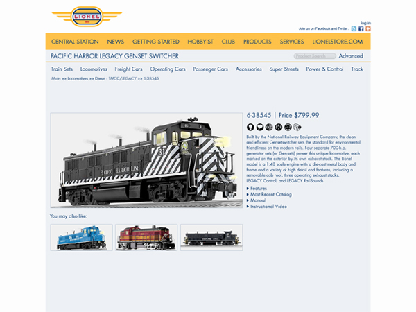
The website is clean and easy to navigate. The homepage displays small amounts of information found throughout the rest of the site. News and information can be found here, as well as different products and featured items.