

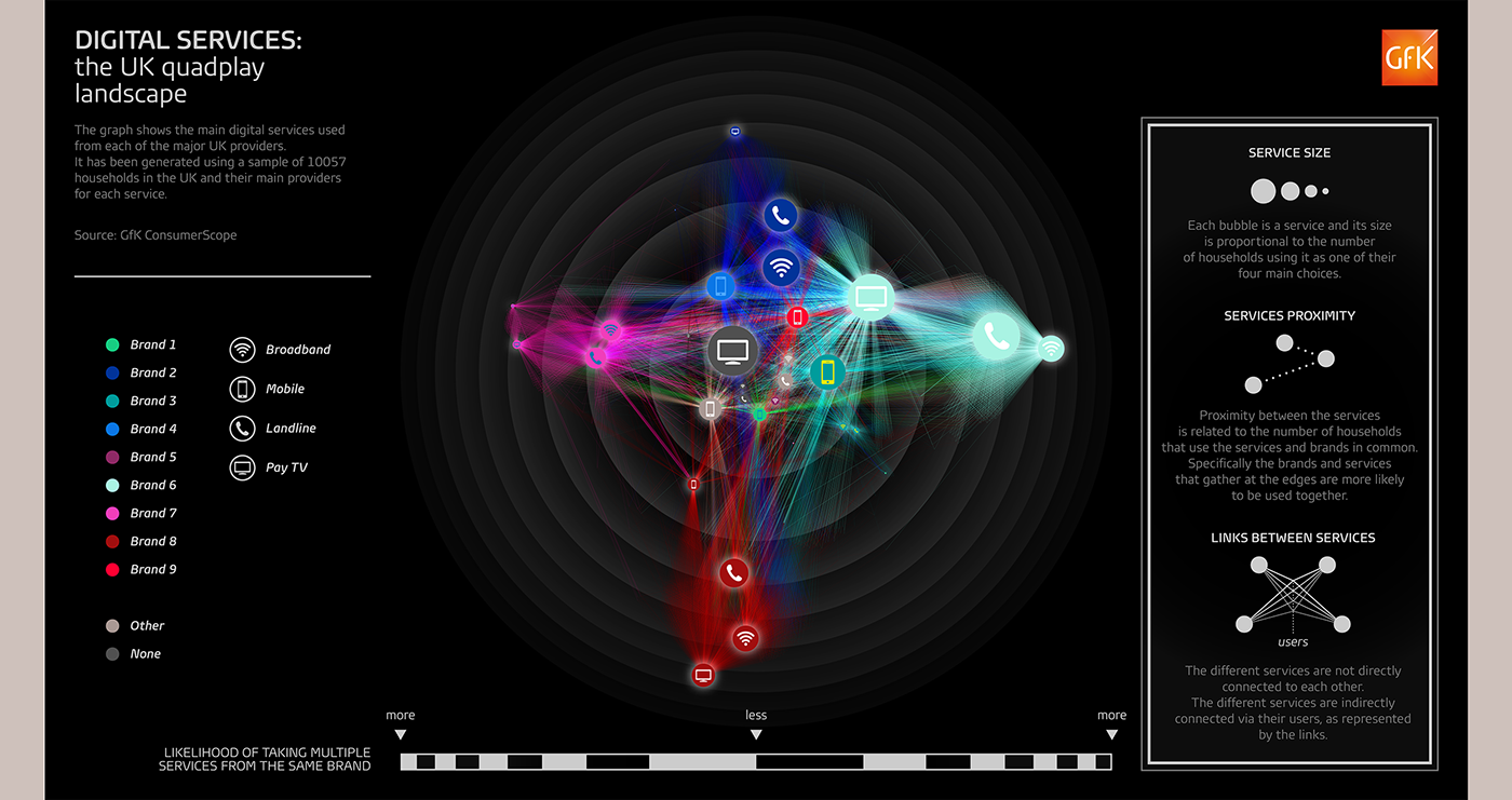
Visualisation designed for GfK UK by the in-house Client Creative Solutions team to show how people use different digital service from different brands together.
Each bubble is a different brand, positioned on the graph more or less close to each other according to how many respondents they use them together (i.e. broadband from Provider 1 + landline from Provider 1 + mobile from Provider 2 + TV from Provider 5). Clustering they show what groups of services are more likely to be used together. In particular if a brand orbits on the outer circles, it is more likely to have loyal customers, using only its services, while the closer it gets to center the more likely to be used together with any other brand. Light beams from each bubble point towards the other services the respondents declared to use. A wider ray shows a higher number of different services used with the source one.
All data are confidential.
© GfK UK 2015
© GfK UK 2015
_____________
______________


