


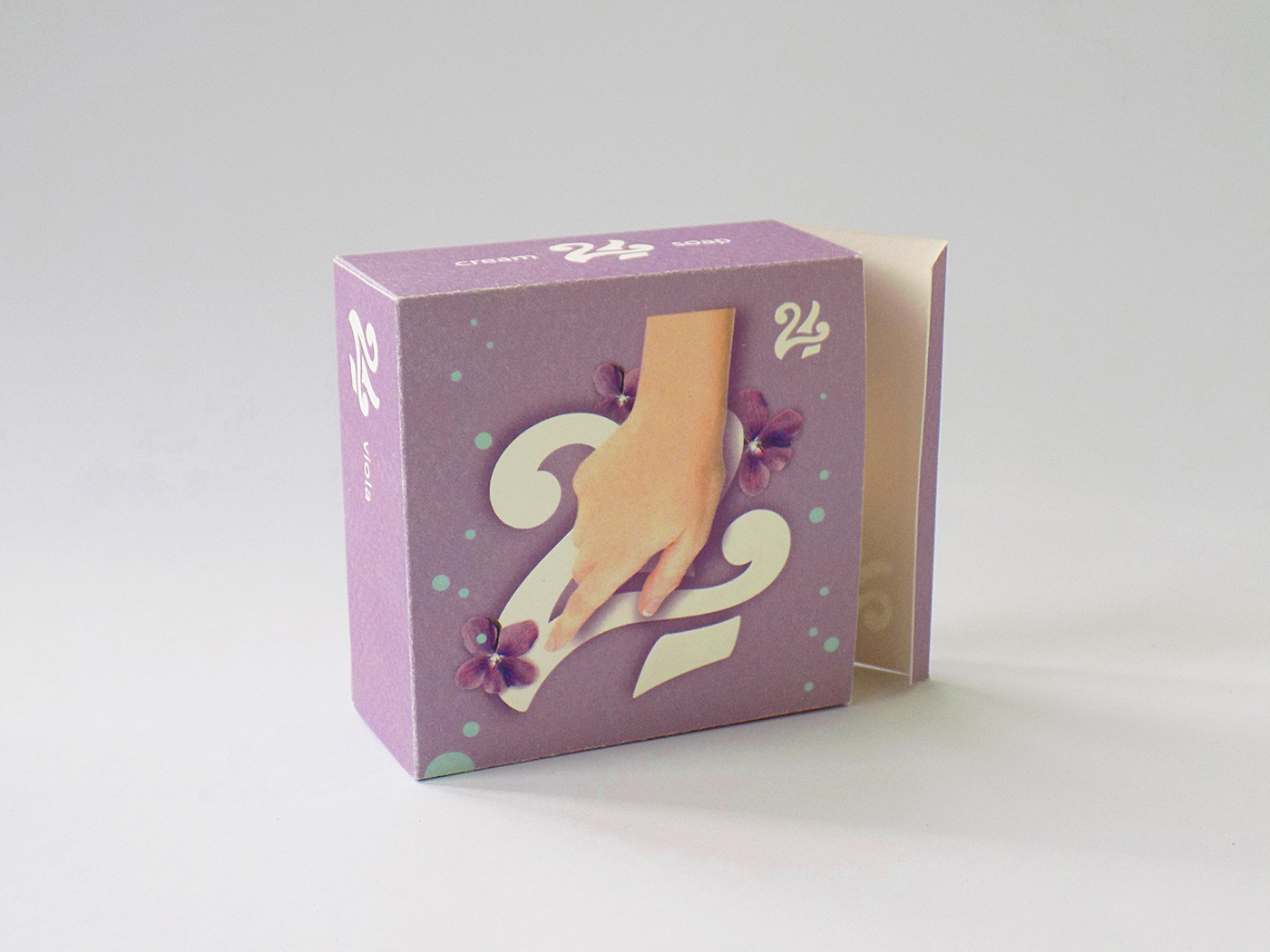
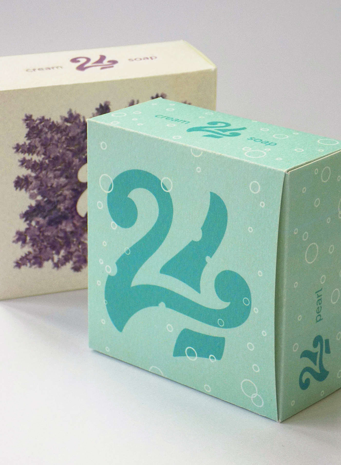
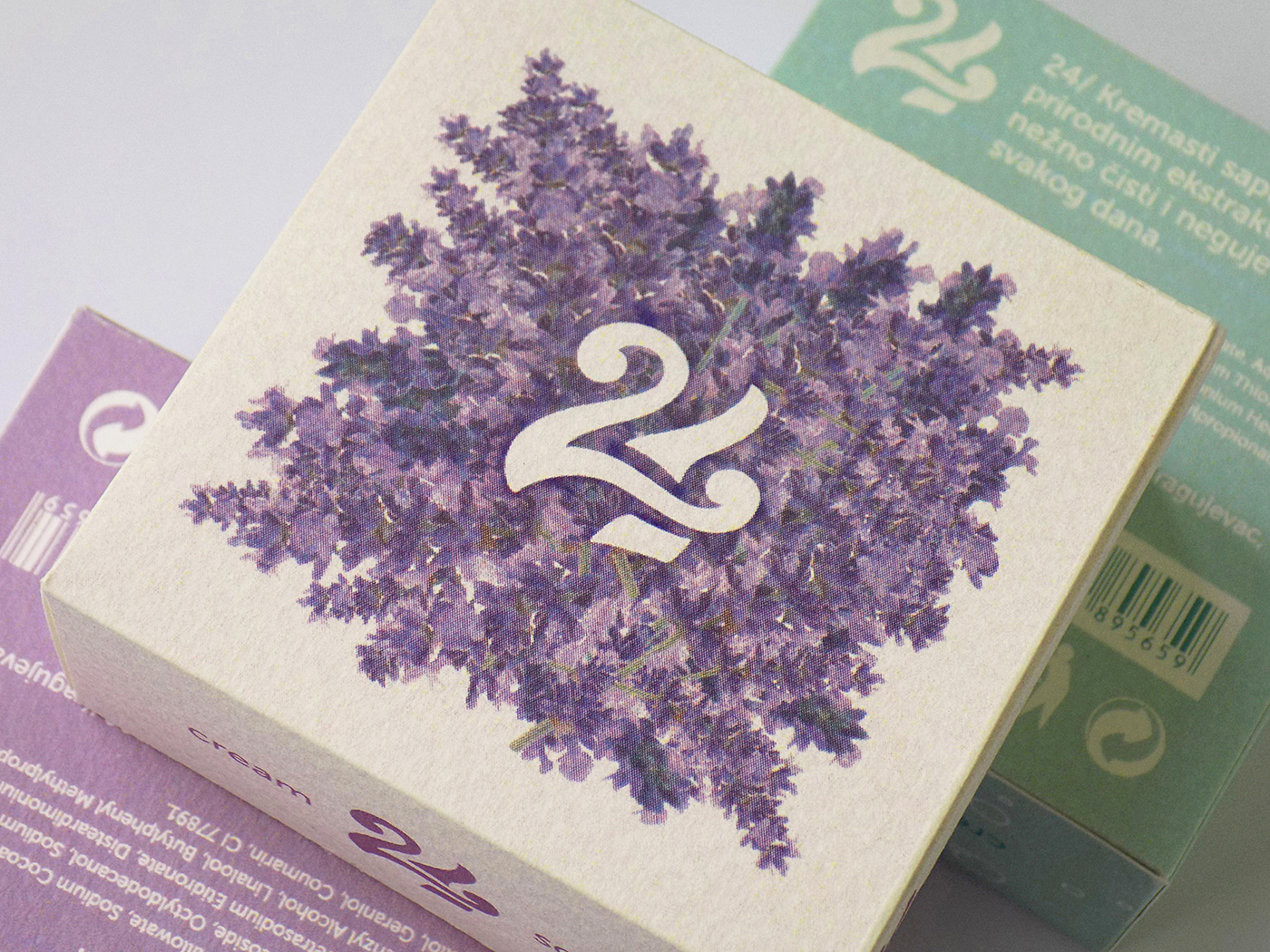
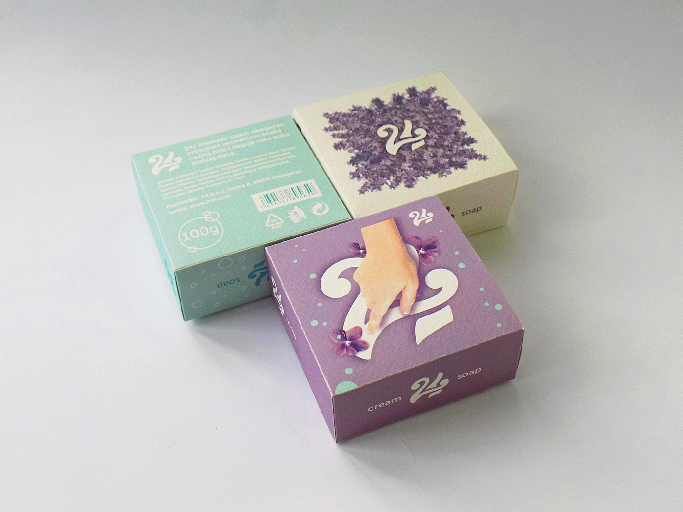
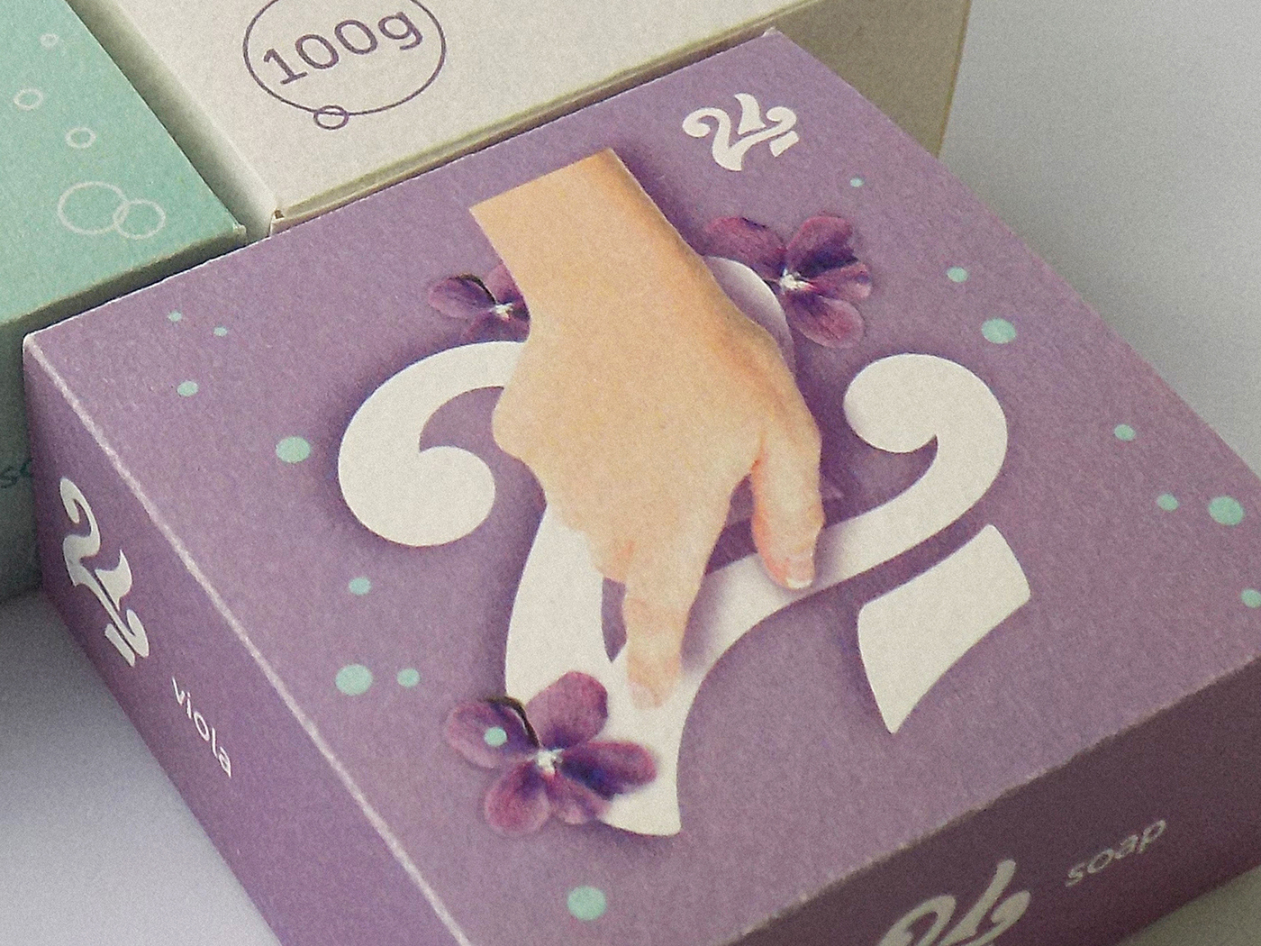
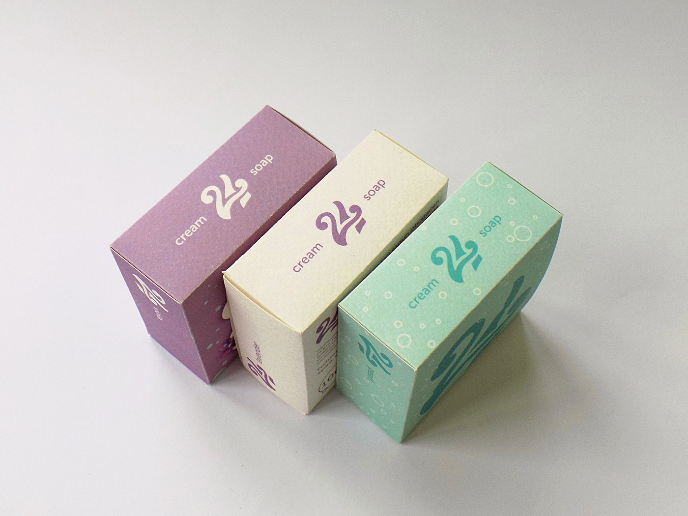
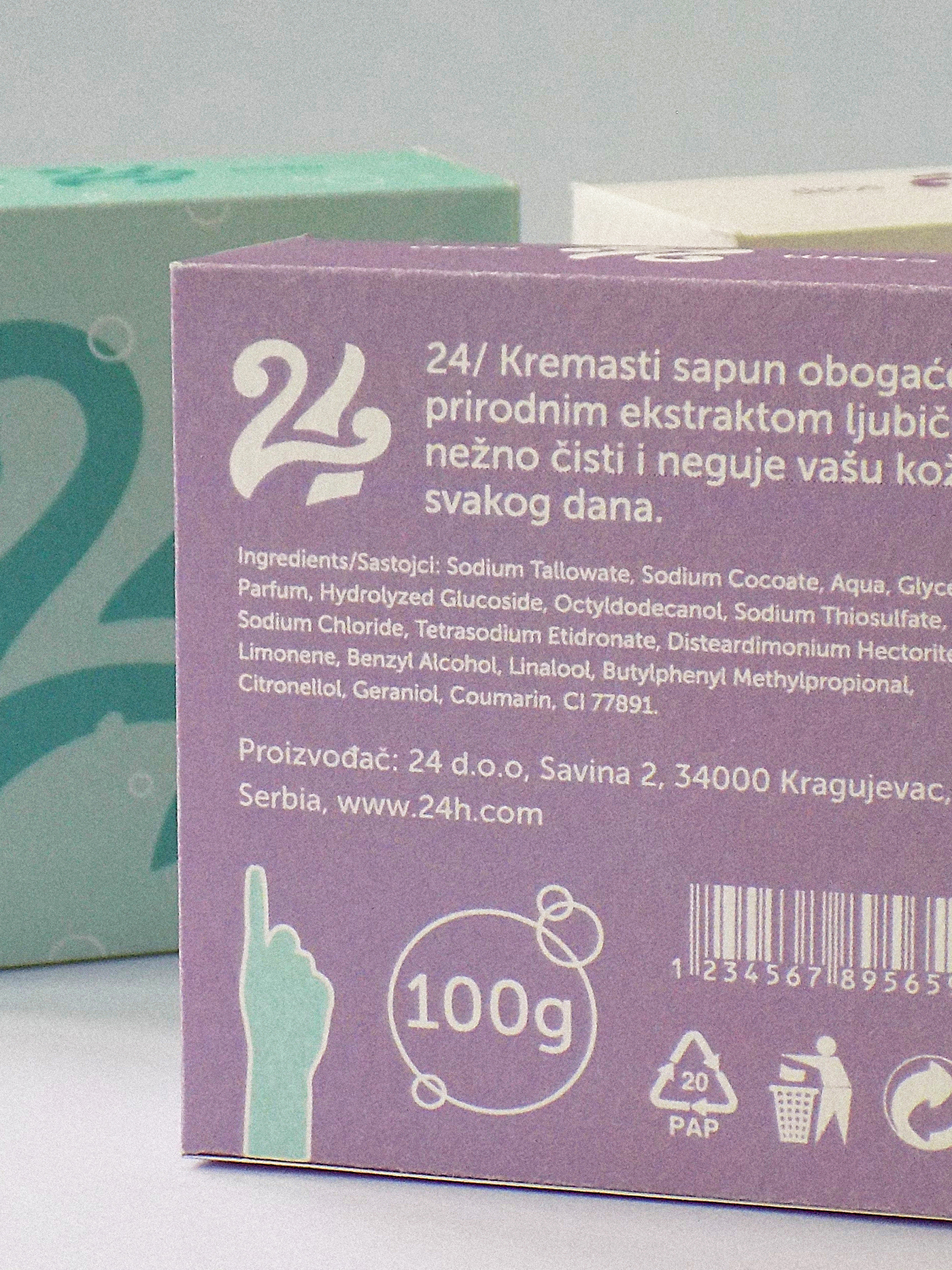
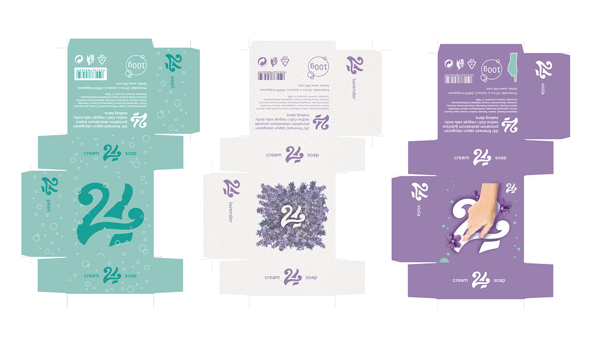
The first part of the task was to create a series of packaging, beginning with the economy version, through the more expensive one, to the premium version. The name “24h “ was chosen because it implies freshness and beauty throughout the day when using this product. Three different colours indicate three types / scents: Pearl, Lavender and Viola. Lavender ( premium ) should be printed on some high-quality paper and hot foil stamping should be used.
The second part of the task was creating a campaign for the premium packaging which included not only one poster and billboard but also the teasers. Since Provence is a region famous for lavender, I chose it as a “backdrop“ for the advertisement, and came up with the message “Using this soap will make you feel as if you were somewhere in Provence“. :-)
The animated commercial was self-initiated.


--- The campaign for the premium packaging ---
( teaser poster and the main one )
( teaser poster and the main one )

--- Campaign Part 2 ---
( teaser billboard, the main billboard and magazine advertisement )

--- Campaign Part 3 ---
( Animated commercial )


