Information visualization for La Lettura, Il Corriere della Sera
/ January 31rd, 2016 /
/ January 31rd, 2016 /
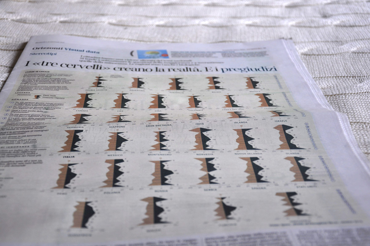
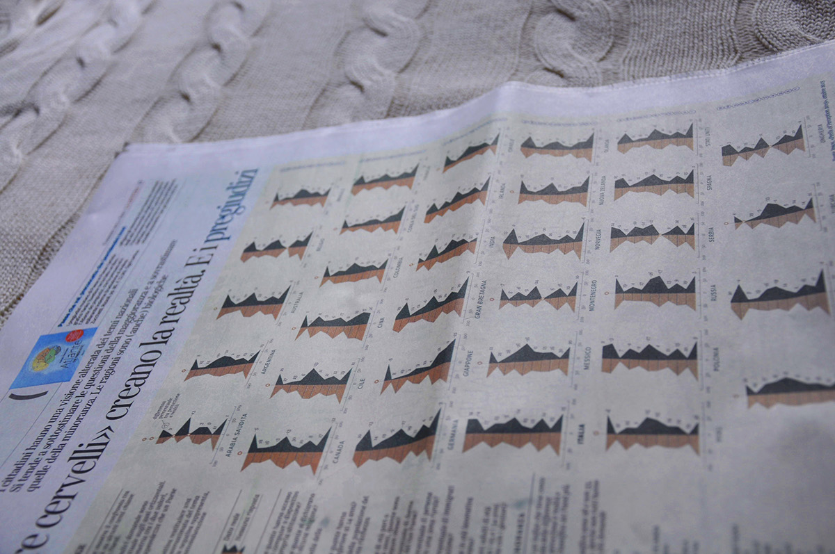
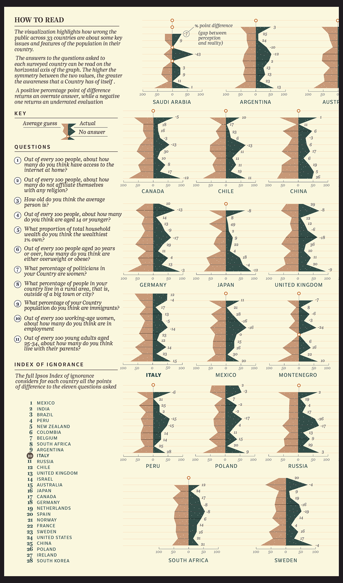
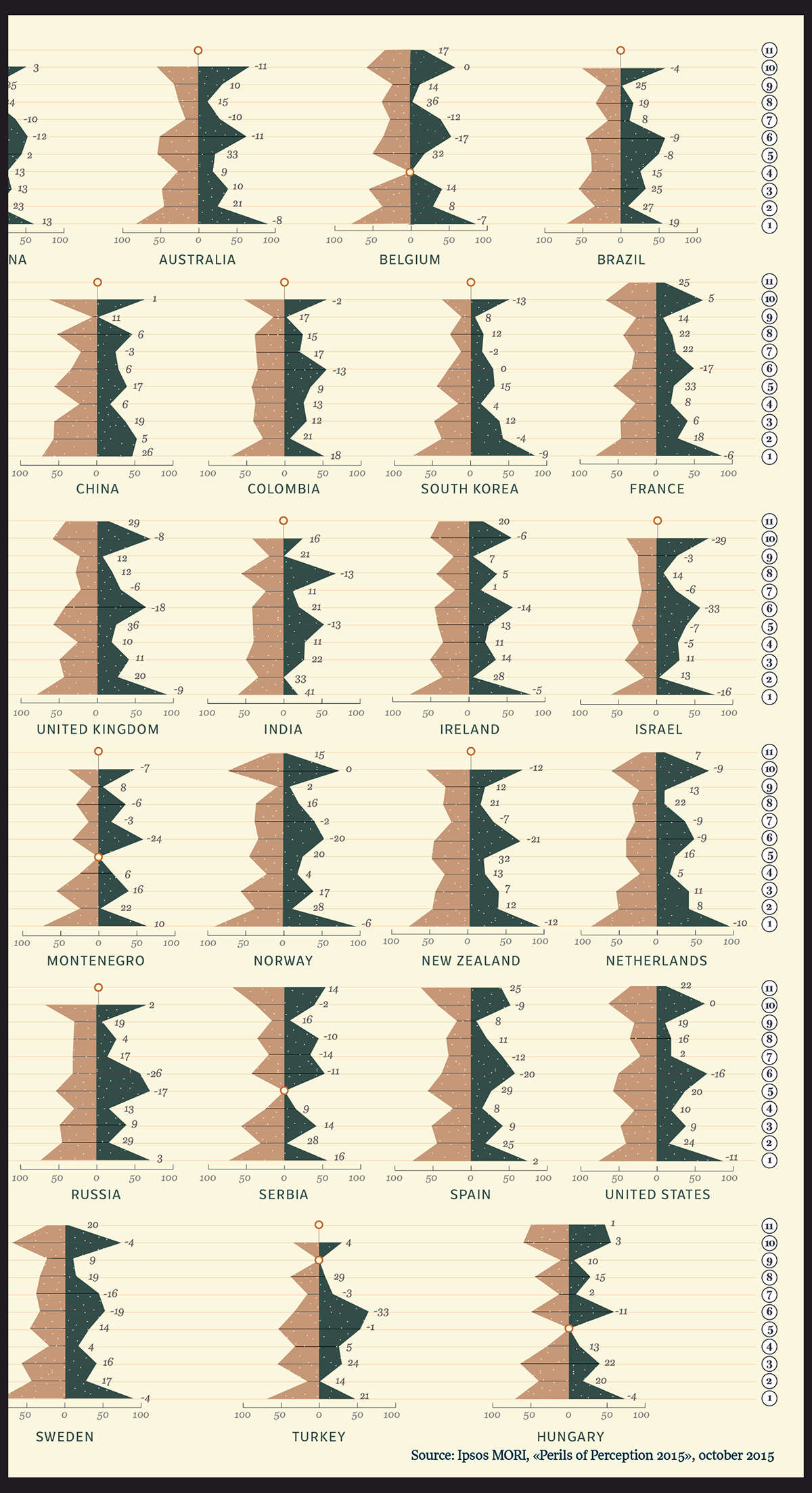
HOW TO READ
The visualization highlights how wrong the public across 33 countries are about some key issues and features of the population in their country. The answers to the questions asked to each surveyed country can be read on the horizontal axis of the graph. The higher the symmetry between the two values, the greater the awareness that a Country has of itself. A positive percentage point of difference returns an overrate answer, while a negative one returns an underrated evaluation
SOURCE: Ipsos MORI - Perils of perception, october 2015

Thanks for watching!
:)

