Concept & Identity ROUTE
Space produce & operation TWOSOXTWOSEVEN
Graphic application ROUTE
Embroidery art momhanipopo
AVECNOUS : European Bistro
European brunch and dessert place, AVECNOUS, opened their second shop in jeongja-dong this summer. We were asked to be a part of this transition working on graphic design used in the sapce, as well as some architectural elements renewing over the presence of the first shop located in garosu-gil, Seoul.
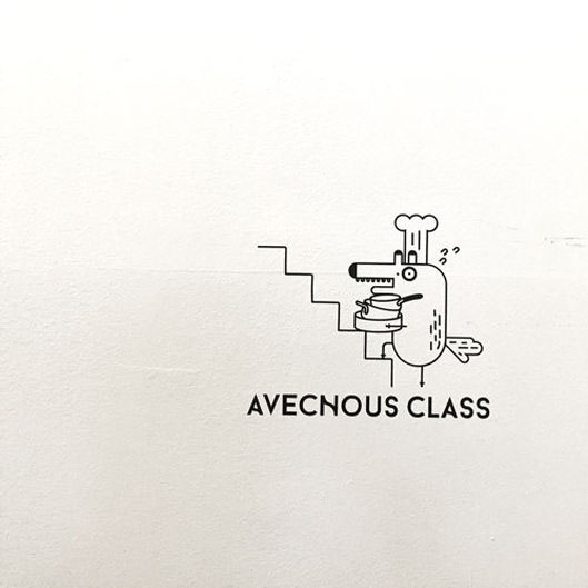
French word 'avec nous' meaning 'with us' was named after owner chef's philosophy running cafe for people who want to drink, eat, play and talk together come and enjoy. Considering its meaning, we got into abstract step of designing new logo and tagline to make the new space equally special and better. This was the first element that we worked on, which ultimately lead us through the whole process of this project.

Logo & character
We imagined that new AVECNOUS would be more commercial and communal café rather than homemade style of small delicatesson. Thick and straight, but not too strict and boring looking logotype conveys this idea of expansion. Partially curved transformation of type on the logo reflects the spatial/physical essence of the cafe- twist of traditional dishes served for people who casually want to come by and taste the warmth of their heart and soul. Instead of modern way of making symbol of formalized 'branding', we created animal characters designated for each shop. It is an element that communicates and expresses, preceding simplicity.

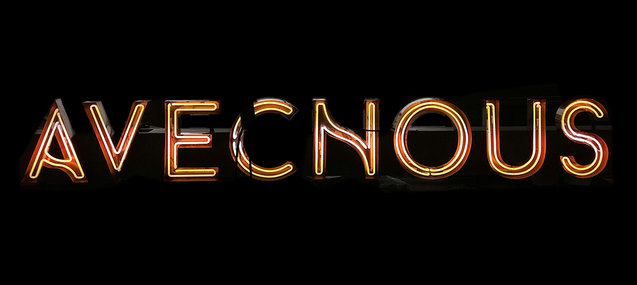
Façades
The neon sign hangs on the front of AVECNOUS' entrance and terrace, reflecting sunlight with its bronze housing material at its most visible at night. The façade was lifted straight out from new logo type taking the identical curve and straights, and it expands throughout other graphic applications such as business card, other flat prints, and interior material selections. Bronze becomes typical of AVECNOUS' material language since this front installation.


Tiles
Diamond flower-patterned circle tile covers up the major section of cafe's floor, creating unique mood in the space. Some signature images, fox character and letterings are patterned out in the entrance and kitchen area. We considered that ceramic tiles would be the most durable and impressive guide to the customers visiting the cafe.


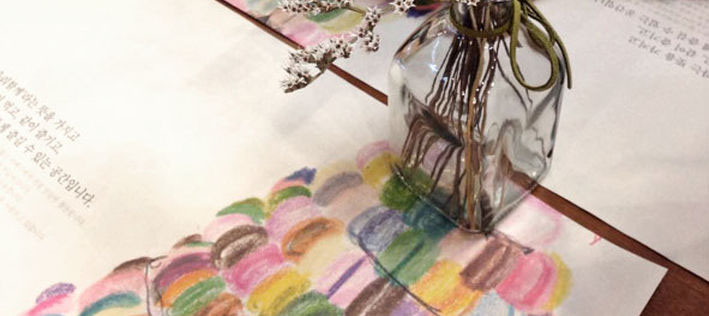
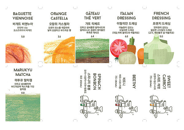
Menu pieces and tablemats
We also carried main lettering over to the headers of menu pieces and placemat in order to spread new image of the cafe effectvely to as many visitors as we could, because of it's viable aspect applicable to almost every element existing in the cafe. To offer immersive experience in the manner of serving food, we prepared several kinds of placemat with signature images printed.


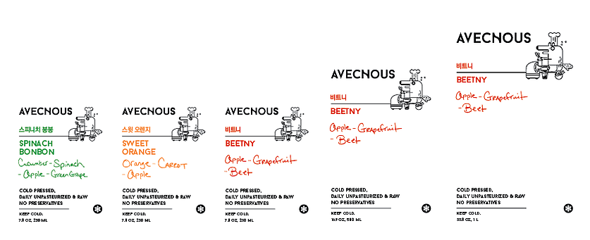
Packages and more
label for juice bottle
We also carried main lettering over to the headers of menu pieces and placemat in order to spread new image of the cafe effectvely to as many visitors as we could, because of it's viable aspect applicable to almost every element existing in the cafe. To offer immersive experience in the manner of serving food, we prepared several kinds of placemat with signature images printed.


canvas bag


Tarte & Cake box

Paper cup sleeve

Key holder

Embroidery
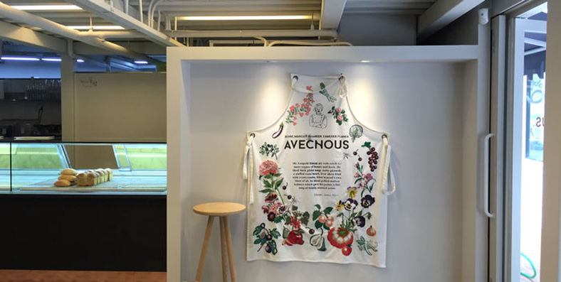
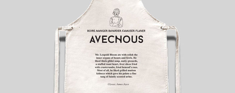
One of my favourite things that we see in the place is the large-scale apron by textile artist Hani Min , which stands right front of the entrance and greets people with it's beautifully crafted artwork. We found out that customers love this warm-hearted installation on the wall, because not only it is pleasant to see, but also feels comfortable by touching the textile and experience the texture.

James Joyce
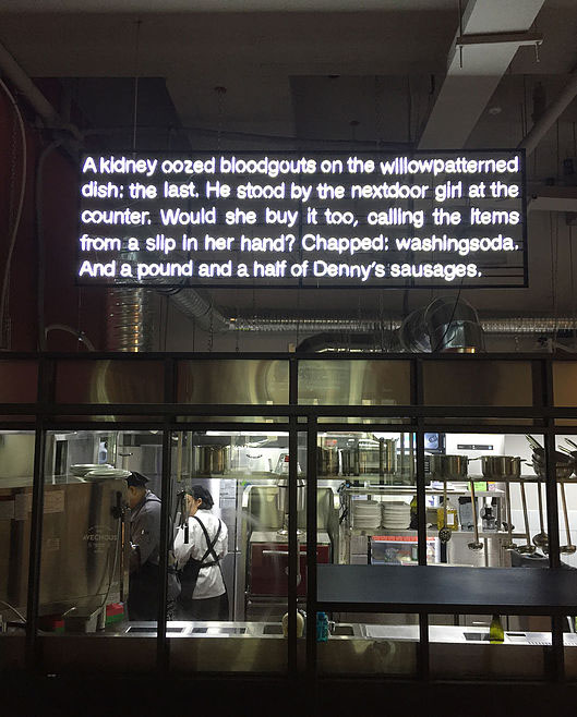
As a lighting fixture for kiitchen area, we fabricated some excerpts from novel Ulysses by James Joyce, and while other part of his words is silkscreened on apron installation embroidered with beautiful palettes of flowers and vegetables. Both paragraphs are particularly related to the subject of 'cooking' and action of 'making something to eat for someone', which drove our design elements to reconnect them to physical elements in the restaurant spcae.


Store & business cards
Following the essence of copper leaves and character for each shop.


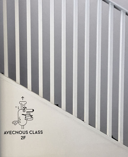
Wayfinding
We embedded the place with simple way of attaching stickers of fox character referring to the specific area.. It blends well with glass, painted wall, and other spatial objects for customers to pick up on.


Display
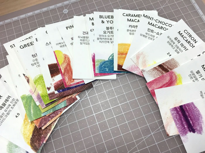
pricetag done by color pencil drawing referring to sweets, letting people choose from the selections in the dessert showcase for a treat after meal, or take some to go


Application
website and mobile application

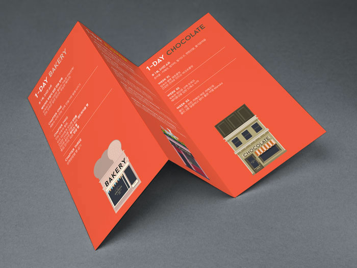
Tri-fold brochure
About one day class at the shop