A new design language for all of Google.
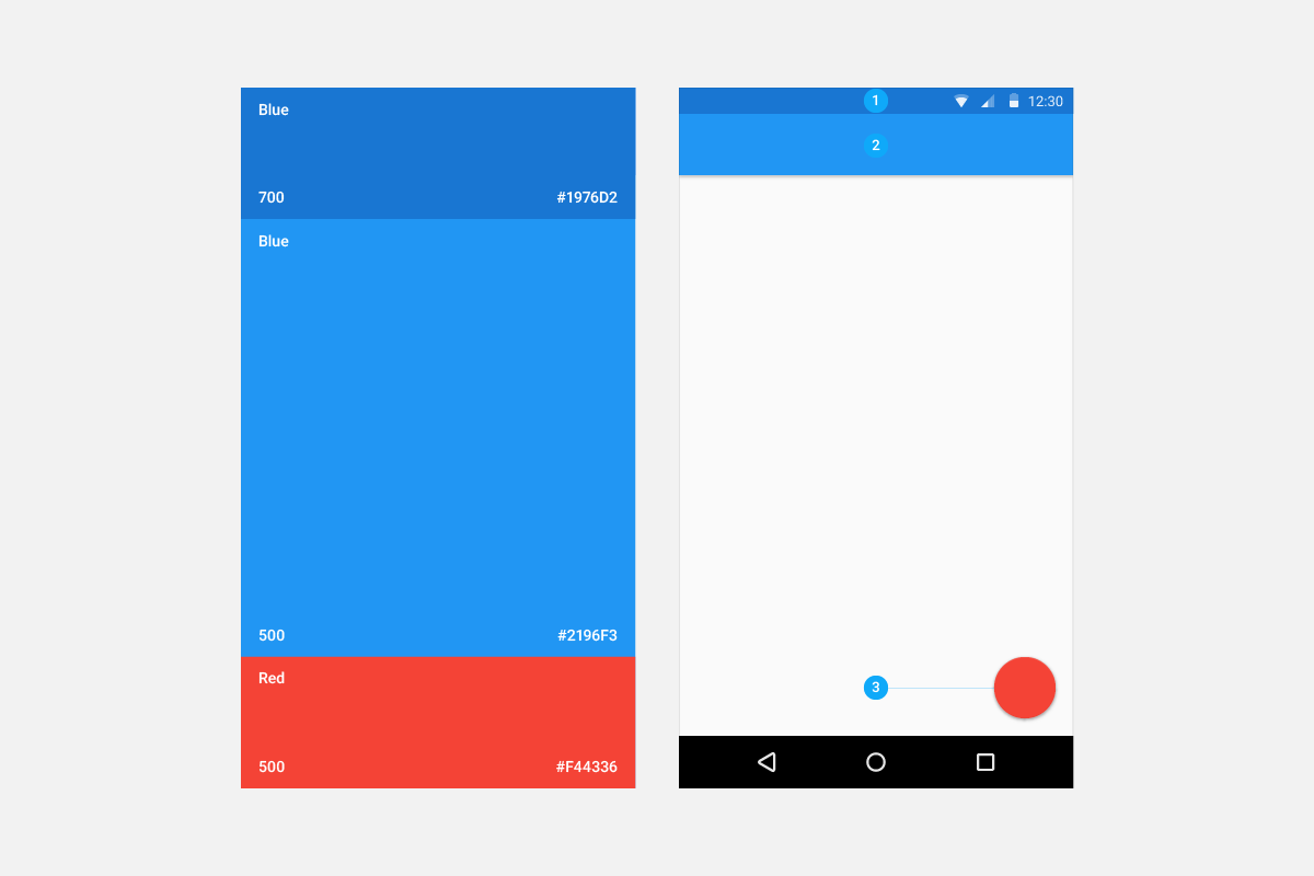
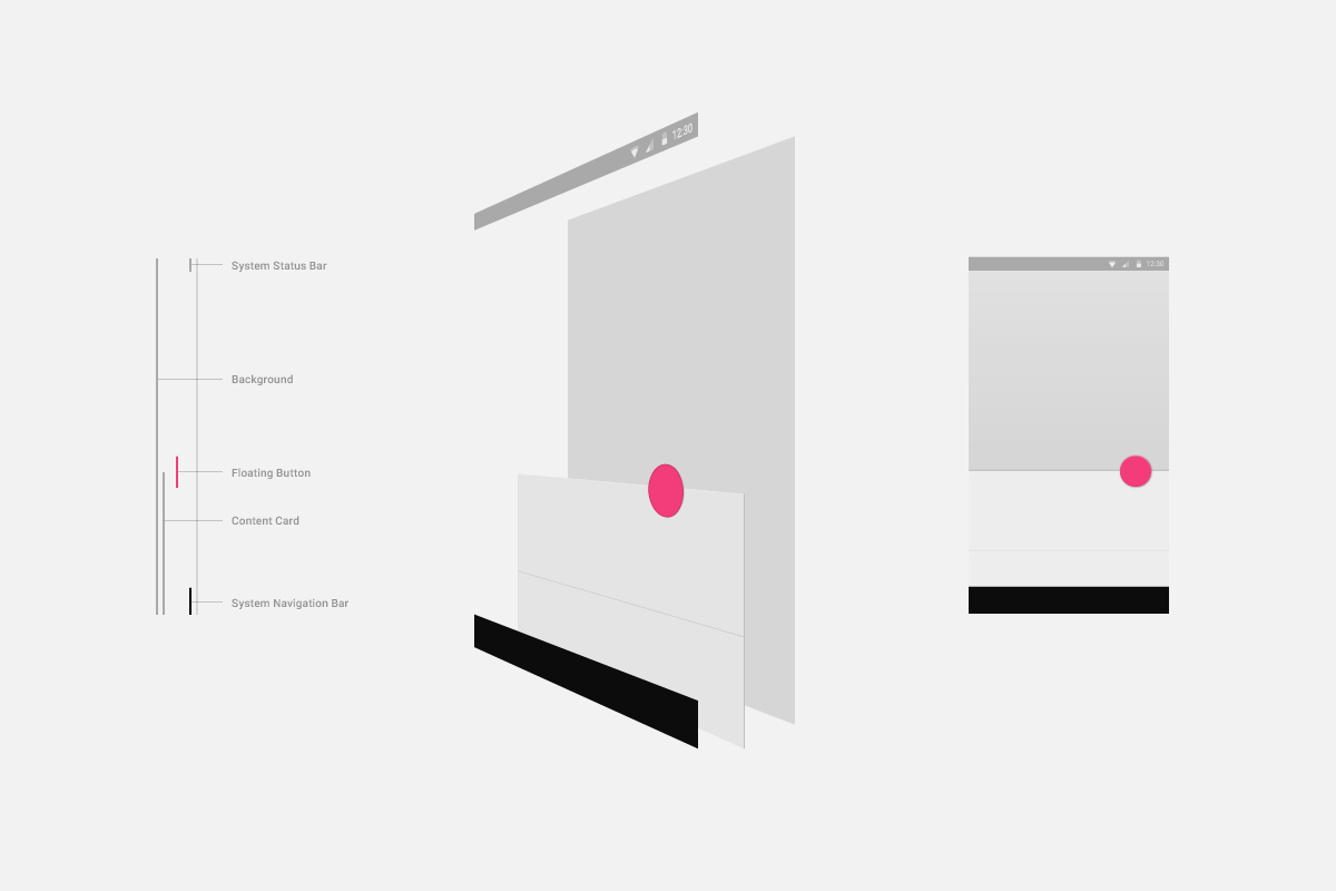
Material is a design language that unites GOOGLE and ANDROID under a visually rich style and set of principles. The underlying concept is based on the properties of paper and ink while the design approach is grounded in grid-based layouts, vibrant colors, large imagery, and typographic scale.
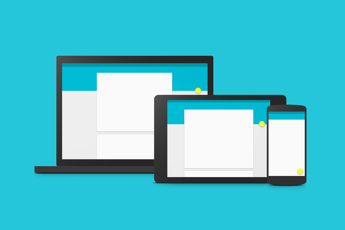
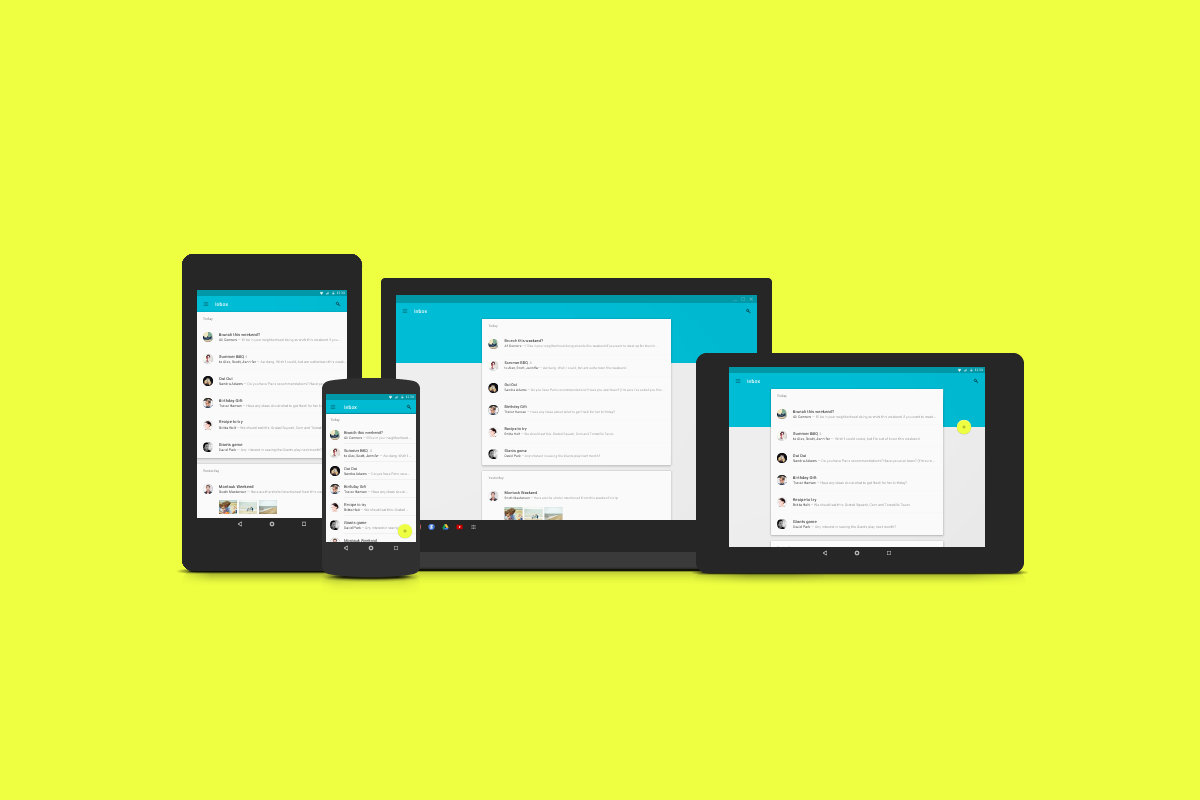
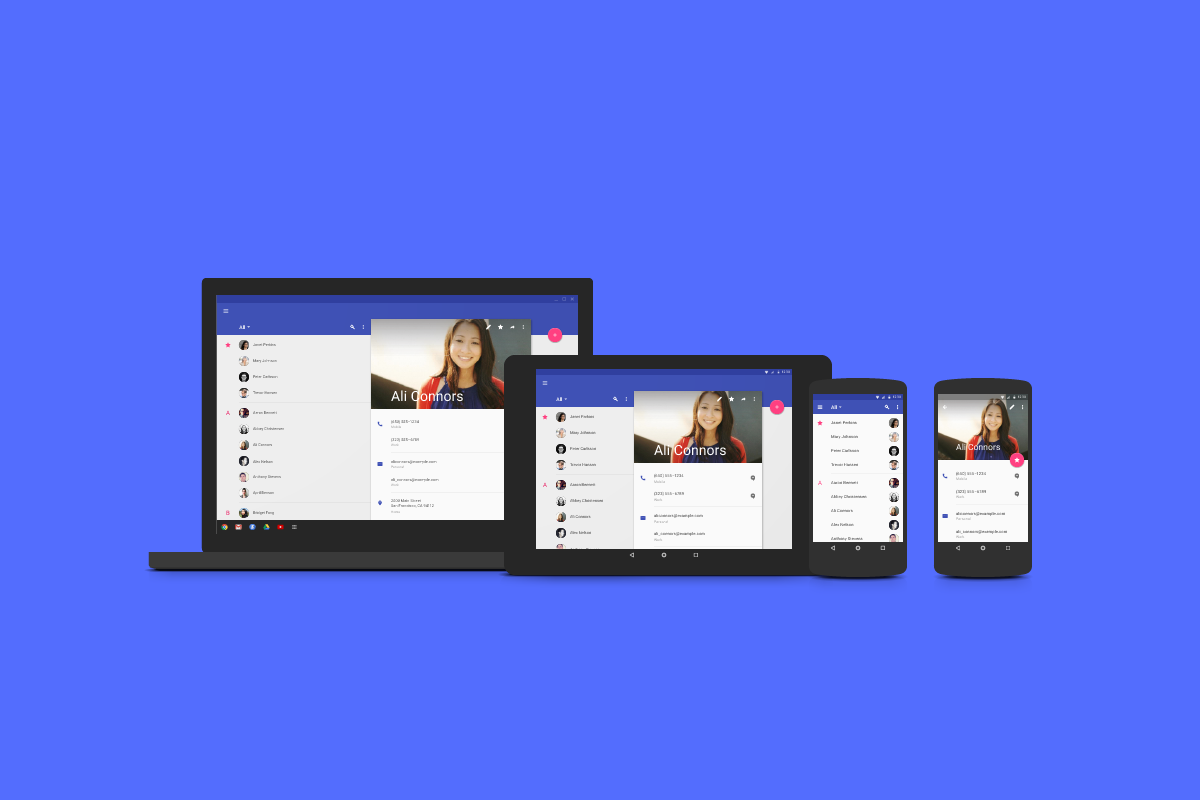
PRODUCT UI


PRODUCT LOGOS
GOOGLE’s product logos are inspired by the tactile qualities of physical material. Each logo was first hand-made out of paper to reference how lighting, fold and elevation appear offscreen. Subtle shadows and highlights evoke a sense of surface and tactility on an otherwise reductive system.

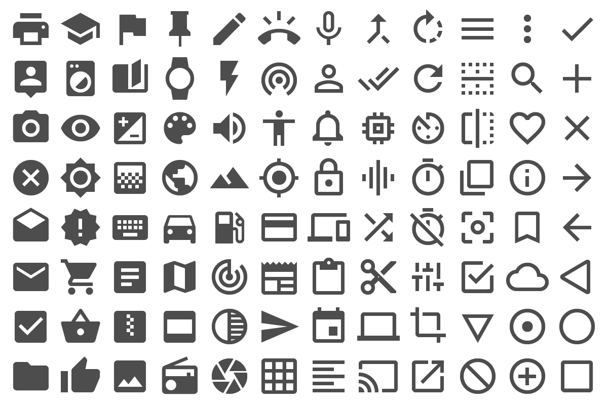
SYSTEM ICONS
The design of 1200+ system icons is simple, modern and bold—ensuring readability and clarity even at small sizes. The icons were developed on a custom grid to facilitate consistency and establish a clear set of rules for the positioning of graphic elements.
TYPEFACE
With the launch of Material Design, GOOGLE’s Roboto typeface was updated with an increased width and rounder characters, resulting in a friendlier and more approachable feel. We redrew the typeface, aptly named Kilroy, to influence the final release of Roboto 2.0.


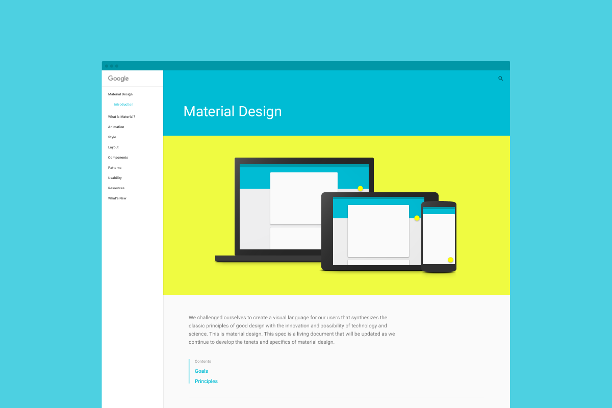
GUIDELINES
Material Design launched with a comprehensive set of principles, guidelines and resources. We were asked to create the design and oversee the content direction for the launch of Material Spec. As a reference for both design and engineering the site drew over 2.5 million unique users in the first year.


Commissioned by Google Material.


