Water
Typography, Graphic Design
Typography, Graphic Design
"Typography Day 2012" calls for entries on a poster competition, "expressing your favorite word trough the typography of your motherscript."
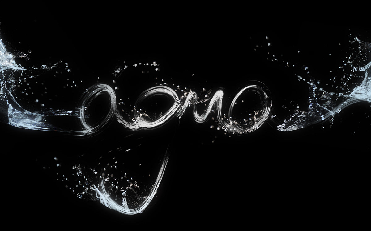
In this typographic composition I present my favorite portuguese word "água", which stands for "water" in english.
I chose it because it is a natural and universal resourve and as a sustainable designer, I always gave and I still give great importance to the preservation of this precious resource.
In relation to the word itself, I did not use any specific typography, I decided to write the word at hand because that way I could get a more natural result, more smoothly, just making it more look like water.
This poster was one of the winning entries of the competition.
You can see more details at: http://www.typoday.in/poster_result.html