
Our team chose to approach the redesign of the Minute Maid® kids juice box or pouch with a special focus on the straw and handling. The straw is easy to lose difficult to open and hard to insert into the small foil puncture spot on the top of the box or pouch. With our new design we aimed to simplify the user experience, minimize waste and still keep the fun and enjoyment of drinking a juice box.
In our new design, every piece of the juice box is contained within itself. We have eliminated small pieces, and instead have created a product made up of recyclable material that can easily be recycled in just one step. This new design, which uses minimal force against a flat surface to poke the straw upwards through a foil lining, no longer requires the user to fumble with a small straw and puncture point. The new box creates an interface that the user needs only one hand to operate from start to finish and requires very little dexterity. With a rounded rectangular shape, the ease of packing and transportation is maintained. The slight adjustment to the form creates a more ergonomic grip, without sacrificing packing density. We have also added an edible fruit gummy that would fit in the top of and cover the straw. This seal would be completely edible and would simply be squeezed off the top of the straw in one’s mouth, acting as a seal to the straw before the first drink so that the juice will not spill or splash before the user is ready to drink.
The branding of the product is optimistic and child-like. Primary colors and hand-written text are truly eye-catching on the shelf. The name Zumo and the pattern in the branding both reflect the product itself. The pattern is an abstract visualization of the juice and the fruit it is made from. The name Zumo comes from the Spanish word meaning to juice or squash, an appropriate reference to the pressing motion used to open the packaging. This name is also fun for kids as it is easy to remember and rolls off the tongue. Kids will love this product for its bright and fun packaging as well as for the enjoyment that comes from pressing it against the table to reveal the straw.
Claire Zimmerman, Visual Communication, Senior
Janae Hall, Illustration & Animation, Junior
Grace Heitmann, Visual Communication, Sophomore
Jack Hoard, Industrial Design, Junior
Michael Mcculley, Industrial Design, Junior
Janae Hall, Illustration & Animation, Junior
Grace Heitmann, Visual Communication, Sophomore
Jack Hoard, Industrial Design, Junior
Michael Mcculley, Industrial Design, Junior
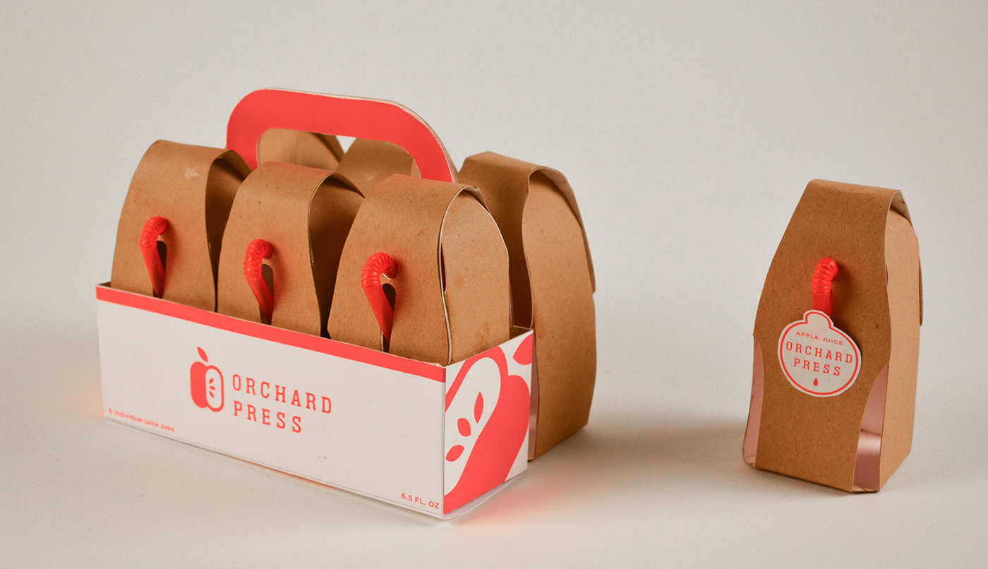
Here at Orchard Press, we take juice to the next level of sweet. Sweet in taste and sweet in experience. We offer parents a responsible way to sweetly refresh and add sweetness to their kids lunch boxes, snack times, and road trips with our fully recyclable juice box design: the press-n-sip box. The molded-pulp outer shell provides a fully recyclable container, while protecting the juice pouch within. In a culture of comfort with one time use products, the industry could use a new approach. The form uses a Bag-in-a-box solution, 100% Recycled Shell and a Molded-Pulp Shell made from bio-based material (similar to egg cartons) that can be recycled or composted. After the juice is finished, the consumer simply separates the pouch from the cardboard and recycles each to their respective bins.
Typical juice boxes attach a straw with a separate plastic sleeve and glue adhesive, creating two additional pieces of waste. Inspired by box wine packages (ironic, we know), Orchard Press uses an integrated straw within the juice pouch (LDPE plastic), thus removing the step of puncturing the foil top of the tetra-pak.
The packaging simply plays up the familiar motifs of real fruit, utilizing the straw as the stem and using a fruit sticker as a way to keep the straw in place and protected from dust and other dirt that happens during shipping. Along with the unique material, the simplified bold graphic elements in two color printing reduce excessive ink use as well as creating a simple, light and natural identity. The brand differentiates itself to appeal to the parents and children searching for an alternative to typical bright and busy boxes on the shelf. The white carry box includes a handle for simple transportation and access helping to compliment the brown packaging of the juice boxes while keeping with the simple and bold identity. With a crack of the outer shell and a rip of the pouch, the finished treat is ready to be recycled.
Whether you enjoy juice boxes or pouches, Orchard Press has your back while having our planet’s back too. Sip, rip and recycle.
Juice Responsibly!
Lucas Nelson, Visual Communication, Senior
Kevin Bower, Industrial Design, Junior
Veronica Villhard, Industrial Design, Sophomore
Alex Womack, Visual Communication, Junior
Kevin Bower, Industrial Design, Junior
Veronica Villhard, Industrial Design, Sophomore
Alex Womack, Visual Communication, Junior


Johnny Apple Juice is more than just a juice box, it’s an experience! Every detail of the packaging has been designed to be playful and full of fun, all while being easy to use. The experience begins at the store with Johnny Apple Juice’s unique packaging. The bright shiny apples and whimsical crate help them to stand out out in crowd. Juice lovers young and old are sure to love bringing home a crate of fresh juicy apples. But the fun has just begun! Once you’re at home, there’s nothing to stand between thirsty sippers and their juice. The open crate makes it easy to reach in and pick the freshest looking apple. Just tear the stem and you’re ready to enjoy! The built-in straw passes through the core of the apple straight to the bottom, ensuring not a drop is wasted. The fun doesn’t end when the juice is gone. Squeezing the empty apple transforms the round shape of the bottle into a used up apple core ready to be discarded. But wait! Don’t just throw that old apple into the trash! Johnny Apple Juice bottles are made of biodegradable corn-based plastic and recycled paperboard that can be thrown into a garden or a compost bin, just like a real apple. Johnny Apple Juice, it’s good to the core!
Hanan El Shoubaki, Visual Communication, Senior
Colin Bain, Industrial Design, Senior
Adam Henderson, Illustration & Animation, Senior
Rebekah Winegarner, Industrial Design, Junior
Colin Bain, Industrial Design, Senior
Adam Henderson, Illustration & Animation, Senior
Rebekah Winegarner, Industrial Design, Junior
Coca-Cola® Challenge - The Coke Packaging team has picked:
Minute Maid® kids juice box or pouch as their competition category.
Minute Maid® kids juice box or pouch as their competition category.
The Problem: Straw detaches and gets lost frequently and the straw is hard to insert. Juice squirts out/spills easily when package is full.
The scope: Design a package that is more easily manageable for kids and place a special focus on how the straw is used.
Your mission for the next 48 hours is to create innovative, new packaging for ONE of these categories.
Your designs can incorporate national brand or store brand names if needed.
Your designs can incorporate national brand or store brand names if needed.
Please make sure that you follow the rules posted on the official website at www.48hrrepack.com.
You have 48 hours. Submissions that are submitted after the deadline on Sunday, January 24th, 7 pm EST will be disqualified.
Be mindful of the judging criteria and weighting when developing your designs:
· 20% Promotes responsible use of materials. Your package should use renewable or recycled materials, be recyclable, and promote recycling.
· 15% Improved functionality. Good packages are easy to use. Does your package promote consumer convenience - i.e. easy transporting, handling, opening, dispensing, resealing, preparing or reuse?
· 15% Creativity and originality. How did you approach the problem in a new and revolutionary way? How does your product stand out on the shelf?
· 10% Practicality. Designed for Business – hits the sweet spot between what a consumer will desire and can afford and what a manufacturer can produce for a profit.
· 15% Emotional Connection. Besides its functional value, does your package create the emotional connection with the consumer, can it create a “got to have it” feel at the point of purchase?
· 25% Presentation. Presentation of the idea is often ignored until last, but is often the key to a winning idea. Entrants will be allowed to submit supporting documentation and a video to convey their ideas. Package images are required.


