The guys at Flugplatz (Airfield) Ganderkesee came and said they needed a new website. After doing some research and evaluating their logo, colors, brand communication, etc., it was clear they needed more than just that.
The Development of the Logo
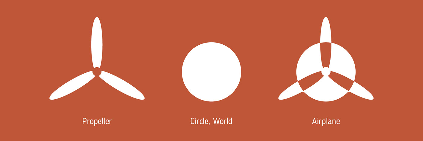
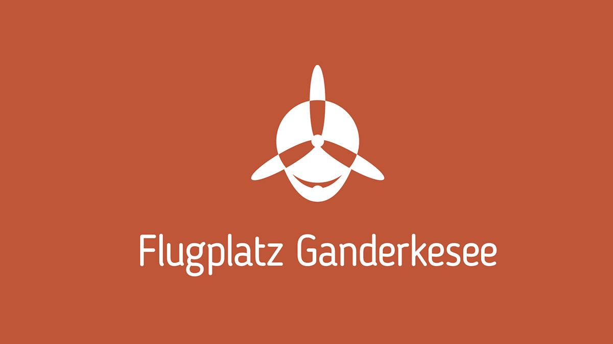
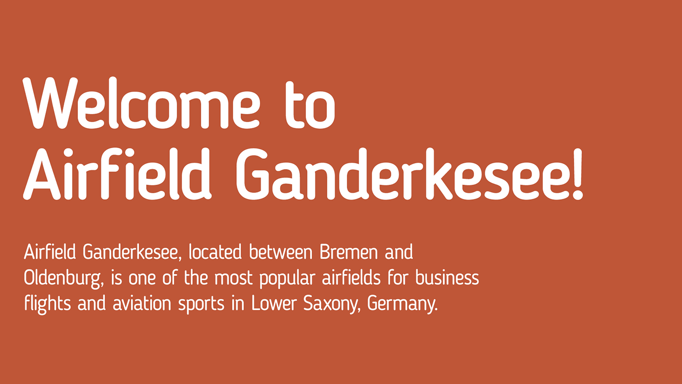
Airfield Ganderkesee is not just a place to start and land – it is much more. Flying and other air sports are their passion.
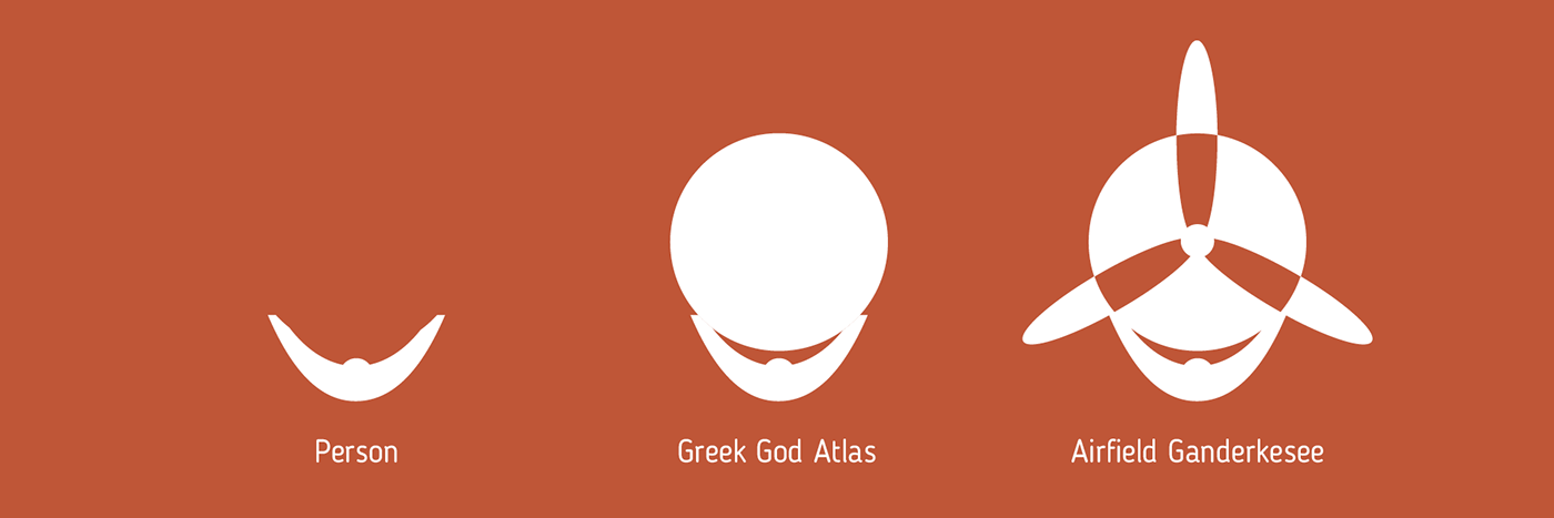
You may wonder what the Greek God Atlas has to do with the airfield. Well, it is part of its history.
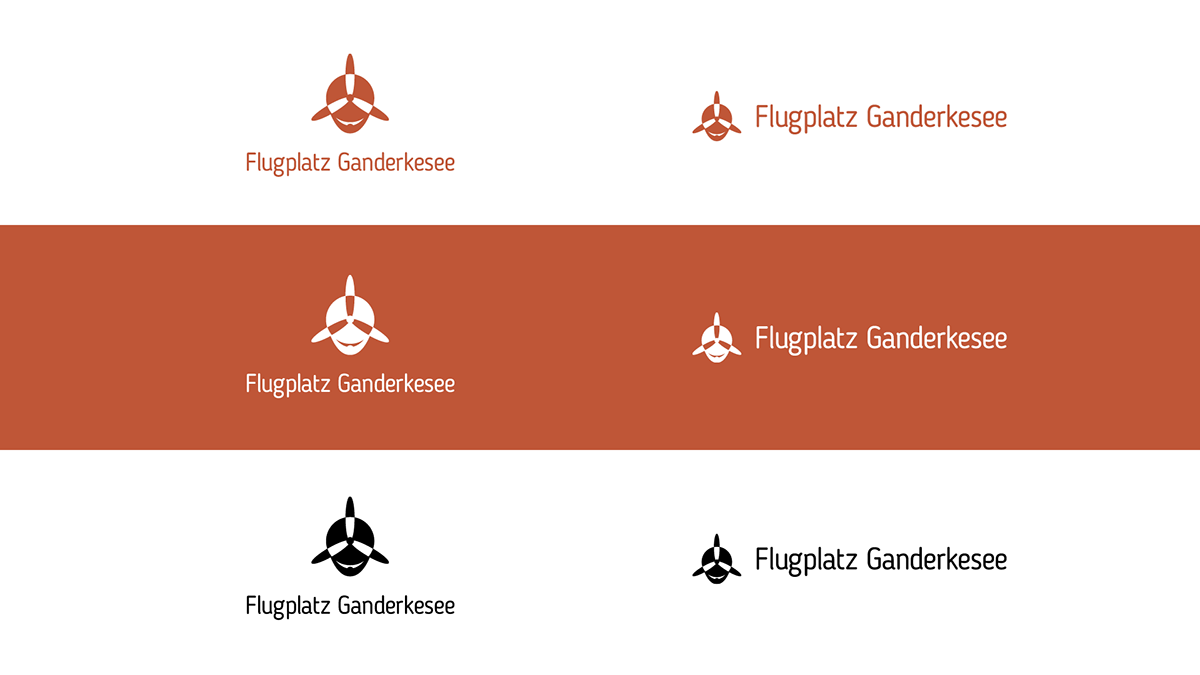
A longer version of the Logo is available if space is small.
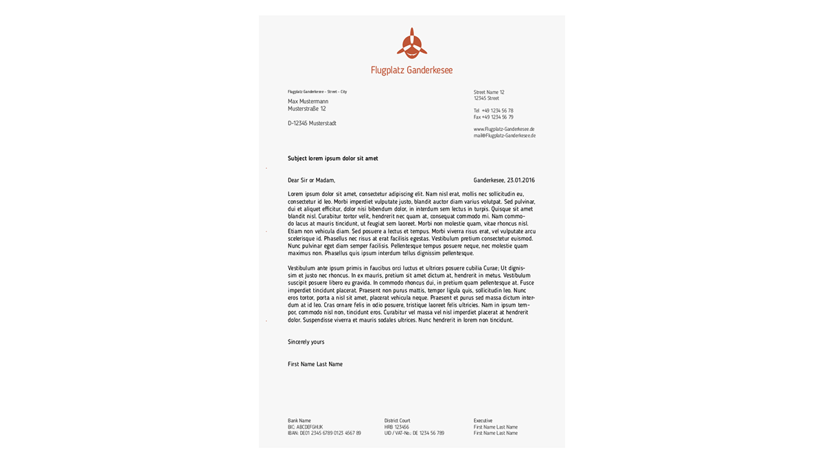
Blogger Sans, the typeface, is being used throughout the Corporate Design. It is quite legible – even on smaller sizes – and perfectly displays the personality of the airfield.
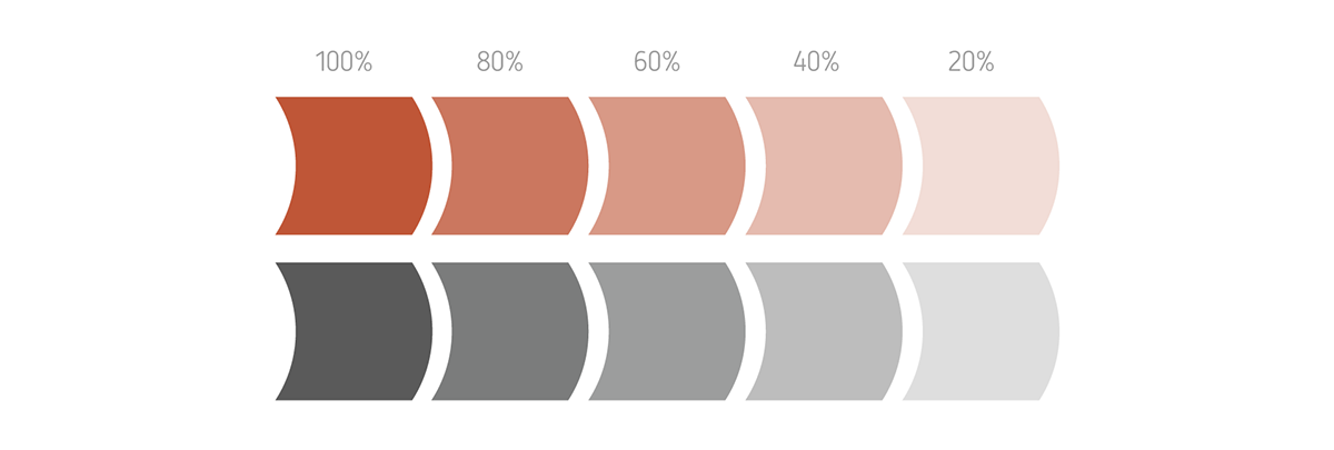
Orange is the dominant color. Next to black and white, shades of grey may be added.
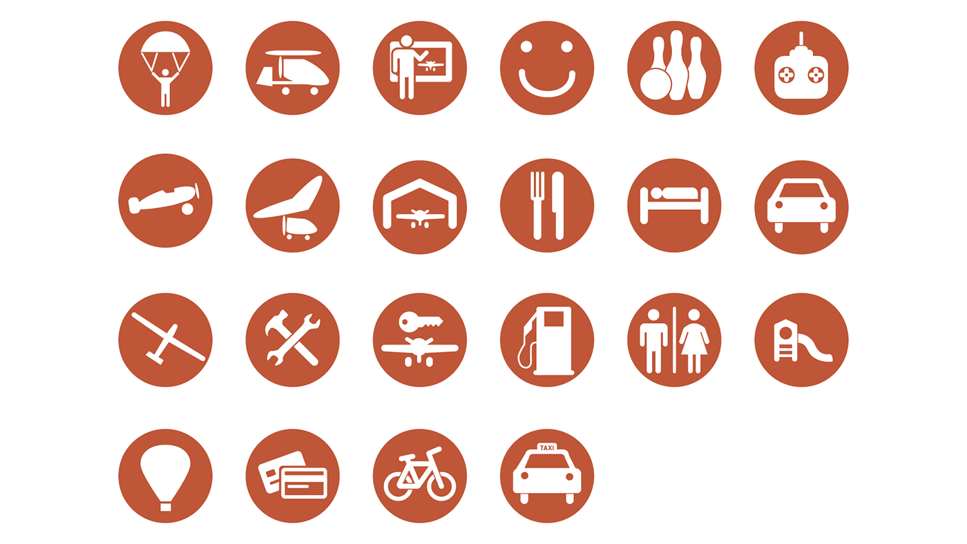
Although small, Airfield Ganderkesee has a lot to offer. Activities and Services are to be found by icons.
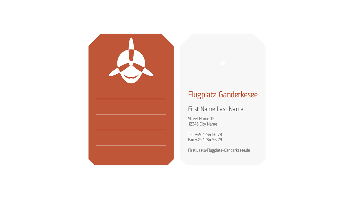
Business Cards often end up in a certain place – the trash can. Why is that? It probably is because they aren't special enough. They carry the name of some person you met, but nowadays you can just look them up online. The idea was to give its receiver an added value. This business card has important contact information, looks like a baggage tag (even has the hole for that), and data or notes may be added on its front.
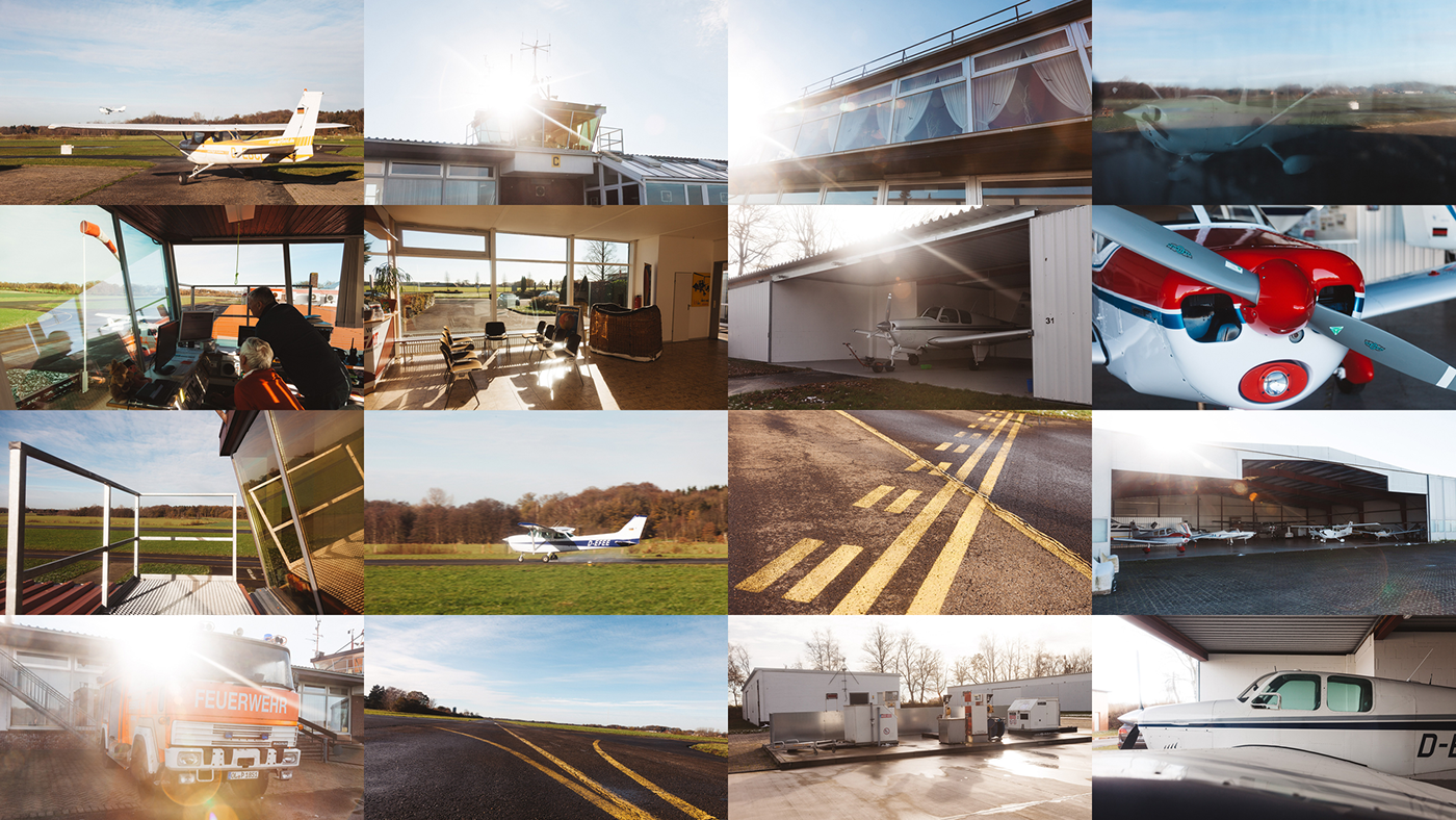
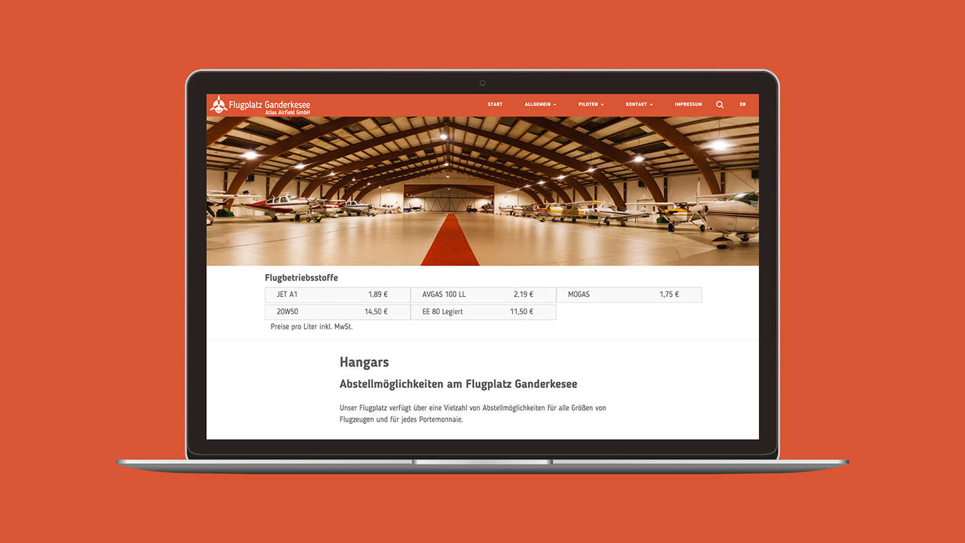
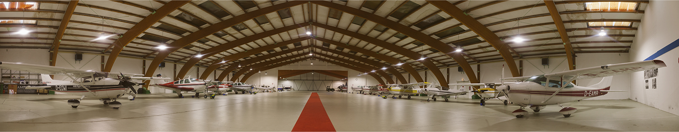
The Website features grand pictures that show off the airfield, the bold orange-red color, the typeface, … Why don't you take a look yourself?
This project isn't entirely finished. Come back to see what else was worked on. Some of them are still in the works, others aren't ready to be shown yet.
Marvin Stelljes | www.MarvinStelljes.com