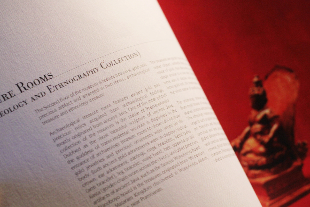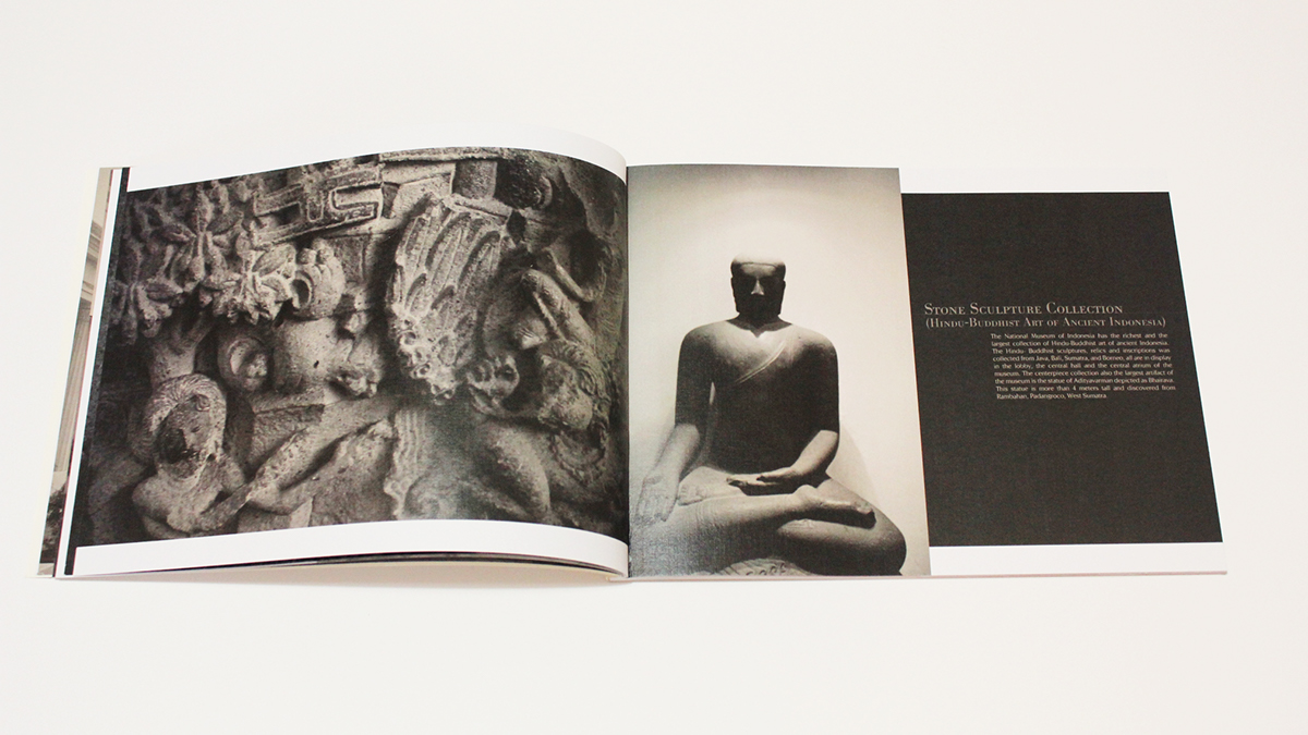
Visual Identity of Museum Nasional
Brief:
Rebrand the Museum Nasional Jakarta
Response:
Based on the research and field trip to Museum Nasional Jakarta,
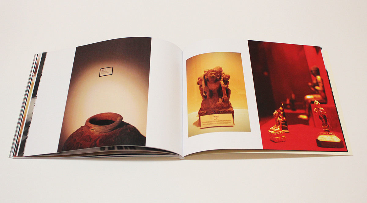
I found that this museum is one of the best in Indonesia (also one of the largest in South East Asia),
because the building is nice and clean, and there are wide varieties of collections from around the world.
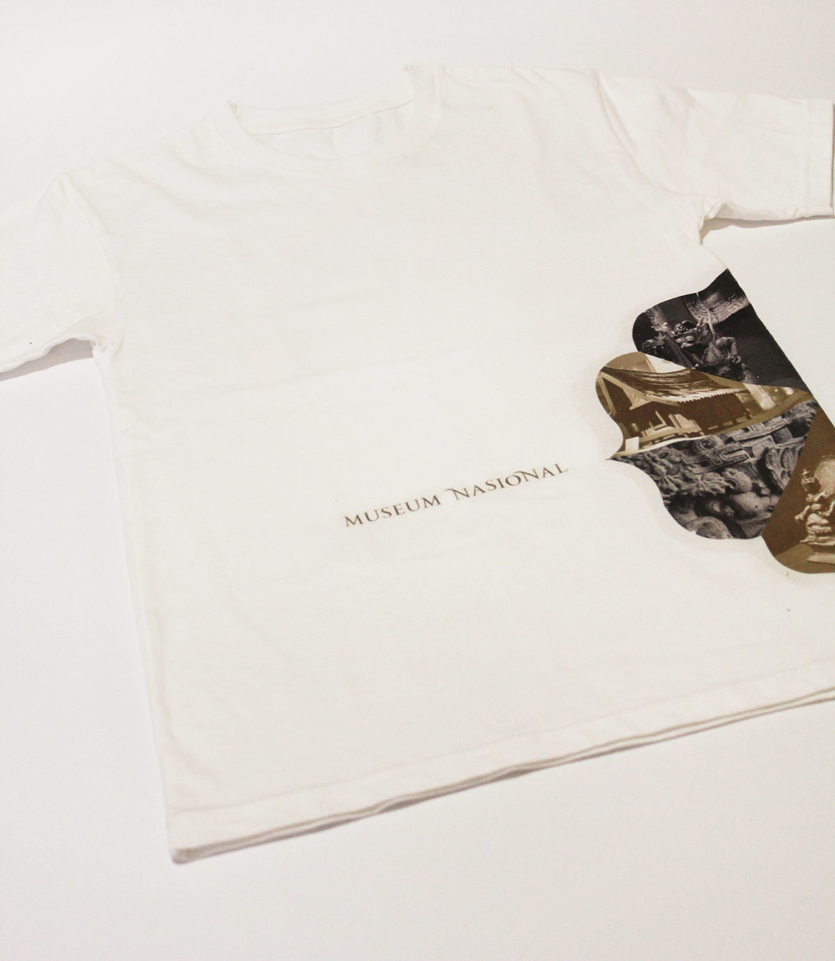
The look and feel of the museum is old, classic, authentic, heritage, with a touch of colonial style.
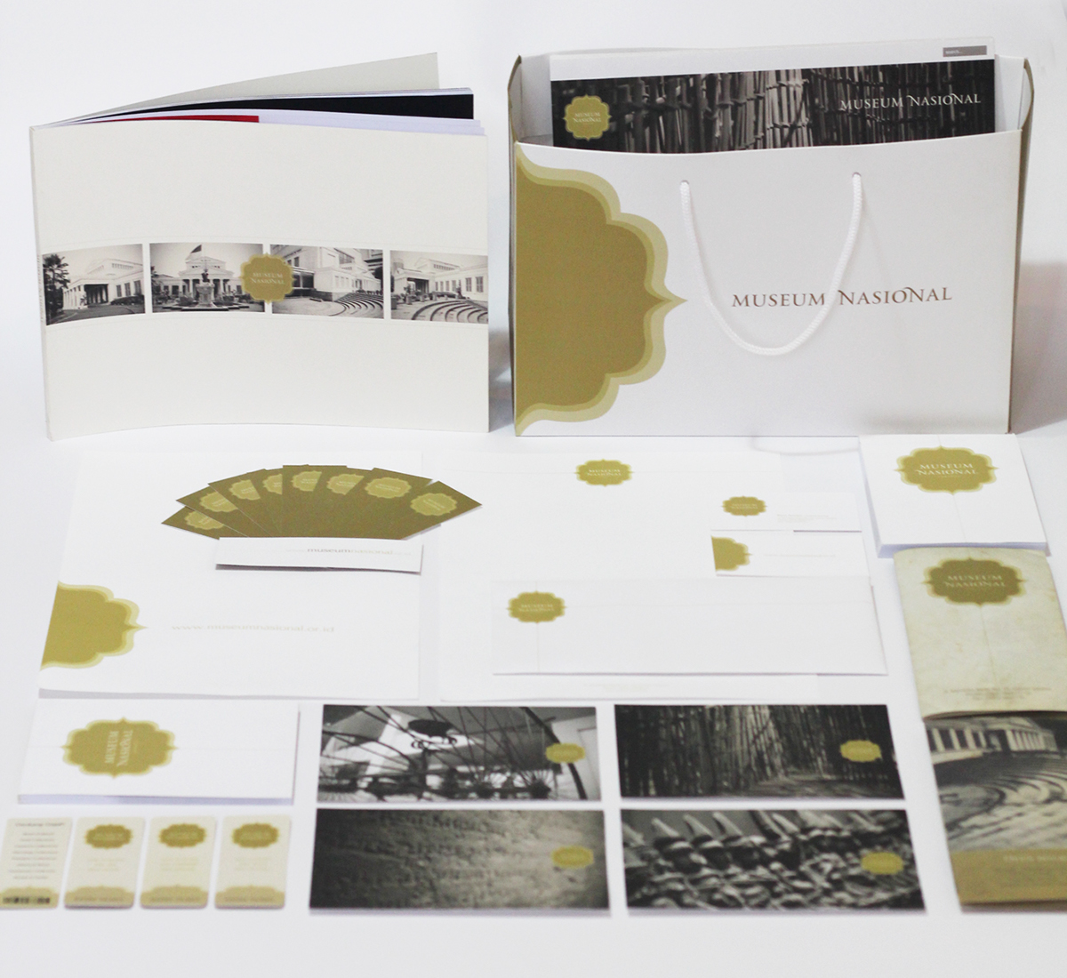
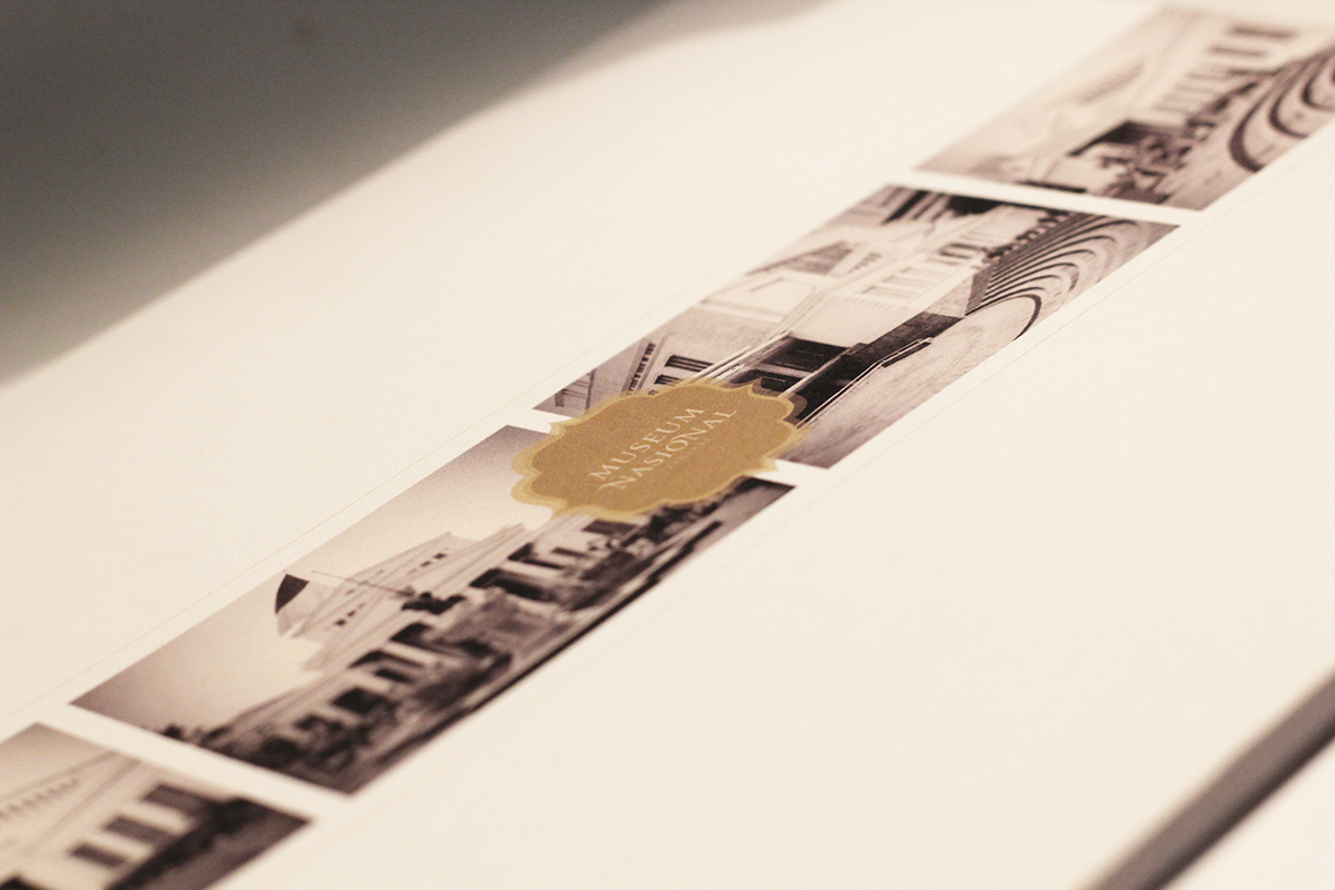
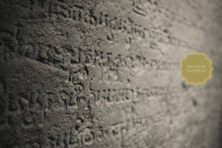
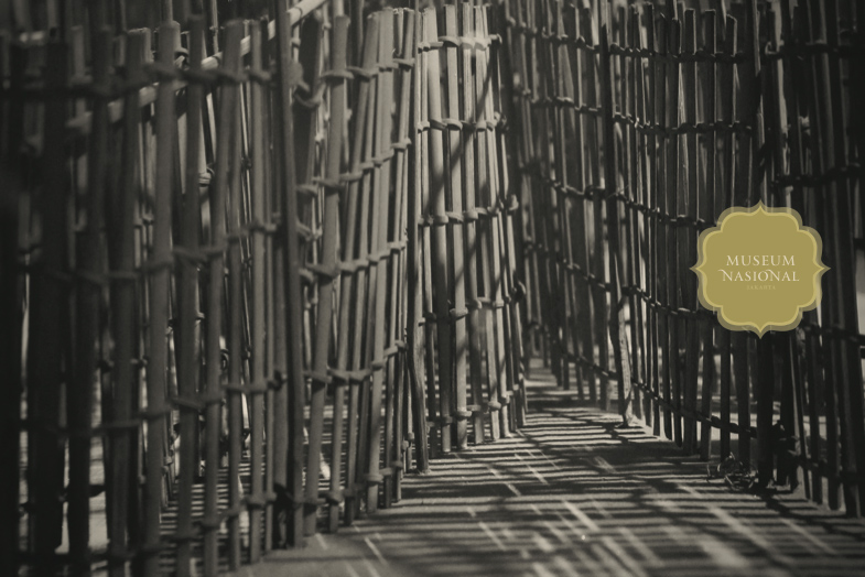
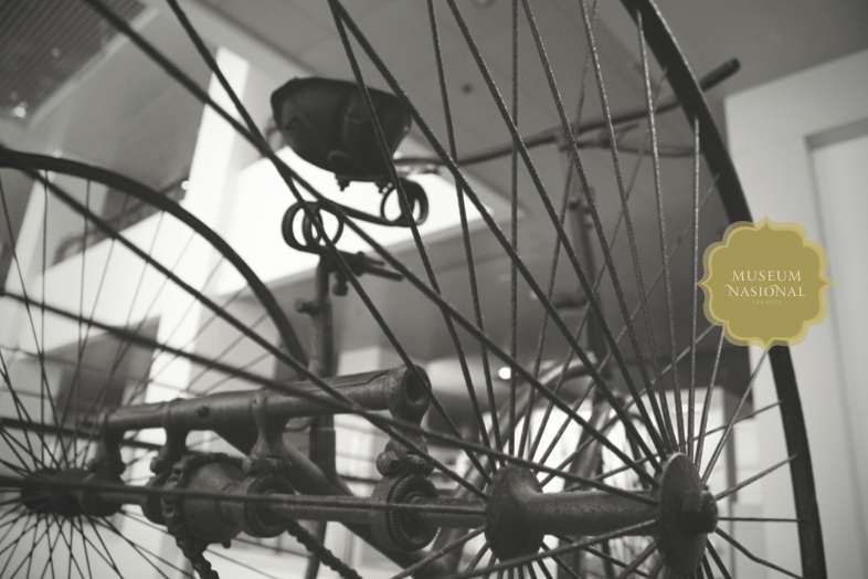
All the photographs were taken by myself (also the digital imaging).
Rebrand the Museum Nasional Jakarta
Response:
Based on the research and field trip to Museum Nasional Jakarta,
I found that this museum is one of the best in Indonesia (also one of the largest in South East Asia),
because the building is nice and clean, and there are wide varieties of collections from around the world.
The look and feel of the museum is old, classic, authentic, heritage, with a touch of colonial style.
All the photographs were taken by myself (also the digital imaging).
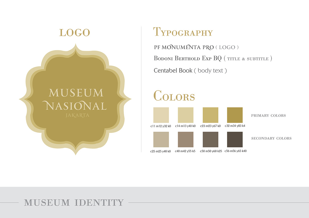
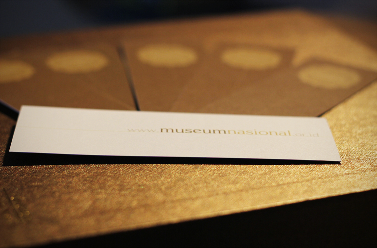
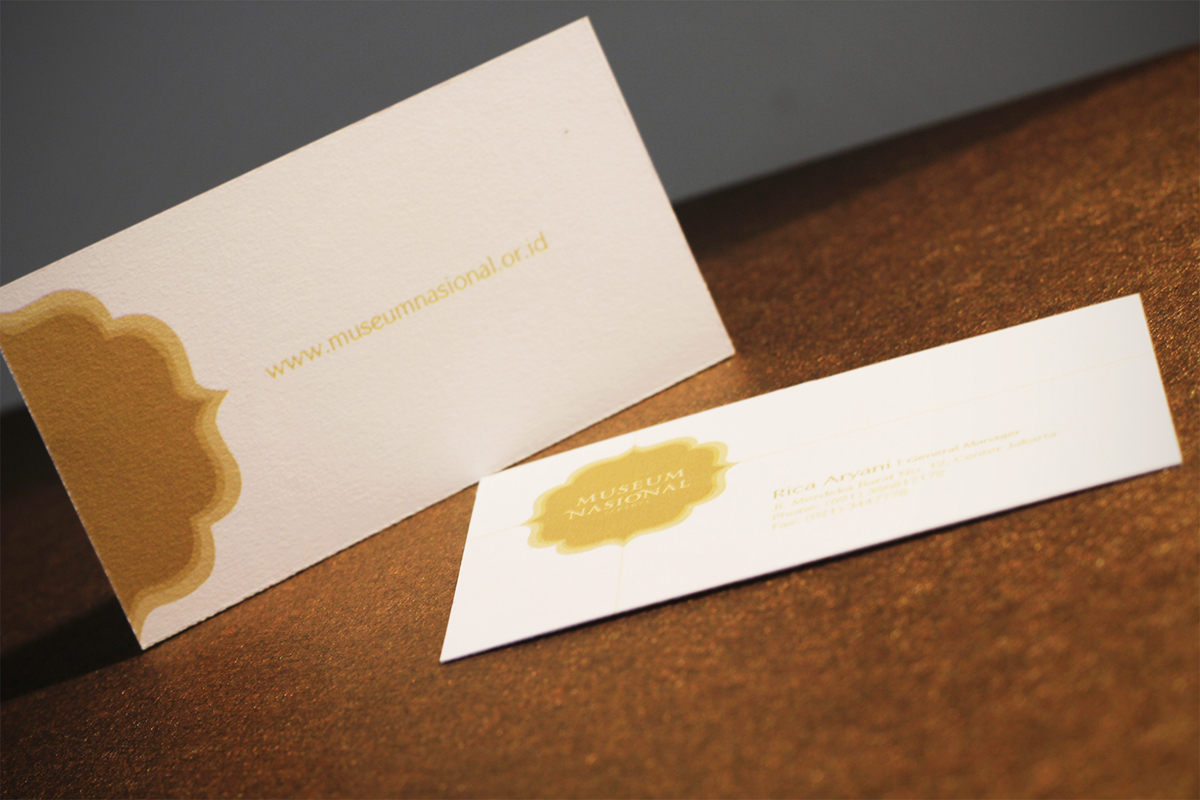
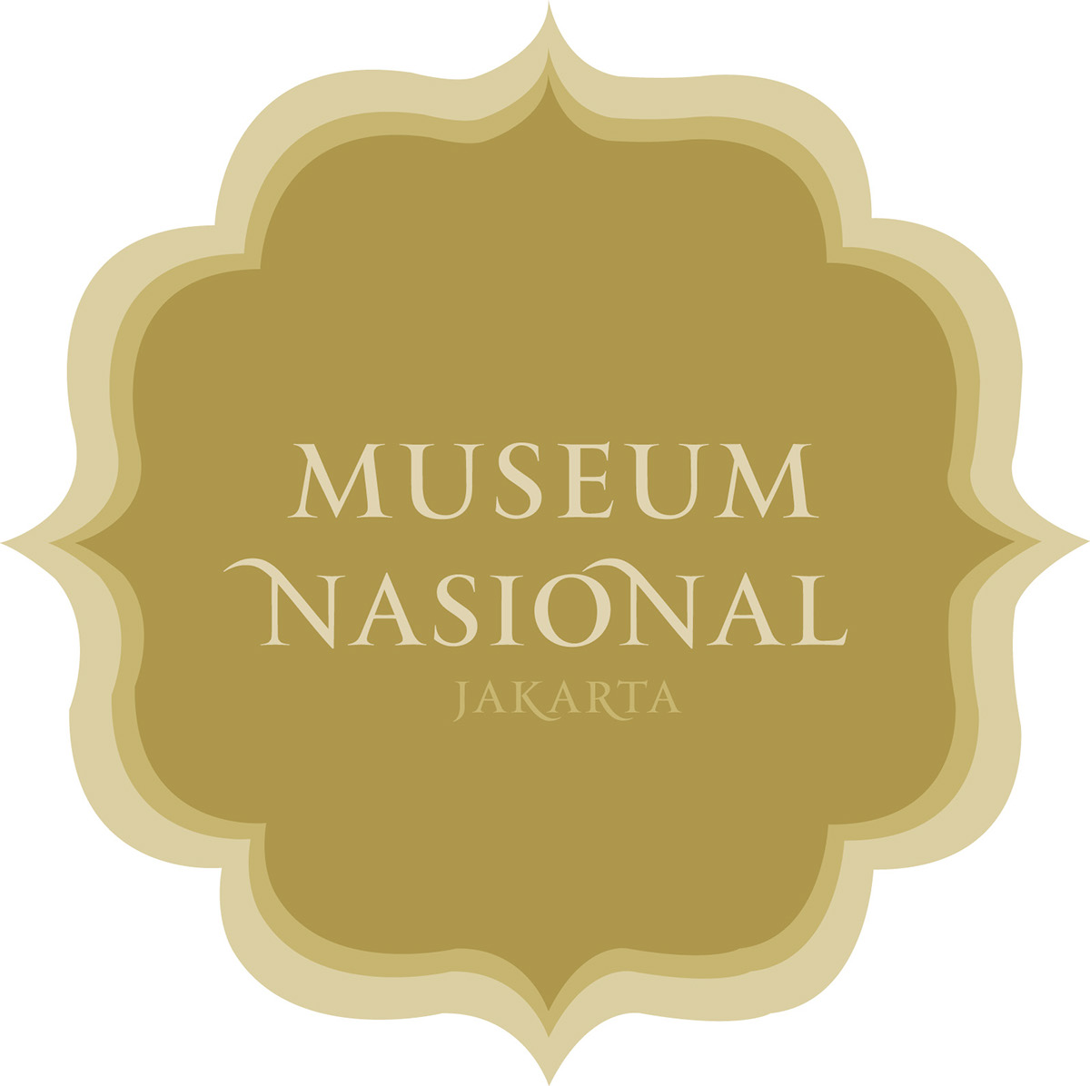
The shape of the logo (which has 8 edges in it) represents the 8 different main collections of the museum.
The main colors that I used for this project are white, gold and brown;
for white represents the actual building color, and brown represents
the main collections of the museum which is bronze.
The main colors that I used for this project are white, gold and brown;
for white represents the actual building color, and brown represents
the main collections of the museum which is bronze.
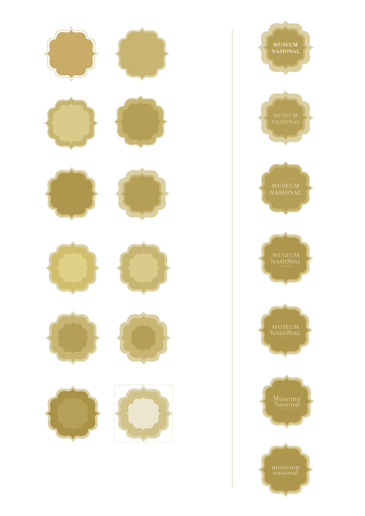
Logo development
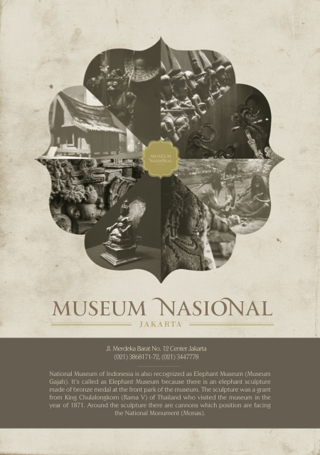
Poster
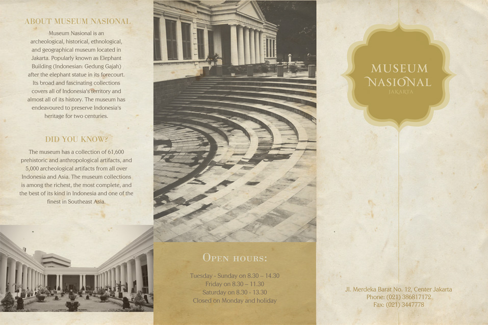

Brochure

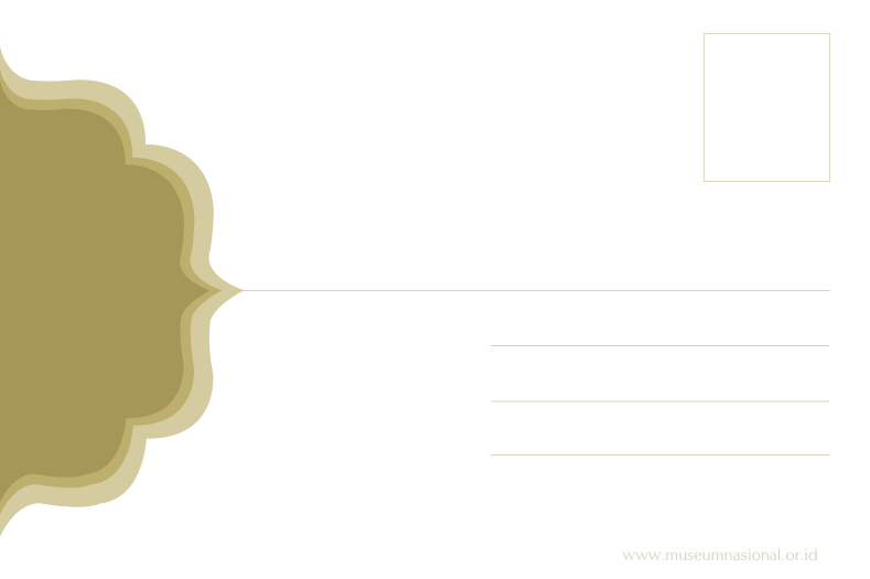
Series of Postcard

Website homepage
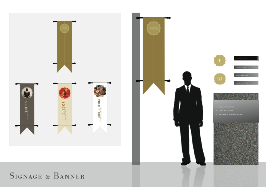
Signage & Banner
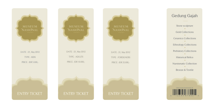
Entry Ticket