Project Scope: Editorial Design
Project Date: 12.2015
Creative Director: Tung Juno
Art Director: Minh Tran
Designer: Minh Tran, Nam Vu, Viet Do, Son Min, Hieu Tran, Tam Do
-
Project Date: 12.2015
Creative Director: Tung Juno
Art Director: Minh Tran
Designer: Minh Tran, Nam Vu, Viet Do, Son Min, Hieu Tran, Tam Do
-
Photo: Duc Bui
Stylist: Thuy Duong
About Project
GAM7 là tạp chí chuyên ngành dành riêng cho thế hệ Marketer và Designer năng động tại Việt Nam, phát hành bởi RIO Creative. Ấn phẩm in đặc biệt GAM7 Book ra mắt dịp Tết 2016 ra đời với sứ mệnh trở thành cầu nối giữa hai thế giới Marketing và Design, vốn tưởng chừng như khác biệt nhưng lại liên quan mật thiết với nhau. Với mục tiêu đó, thiết kế của tạp chí cần phải trung hòa được hai yếu tố sáng tạo và thực tế.
-
GAM7 is a specialized magazine dedicated to dynamic Marketer and Designer generation in Vietnam, issued by RIO Creative. Special print GAM7 Book wil be published in 2016 Lunar New Year with the mission to become a bridge between the world of Marketing and Design, which seemed different but closely related. With that goal, the design of the magazine should be both creative and practical.

The nameplate
Các chữ cái trong logo Gam7 được liên kết với nhau, không tách rời thể hiện cho sự kết nối giữa marketer và designer, giữa đội ngũ biên tập và độc giả. Nét ngang của số 7 được kéo dài vô tận thể hiện cho sự tăng tiến và phát triển không ngừng, đồng thời là nét đặc trưng cho nhận diện bìa tạp chí.
-
The letters in the logo Gam7 linked together, not separate imply the connection between marketers and designers, between the editorial team and readers. Non-stop extend horizontal strokes of number 7 is not only implies the incremental and endless growth but also characteristic for identifying the magazine cover.

Motion created by Khanh Viet Nguyen
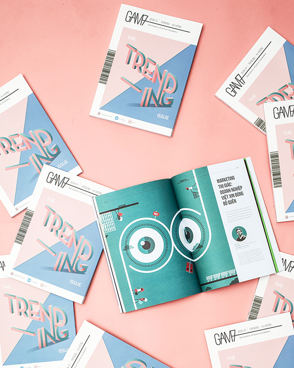
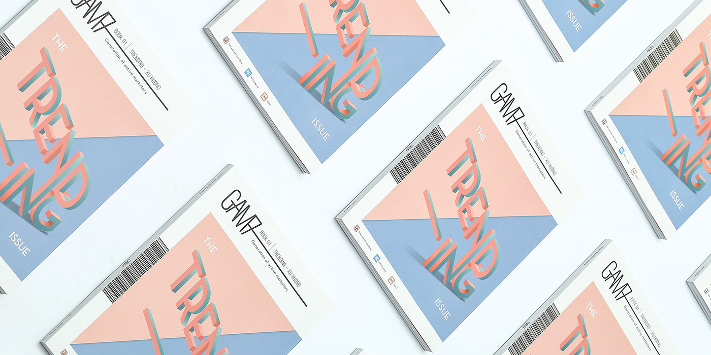
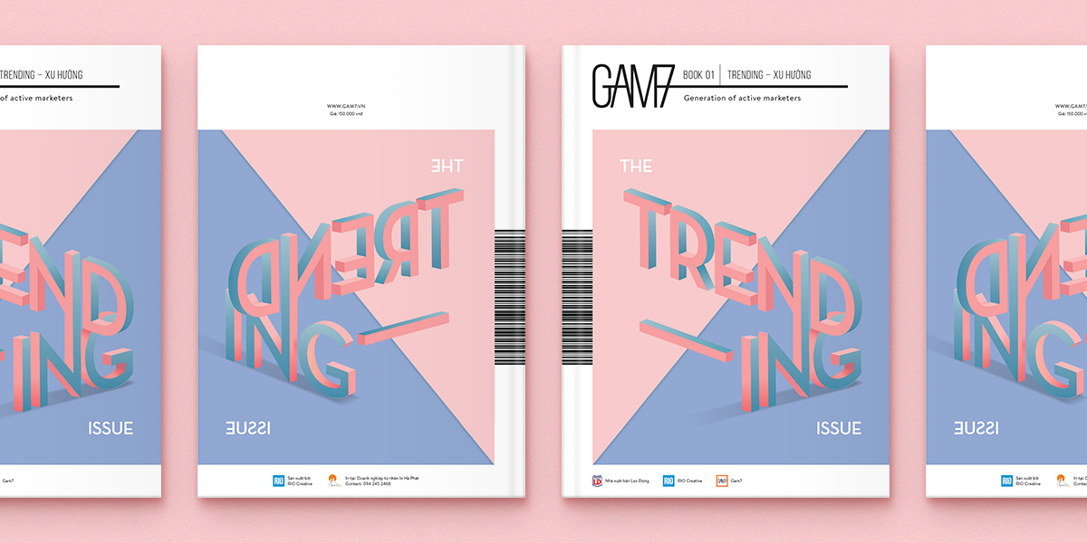
Cover and theme
Với chủ đề số 01 là Xu hướng, chúng tôi sử dụng cặp màu sắc của năm 2016 do pantone công bố để thể hiện điều này. Đồng thời việc sử dụng hai màu tương phản cũng giúp liên tưởng đến cặp đôi marketer và designer song hành với nhau trong công việc. Bìa trước và bìa sau sử dụng hai hình ảnh ngược nhau đặt ra một câu hỏi: "Xu hướng là thứ chúng ta có nhất thiết phải đi theo không, đôi khi làm ngược lại sẽ tạo nên một giá trị khác biệt."
-
The theme in the first issue is Trending. So we use Color of the year 2016 announced by Pantone to present. Also the use of two contrasting colors also associate marketer and designer working together as a team. Front cover and back cover using two divergent picture posed a question: "Do we have to follow the trend?, or sometimes do the opposite would make a big difference."
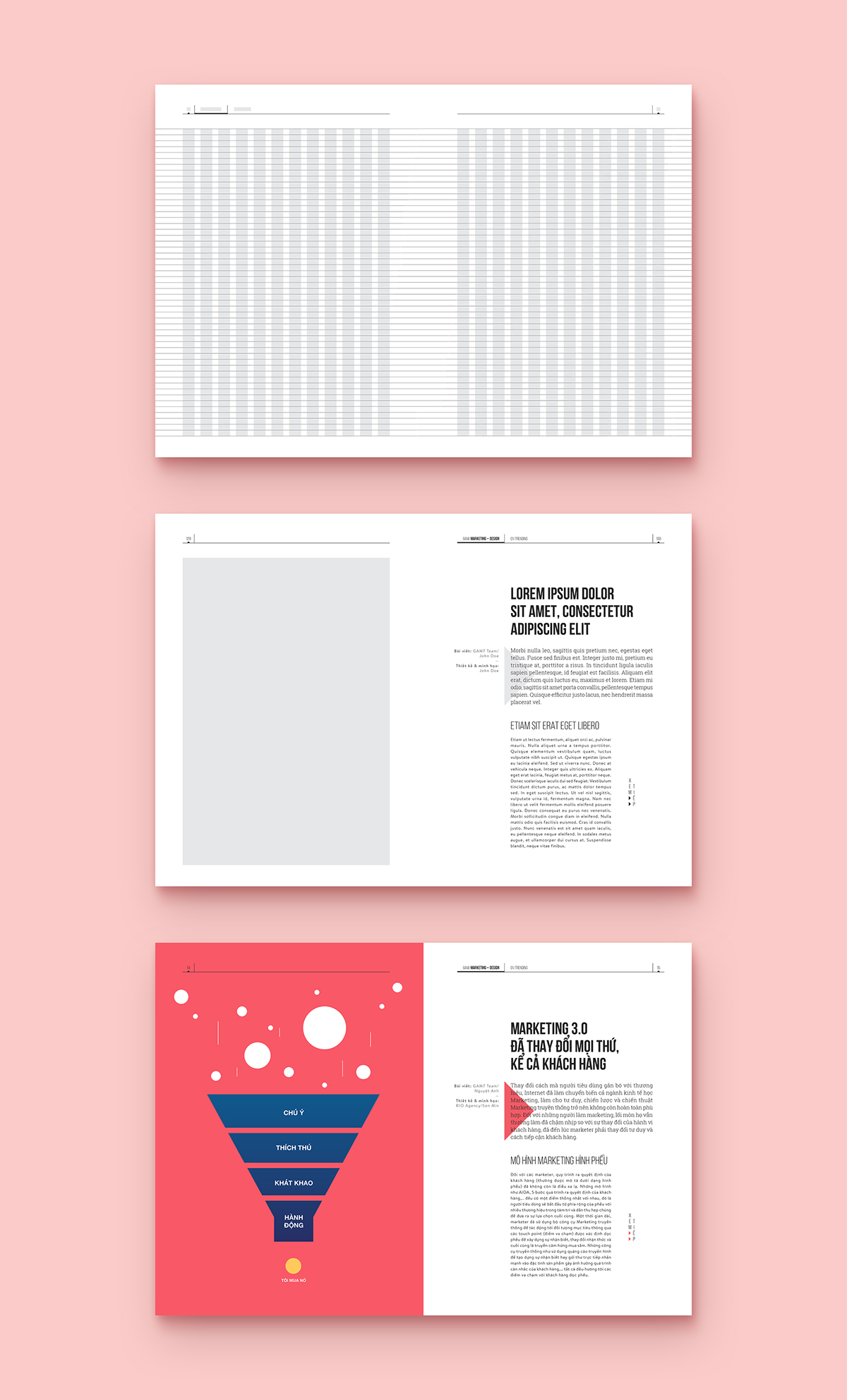
Grid systems
Chúng tôi sử dụng hệ lưới 12 cột để tạo nên độ linh hoạt tối đa cho thiết kế, đồng thời vẫn thể hiện cảm giác nghiêm túc của một cuốn sách.
-
We use a 12 column grid system to create maximum flexibility for layout design, while still ensuring formal sense of a book.
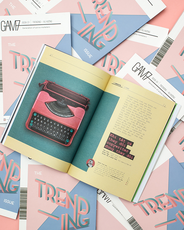
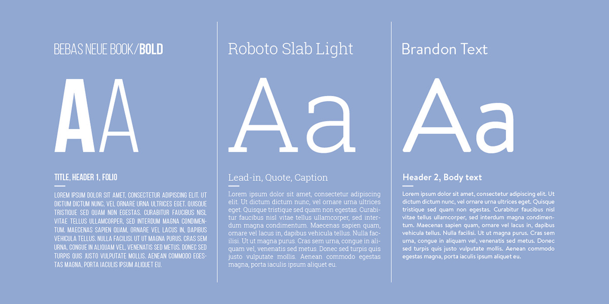
Typography
Các kiểu chữ Bebas Neue và Roboto Slab được sử dụng để tạo nên cảm giác nghiêm túc và trưởng thành của tạp chí kết hợp với Brandon Text mang phong cách trẻ trung và đương đại.
-
Bebas Neue and Roboto Slab typefaces are used to make sense of formality and maturity of the magazine combined with youthful and contemporary style of Brandon Text.
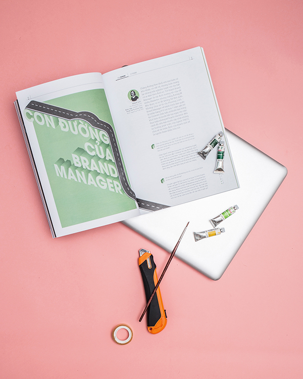
Design spread

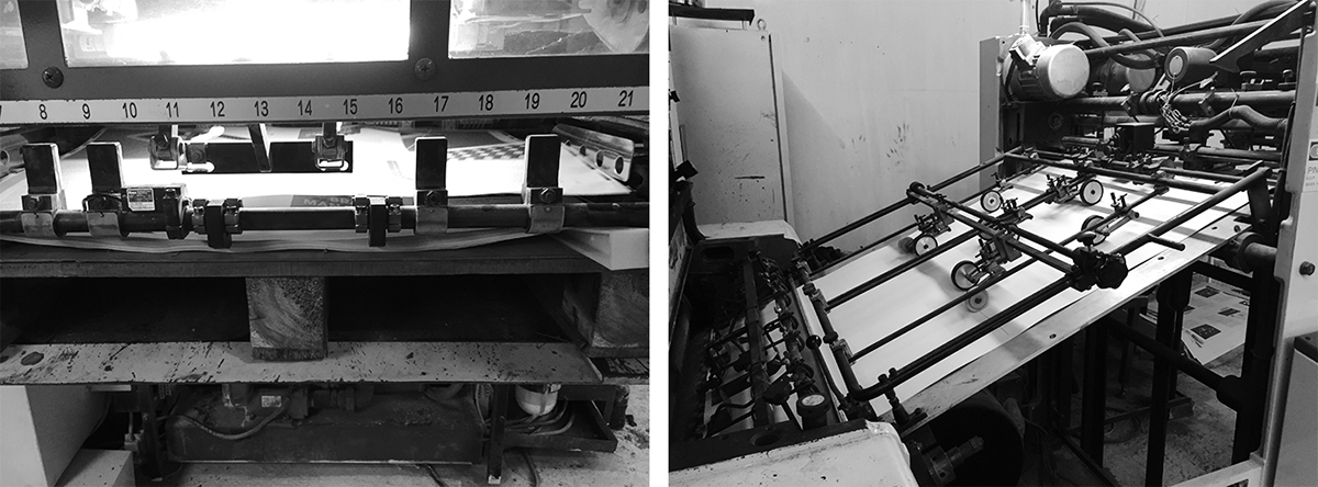
Printing process


Gam7 Photos
Photo: Duc Bui
Stylist: Thuy Duong