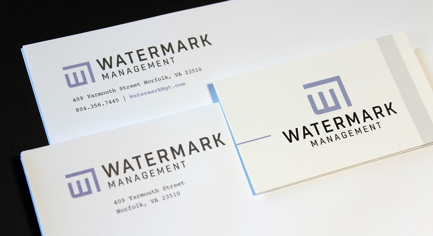

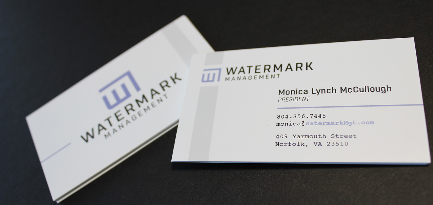
Watermark Management Identity
An identity marking a new beginning for urban apartment living in Norfolk, VA
As Watermark Management was being formed, I led the way to creating their identity. After several meetings with Moncia Lynch McCullough, President of Watermark Management, a few key concepts and rules surfaced. Watermark Management needed something to stand out against the typical real estate looks around town. They needed something refreshing, yet authoritative and trustworthy.
Watermark Management makes a habit of developing their own properies from historical buildings. They alter the building as little as possible, yet update it to be as modernly convenient and resourceful as possible. This care of craft, preservation, and "resource mindedness" are all characteristics that went into the making fo their identity.
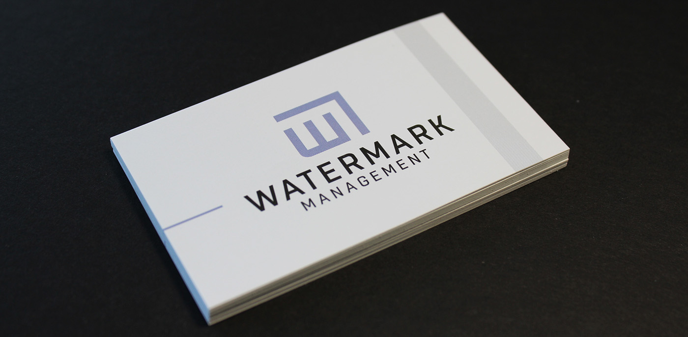
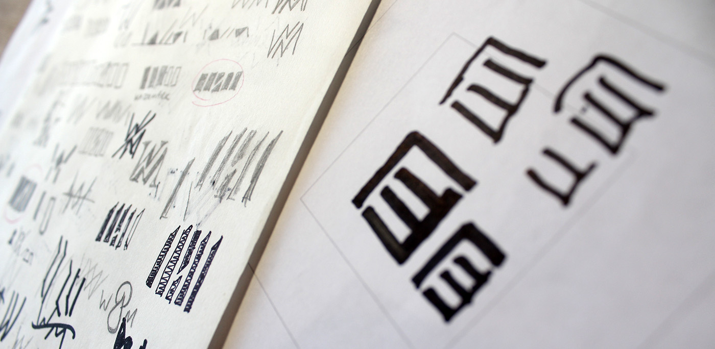
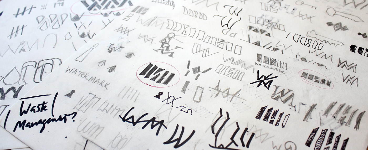
The concept behind any watermark is that something is present, but unseen unless you go looking for it. The architecturally drawn 'W' coupled with a "roof over it's head", creates an invisible 'M' in the negative space. Just like planning an interior, boundaries are established to sculpt a space to exist. The logo is supported by the typeface, Boxed. The rounded-square sans-serif creates a strong voice that also harkens back to the handwriting of a draftsman working on blueprints.
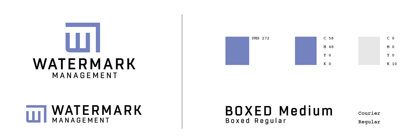
The secondary typeface, Courier, is used with duel intention. Not only does Courier harken back to yesteryear of typewriters and early computers, it looks forward and borrows from trendy restaurant menus looking for an authentic, crafted voice. These duel meanings speak to Watermark Management's target audience of young, hip professionals.