The Affinity app icon design project has been an evolutionary process for revolutionary products.
What started in 2013, a year before any Affinity apps launched, grew with engagement, awareness and perception. With a brief that covered the typical use cases of an app icon, the design evolved with our apps as we went from beta to launch to Apple Design Award winners and App of the Year 2015. The future beckoned and my vision was to create a new identity that
has future scope to respond.
has future scope to respond.

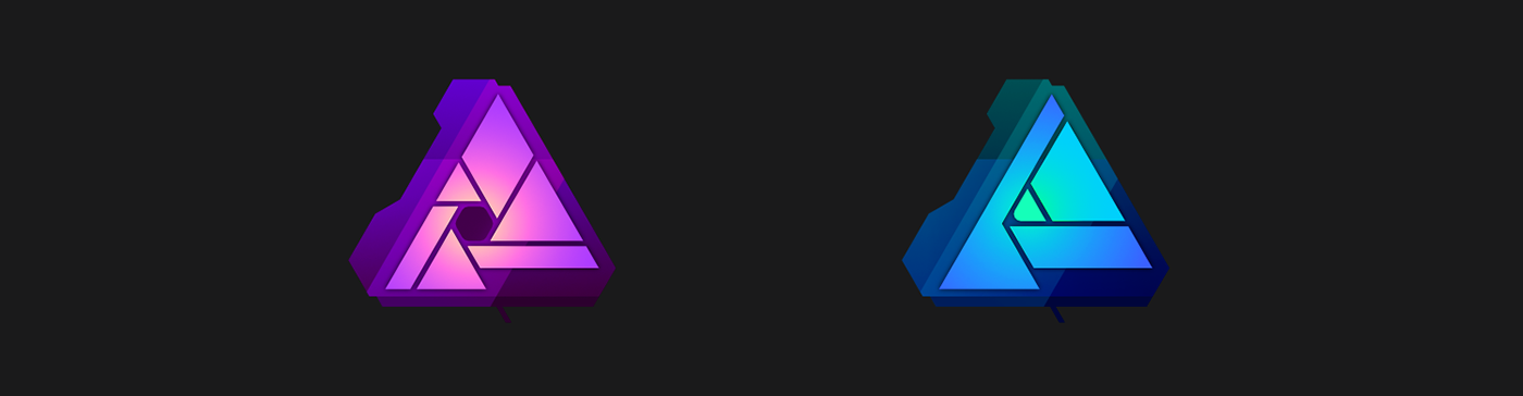
With unknown apps and an unknown brand name, with plans for a tightly-integrated suite that would take time to be released, it seemed a clear choice to speak of the apps' purposes with icons that referred to the familiar, to a real camera lens, a real pen; skeumorphism. Development was set within a backdrop of a triangular A-shaped theme that would be suite-wide and for
Affinity branding.
Affinity branding.

Development of the thematic triangle, its boldness, contrast, use of colour, with shape and outline variations, was all carried out in context of how the icons would appear in the Mac App Store and in Mac OS X Docks. This period saw Mavericks as the most popular OS version, with Yosemite on its way and different brightness Docks in use.
Flat design was still a step beyond the realm of other OS X app branding, standing out for the wrong reasons. However, flat design remained part of development; iOS loomed in consideration with Apple slowly merging style and behaviours across its platforms, and Windows 8/10 and Google's Material Design increasing in popularity. Windows 8 was an instance of a big step to flat design, not one that emerging Affinity apps needed to make while establishing their usefulness.

While the bounds of the Affinity logo, as also used in the original app icons, was an important theme to maintain, a bold border constrained the central area too strongly and appeared too heavy in the Mac App Store and Dock. Growing the central sector towards the boundary made the whole icon lighter and brighter, while also producing around double the inner area to develop
key elements. The step also framed the icon artwork differently, better showcasing the character of the outer shape's developed left side and lower edge rather than offering an even, solid block backdrop.

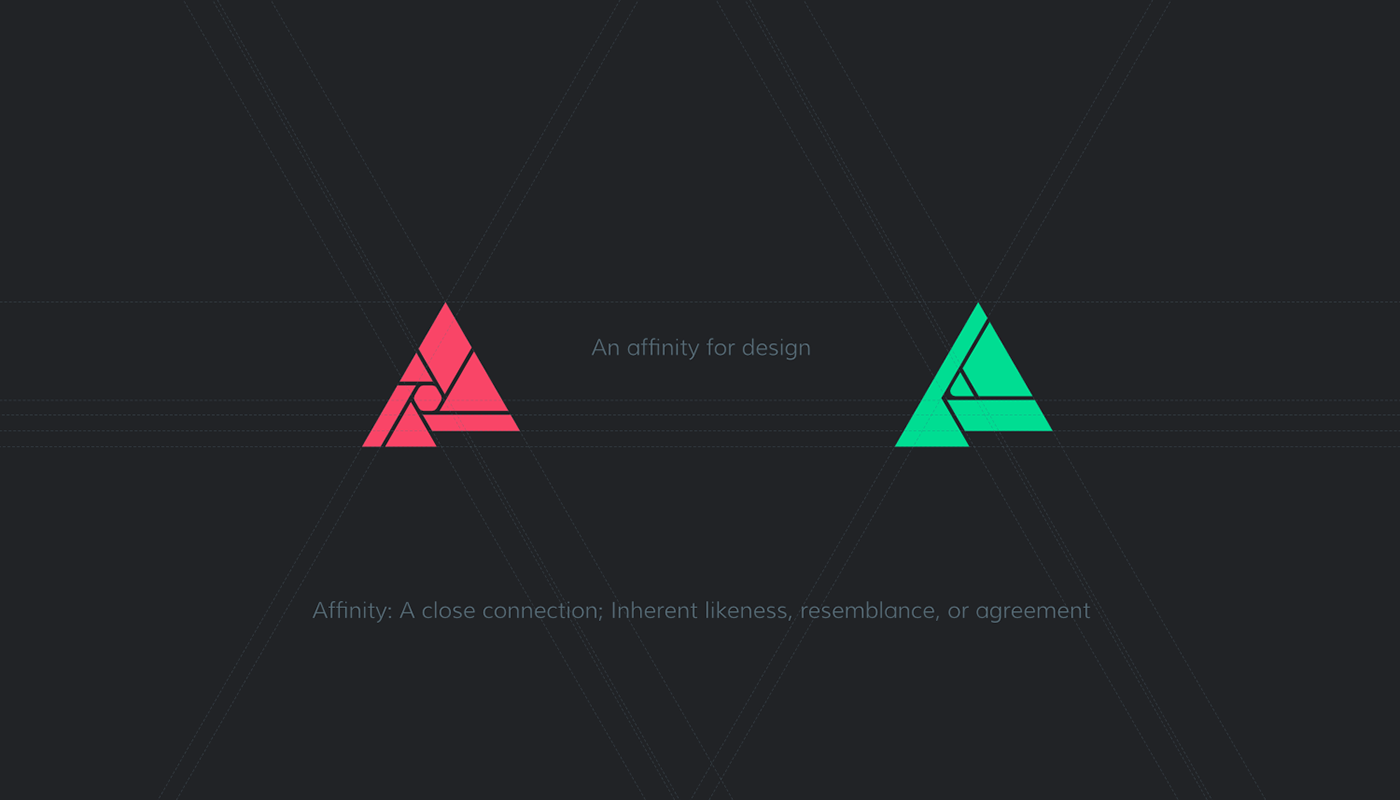
Keeping flat design as part of the design process allowed exploration of the base shapes and lines the key elements of the icon, its purpose, keeping the brief at the heart of the job. The camera lens became an aperture, the drawing tools became a pencil tip, while retaining the now-familiar Affinity logo shape. The icons were able to share not just the basic outline geometry, but also to echo elements of smaller components with each other, the thickness and size of many strips and triangles.

The procedural evolution of the design that included flat and skeumorphic elements found a merger of the original layered triangle shape with the new core elements of the focussed flat design; cleaner, more modern icons that still indicated the app's purposes, shared a suite and brand identity, and suited a growing professional audience that had increased awareness of the apps and their positioning.
The current icons, launched in July 2015 to coincide with the release of Affinity Photo, give each app a refreshing identity. The knocked-back outer geometry of the Affinity logo shape add a layered depth, the triangular Affinity A is reinforced, original colour elements are retained, and super-smooth gradients work to add depth and focus on the core of the icons. The image editing app's stylised camera aperture and illustration app's pencil tip are given subtle emphasis in what also works very strongly when
considered as a simple coloured shape amongst other applications in a Dock or App Store listing.
THANKS FOR READING


