
_FONT SANES
School project
Year: 2009
School project
Year: 2009
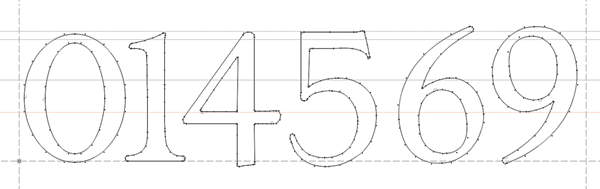
I created readable typography suitable for long text. Serif font with high contrast in lines to make it seems more organic. Serif is leading you through long text. Font Sanes is appropriate fot short text and headings as well. This project also includes font installation in the poster design. We investigated the font and selected appropriate topic for the poster.


Monogram.
I describe font Sanes as readable, organic font which is more suitable for cultural themes. I made posters for the exhibition of prints known under the name Irwin Icons. Type of poster is typographic so I used one of their simbols and linked it with my type. I created two posters by trying different positions and backgrounds.


Sanja Radakovic
Ljubljana, 2009

