
Made in Pasta Foodmanufactura image design
The background:
There are things in life that you love because of their simplicity. Like a good cup of coffee in the morning. Or staying up all night watching your favourite series. Or having a quick, delicious bite when you're starving but you are in a hurry.
Our client had a simple idea: to make artisan handmade pasta and offer delicious neapolitan pizza slices at their cozy place at Oktogon. With that in mind we had diverse tasks: to develop the core concept and brand identity, packaging, interior decoration elements and communication.
Simplicity can be tricky. With pizza places popping up all around the city, we wanted to differentiate ourselves, without making it too complicated.
The name and the concept:
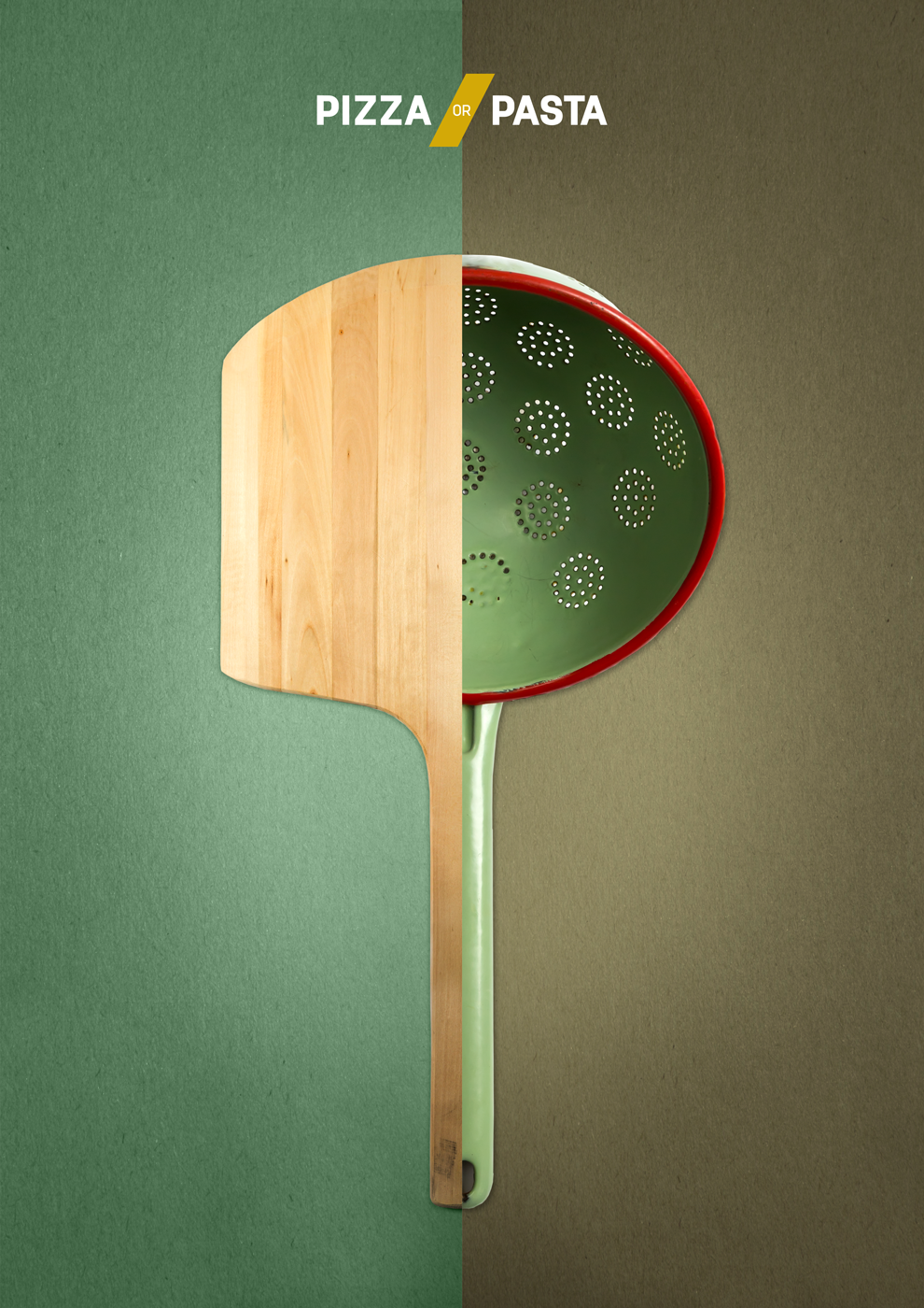
The core idea was to build the brand on the food they are offering: pizza and pasta. We realised that we had two well known, beloved Italian meals that everyone knows and loves, yet they are completely different in many ways. So we put these opposed associations in focus.
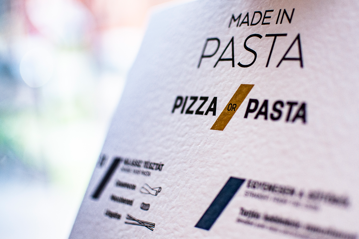
The logo:
Simple typographic logo with a twist. The narrow, aerial Made in Pasta logo is paired with the bold Pizza or Pasta words, to put the emphasis on the food they are offering. And to give it and edge, we used a vivid yellow color and a shape that resembles a well known pasta type: penne.


Photos: Pizza or Pasta?
We photographed several phases during the cooking to demonstrate the differences. The question urges you to choose from 2 completely different dishes. These photos are used in the interior and in the communication as well.
We photographed several phases during the cooking to demonstrate the differences. The question urges you to choose from 2 completely different dishes. These photos are used in the interior and in the communication as well.


Interior:
Besides the photos that show you the two meals, we put playful infographics along the tables. The idea was that most people will come by themselves and stay for only 15 minutes while waiting and eating. We wanted to give them something to glance at so we collected fun facts of the Italian cuisine and made hand-drawn graphics for them.


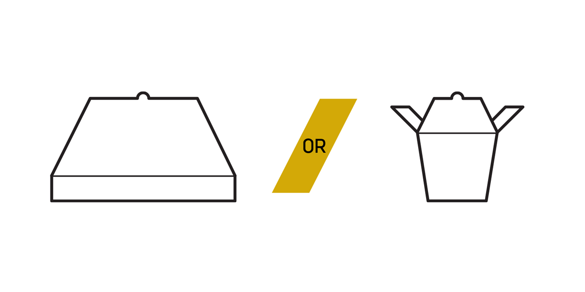
Signage, menu and packaging:
To keep it simple, we used pictograms to show the foundation of the restaurant: the pizza and pasta and their different associations/characteristics.
These appear on the store window and on all the packages.
You can see the menu on variable painted wood blocks, because they have new tastes every week.


Communiation:
The communication follows the previous idea:
Come in and decide what you are in the mood for: Pizza or Pasta?
Quick, brief questions straight to the point:
Pizza or Pasta?
Naples or Bologna?
Mozzarella or Parmesan?
Baked or cooked?


