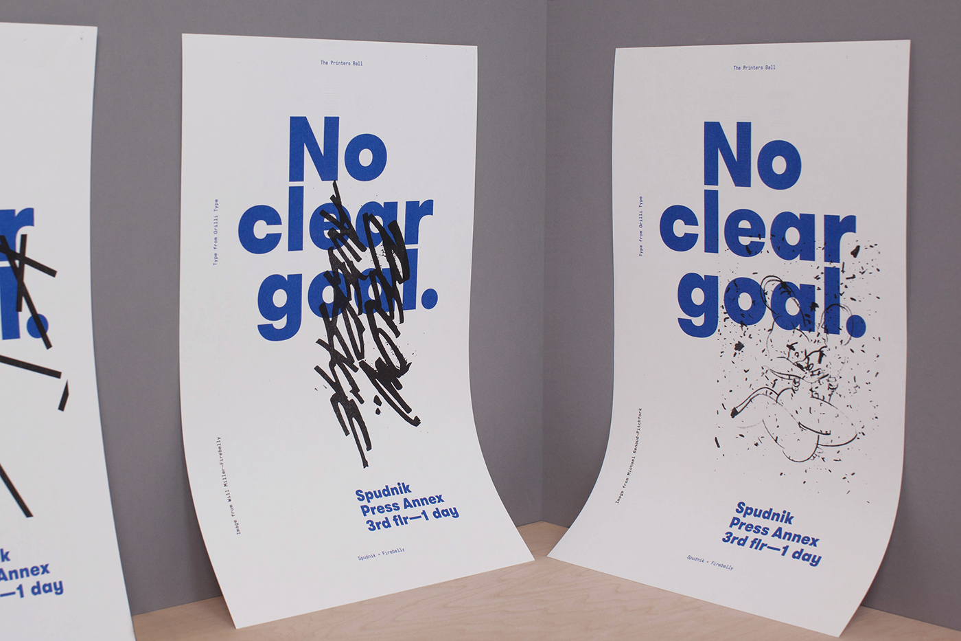
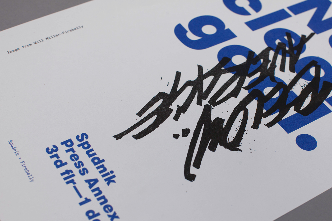
The black images were sourced and credited from the assembled library. L to R: Will Miller of Firebelly's lettering and Pitchfork's Micheal Renaud's sketch.
This Project was a Collaborative Effort
STUDIO: Firebelly | DESIGN TEAM: Nick Adam
CLIENT: Spudnik Press | PRINTER: Risograph at Spudik Press
CLIENT: Spudnik Press | PRINTER: Risograph at Spudik Press
During my time at Firebelly there were opportunities to participate in exhibitions, curate galleries, design and lead workshops, as well, to participate in lectures — all on top our design work. There was a moment where I was privileged to have an experience that allowed all of these to happen at once with Spudnik Press while designing a poster series as a promotional campaign.

L to R: DAAP Professor, Matt Wizinsky of Studio Junglecat circuit lettering, next to Firebelly's Nate Beaty's comic sketch
PROJECT CONCEPT:
I am fascinated by the work and histories behind images we release into the world. It seems the passed over concepts, early ideas, and experiments that may not have had a direct end-use show much of an individual designer's personality and approach. Yet these pieces rarely find a place to live.
Another curiosity I have is in the paradox observed when we, as designers, talk about ourselves. Half of the time, I find we have a similar way of talking about what we do, while in practice we tend to have surprising differences. The other half of the time, it seems we attempt to distinguish our process and, by proxy, ourselves or studio from another when there are many similarities.
Another curiosity I have is in the paradox observed when we, as designers, talk about ourselves. Half of the time, I find we have a similar way of talking about what we do, while in practice we tend to have surprising differences. The other half of the time, it seems we attempt to distinguish our process and, by proxy, ourselves or studio from another when there are many similarities.

Invited to create a Risograph workshop and exhibition for graphic designers at Chicago’s largest print-based festival, I took this as an opportunity to explore these curiosities.
Prior to the workshop, I reached out to close colleagues and assembled a small library of logos, patterns, type, and artwork that, for whatever reason, never went further than process work or an initial presentation. The intention was that workshop attendees would also be invited to bring examples of their early work and with our collective library they'd recontextualize the work while also learning how to use a Risograph.
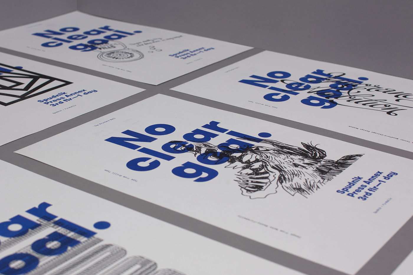
The variable image peaks into the library of content, seen here: Plural's Renata Graw, IDEO's Mary Foyder, ChiDM's Tanner Woodford, Matthew Hoffman, and Nate Beaty
Wanting the exhibition poster to be true to the brief that others had met, the designed intention was to serve as an example of what participants could expect to create in our time together. As well, it needed to be representative of work that occurs early in my process. So I approached the poster in the way that I begin most projects—spacial relationships with meaningful typestyles.
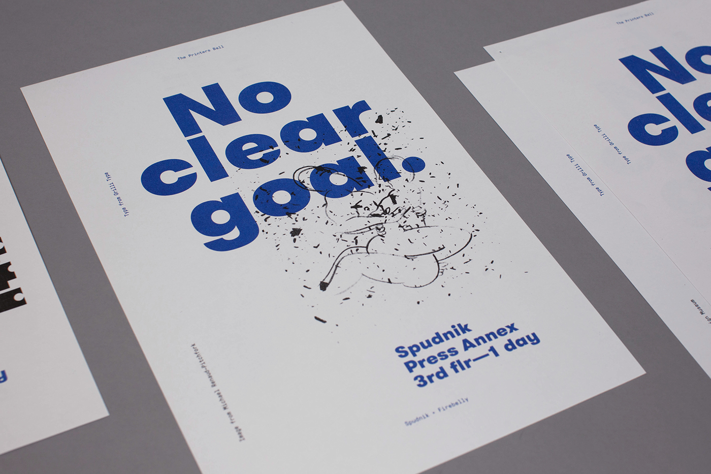
My first step was to organize content in a manner that defined a hierarchy, thereby revealing the elements I had to work with. Considering that the only requirement was to create a poster, the beta release of Grilli Type’s GT Eesti was selected as the primary typeface. While Estonian-based, I felt its letters, so full of personality, were not dissimilar to the masterful posters painted by Zurich artist Otto Baumberger. Working with the content elements, personally subjective spacial and size relationships were attained through rules of halves and thirds. All of the pieces locked in quickly, however I redrew several letters to increase horizontal & vertical relationships across the headline.
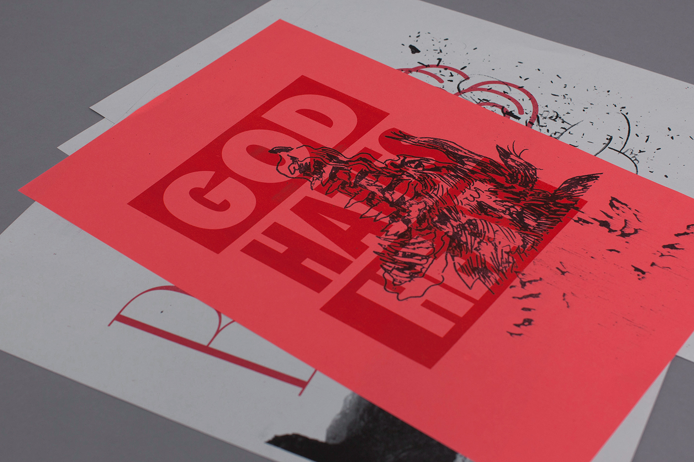
Typically, this would have been the point where I would begin new versions, invite a teammate’s perspective, or share with the client. To stay true to the brief, I stopped, made a proof, and began utilizing the library of images to assemble a series of veritable posters upon the Risograph’s scanning bed.

This process of collage, deconstruction, and reappropriation provided context and contrast to see how, as graphic designers, we have both similarities and differences. We'd also revisit the approach of graphic designer as an assembler of existing material.
Purely as form through play, participants gained an heightened awareness to the depth of different designers’ processes. The hope being that the more we understand another person the better we may understand ourselves and, in this context, the width of our field.

Featured here is Tanner Woodford's proposed identity for the Chicago Design Museum's retail space
Our collective end product was a series of collaged artworks to be exhibited at Spudnik Press's Printing Annex, for the month following Printer's Ball. Once completed with the ten-hour workshop, I took a moment to make the following simple layering studies juxtaposing works from the library of submitted content.

Joined together in a mix of emotive with iconic: Matt Wizinsky, Micheal Renaud, Some Odd Pilot, Bud Rodecker, Nate Beaty, Tanner Woodford and myself
Project Deliverables:
Branding, Creative Direction, Poster Series, Graphic Design, Workshop Creation and Facilitation
This Project was a Collaborative Effort:
STUDIO: Firebelly | DESIGN TEAM: Nick Adam
CLIENT: Spudnik Press | PRINTER: Risograph at Spudik Press
CLIENT: Spudnik Press | PRINTER: Risograph at Spudik Press
CONTENT LIBRARY:
Kim Knoll & Kyle Ertmoed—Knoed, Matthew Hoffman, Tanner Woodford—ChiDM,
Annika Olsen—Wright, Nate Beaty—Firebelly, Bud Rodecker—3st,
Michael Renaud—Pitchfork, Joy Burke—Pitchfork, Matt Wizinsky—Studio Junglecat,
Annika Weilander—Some Odd Pilot, Chris Eichenseer—Some Odd Pilot,
Nick Adam—Firebelly, Cheryl Towler Weese + Hillary Geller + Silja Hillmann +
Maggie Lewis + Tuan Pham + Brad Sturm + Denise Rynkar all from Studio Blue,
Will Miller + Ross Burwell—Firebelly, Matthew Terdich—Programme,
Renata Graw—Plural, and Mary Foyder—IDEO
In order of participation.

