


This assignment called for a company’s existing Annual Report to be redesigned and made over. I selected the Disney Company, simply because I am a fan.
I noted Bob Iger (the company’s CEO) often talked about the importance of story telling throughout all aspects of the company, so I incorporated it as the theme of my design. I chose a square page to suggest a story/picture book, and I splattered a few vibrant watercolours where appropriate for a childlike, playful element in the report.
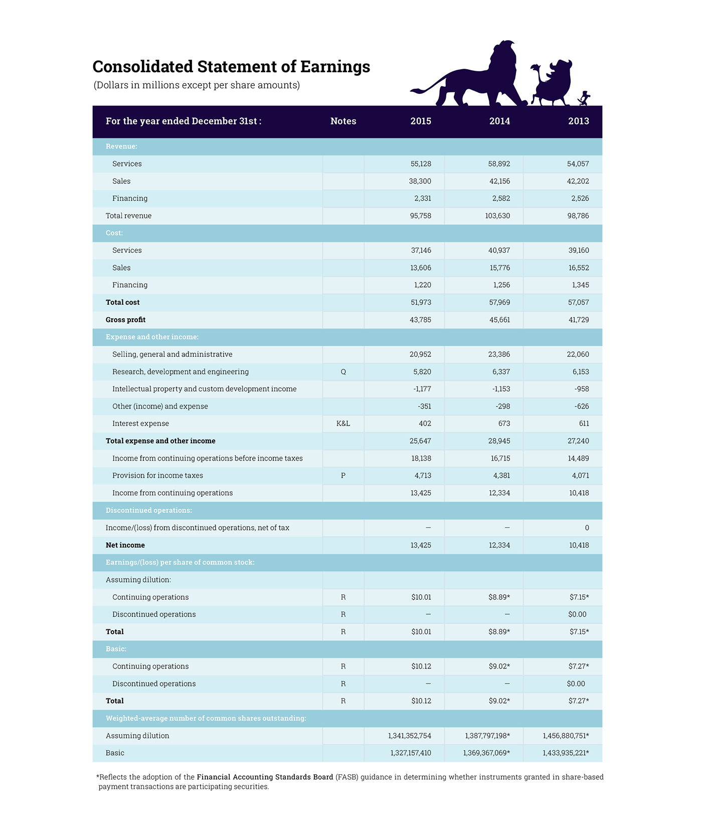
Character silhouettes were vital, and I chose to use vectors instead of the literal cartoons, as this better complimented the large bodies of text. I created infographics and playful graphs and laid them out like a web-page, making the data super easy to read for those strong and weak in numeracy.
I wanted my colour pallet to be a harmony of professionalism and magic, and I feel the deep purple achieved exactly that. I was even fortunate enough to find a beautiful metallic silver paper, which I used to add a little luxury to the cover of
my report.
For the report’s fonts, I chose Lindy’s Diner and Roboto Slab. Both are serif fonts, but they were able to work well on a page with enough distance between them. Waltograph was, of course, used for the company name throughout. It is a font based off the cursive handwriting of Walt Disney himself.
This assignment was possibly my favorite in the course, and I look forward to future opportunities to compose creative company reports.
I noted Bob Iger (the company’s CEO) often talked about the importance of story telling throughout all aspects of the company, so I incorporated it as the theme of my design. I chose a square page to suggest a story/picture book, and I splattered a few vibrant watercolours where appropriate for a childlike, playful element in the report.
Character silhouettes were vital, and I chose to use vectors instead of the literal cartoons, as this better complimented the large bodies of text. I created infographics and playful graphs and laid them out like a web-page, making the data super easy to read for those strong and weak in numeracy.
I wanted my colour pallet to be a harmony of professionalism and magic, and I feel the deep purple achieved exactly that. I was even fortunate enough to find a beautiful metallic silver paper, which I used to add a little luxury to the cover of
my report.
For the report’s fonts, I chose Lindy’s Diner and Roboto Slab. Both are serif fonts, but they were able to work well on a page with enough distance between them. Waltograph was, of course, used for the company name throughout. It is a font based off the cursive handwriting of Walt Disney himself.
This assignment was possibly my favorite in the course, and I look forward to future opportunities to compose creative company reports.

