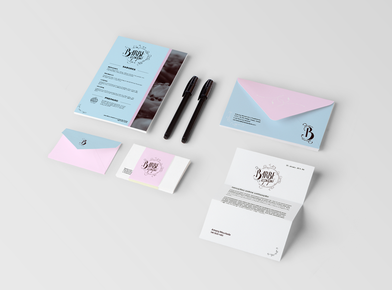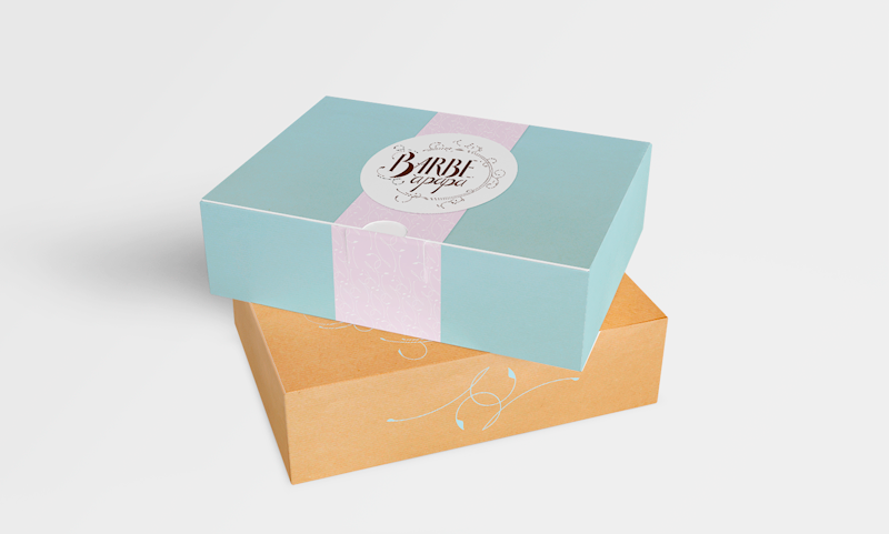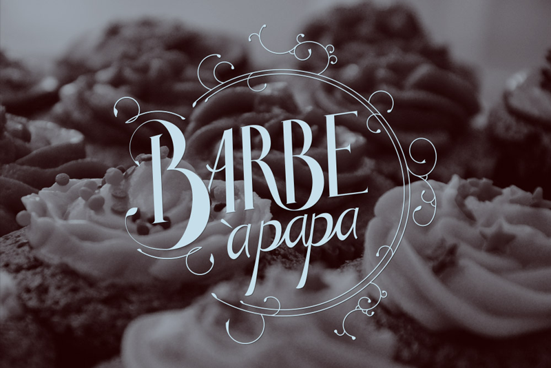
Barbe à Papa
Barbe à papa is a specialized cupcake confectionery made it french, with subtle, pleasant and diverse flavors. To show the lightness of its flavors to the costumers, we used as the main colors the light Blue and Pink, founded in many royal and charming spots of Paris. The logotype search for the scribbles of the Rococó style, taking us to the XVIII century with a modern twist. The Typography was chosen to contrast with the informality of the lettering.
Barbe à papa é uma confeitaria especializada em cupcakes finos à moda francesa, com sabores diversos, sutis e agradáveis. Para demonstrar a delicadeza de seu sabor aos consumidores dos cupcakes, usamos como cores principais o Azul pastel e o Rosa, que são encontrados nas construções reais e pontos charmosos de Paris. O logo procura passar um rebuscamento rococó remetendo aos tempos da França do século XVIII com ares modernos e a tipografia foi escolhida para dar contraste com a informalidade do lettering.