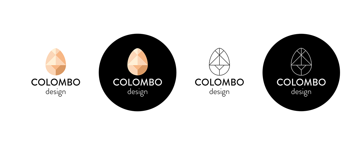
To design my personal logo I based the concept of two main things, starting from my surname.
First of all the egg of Columbus or Columbus' egg (Italian: uovo di Colombo) refers to a brilliant idea or discovery that seems simple or easy after the fact. The expression refers to an apocryphal story, attributed to Girolamo Benzoni (History of the New World, 1565).
After his return from America in 1493, Christopher Columbus (Cristoforo Colombo) was invited to a dinner in his honor by Cardinal Mendoza. Here some Spanish gentlemen tried to belittle his company saying that the discovery of the New World would not be that difficult and that anyone could succeed if he had had his means. Hearing this, Colombus became indignant, and challenged the Spanish nobles in an equally simple feat: to make an egg stand upright on the table. Each of them made several attempts, but no one gave up and managed company. They were convinced that it was an insoluble problem and prayed Colombo to demonstrate how to solve it, which he did immediately: he simply practicing a slight dent at the end of the egg, beating lightly against the edge of the table. The egg remained straight. When those present protested, saying that they could do the same too, Colombo said, "The difference, my lords, is that you would have done it, but I've done it."
Egg of Columbus (uovo di Colombo) is also the name of a puzzle similar to the chinese tangram. This inspired the shape of the egg, diveded in symmetrical pieces.

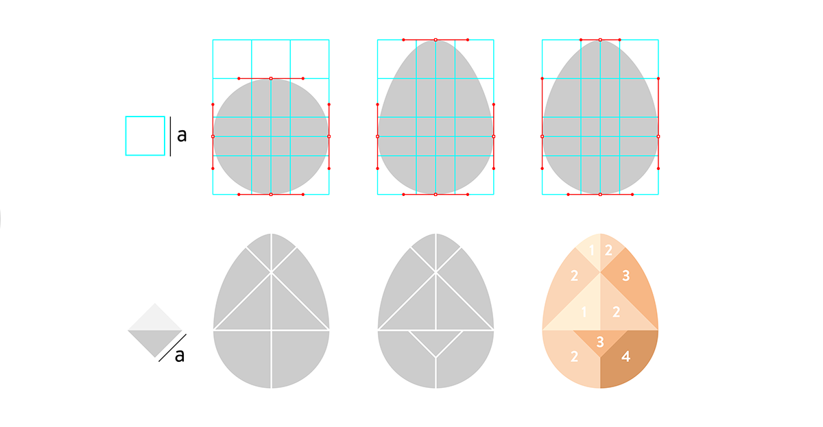
Colours based on real egg shells, which also reminds of skin tones to suggest a human centered design and deep sense of ethics.

For the logotype I wanted to use a font geometrical and neat but modern and with a lovely attention to detail like kerning and corners.