


FPCONF is the first conference on functional programming in Russia. The leitmotif of the signature identity is closedness for the "laymen". Often even Wall Street veterans with ten years of experience do not understand what the articles on functional programming are about. The black and white style conveys the atmosphere of the elite, private Princeton University mathematical club or the MIT laboratory, in which great scientists solved abstract mathematical puzzles, studied computational issues and created imaginary machines with infinite computing capabilities. Modern abstract graphics, connecting with the Greek letters of the logo, creates an image of the connection of times and aspirations in the future.


Ten-frame stereo-vario sticke
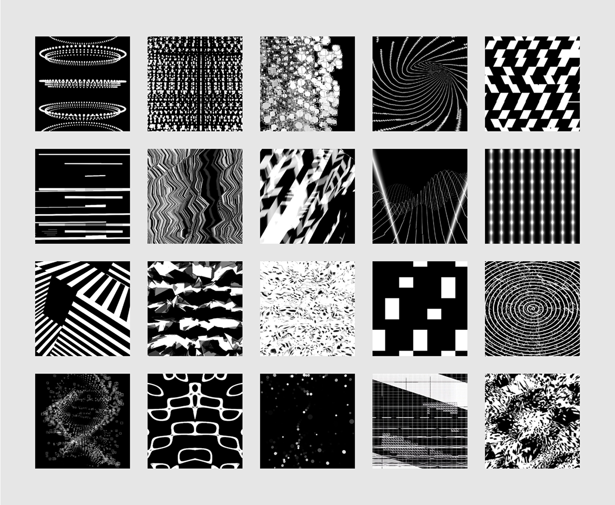
Signature graphics
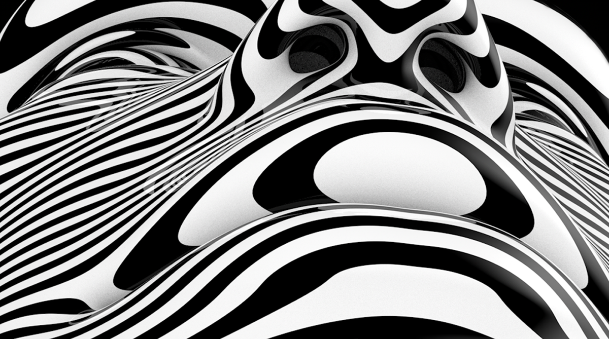
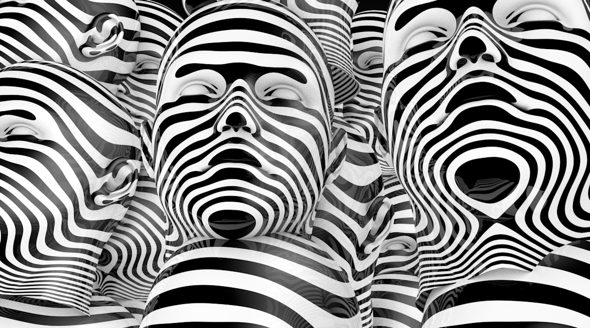
The main components of the style are a 3D head, as an image of the human mind, and generative graphics, the basis for which are mathematical functions.

Interactive installation
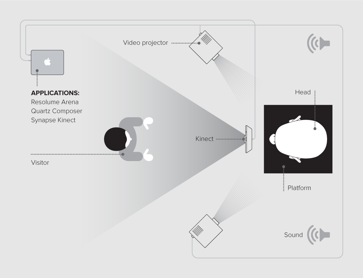
To enhance the atmosphere of futurism and to add extra mood to the conference, a three-meter interactive installation has been developed. Reacting to music and movement, the installation has become the physical embodiment of the signature identity.
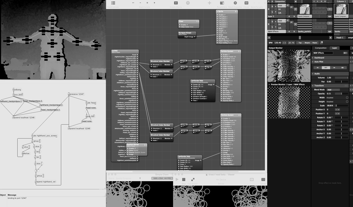
Software solution
To recognize the movement and coordinate data of the palms through Kinect, the Sinapse program was used. Using quartz passthrough plus, the data from Sinapse was transferred to Quartz Composer, where generative graphics were attached to the coordinates of the palms. To transfer images from the Quartz Composer to the Resolume Arena, the Syphon program was used. In the Resolume Arena, the graphics were additionally processed and superimposed on another layer of generative graphics that reacted to the music.
Art director: Sergei Anenko
Interactive designer: Egor Abaturov
See more about us: Evrone
Design & identity for the tech conference
Branding for websites
Product design services by Evrone


