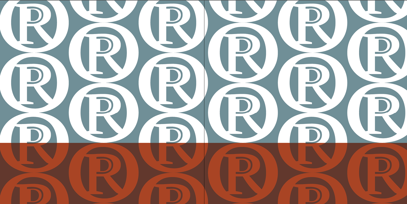
As I close out the first semester of my sophomore year, I created one final project. I designed a lettermark that represents O'Hare International Airport's code ORD while encompassing the city of Chicago and all it embodies. My lettermark is inspired by a city whose roots support the pillars of industry and innovation -- the first railroad, the trucking industry, the first ferris wheel, the reversal of the Chicago river (referred to as the civil engineering monument of the millennium.) I played with the idea of a circle similar to the old train lettermarks, the motion of a ferris wheel and the rotation of water, to develop a lettermark that resembled a seal--a stamp of approval.The way the letters ORD are embedded symbolize Chicago's intertwined culturally diverse neighborhoods.The lettermark is simultaneously progressive in its lines and an homage to the city of Chicago's rich historic past in the areas if industry and transportation.


Check out my process at http://coo-design.tumblr.com

