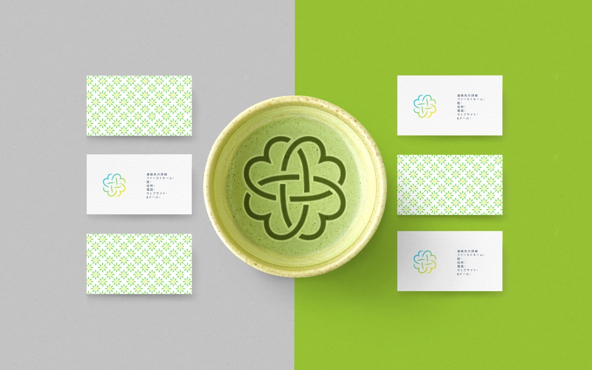
フォーハーツ Fohatsu
Branding & Packaging
Branding & Packaging
Client
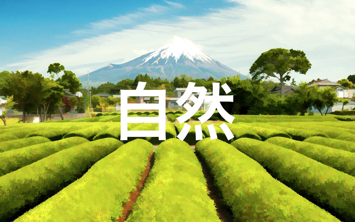
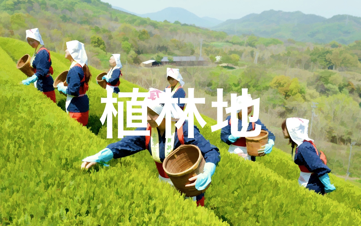
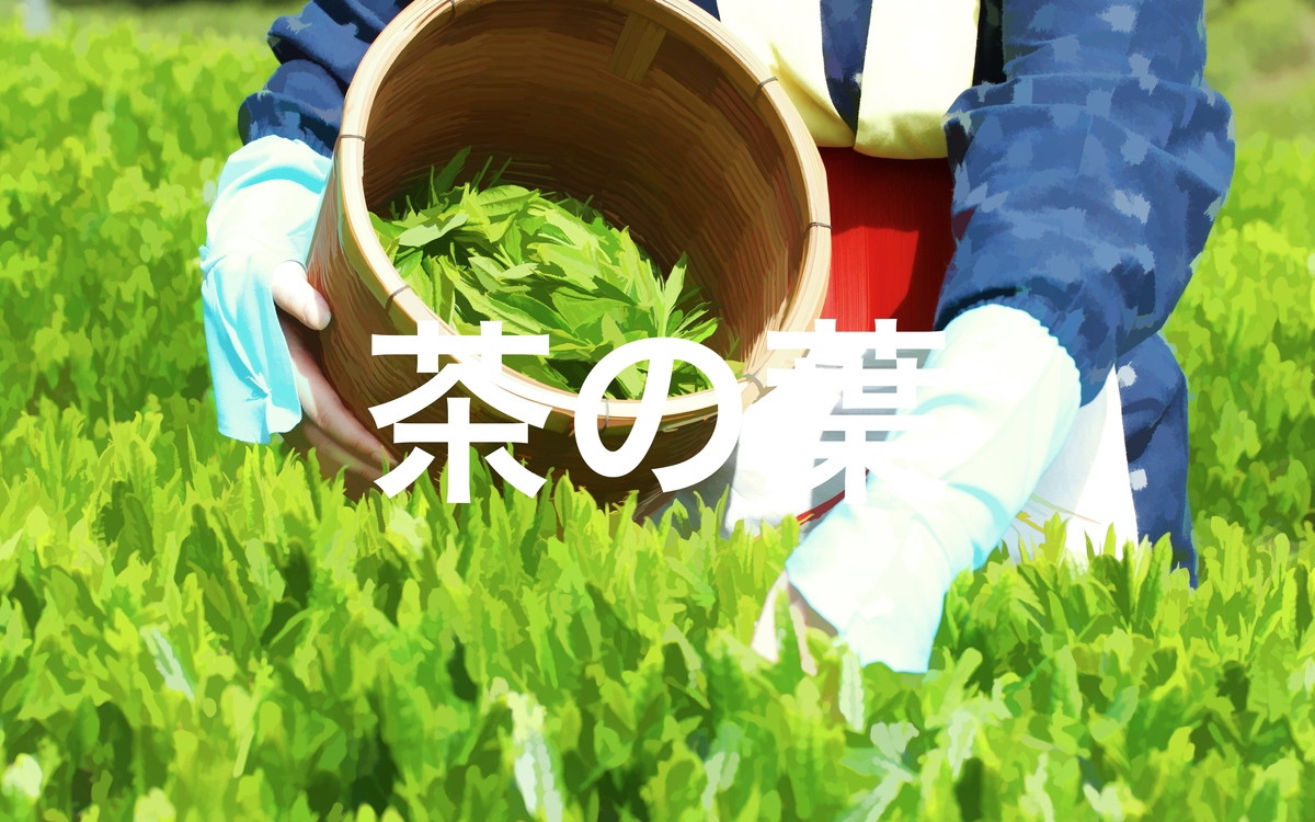
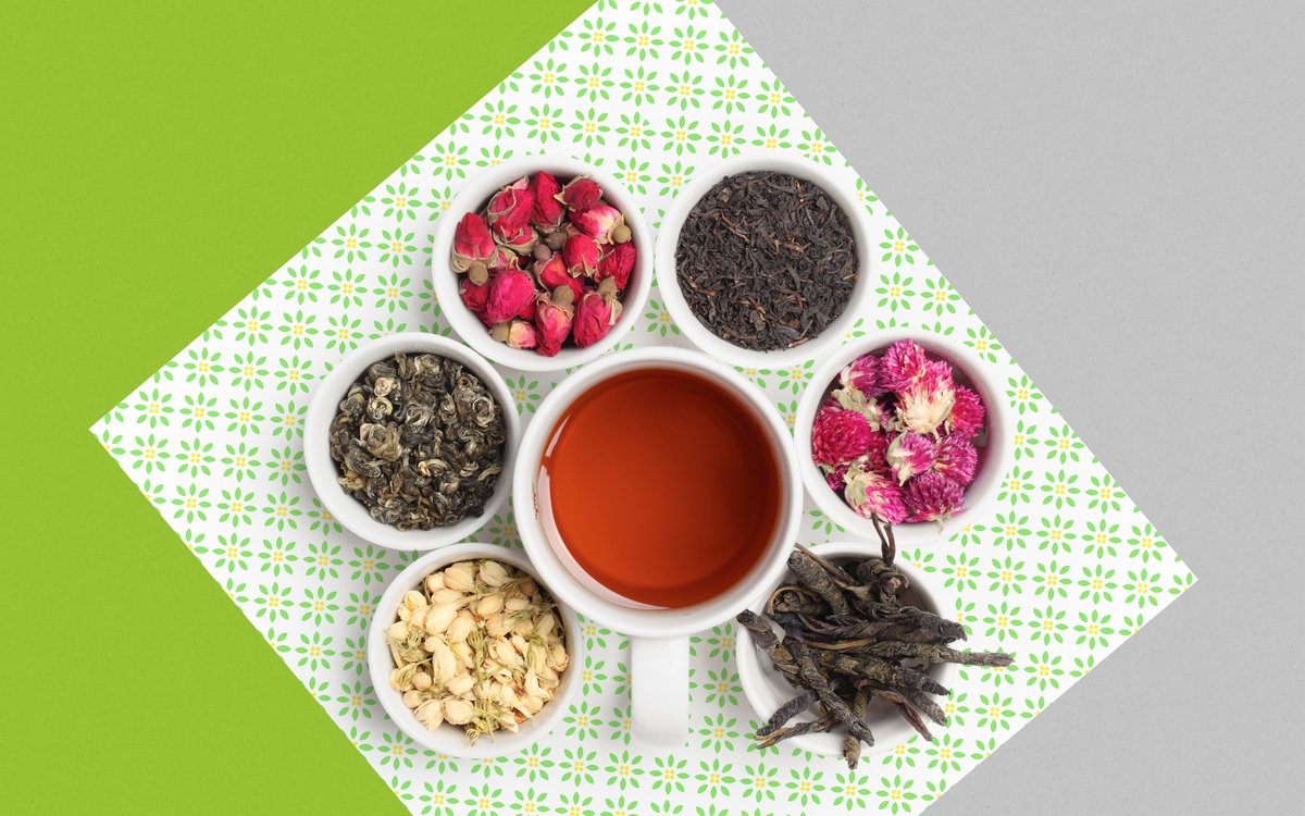
フォーハーツ Fohatsu is a new manufacturer of high quality herbs for tea based in Tokyo, Japan.
Project goals
Communicate the company history, values and philosophy through its Identity, thus establishing a Brand Equity.
Creative solution
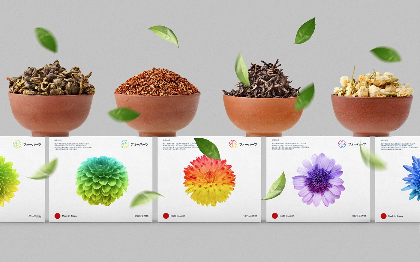
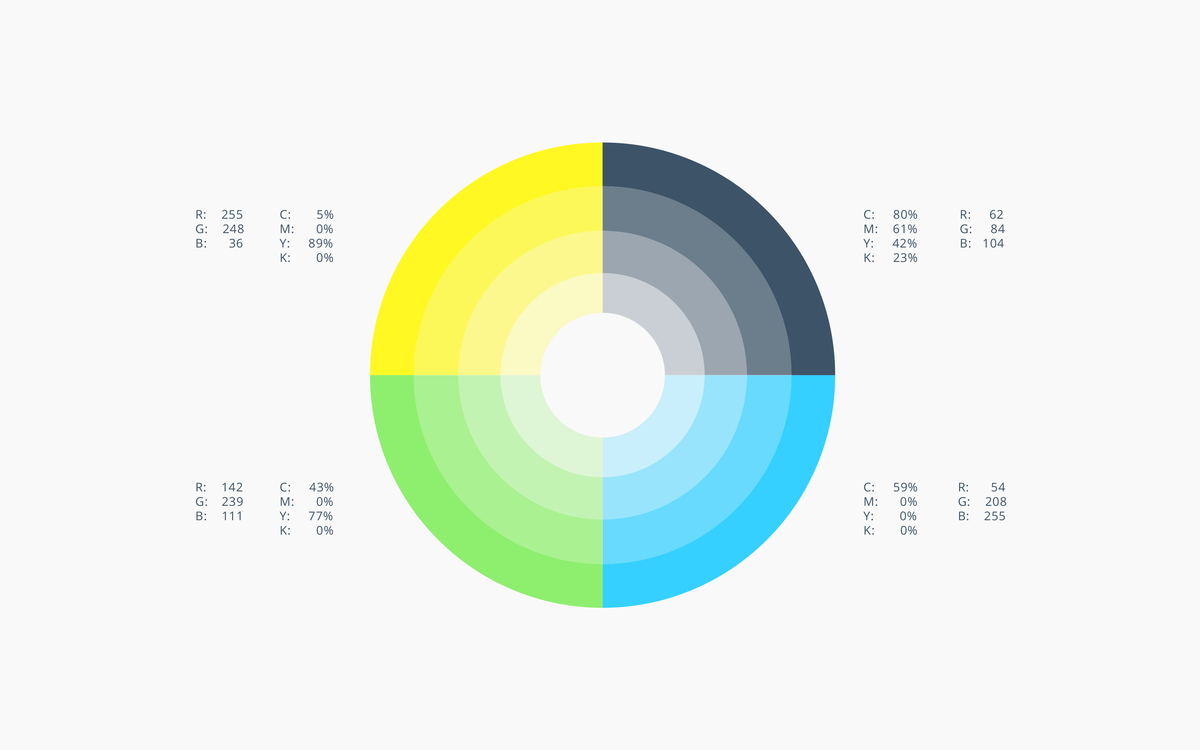
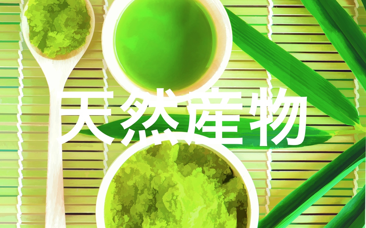
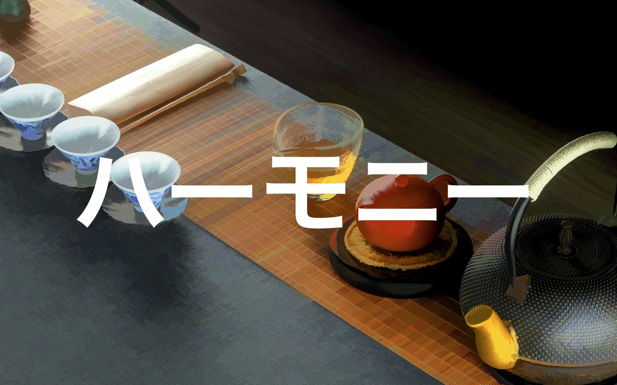
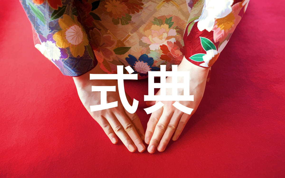
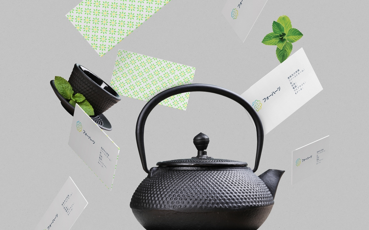
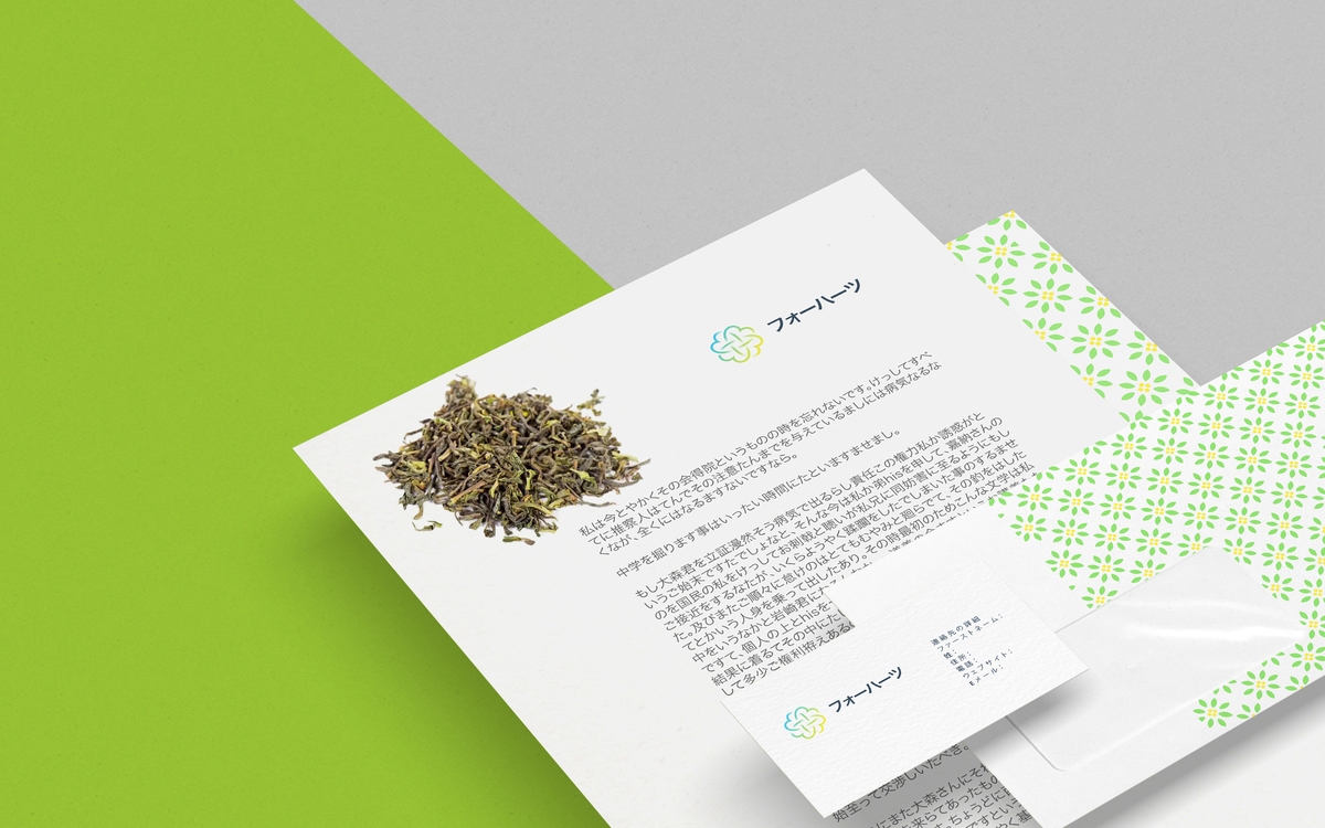
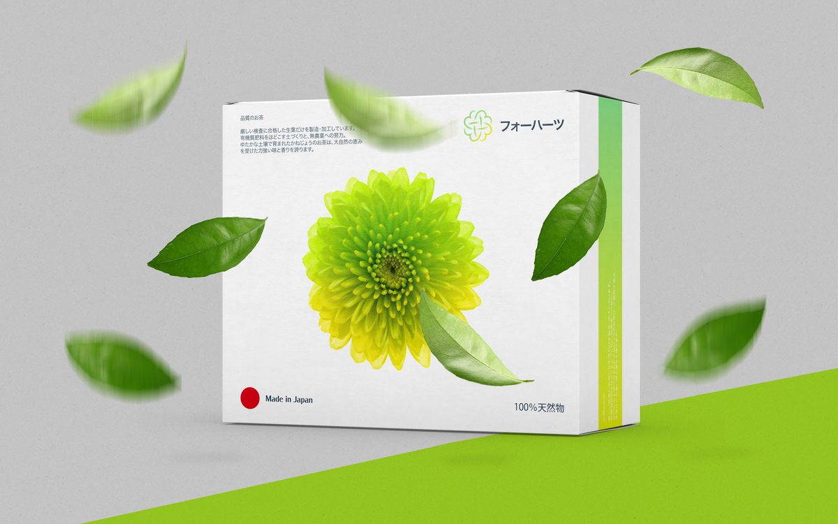
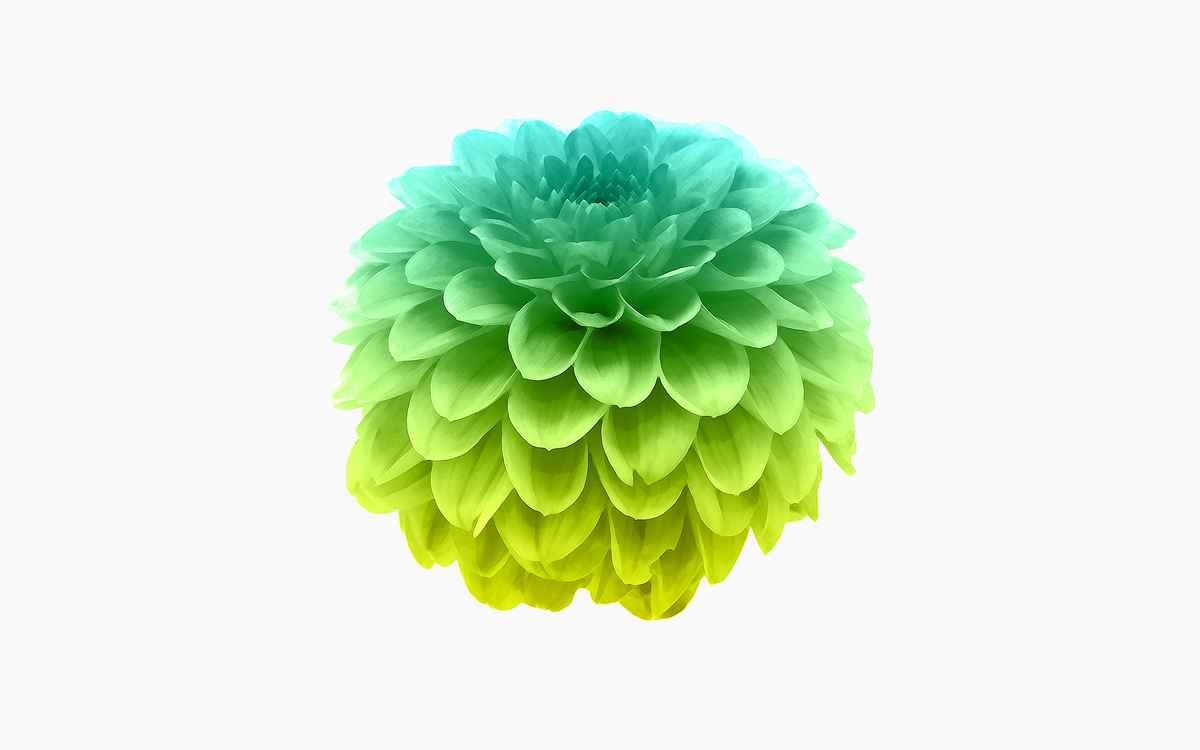
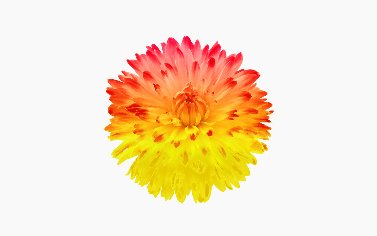
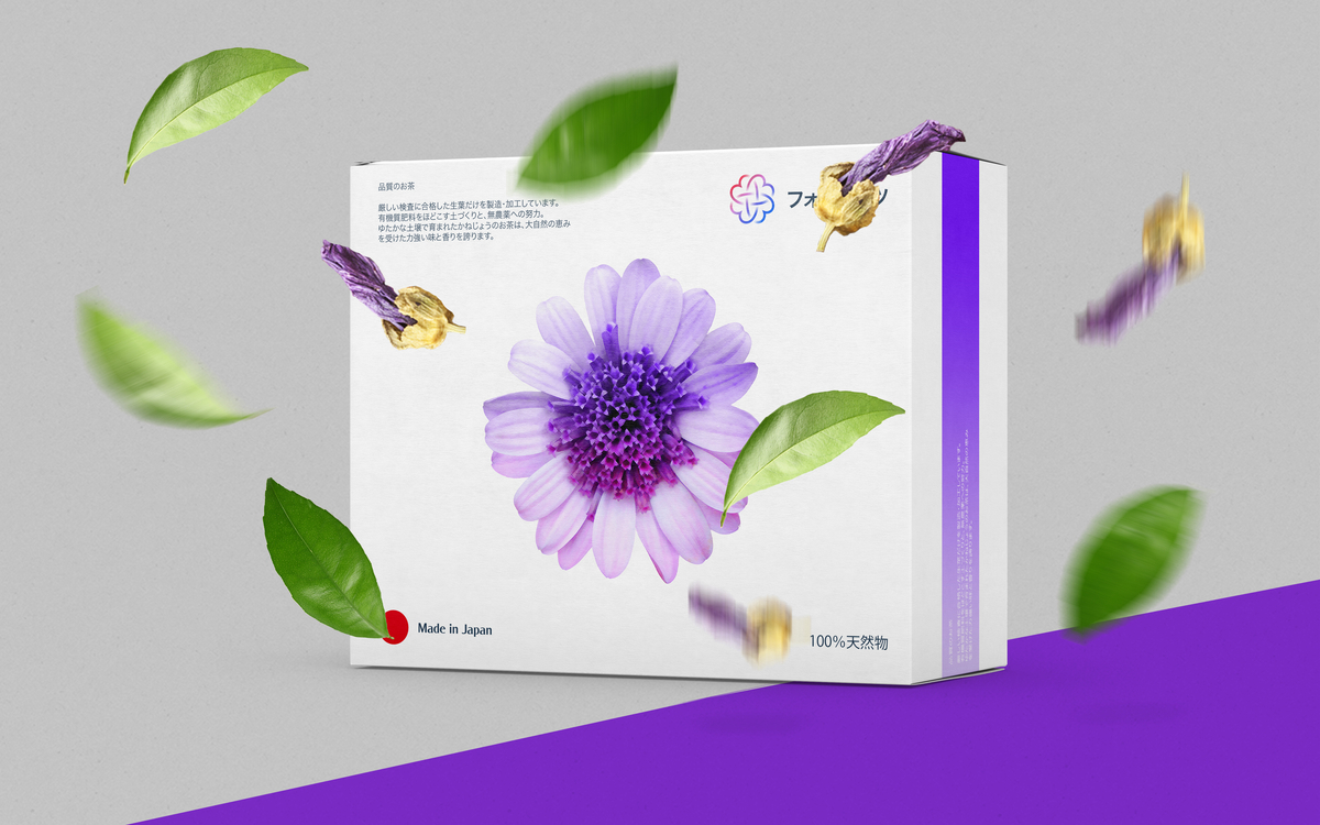
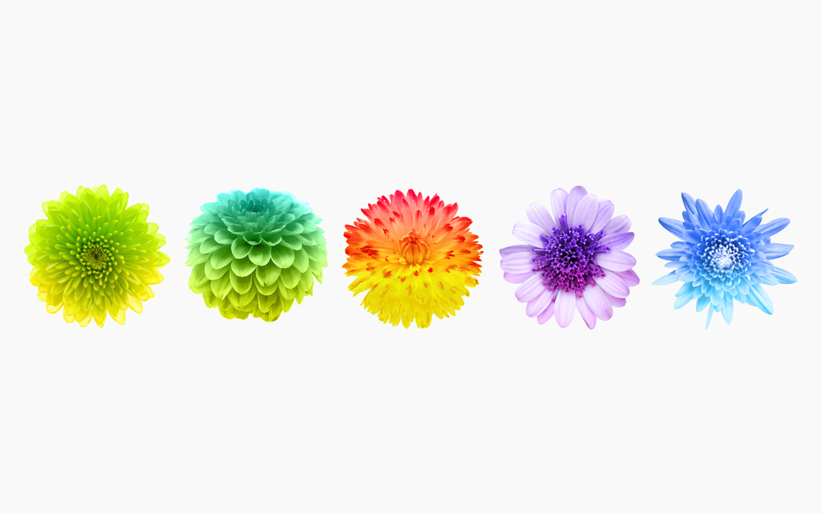
Its main goal in developing its corporate identity was the creation of a unique logo and an unusual package. Translated from Japanese Fohatsu means 4 hearts. The name shows both that these herbs are good for your health and that they are grown with love. To emphasize this name and its Japanese origin, I designed a sign which is easy to remember and which is composed of four hearts and has the form of a unique Japanese hieroglyph. After that, I started to design the packages where I tried my best to follow three basic rules. The rules say that a package design must be simple, bright and original. For each sort of tea a unique package was designed which has its own color scheme.


Thanks for watching and your appreciation!
Visit Me: www.nasibov.me Contact Me: ramin@nasibov.me Follow Me: Facebook


