
A geometric typeface, with a twist.
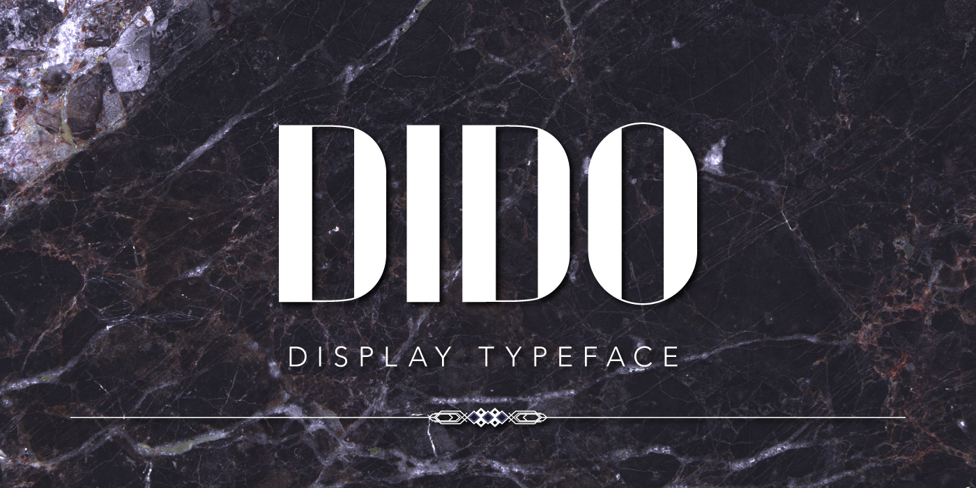
Dido is a display sans-serif with a retro touch that mixes simple, geometric shapes with the elegance and weight contrast between thick and thin lines of Didone typefaces.
This is an ongoing experiment: at the moment, Dido is available in two versions that only include standard uppercase and lowercase characters and numbers.
The project


Details


Standard version


Alternate version


© 2015. By Federica Ciotola


