

The Brief
______________________
Create a piece of work which encapsulates the essential personality/functionality of that typeface and the particular visual qualities/associated with it.
The format of you final piece is open but not arbitrary so whatever you choose to produce, it must be appropiate for your typeface.
My Outcome
______________________
______________________
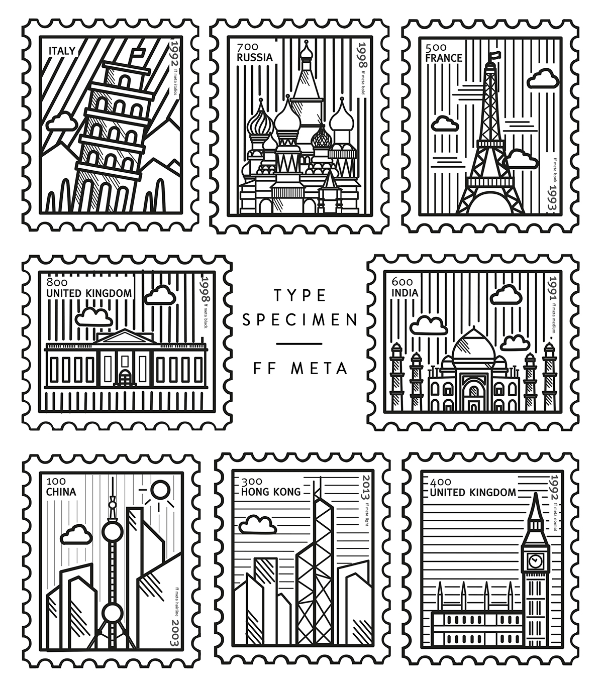
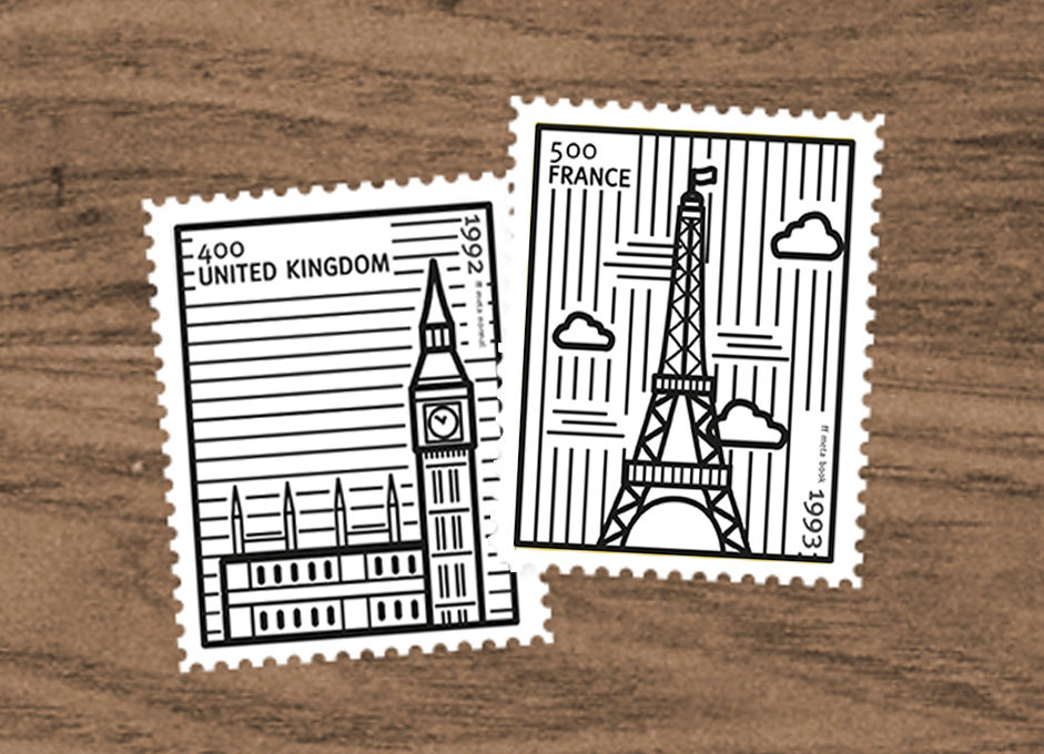
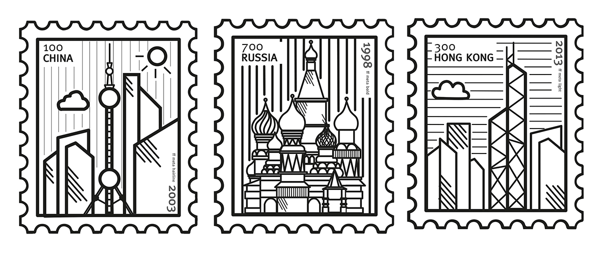
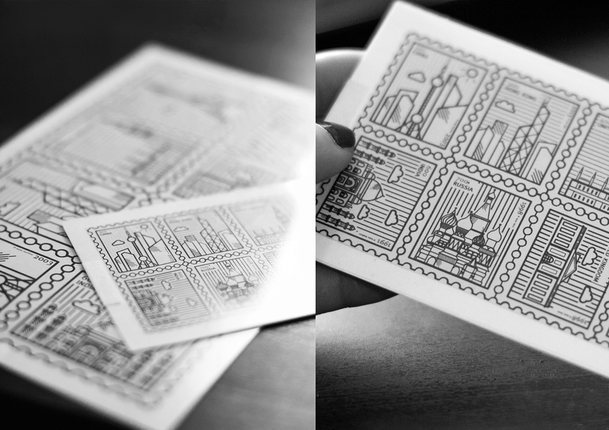
FF Meta is a typeface that is described as being very basic and sturdy and is ultimately an antithesis of Helvetica. Although the German Post didn't end up using the typeface for their branding, the international design community embraced and recognized the typeface as a very iconic typeface. For my project I decided to design a set of stamps that encapsulates this through the use of Iconic buildings from around the world. I designed the stamps using very basic vector lines to mirror the serif features of the typeface. The typeface itself has a range of different weights and styles ranging from hairline to black which has been developed between 1991 and 2005. I included these facts on the stamps itself and incorporated the year each weight was released. The background of the stamps mirrors the weight of the font, the thicker the line the bolder the font.
FF Meta is a typeface that was intially designed by Erik Spieckermann for the German Post Office. Some of their requirements as a typeface were:
1. Narrow to save space
2. Have strokes thick enogh to withstand uneven printing
3. Contains clearly distinguishable characters
4. Versatile characters that are unobtrusive
5. Be able to combat poor definition, optical illusions and over inking
6. Available in regular, regular italic and bold


Thanks for Scrolling!


