After a couple of years it's finally time for a big logo restyling. I'm totally satisfied of the previous one (also featured in the Pantone gallery) but I want to do another step with something more minimalist and essential.
BASIC IDEA
The font I've used is the Nexa Bold. Starting from the two letters "HA" (Hansen ART) I've applied a fake "italic" effect on the "H" in order to match the "A" inclination.
From this point the idea was to remove a major part of booth letters in order to make the logo essential.
From this point the idea was to remove a major part of booth letters in order to make the logo essential.


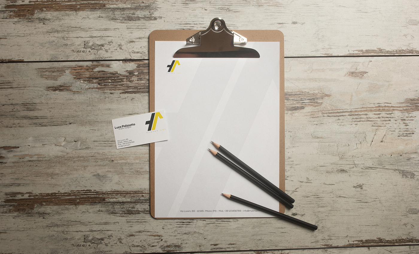
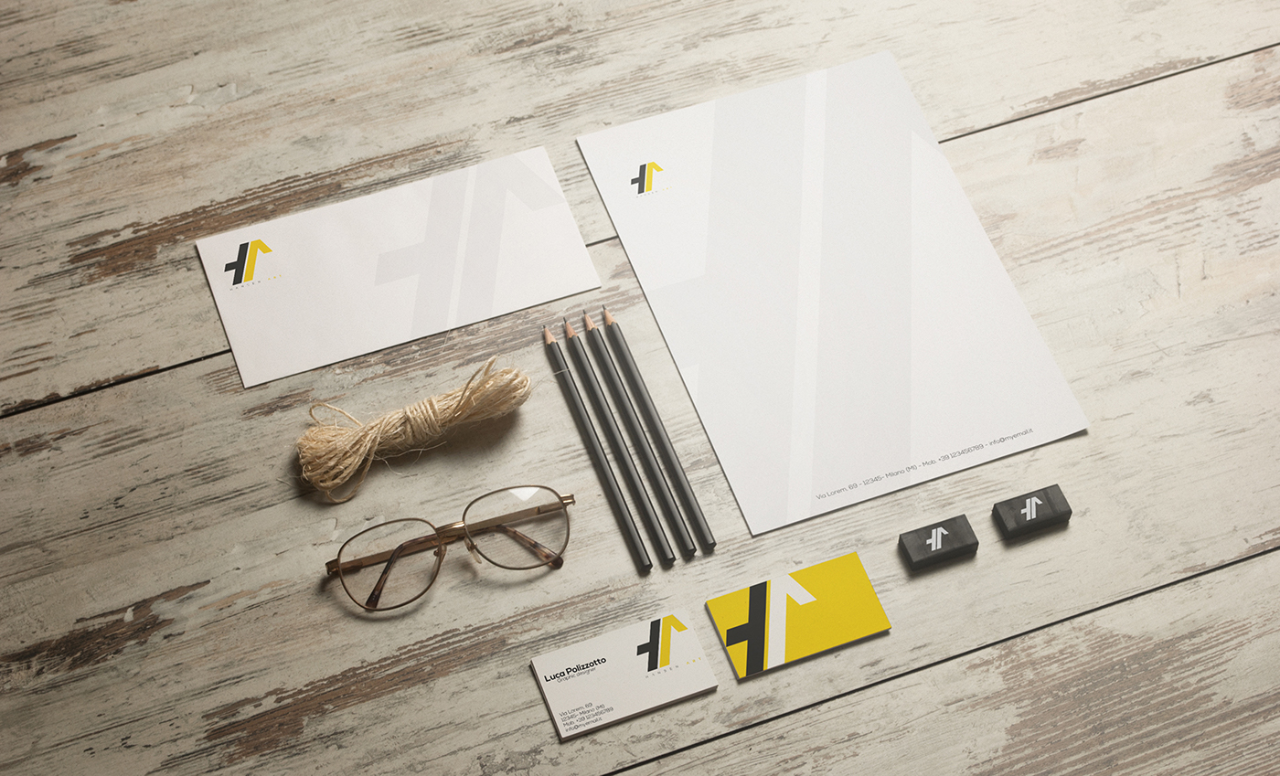
I've decided to add also a text under logo in order to make it more readable and also for some kind of use I'll do of this one.

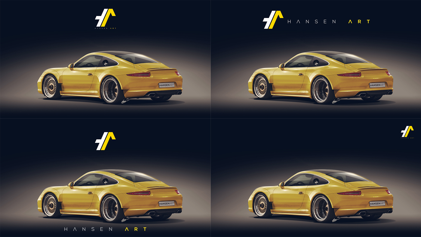
COLORS
As usual I don't like to use too many color on a logo so this time I've decided to work with black and the PANTONE Medium Yellow C (and yes I'm a huge Yellow lover).