Cycle Technologies came to ISL with a mission: to bring their new algorithm, which was developed by the leading fertility scientists in the world, to market. The algorithm predicts a woman's chance of pregnancy each day of the month, using only the start date of her period, and is designed to be 97% effective. It's so effective that it can be used as birth control — we were intrigued.
We went through a research phase where our team explored the possibility of making a physical product to house their algorithm, but ultimately our research led us to recommend an app as their first product. We went through the UX process, including background and competitive research, personas, and mapping user flows, before starting on wireframes. When we finally started on design, we had a solid concept in mind and the process went pretty smoothly.

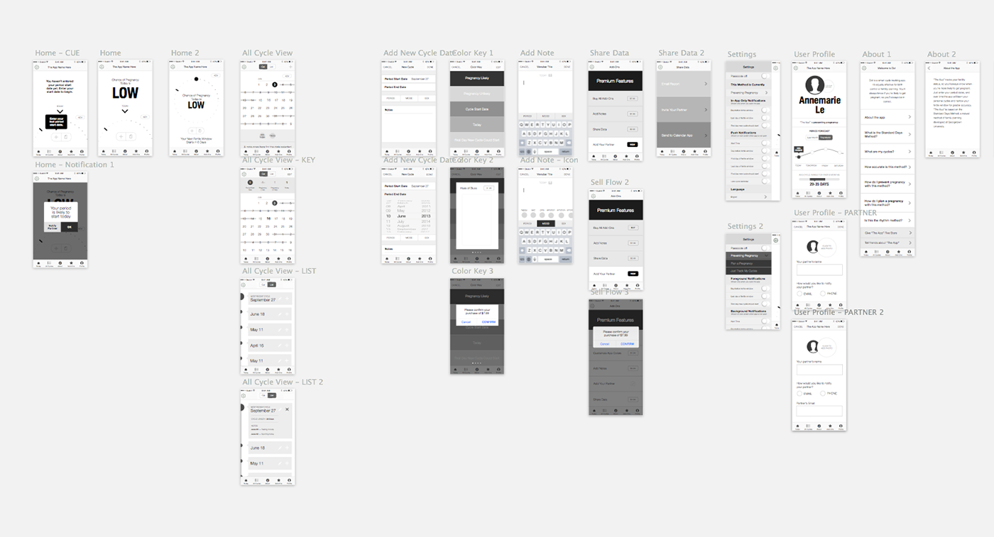
Some wireframes for Dot

Some early sketches for the Today view, effectively the home screen of the app. The algorithm provides lots of data, but we wanted to keep this view as simple as possible so that a user could simply glance at the screen and immediately know their status. We removed more and more from this screen until we came up with the final Today views, below.
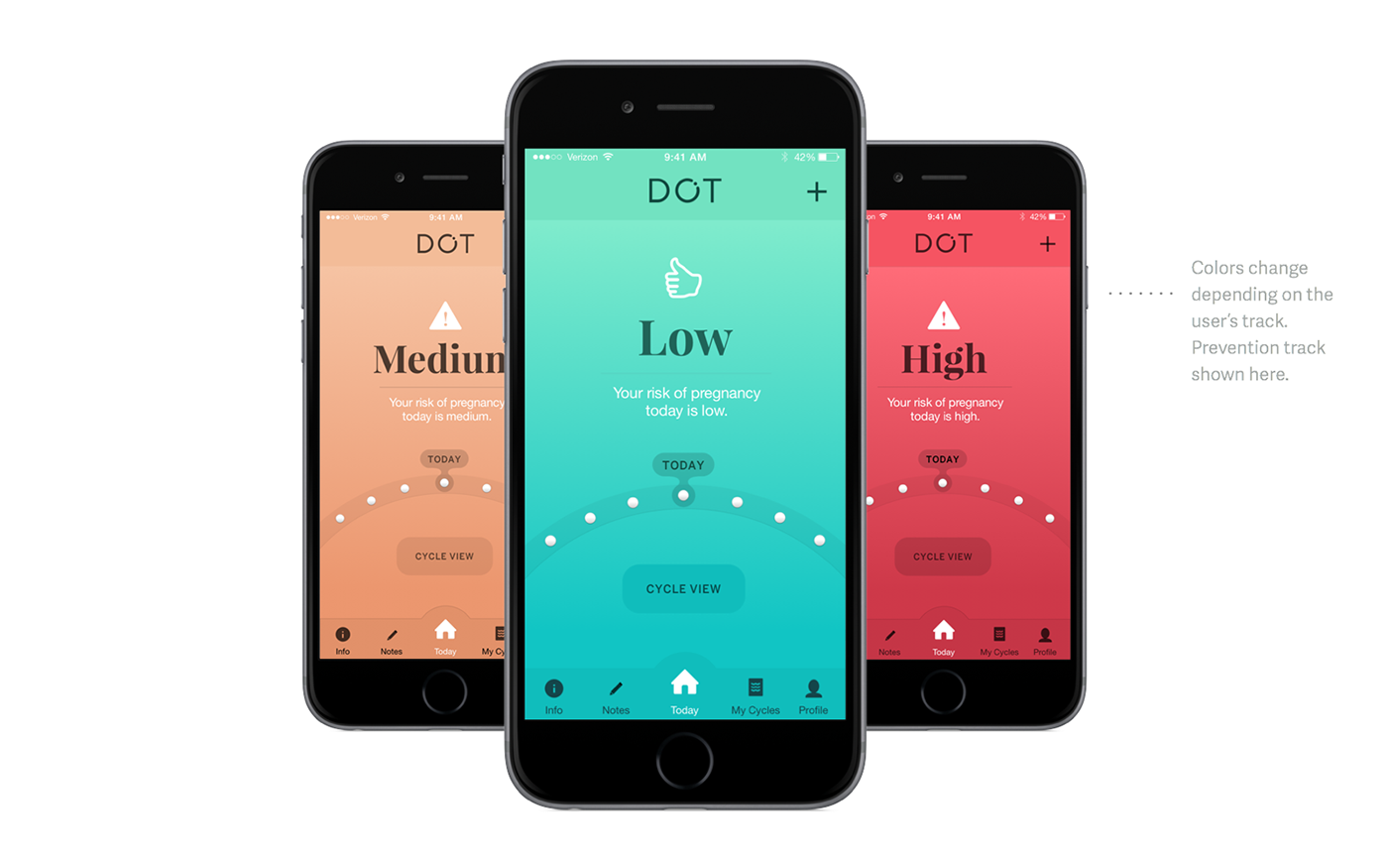
The final Today views are extremely simple. A stoplight color theme semantically clues in the user to whether they should be having sex on any given day to achieve their family planning goal. The above example is when the app is used for pregnancy prevention — when the user's fertility status is low, her risk of pregnancy is low, so she's safe to have sex when seeing this screen (hence the semantic icon of a thumbs up, and the green color).
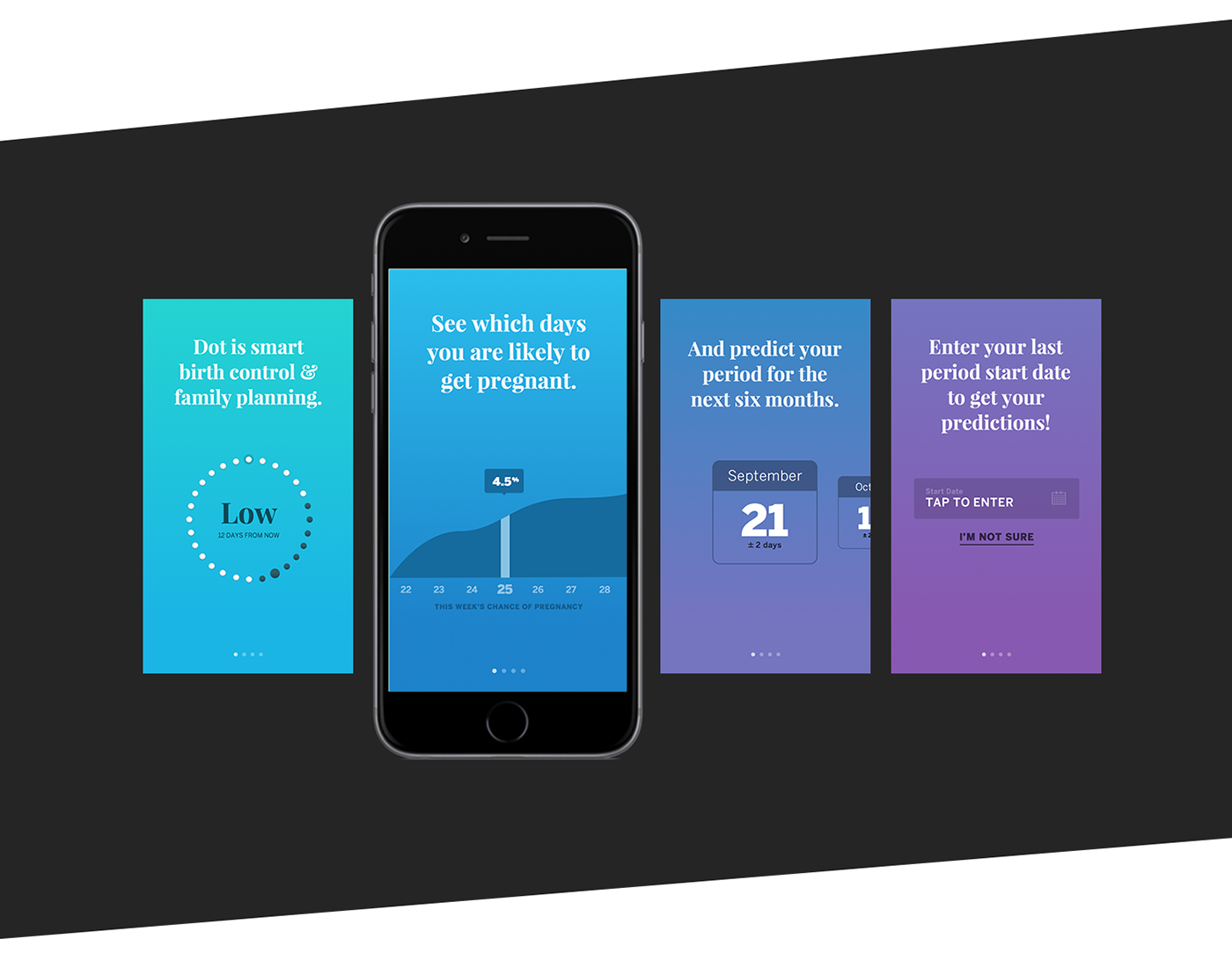
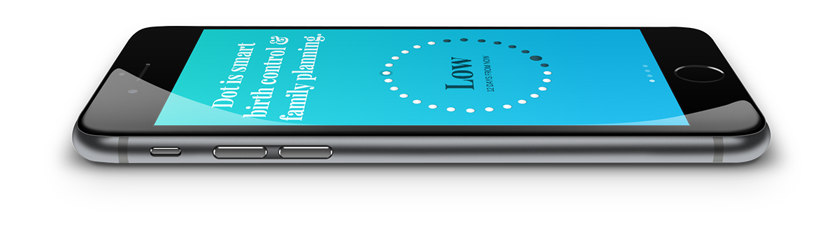
The introductory screens were some of the hardest to design successfully. We went through several iterations with lots of explainer text and whimsical illustration, but we found in testing that users completely glossed over everything and quickly swiped through. Finally, we pulled some of the real UI features from the app and added them, including their animations, to the intro screener. The movement helped users linger on the screens and by the time they made it into the interface, they were more familiar with the core features and benefits of the app. Whew!
There are so many more screens and features — but for now I'll end with a screencap of the profile page, which shows the details and animations of the data that the algorithm provides. You'll see a graph of this week's fertility, laid out like a weather forecast, and a six month swipable period predictor.
A screencap of the actual intro screen animations
The Team
This app was produced at ISL for Cycle Technologies.
UX + Design — Myself
Creative Direction — Zach Goodwin
iOS Development and Animation — Thomas Degry
Dot Logo — James Bonilla and An Ly


