Bellona Foundation rebranding, design manual
The Bellona Foundation is an international environmental non-governmental organization based in Norway. Nowadays environmental organizations in Norway direct their message to young people. They often use protests as an instrument to influence and can be perceived as politically "radical". This appeals to many young people, but can appear negative to businesses and thus not much effect.
Bellona prefers a solution-oriented approach, through science and knowledge and collaboration with the industry. Their identity must therefore be such that companies can look at them as a negotiating partner they should listen to, not a protest movement they can ignore.
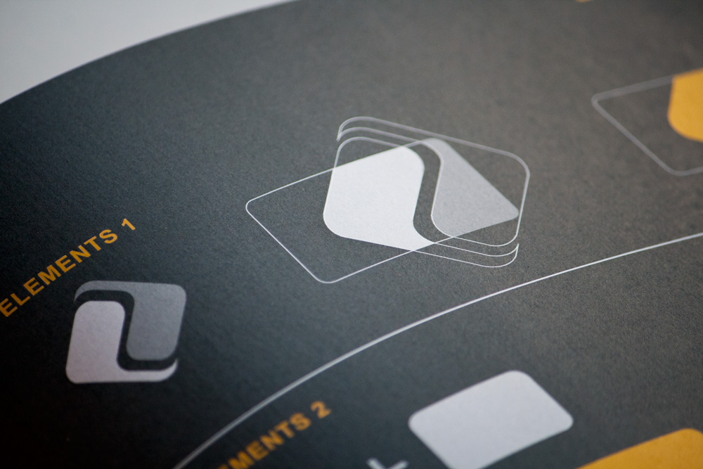
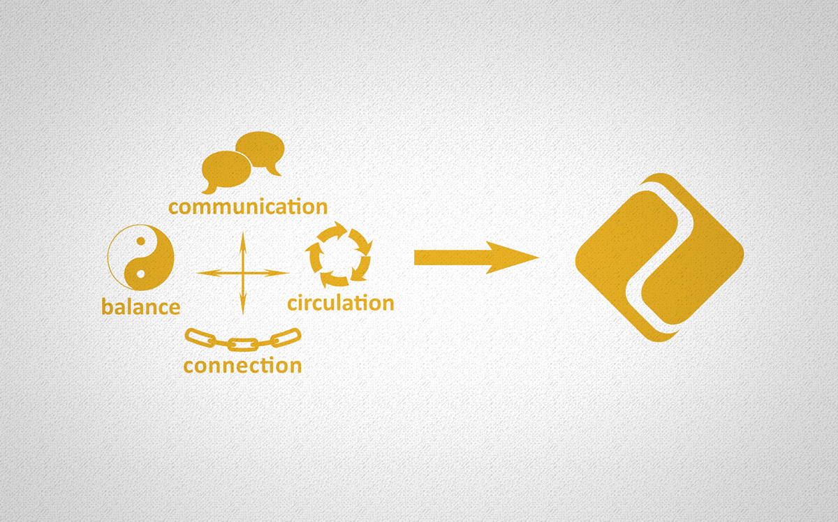
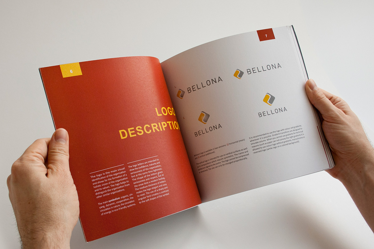
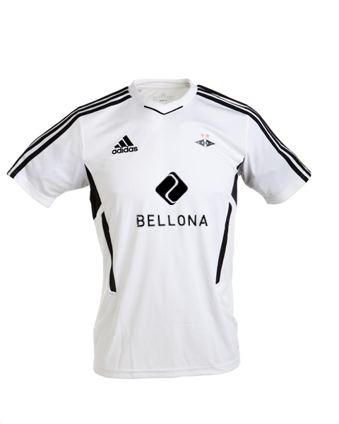
The logo I created is based on two concepts: cooperation and negotiation. I use speech bubbles to represent the negotiation dialogue between Bellona and businesses. I put the question bubbles in a circular shape to symbolize balance of yin & yang both in the negotiations between Bellona and the companies, and the balance between environmental concerns and business interests. I also chose a logo and colors that will appeal to businesses and young professionals who want to use their knowledge to help environment.