


The presentation opener
We worked on this project in a team of seven students (four Graphic Designers and three business studies students) in a time period of one semester.
At first we had a study trip to DLR (Deutsches Luft- und Raumfahrtzentrum) in Köln and to Lufthansa in Frankfurt am Main. There they told us a lot about what is possible and foreseeable in 25 years. We had the possibility to walk around, take many photos and ask a lot of questions.
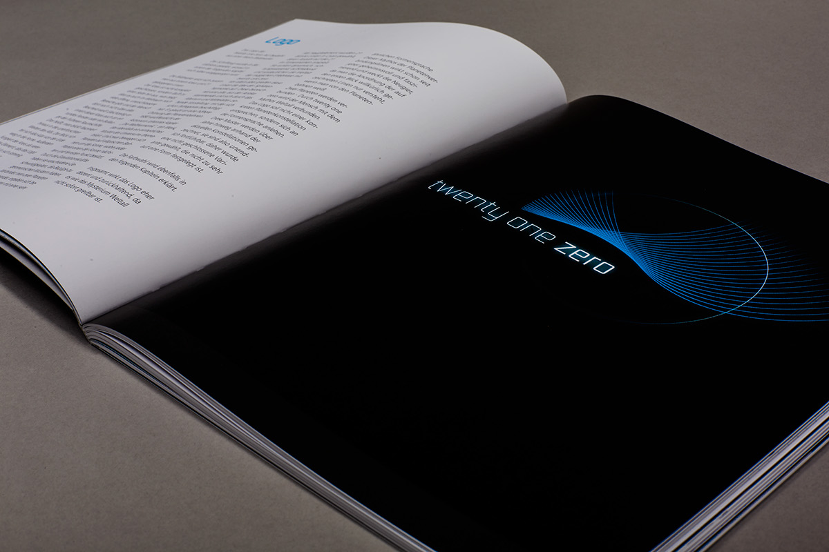
Back in Augsburg the business studies students started to work on our business plan from zero and nearly everything was possible. We chose the name "twenty one zero" in figurative sense of the 21st century where space traveling could be afforable for normal citizen. Zero stands for zero gravity in the universe.
Further we worked on some questions like:
- How to book the journey?
- What does the ticket look like?
- How do you get to the spaceship?
- Is preparation necessary, if yes, how long?
- Do you get any giveaways at the end?
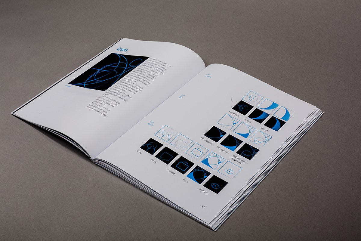
Icons in Flagshipstores and departure terminals

The website opens with a countdown
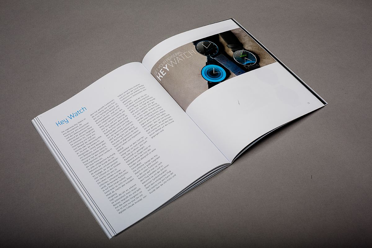
The Key Watch
As you book your space travel you'll receive your personal watch. This is your ticket. In the beginning you can see a countdown when your flight will start. The watch face will pulsate some hours before your flight will start and thats the signal to come to the flight center.
After your flight the key watch is a gift to wear day by day.
Finally we created a brandbook with the whole corporate design and the business plan (109 pages).
The jingle


