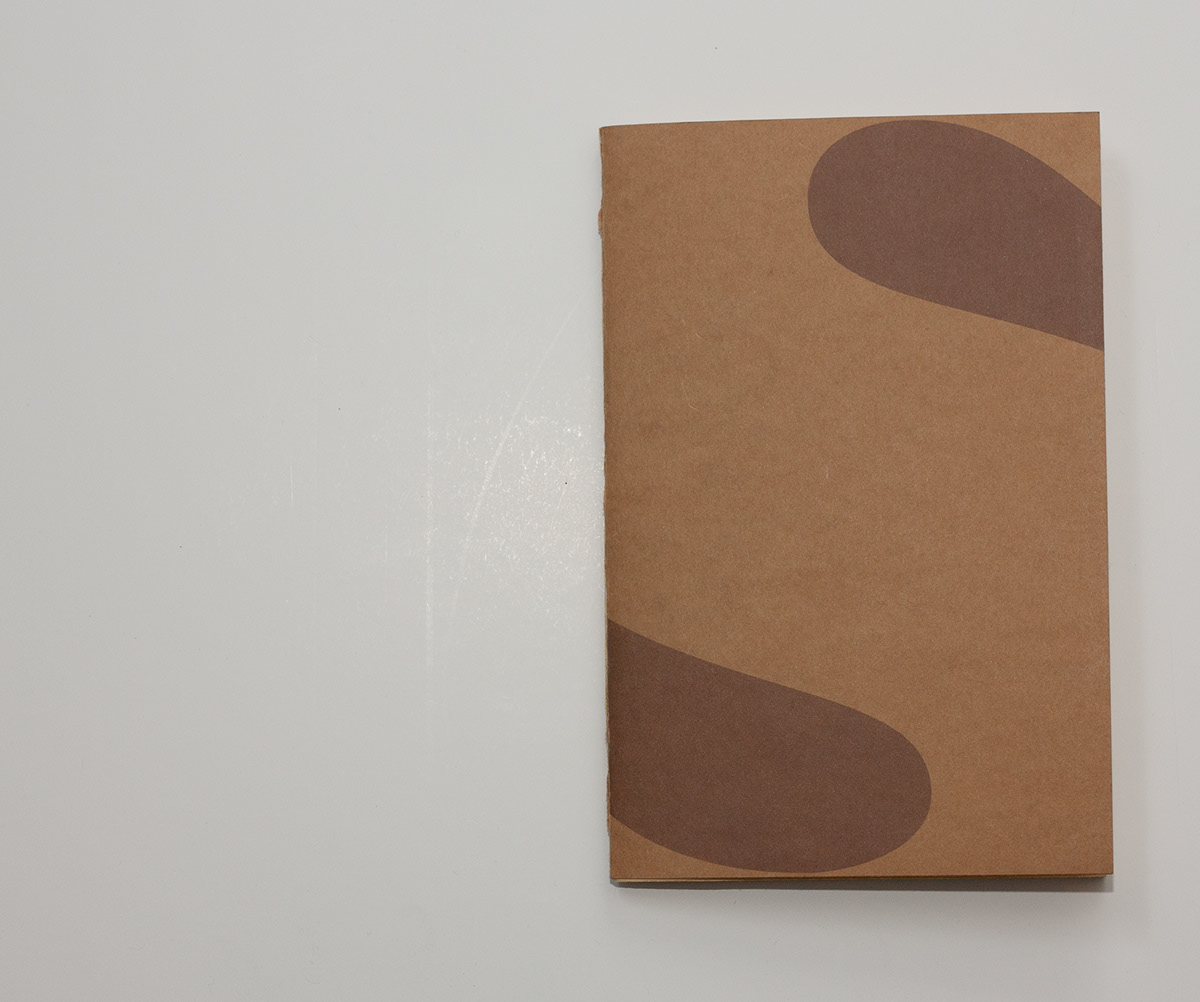
Editorial Project: Palindromes
A little book about palindromes.
This is a project I made for the Typography course during my bachelor degree in Design.
It's a little book about palindromes, i chose this subject because we had to experiment with
typography and I tought that palindromes could offer a nice way to do so.
Below you can see some pages of the booklet, hope you like them!


This lettering was done carving letters on a potato and then using them as stamps to produce
this palindrome based on the Basnoda type created by Pierre Di Sciullo, used to reproduce
a quote by Georges Perec.

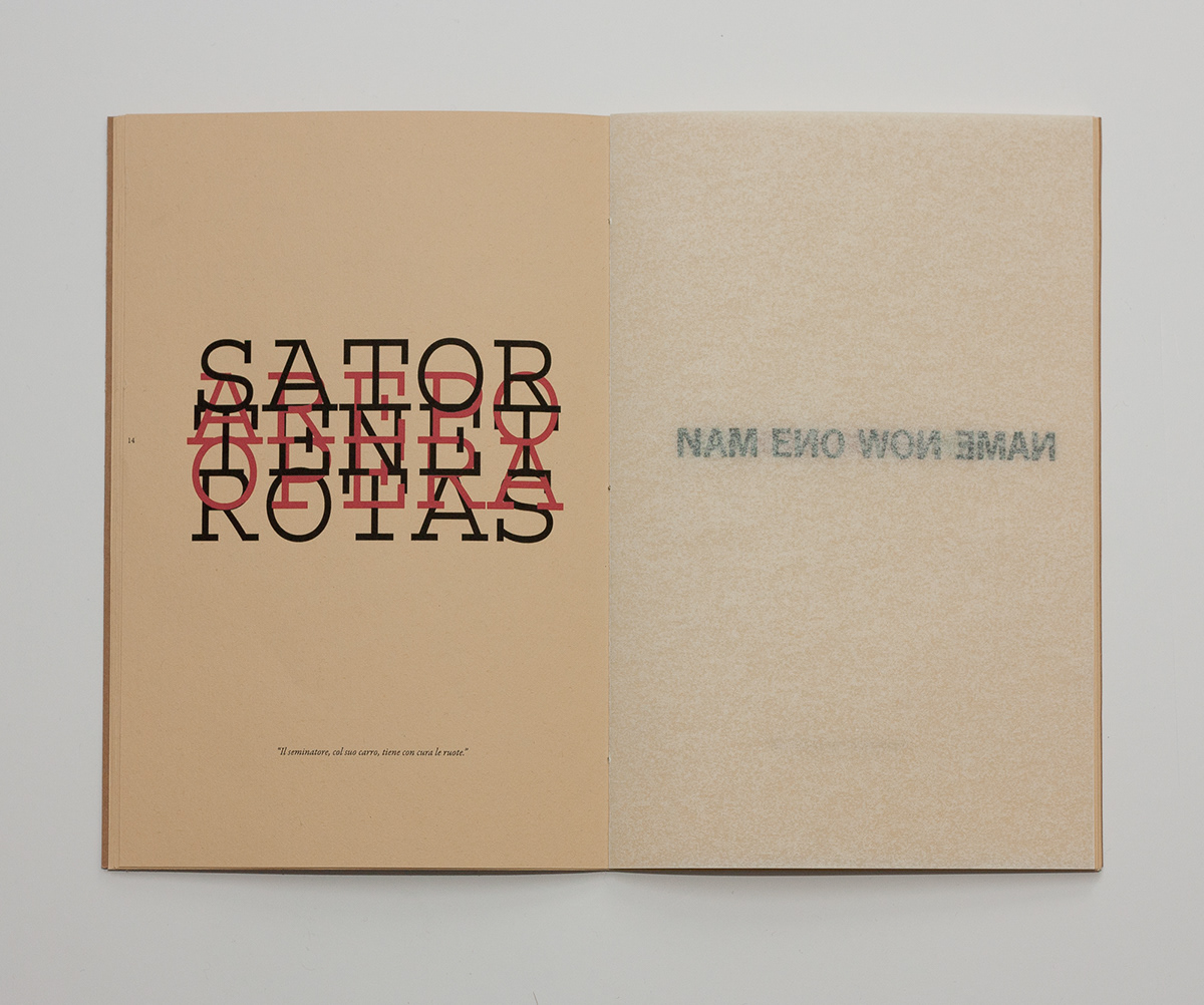
One the left page there's the roman palindrome called "Sator Square". I decided to give it a little twist
and compress the spacing, using alternatively black and red in order to keep the writings readable.
On the right page, I used a semi-opaque paper to print a palindrome, so it's possible to read it on both sides.
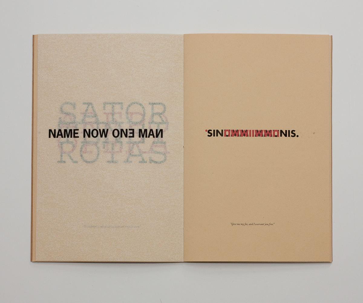

Here i used a long palindrome and divided in half by the letter N, which is in fact red.
The second half of the palindrome is upside down to give the idea of readability in both ways.

Thanks for watching!


