Last month ICON Magazine asked us to contribute to their popular Rethink feature. The feature asks designers to redesign something they think needs updating, has been designed badly or has a problem that needs solving. We chose IKEA or more specifically, the IKEA logo.
— Tell us what you think #IKEArethink
Love it or hate it — IKEA is part of life. Founded by Ingvar Kamprad in 1943 (at age 17), IKEA now operates in 47 countries with more than 370 stores. The company’s name is an acronym that consists of the initials of Ingvar Kamprad, Elmtaryd (the farm where he grew up), and Agunnaryd (his home town in Småland, south Sweden).
IKEA combines form, function, quality and sustainability with a low price point — all neatly packaged in the infamous flat-pack box. As a creative, its design focused products appeal to me — and have allowed me to create a home which mirrors my own aesthetic tastes at a price which I can afford. That being said — I share in the universal loathing of building its products.
I am also an advocate of the visual language IKEA uses to differentiate its products. The food packaging in particular is simply outstanding. However, the IKEA logo is another matter altogether. At the head of the IKEA brand it feels rather odd, out of sync with the rest of the company. Obviously the logo enjoys huge recognition but I believe this can be improved upon.
Our objective was to connect the logo with the IKEA brand.
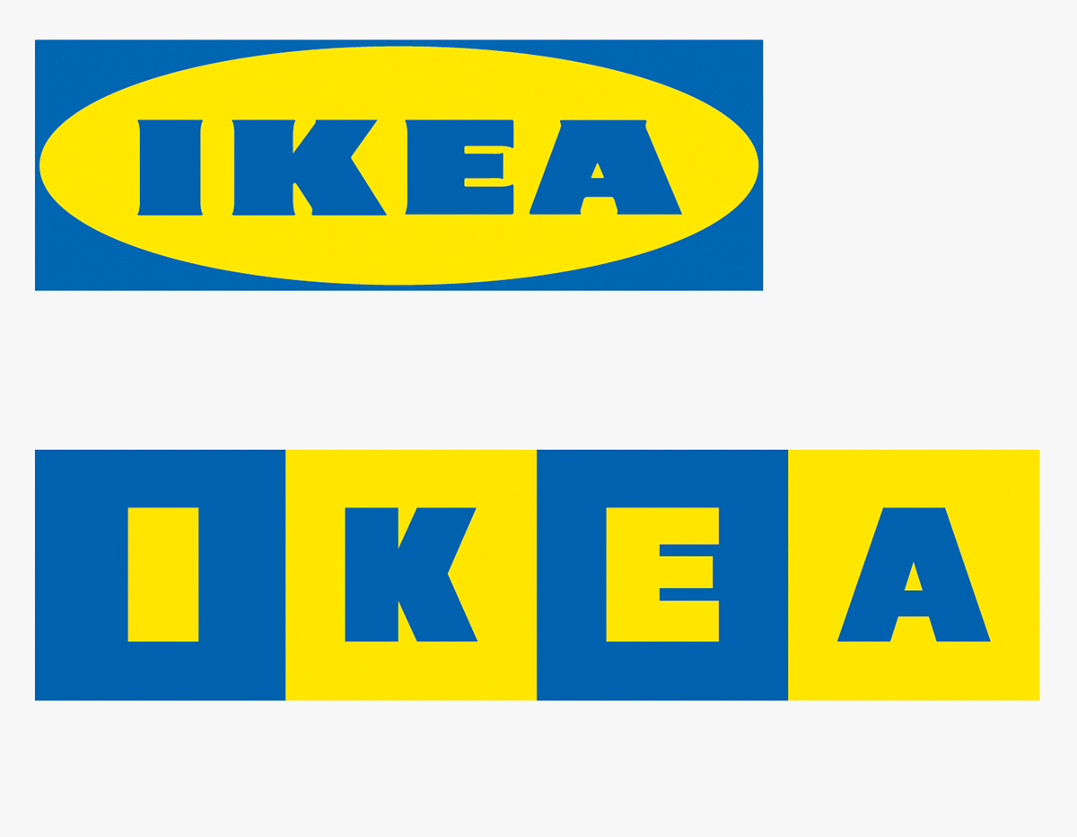

We began by looking at the best parts of the exiting logo. Namely colour and bold type. We refined the type to more closely align with the original Futura Press font (avoiding Verdana at all cost). We felt this cleaner typographic treatment was more suited to the aesthetic of IKEA’s products. Similarly, by continuing to use the core brand colours we ensure that the logo remains instantly identifiable. Removing the oval was also a priority as it severely dated the logo and reduced it’s legibility at smaller scales (e.g. advertising / website etc.).
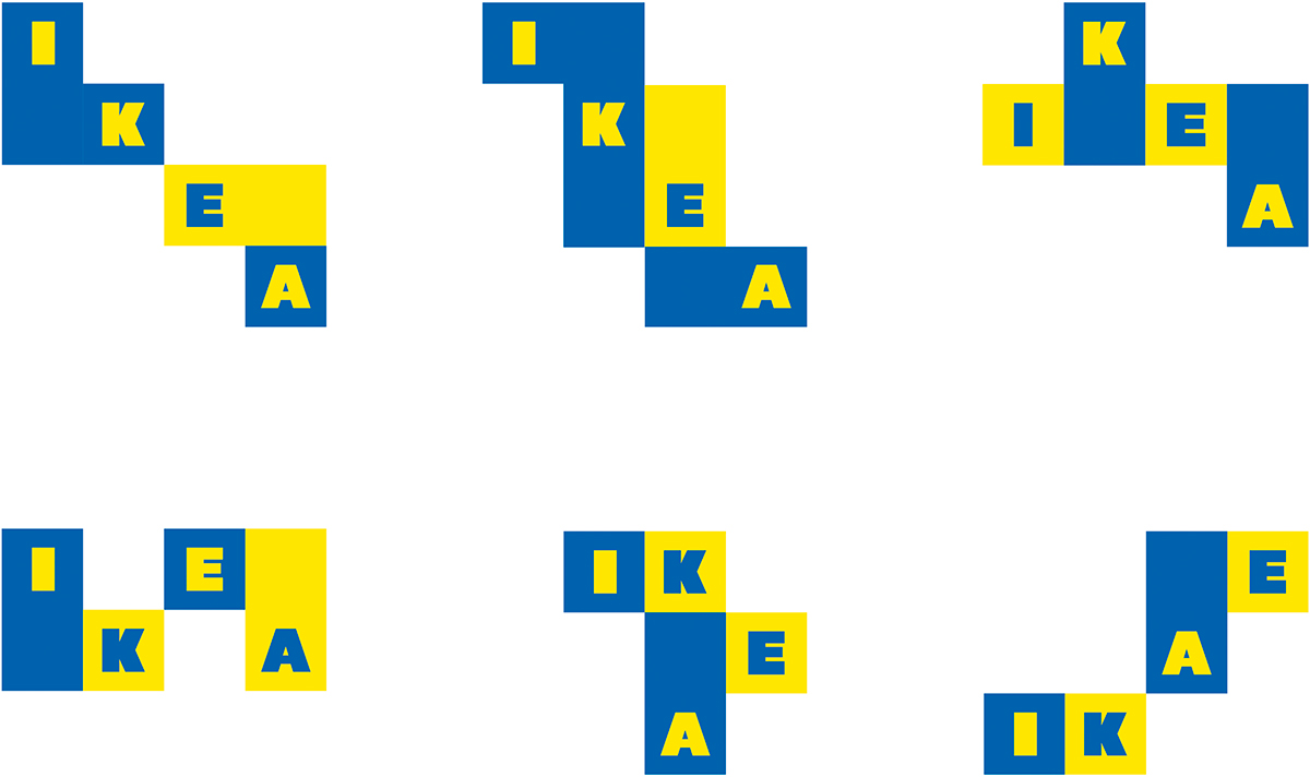
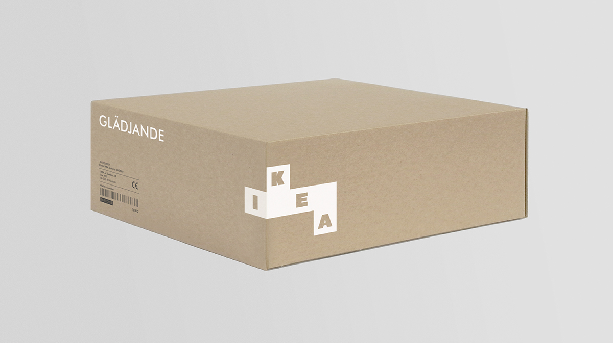
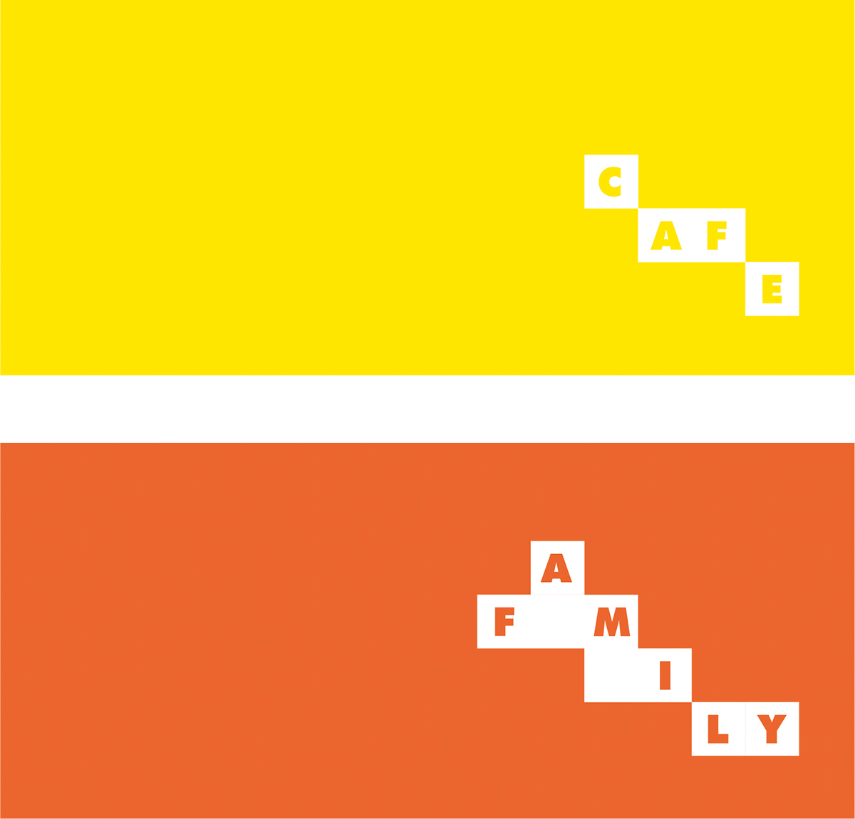
Once the new mark was defined we felt it could work a little harder to communicate the creativity of the brand. We looked at compartmentalising each of the four letters into a modular, stackable identity system. This created a simple, playful and intuitive connection between logo, product and consumer.

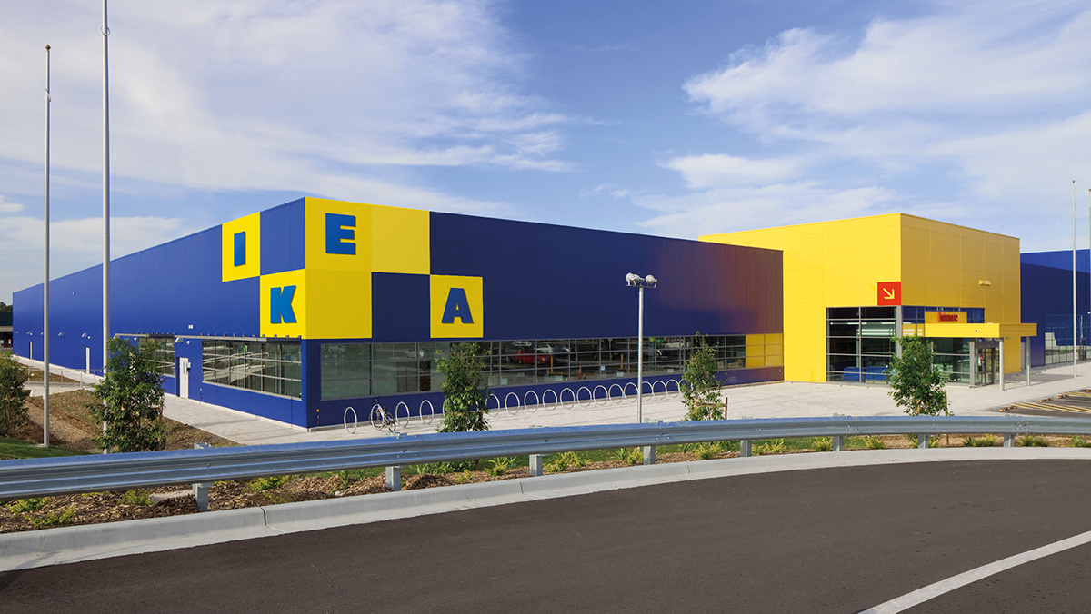
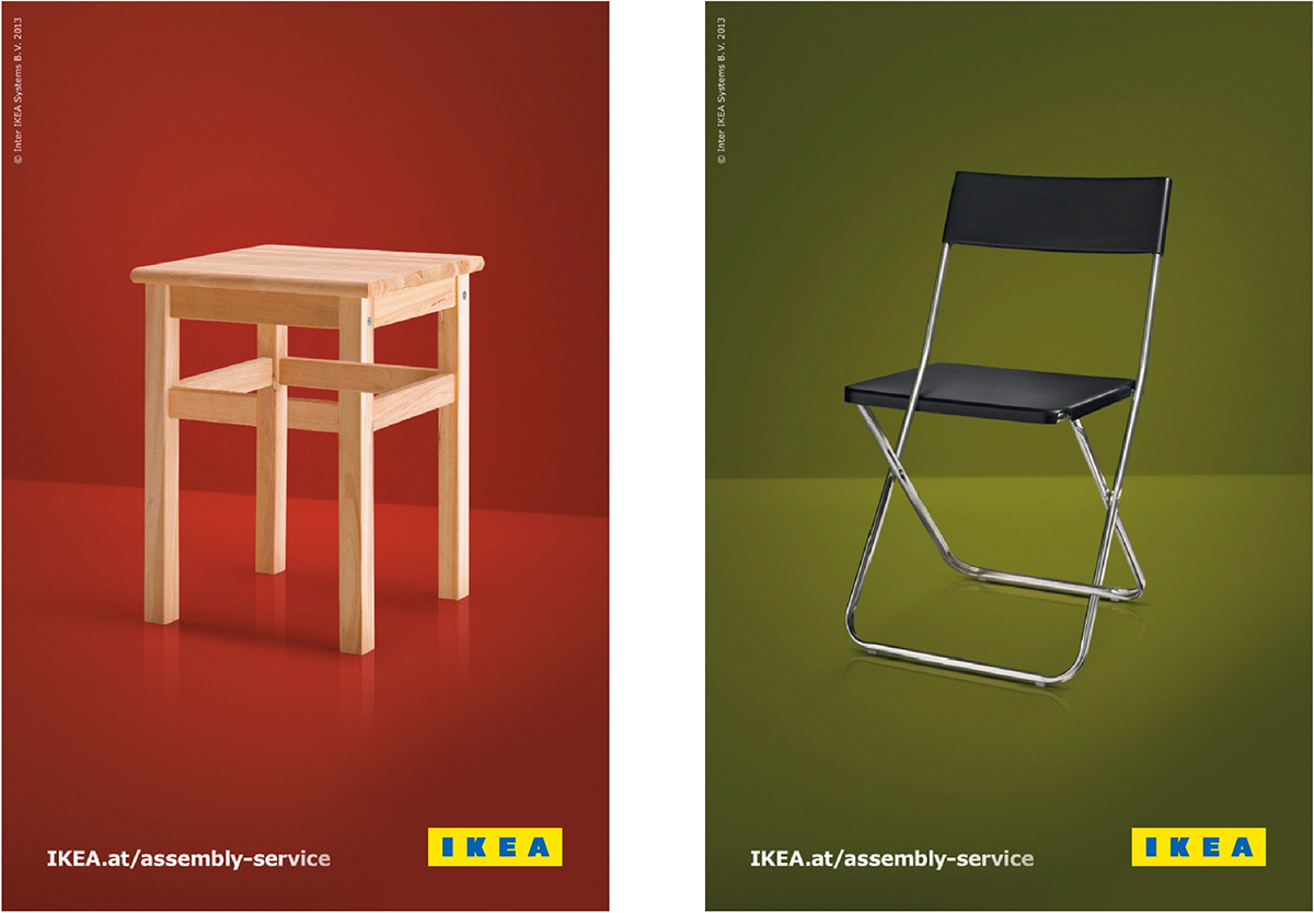
When people think of IKEA they inevitably think of flat-pack boxes and enormous blue rectangular buildings. It therefore seemed obvious to take the modular system a step further, into a three dimensional context — wrapping the logo around shapes — thereby creating a tangible link between brand and product. By extending this modular identity across IKEA sub-brands (e.g. Family, Food etc.) we help to unify the entire visual identity.
The end result is a static primary logo and a modular secondary logo with a huge variety of possible application. Ultimately this allows the brand to be as imaginative and considered as its products.