

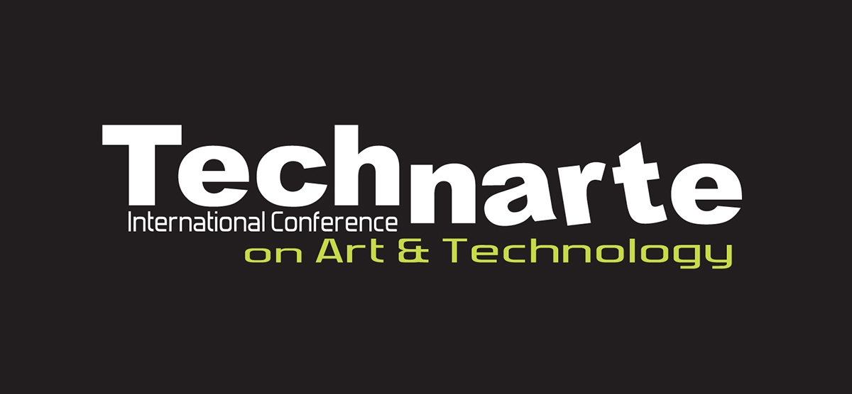
Technarte Logo Proposal
About Technarte
Technarte is an International conference on art and technology. An event meant to enjoy innovative contents, to know other people, to create synergies.
A key instrument in development of business: Art and Technology.
Fields: New reconnaissance fields, like Nano-art, 3D Printing, interactive installations, Art & Robotics, Bio-art, immersive 3D development, Mobile Art, smart materials and hyper-augmented reality, among others.

Technarte is a progressive conference, so representing it visually requires a forward-thinking approach. We need to show off the conference of Technarte’s cool sophistication on the world stage, capture the passion of its people, and provide the conference with a unified, flexible, and future-focused image.
Idea
A brand as a platform where like-minded people come together.
The brands that not only consistently deliver on their promises but continually surprise consumers with new, creative, and relevant experiences.
A solid brand and a strong visual language based on interactivity, minimalism, beauty, geometry, randomness, sound and dynamism.
The brand that acts as a strategic filter for the future.
Dynamic Identity
Identity that is alive, not static but dynamic. It can change and generate new versions over time, and behave like a living organism. A much more vivid and variable identity.
An innovative Company should have an innovative identity.
Concept
Geometric design. Inspired by the design era of art deco, geometric designs are popular in modern brands. The geometric trend allows brands to have fun with color and design elements, but keep the overall design concept simple.
Model
Getting to a short, memorable valuable piece that encapsulates the core of what the brand is about.
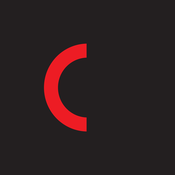
Symbol
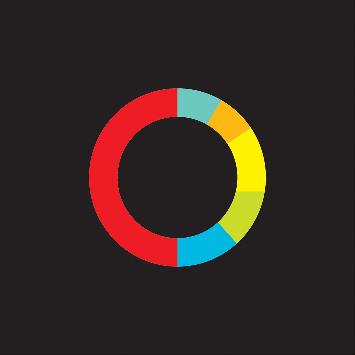
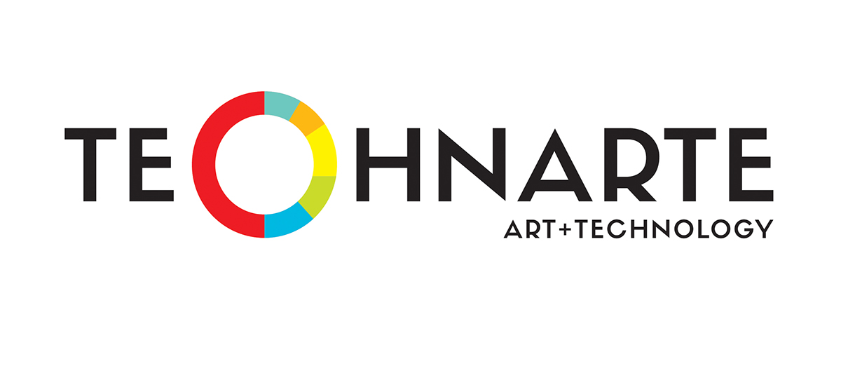
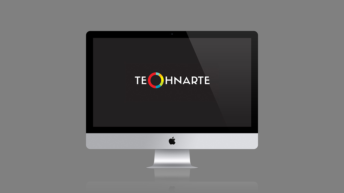
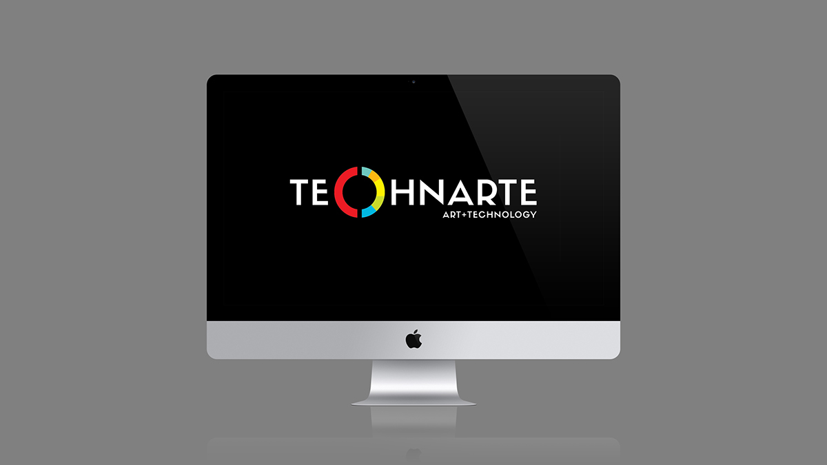
Mark resembles a Rotating Ring. An unbroken band has so many underlying meanings from continuity, to seamless process, to eternal perfection. The addition of a layer of significant color is just one more bonus message. That is a process and that leaves consumers adrift in a state of animated suspension. Multiple parts assembling to work in unblemished unison. This is also a way to introduce some intense color in such moderation that it avoids becoming a garish chroma spectacle. The colored band areas may represent fields, like Nano-art, 3D Printing, interactive installations, Art & Robotics, Bio-art, immersive 3D development, Mobile Art, smart materials and hyper-augmented reality, among others. A logotype that projects the nature of the Brand and its meanings.
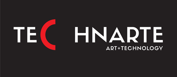
Logo
Logo - holos (Gk. Holos ‘whole’)
Variables behind a constant logo.
The logo as a box that can constantly change its content - colored band areas representing fields - resulting in a different outcome each time.
Designing
‘Less is more’
With a simple design, a brand’s core message is communicated more effectively, leaving behind all the embellishments and noise. Flat, streamlined, and honest is the hottest trend in branding today.
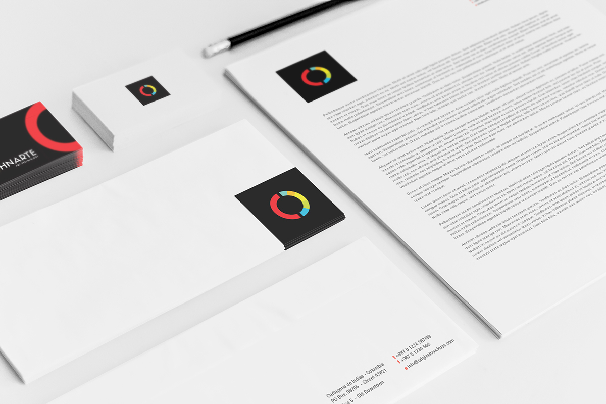
The process of creating visual identity (stationery, signage, brochures and later websites and animations) is not developed further at the starting point - the logo.
Typeface:
Sifonn_Basic
Mock-Up:
Stationery
iMac
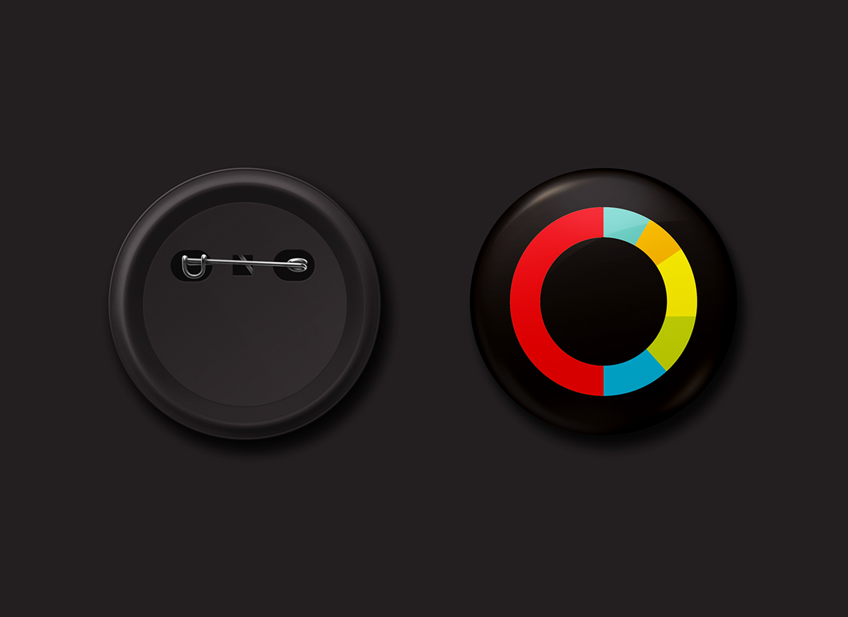
Pin Button Badge


„Logotipas atitinka pagrindinius grafinio ženklo kokybinius reikalavimus, kriterijus”. – Jonas Gudmonas – Vilniaus Dizaino Kolegija (VDK) Profesorius
“Logo design meets the basic requirements for qualified trademark”. – Professor Jonas Gudmonas – Vilnius Design College (VDC)
Thanks for watching!


