For the brief I created a purerly typographic poster publicising a poetry reading of the poet Philip Larkin. The poem that I chose to base my poster on was "Cut Grass."
Cut Grass
Cut grass lies frail:
Brief is the breath
Mown stalks exhale.
Long, long the death
Brief is the breath
Mown stalks exhale.
Long, long the death
It dies in the white hours
Of young-leafed June
With chestnut flowers,
With hedges snowlike strewn,
Of young-leafed June
With chestnut flowers,
With hedges snowlike strewn,
White lilac bowed,
Lost lanes of Queen Anne's lace,
And that high-builded cloud
Moving at summer's pace.
Lost lanes of Queen Anne's lace,
And that high-builded cloud
Moving at summer's pace.
The poem is a metaphor for death as the grass substitutes human life. There is a sense of innocence going through it. Larkin also suggests that there is a peacefulness and tranquility to death. This led me to create quite a minimal poster. The image from the poem that I chose to include in my poster was “Brief is the breath“.
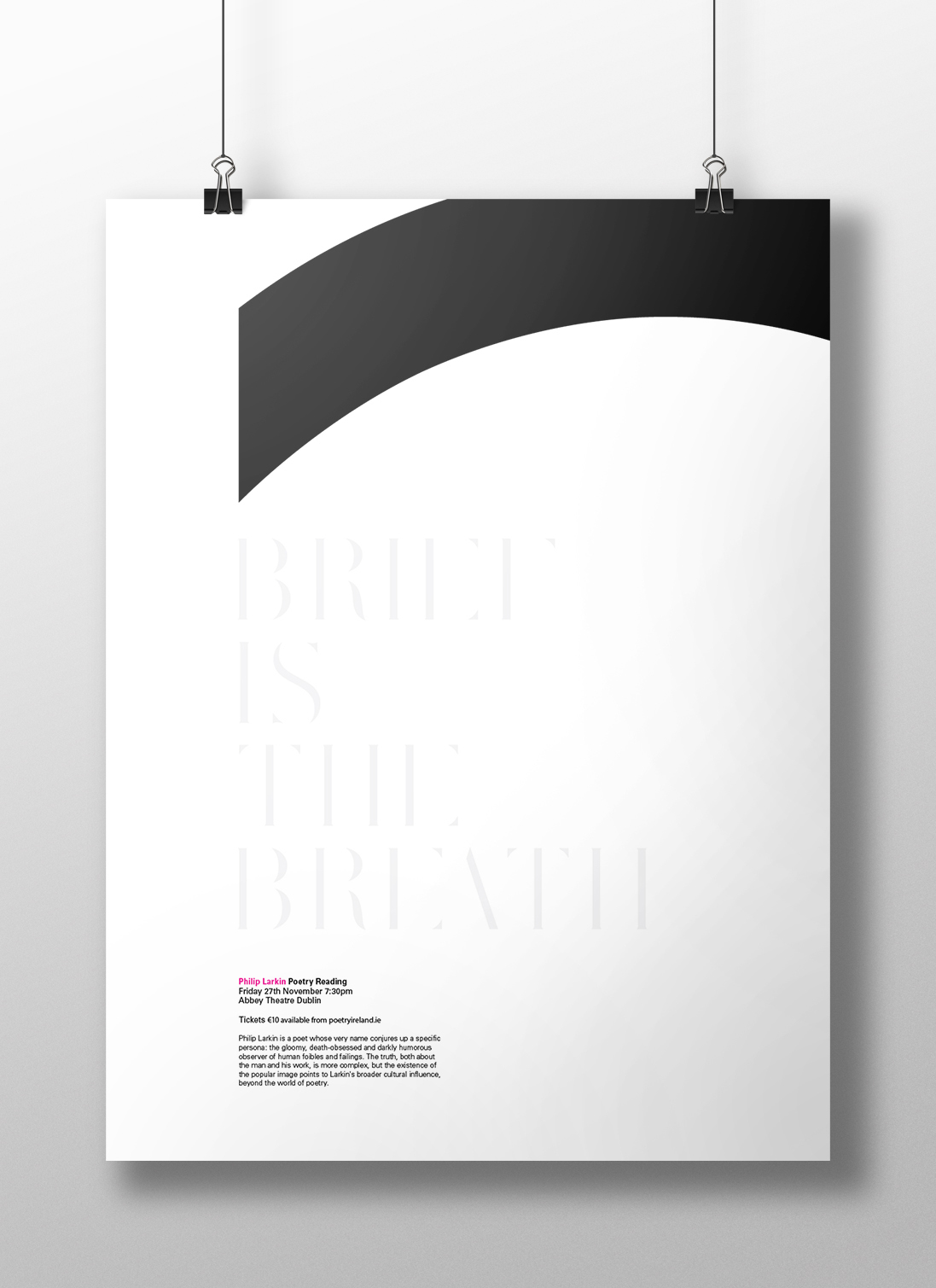
The meaning behind this image led me to chosing the typeface Sunbather. The type is as if it is fading away in the poster symbolising how short life is. It also ties in with other images in the poem such as suggesting a decaying corpse.
The other main element in the poster is a cropped letter c from the futura typeface. This symbolises the grim reaper’s scythe which there is many connotations of throughout the poem with words such as “cut” and “mown” used. It is also a traditional image associated with death. The scythe is placed accordingly in the poster so that it is as if it is about to cut the text. This links the image “Brief is the breath” with the image which follows in the poem “Mown stalks exhale.” The type gives its final breath as it decays about to be cut by the scythe.

I employed a simple grid in the poster as this contributes to the minimal and elegant sense of the poster. This also mimics the structure of the poem itself as it uses a regular ABAB rhyming scheme. The grid creates a strong single guideline in the poster for our eyes to follow as if the viewer is transcending into the grave themselves. There is a sense of balance in the poster also as there is only three main elements of the poster; the scythe, the display text and the body text. I wanted the poster to only have three main elements as the poem only has three stanzas.
I chose a white background for the poster to tie in with the constant white images in the poem such as “Queen Anne’s Lace,” “White lilac” and “snowlike strewn.” This was also why I chose for the display text to be in a light grey colour on the poster. As close to white also without the text becoming illegible. The scythe is black to go in line with a traditional colour associated with death and the grim reaper. I chose to have Philip Larkin’s name magenta in the poster to attract attention to what the event is for. This colour also contrasts greatly with the others used in the poster which again adds to the attention being brought to this aspect of the poster. The light and minimal use of colour in the poster contribute to its elegance and peacefulness that it suggests.
detail of the body text.

