“ Design three packages for a new supermarket product; tea ”
For the branding project we had to design three packages for a product in a supermarket,
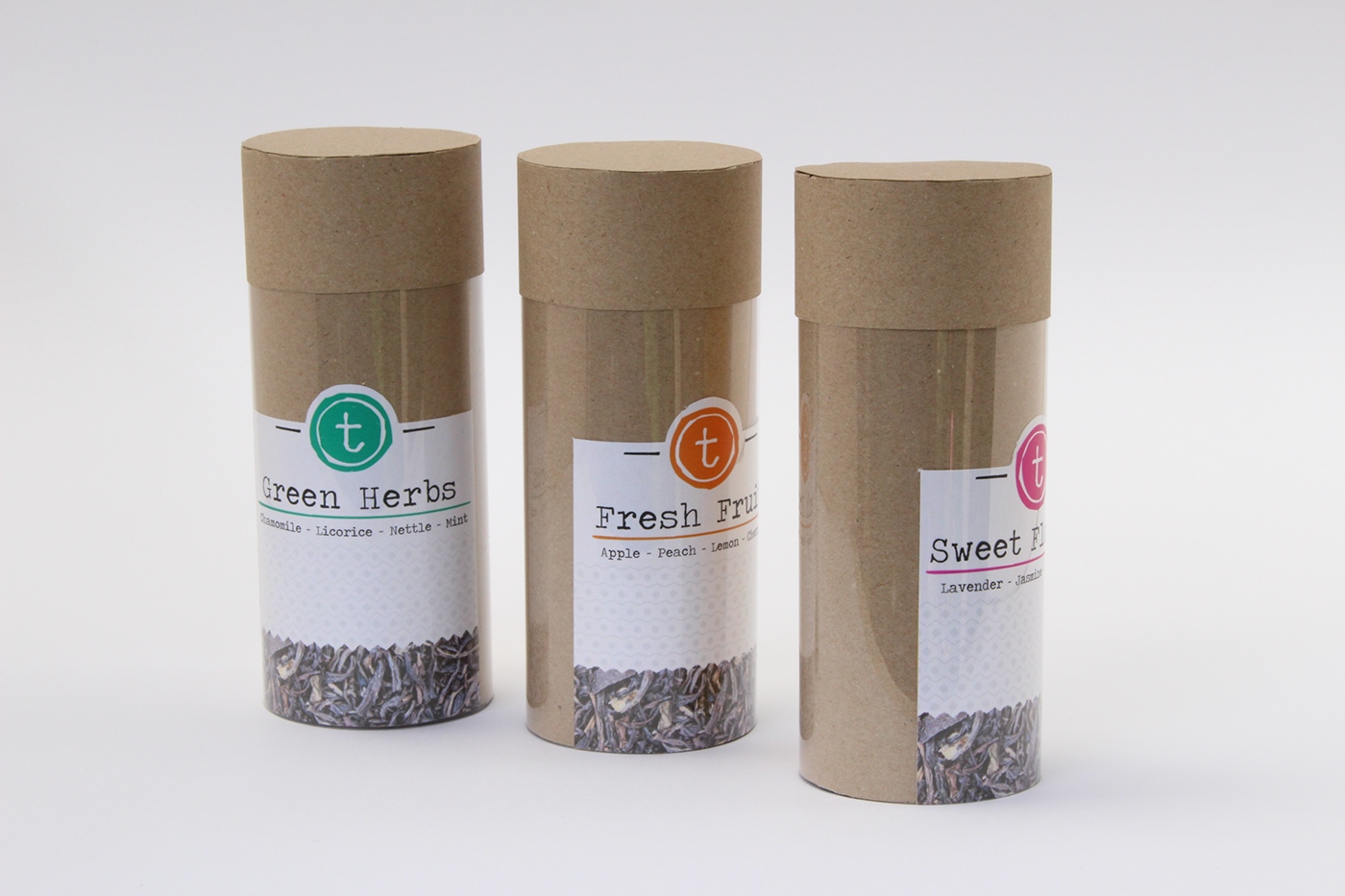
I decided to make a packaging for lavoured tea from Marks and Spencer.
I chose to use loose tealeaves for the product and a cardboard look for the packaging.
This would give it a Fairtrade look, because Marks and Spencer only sell Fairtrade coffee and tea.
I have tried to make the logo also more natural by using a typewriter style font,
and colours and patterns that are consistent with the different flavours of tea.
In the packages you will find 4 different flavours of tea. In this way when you have guests,
they are able to choose the flavour they like and you do not have to stuff your cupboards with lots of different loose packages. The name ‘T’ also represents the fair trade label; it means that it is all just natural tea and no added ingredients.