
Why Does It Always Rain On Me?
A Guide to Glastonbury: Weekend Weather From 2000
The Weather, one of Britons favourite conversation topic, whether it's too hot, too cold, too much snow, too much rain, not enough rain, we're never happy and we're always complaining but we just love talking about it, with friends, family, work colleagues or complete strangers.
For this brief I was to explore the use of open source data found online, from sources such as the Met Office and their large data base and also Weather Underground and create an infographic for an interesting form and topic of weather. As summer was fast approaching and festivals were announcing their acts, it not only got me excited for an amazing summer but it also got me thinking, 'just how bad is the weather at Glastonbury?', as that festival is renowned worldwide for it's varying conditions, with this in mind I decided to explore recent weather conditions at Glastonbury Festival.
I decided to only analyse the data from 2000, in order to keep the examples contemporary and relevant, as I don't believe conditions from the 1970's for example have no relevance now as conditions may have changed. The poster wasn't just a studying into the weather of Glastonbury, but also to educate people who may be going to their first festivals and to educate them, what should they pack? What should they wear? Etc. It was also made to be a way of getting people to try and predict how the weather would be in the next year, although they may be completely wrong.
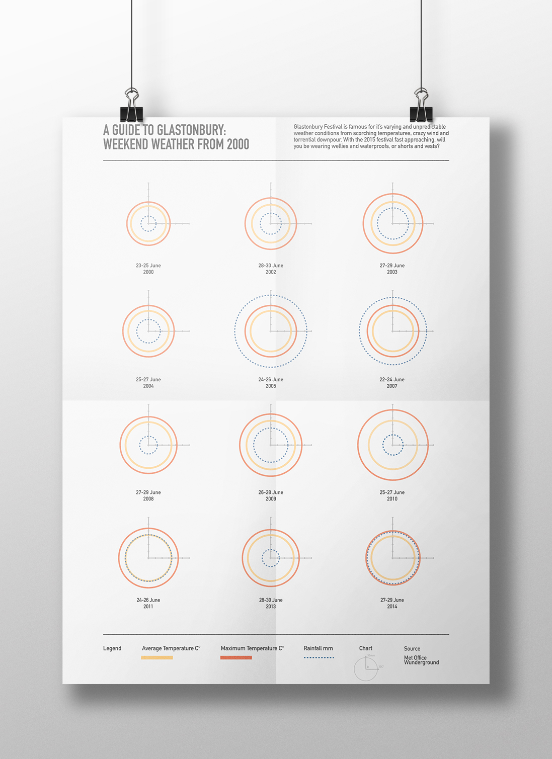
Throughout this project I began to learn some simple coding skills to help collect, sort and visulaise my data, using programmes such as Processing, Node Box and Sublime Text. These programmes allowed me to easily covert my data into CSV files and then export them into visulations onto illustrator, this meant my forms were extremely acurate to the data that I gathered.

When creating this piece I wanted to ensure that the data could be easily understanded and readable through the visulatisation, but I wanted to also ensure that the audience can also actually see the data and compare it with other data sets. To enable this I added a chart on the cirlces, the X-Axis reads the temperature and the Y-Axis reads the amound of rainfall, this allows for detailed anaysis and easy reading of the data for the user.

