Reformat
Responsive web and print magazine
Copywriting, editing, design, art direction, code
Awarded silver in European Design Awards 2012,
and gold at Visuelt 2012.
Winter 2011/12
Typeface: Aperçu
Paper: Coloured copy paper 80g/cm3
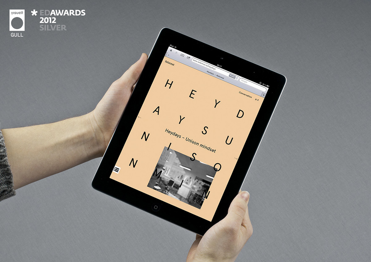
Reformat challenges the web format by exploring the crossing between analog and digital media. The magazine is expressed as a responsive solution, utilizing a flexible design that responds to the screen resolution – as well as to print. Through interviews with leading studios, the content forms the foundation for how the magazine is designed.
Reformat is about the change of an existing mindset, put in a design based context. Web design is graphic design.
Designers featured includes:
– Heydays
– Lundgren+Lindqvist
– Konst & Teknik
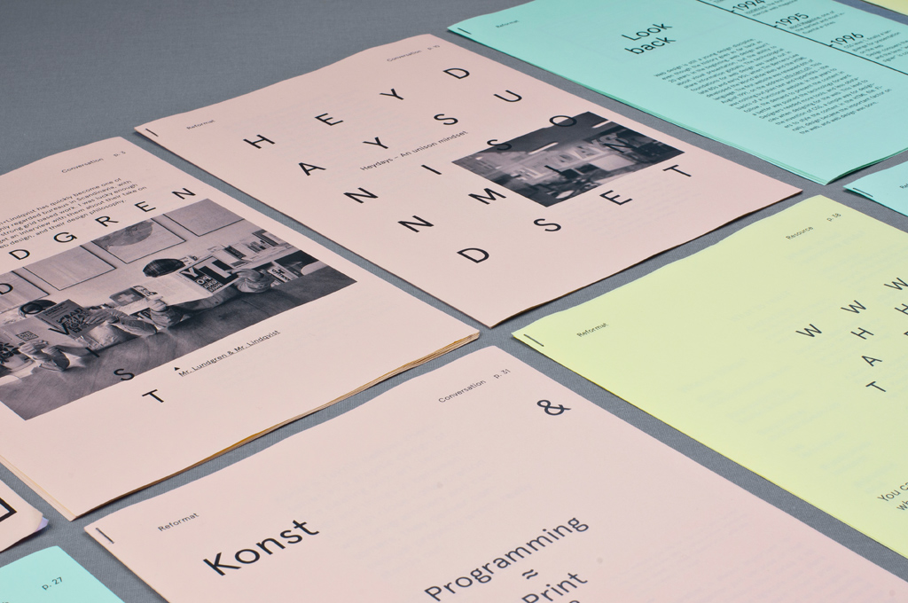
Each article is bound by itself, recreating the navigation from websites, where the articles don't have a fixed order.

The analog version of the magazine is printed on 80g copy paper, recreating the feel of a traditional printed web page. The color refers to the color each article have on the web version.

The text is set in Aperçu, creating a consistent feel on both paper and web.

Reformat explores the subject by comparing and challenging the conventions in print and web, resulting in a unusual solution both for print and web.


