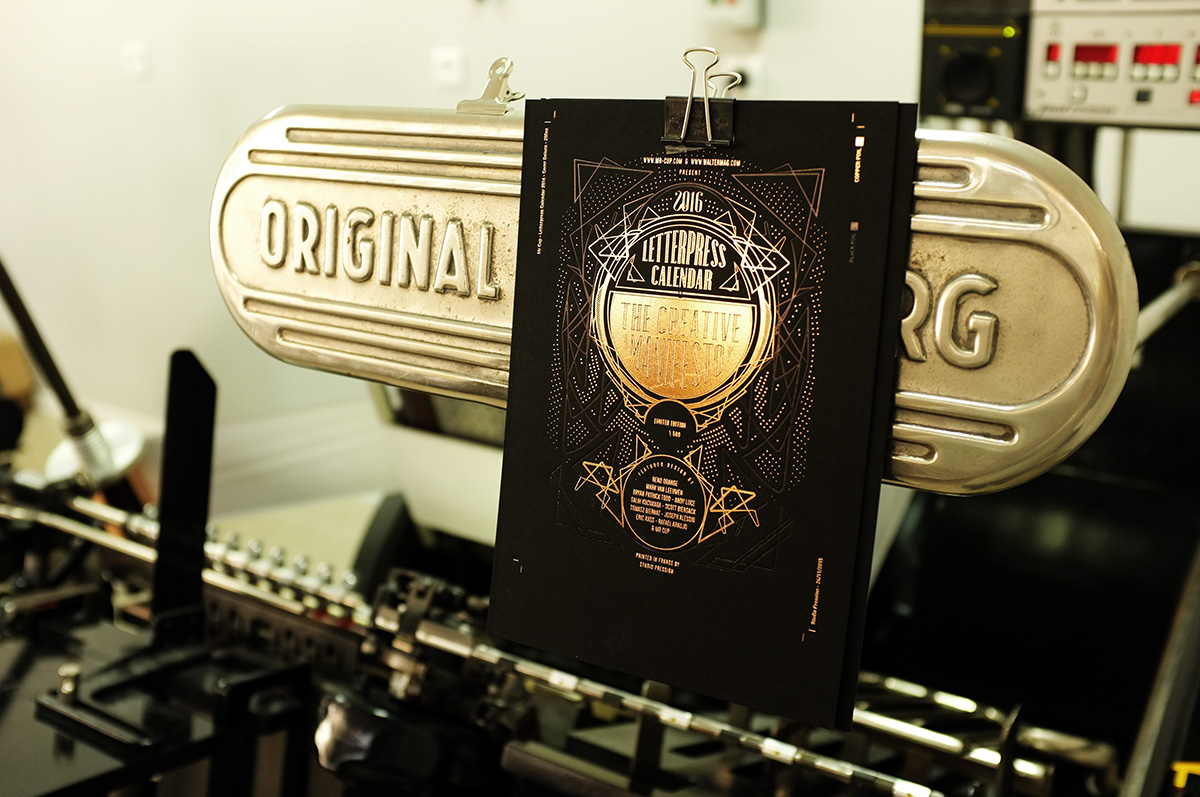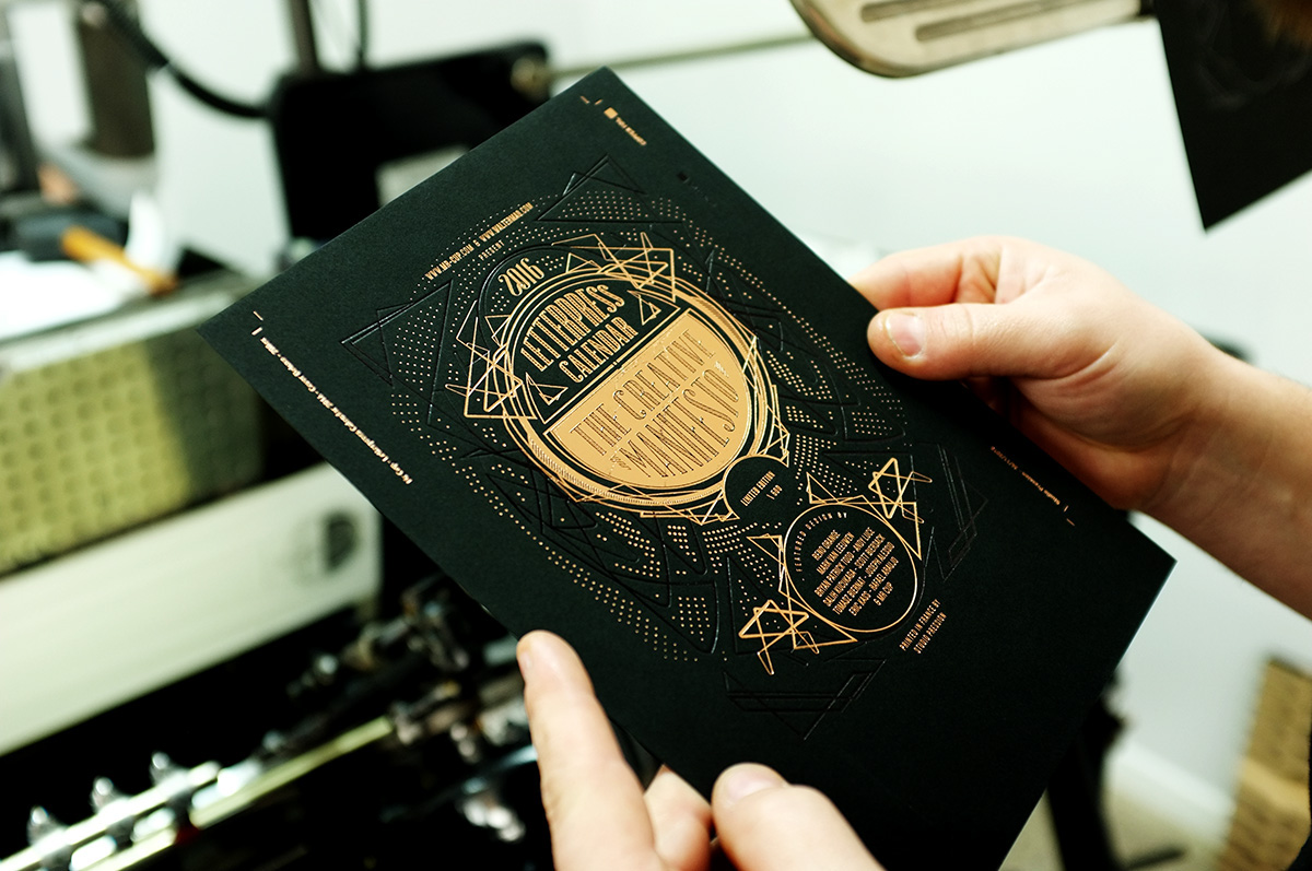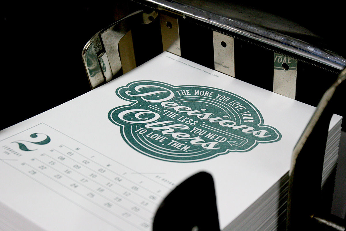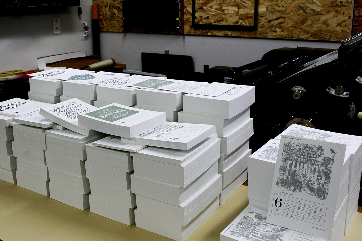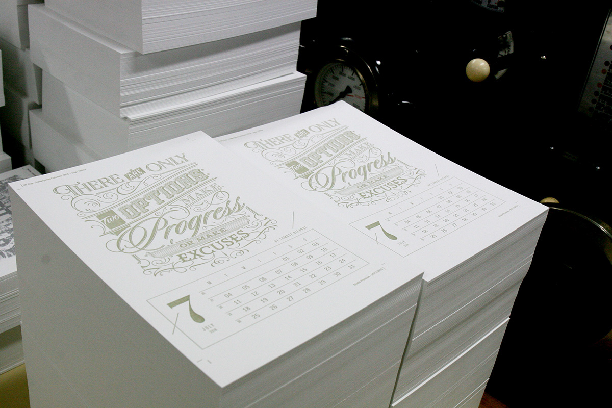

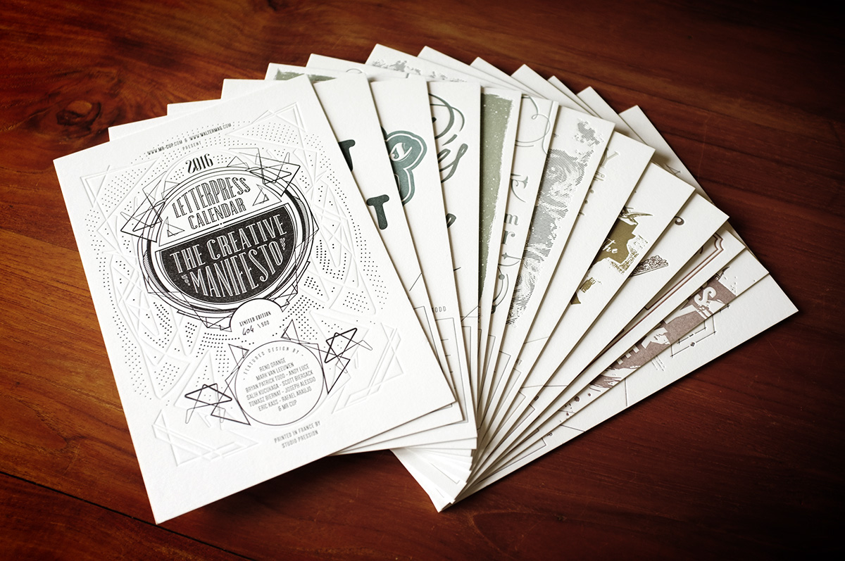
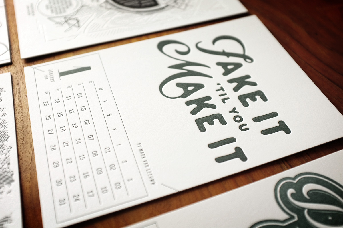
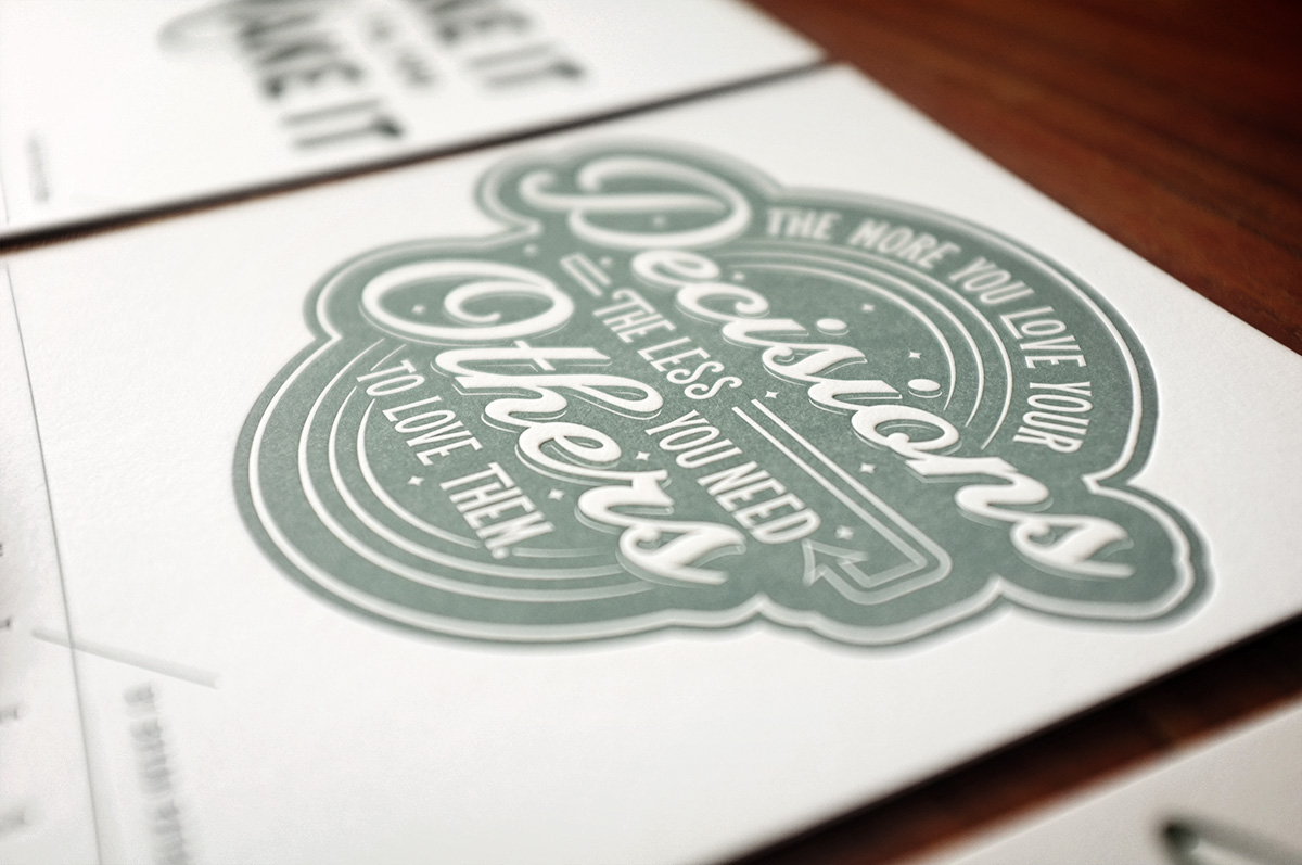
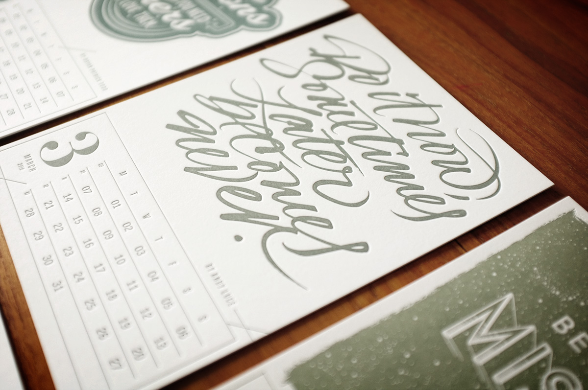
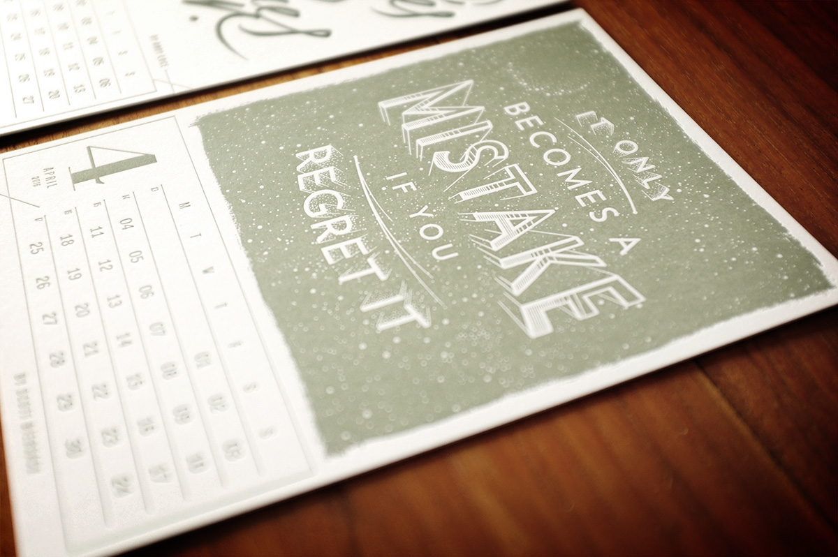
Be creative in 2016 following every month words of wisdom of the Mr Cup creative manifesto letterpress calendar. It is composed of 14 20x14 cm cards printed on 700g french paper. It is a hand numbered limited edition.
It is now sold out but you can get the 2017 edition on Kickstarter.
It is now sold out but you can get the 2017 edition on Kickstarter.
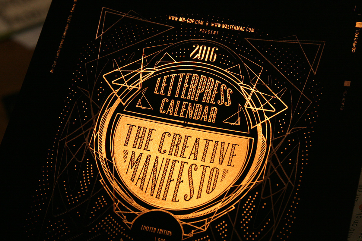
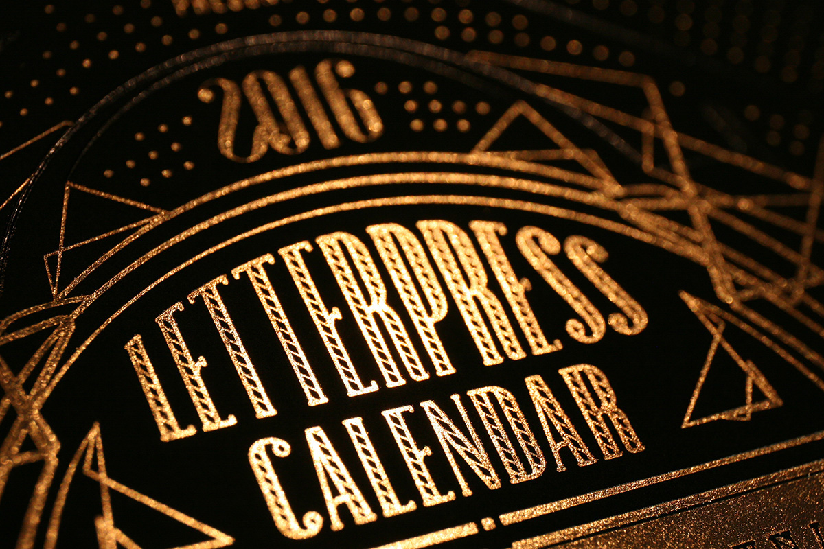
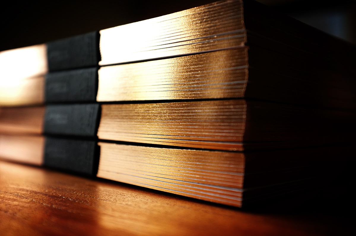
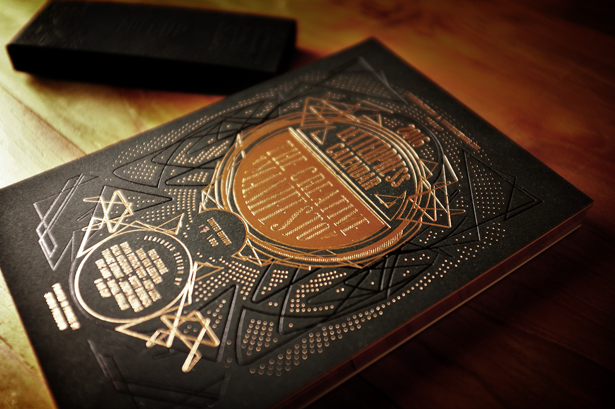
The Special edition comes a copper black cover, with a second black printed design. It comes with copper foil edging !
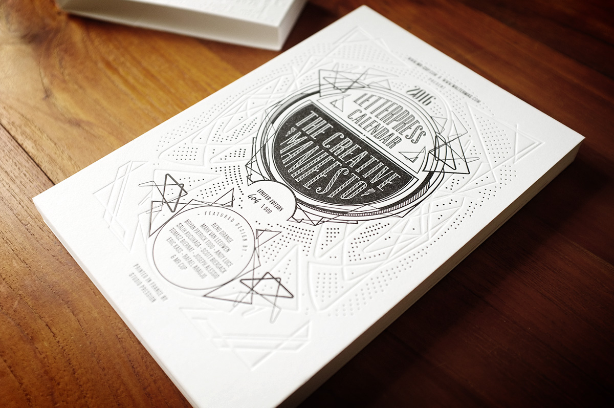
The normal edition has a 2 colors cover printed on white paper. Each page is printed in one color.
The front cover has been designed by Renaud Orange who already work on the past year edition. We wanted a modern art nouveau !
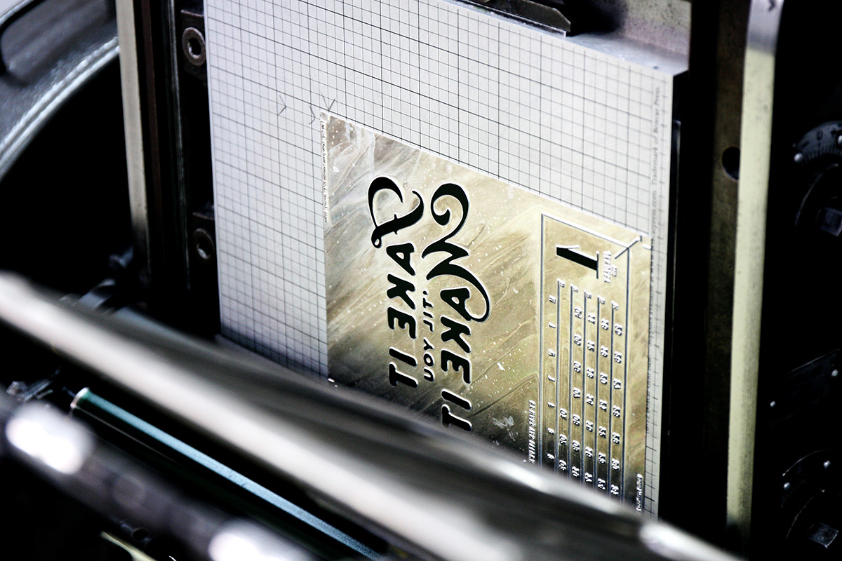
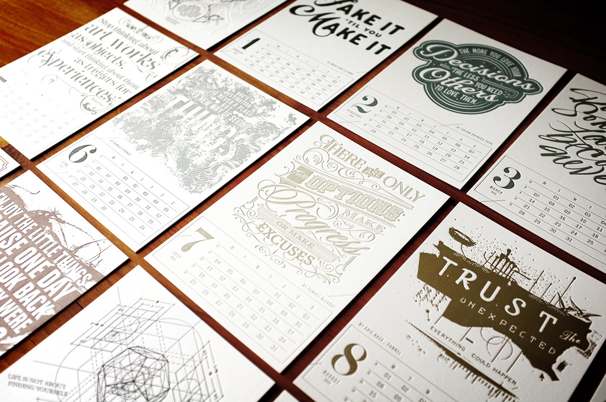
For this year edition, I ask graphic designer and typographer to create unique font work : Mark Van Leeuwn, Bryan Patrick Todd, Andy Luce, Scott Biersack, Tomasz Biernat, Eric Kass, Joseph Alessio, Salih Kucukaga & Rafael Araujo.


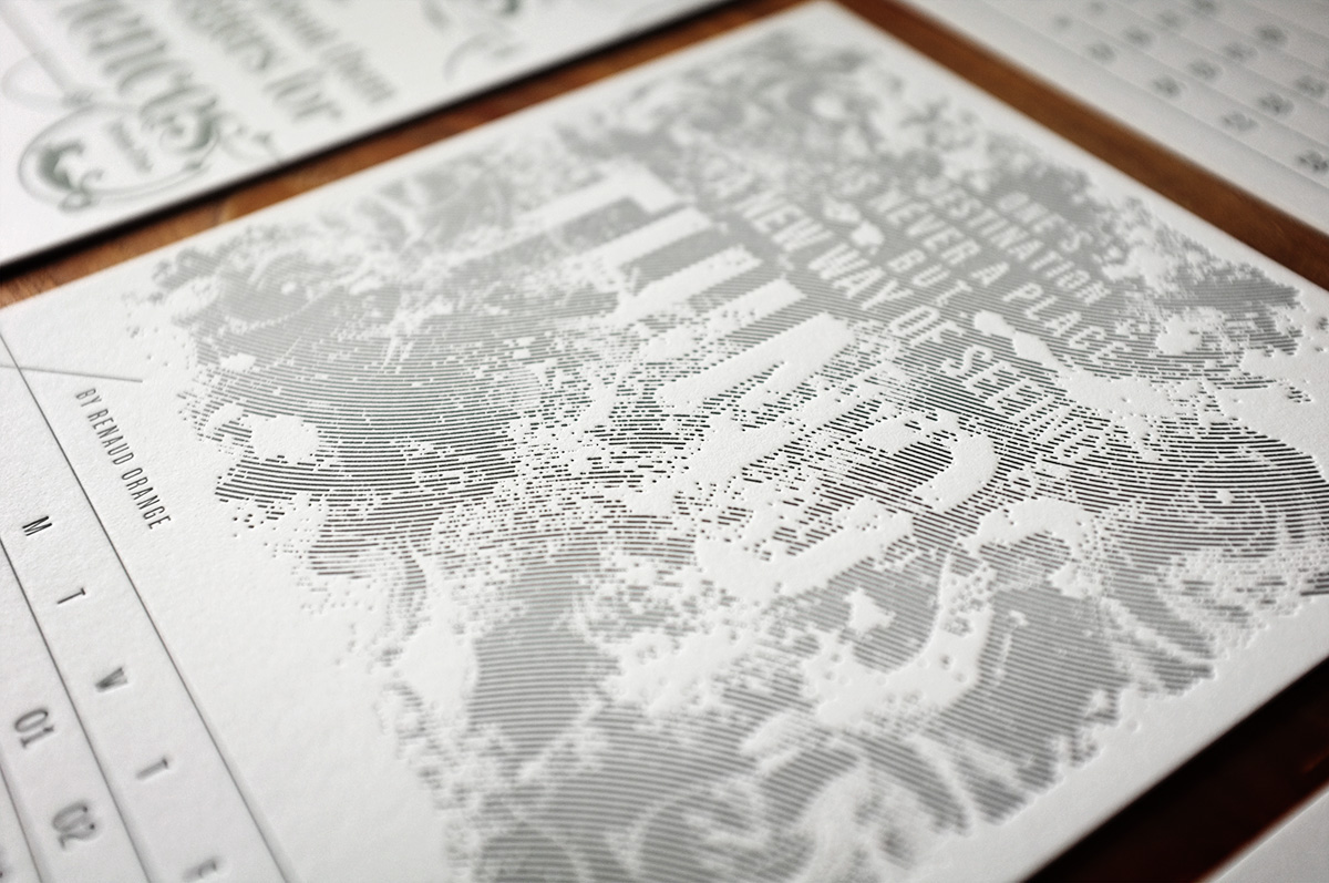
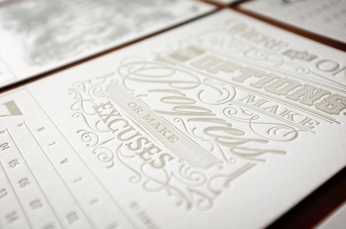
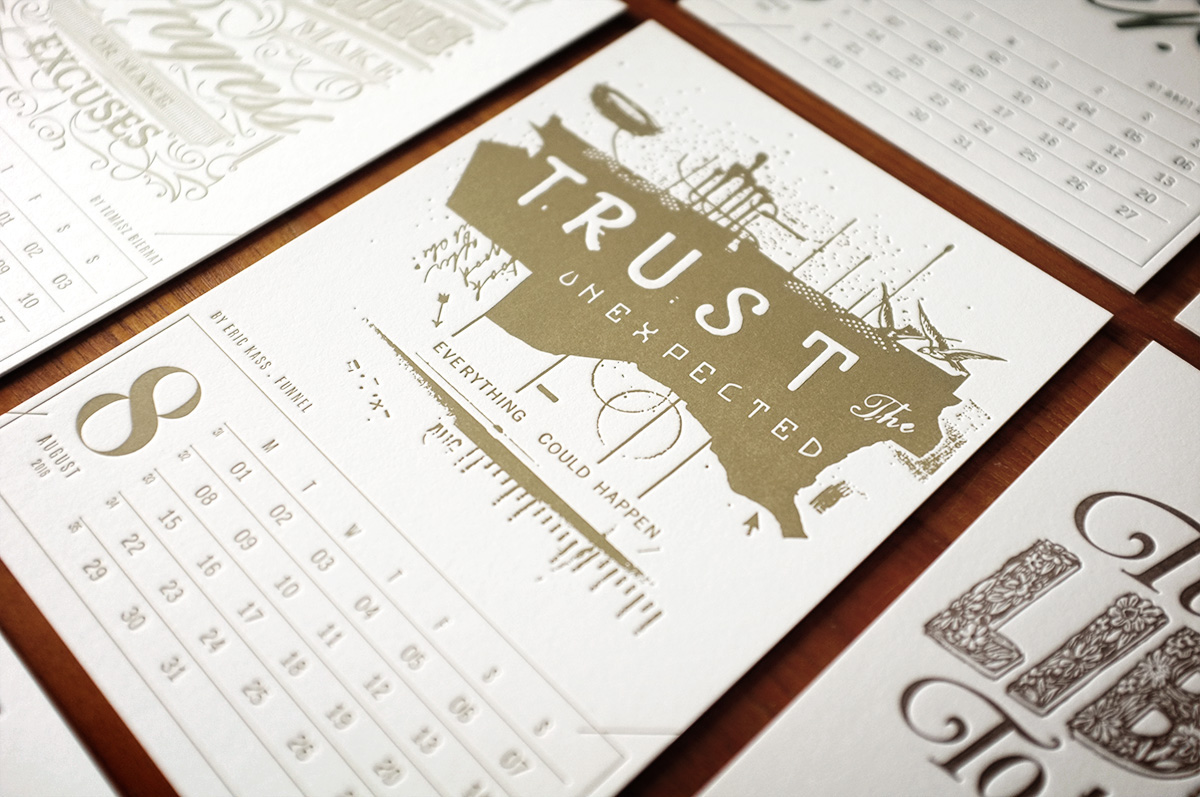


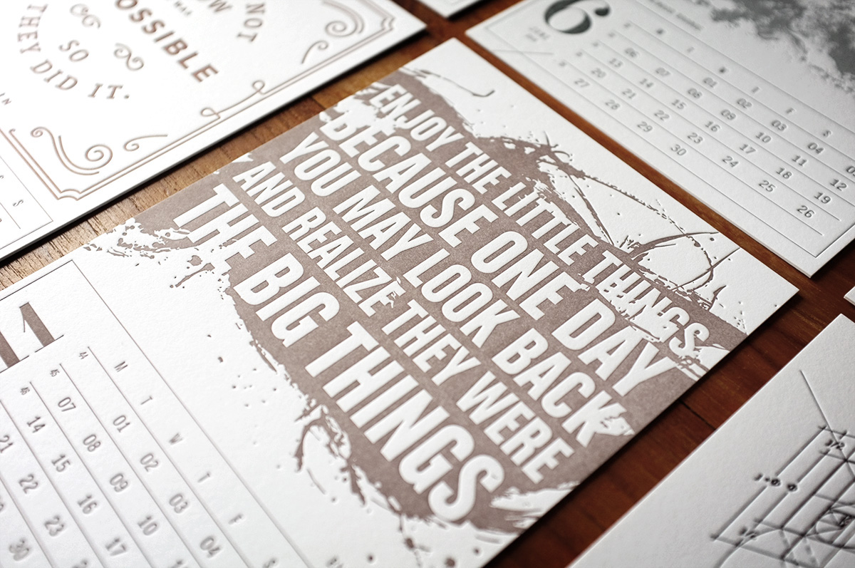

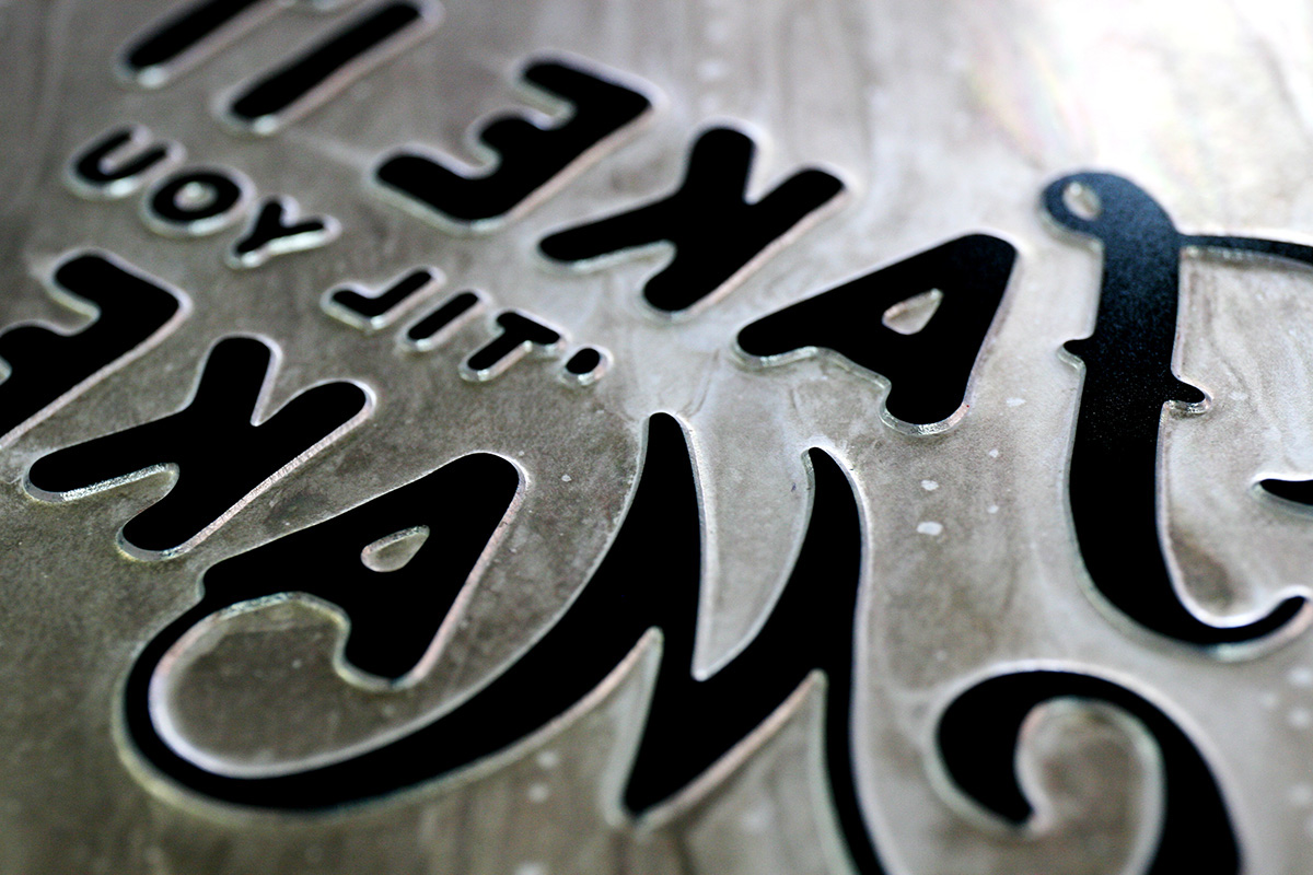
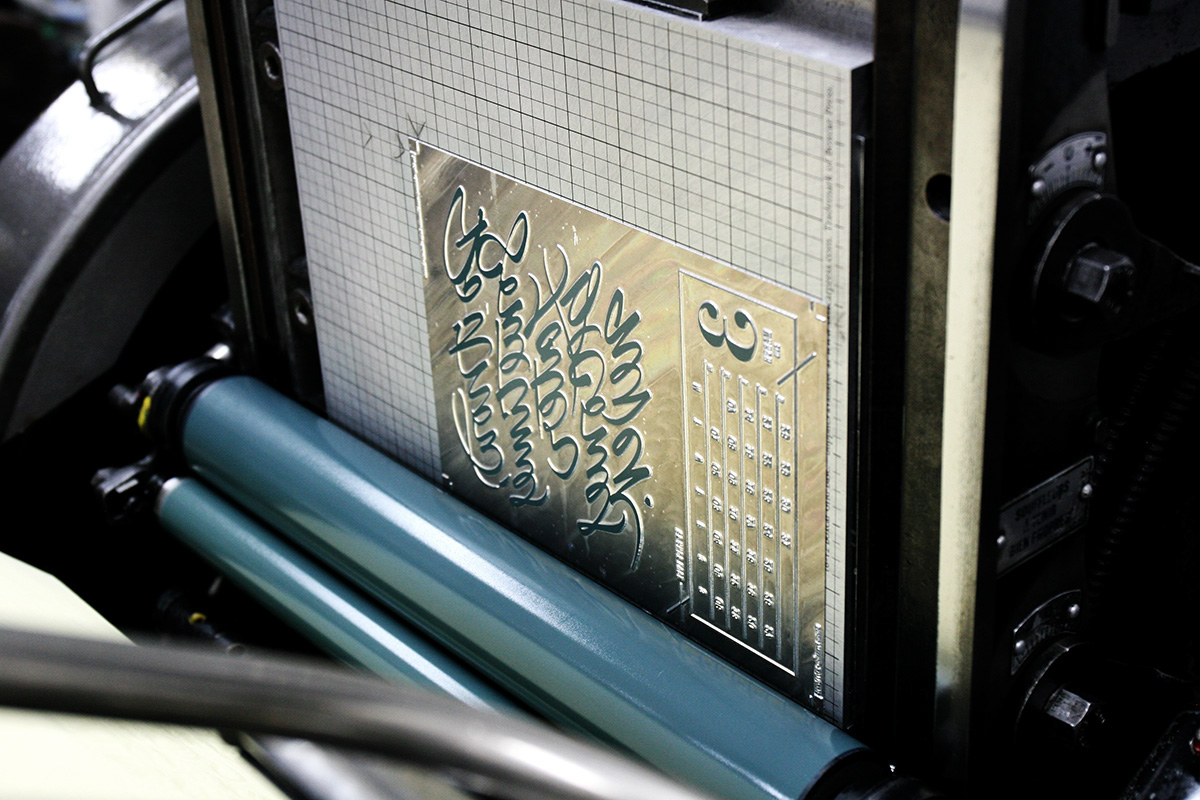
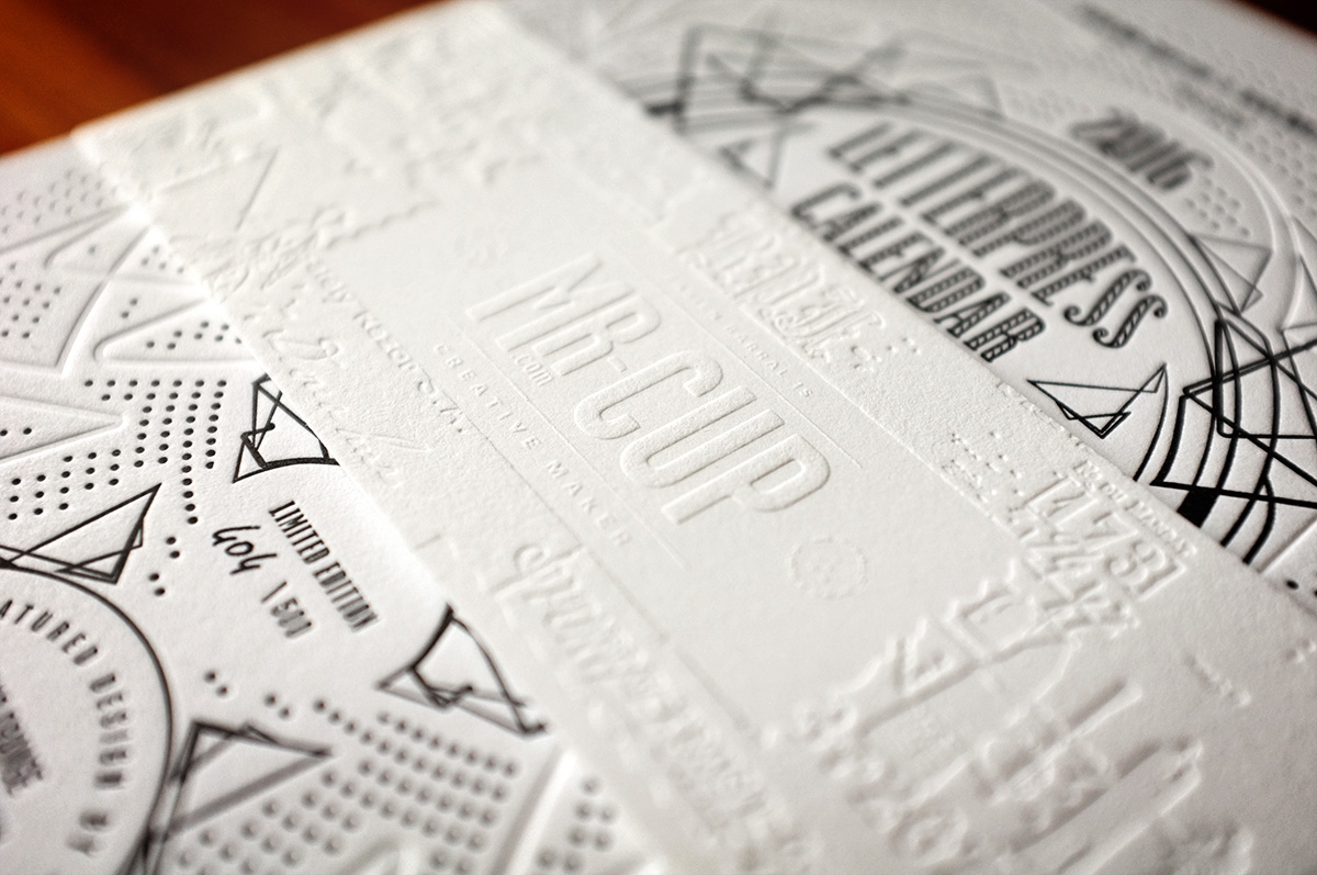
The calendar is printed in France, at Studio Pression. Letterpress printing has the ability to create relief into paper by adding tons of pressure while printing. It’s called deep impression, or debossing. And it’s done at the same time, printing AND debossing, always one color at a time. The thicker the paper, the deeper the impression. For a crisper effect, we use much more harder magnesium plates instead of photopolymer.