Type Hierarchy & Minimal Letterforms
Minimal Letterforms
Taking minimal part of the alphabet and creating a composition with flow while still being able to recognize the letters.
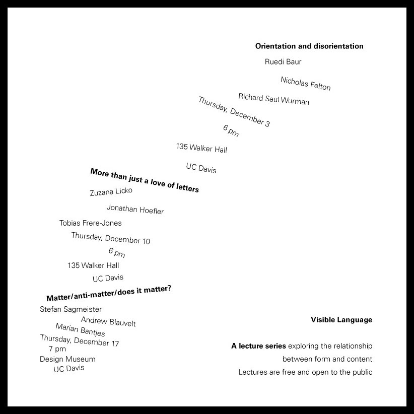
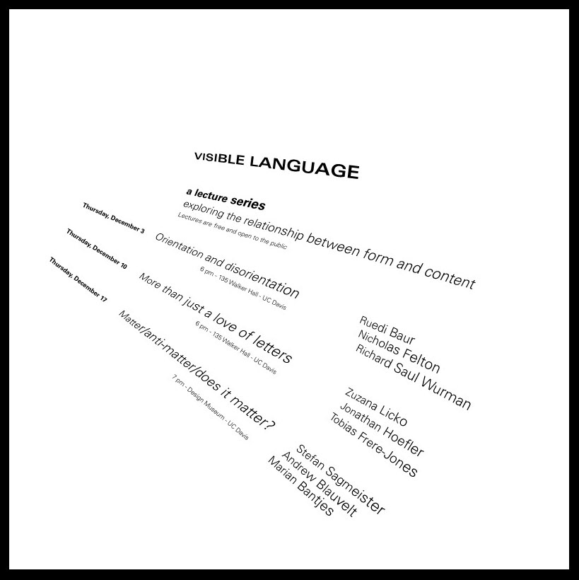
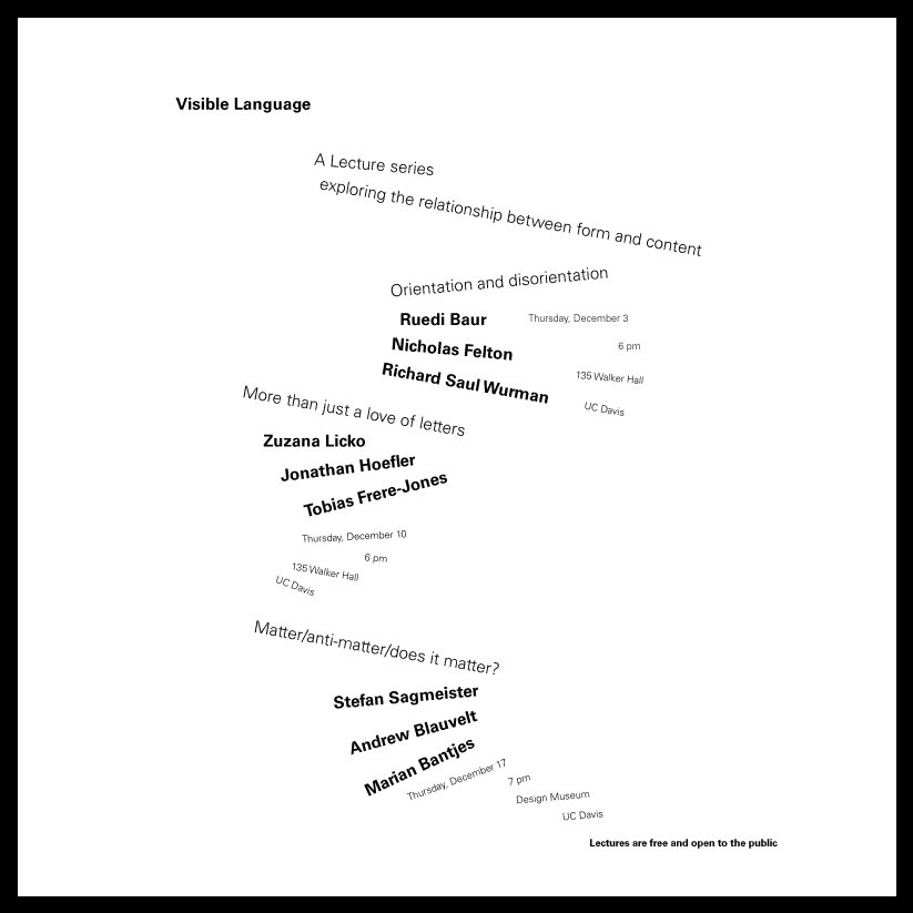
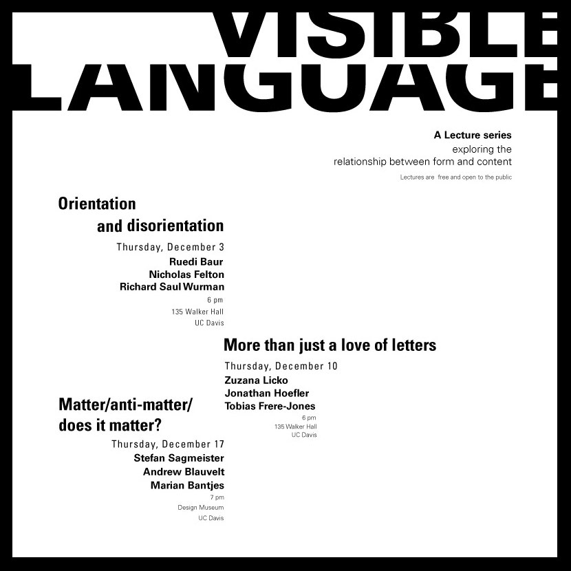
Type Hierarchy
Type study, designing a 10" x 10" board with an event information using one font in black and white. Part one is limited to using only one weight, part two is two weight two sizes, and part three has no limitations. The goal of this project was to achieve a non-static design that captures the viewer's eyes while at the same time, is legible and bold.