


LUZIA ARTEFESTA
Santa Luzia is a well-known place at Viana do Castelo, in the northern Portugal.
What we are about to present to you is a project for a fresh and smart event developed
by SPOT and Confraria de Santa Luzia, who invited us to develop the whole graphic stuff related.
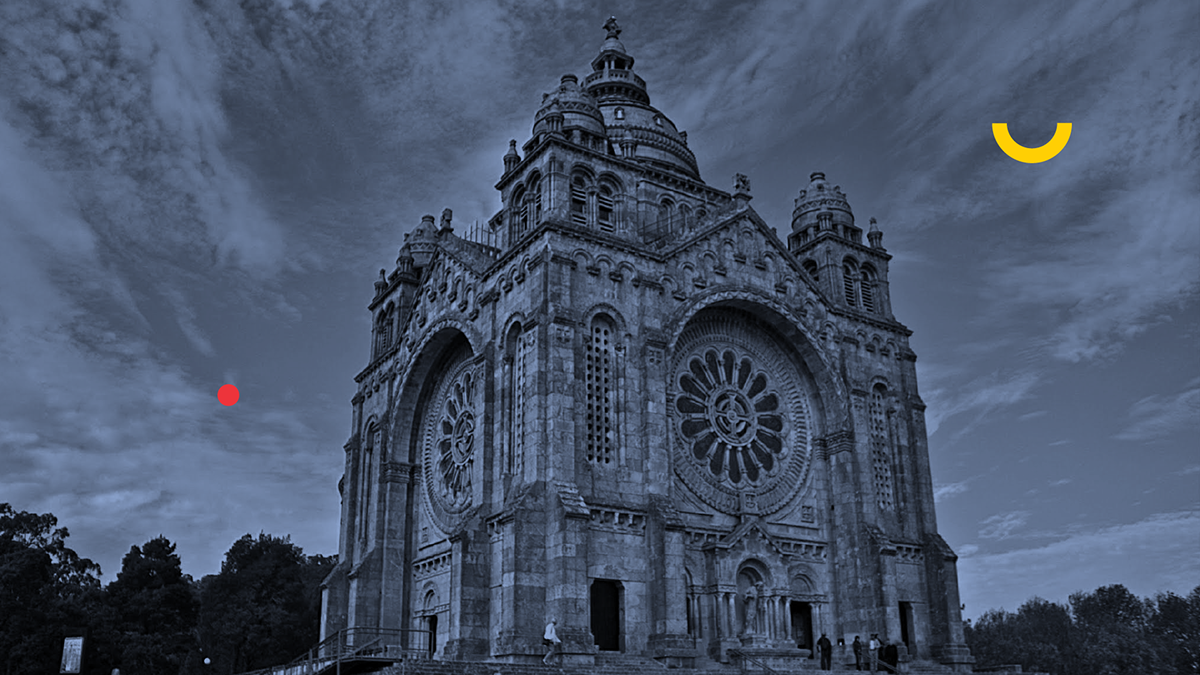
The focus of all the action was the Temple of Santa Luzia.
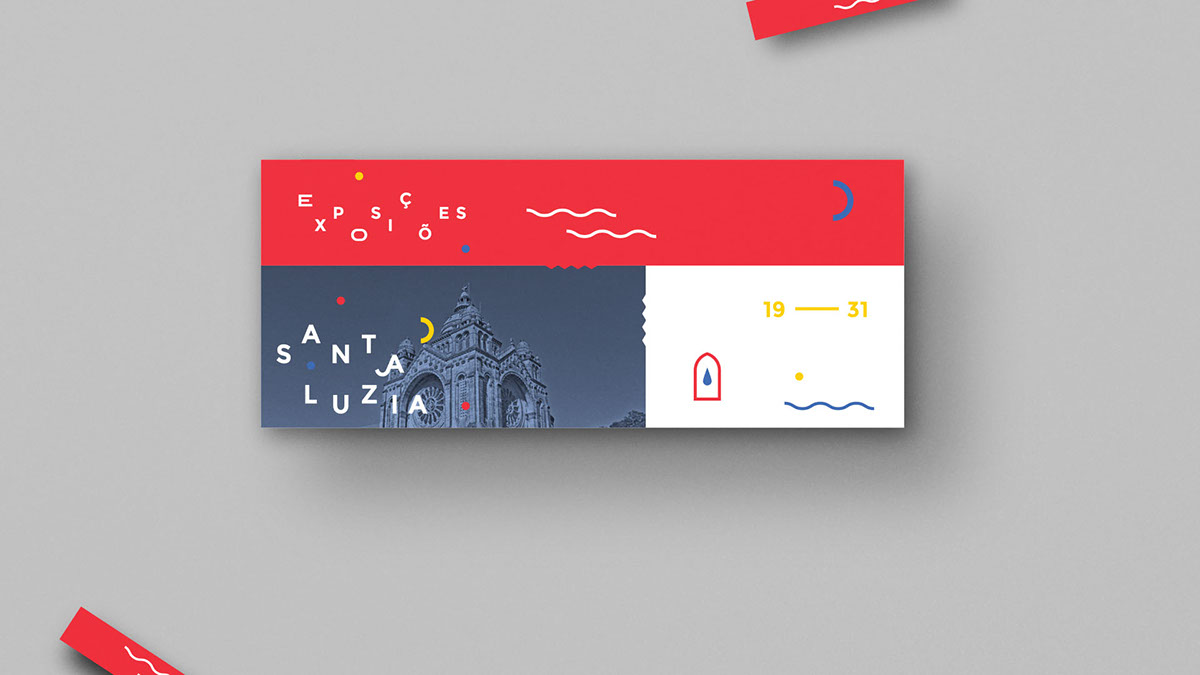
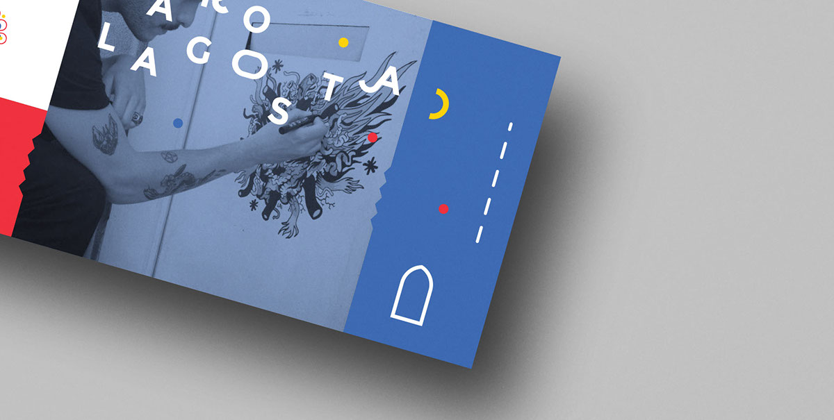
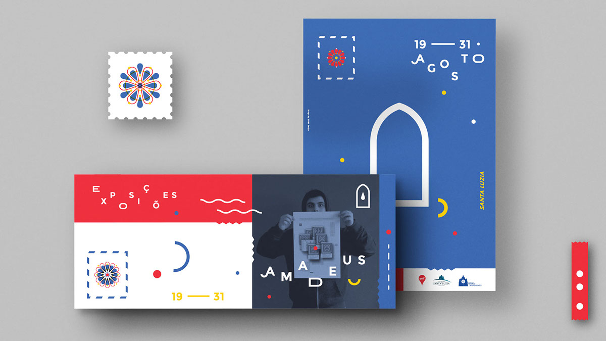
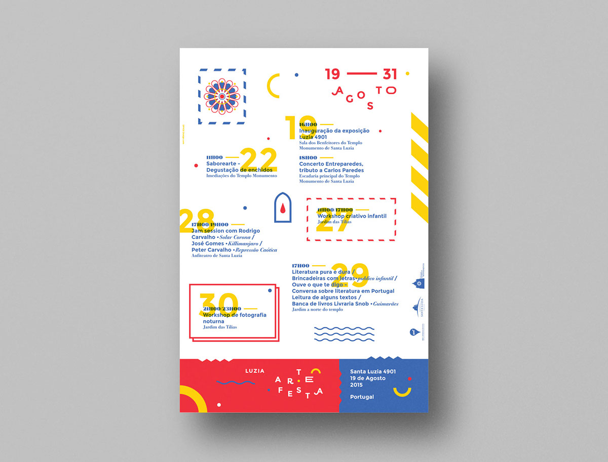
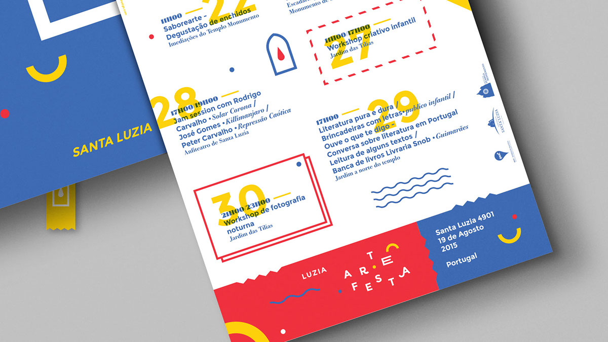
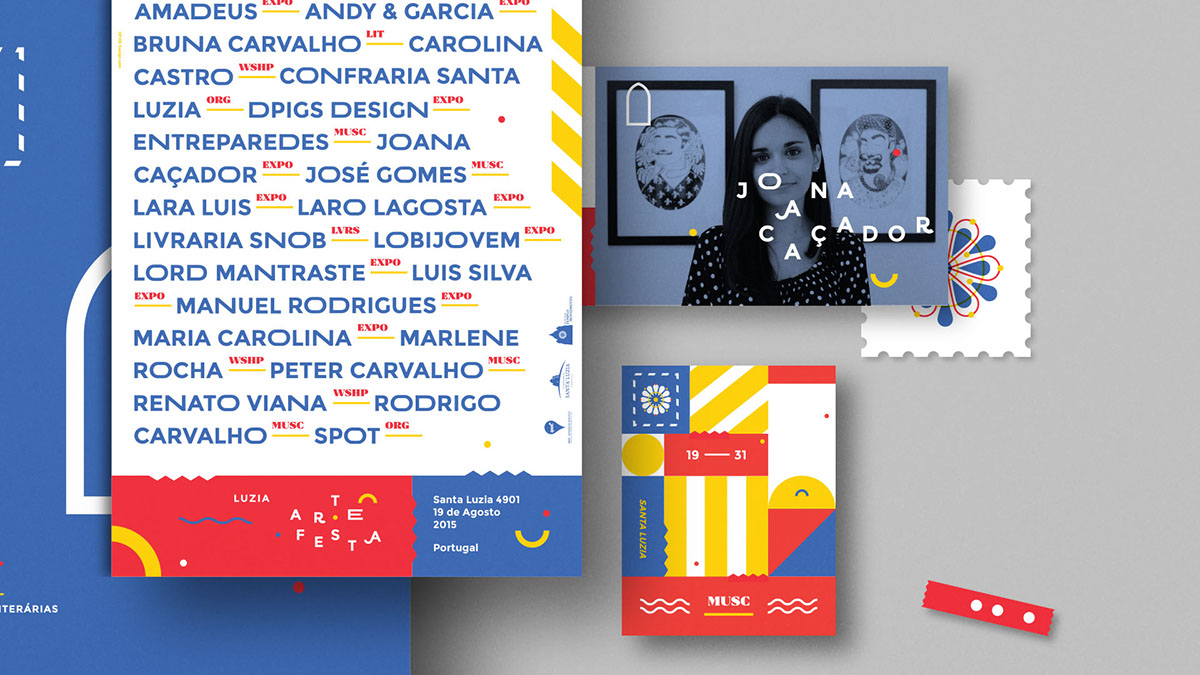
One of the majors events of the program was an exhibition where some illustrators were invited to interpret one local and traditional postcard of the temple.
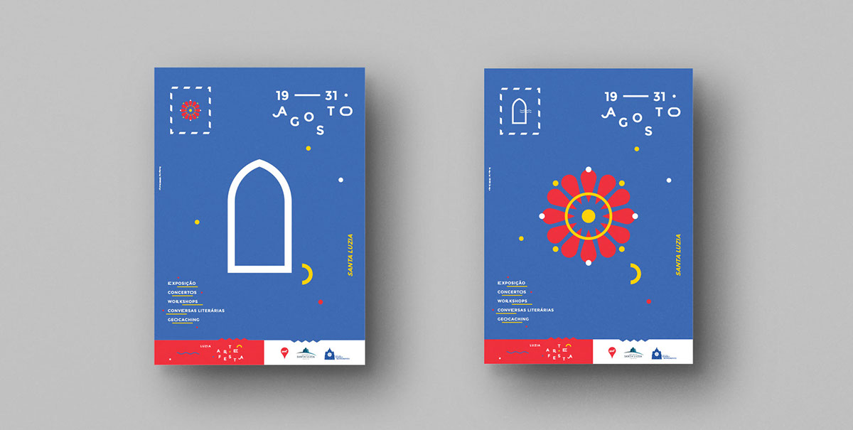
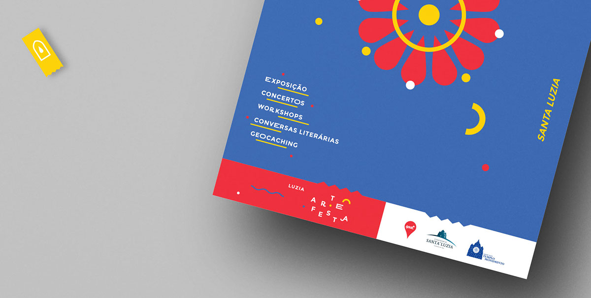
Postcard + Temple
Our goal in this project was to add some dynamic at a quiet place, so, after a while looking at the temple facade, we chose to work with the pretty and colorful rosace from where we took the major form of the logo putting all together with the postcard thematic which is very flagrant as you can see.
As typical at the old postcards we chose three plain shades of blue, red and yellow.


Client: Spot & Confraria Santa Luzia //
Year: 2015 //
Art Direction: Ivo Amadeus Reis //
Design: DPIGS Design //
Year: 2015 //
Art Direction: Ivo Amadeus Reis //
Design: DPIGS Design //