
My brief for this project was to design two posters for a Botany Collection at the Natural History Museum in London.
We were limited to use just Adobe Illustrator and vector imaging.
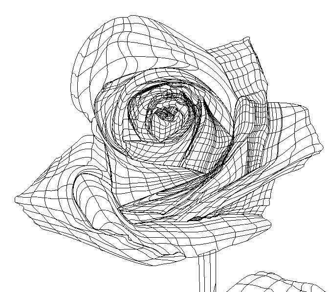
This project started with a thumbnail (shown below) and was developed into two poster concepts. From there I sourced high quality images of flowers that I thought had strong colours and would work well together on two posters.
I took the images that I had chosen into Illustrator and made them a template layer at around 50% opacity. Then I drew around each individual petal with the pen tool, creating an outline of my flower. Using the gradient mesh tool I turned each petal shape into a mesh, and then used the eyedropper tool to apply the colour from the template layer (photograph) to each point on the gradient mesh. I then repeated this technique for every petal, the stalk and the leaf. The completed flower was then taken onto a new A3 page and duplicated. Then a dark purple/blue background colour was added to the posters along with a vector gradient to create a glow behind all the flowers. Finally I added the typography and used the Pathfinder–Divide tool to remove certain parts of the letters, and give the type the effect of being wrapped around the stalks.
I took the images that I had chosen into Illustrator and made them a template layer at around 50% opacity. Then I drew around each individual petal with the pen tool, creating an outline of my flower. Using the gradient mesh tool I turned each petal shape into a mesh, and then used the eyedropper tool to apply the colour from the template layer (photograph) to each point on the gradient mesh. I then repeated this technique for every petal, the stalk and the leaf. The completed flower was then taken onto a new A3 page and duplicated. Then a dark purple/blue background colour was added to the posters along with a vector gradient to create a glow behind all the flowers. Finally I added the typography and used the Pathfinder–Divide tool to remove certain parts of the letters, and give the type the effect of being wrapped around the stalks.
I chose to use the typeface Didot because of its classy and upmarket look which I thought worked well with the imagery and theme of Botany.
Thank you and I hope you enjoy.

Initial thumbnail and concept sketches for the two posters
Purple Rose Outlines

Purple Rose Anchor Points
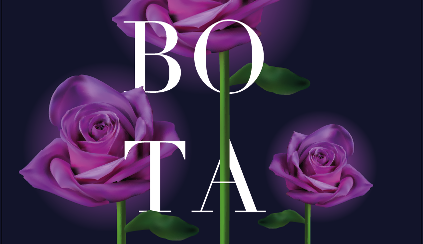
Purple Rose Botany Poster Details
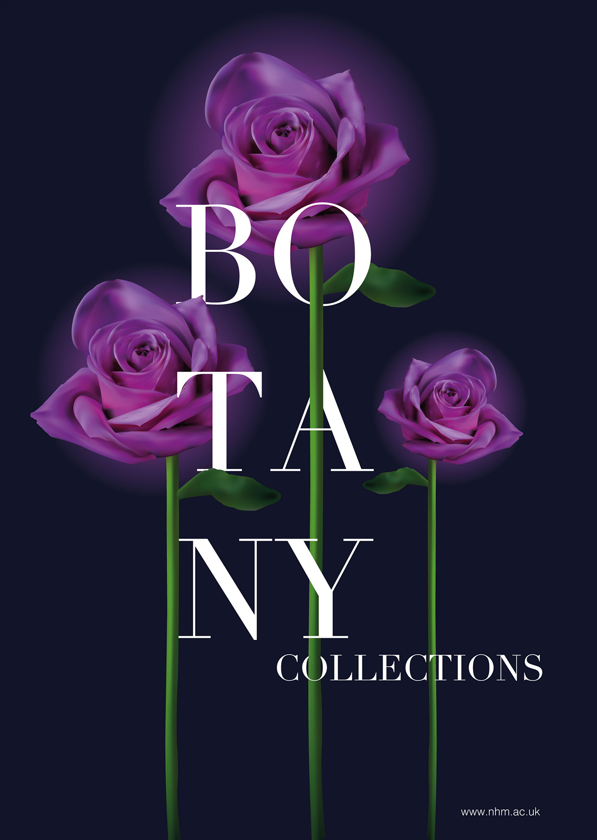
Purple Rose Botany Poster

Orange Dahlia Details

Orange Dahlia Anchor Points

Orange Dahlia Botany Poster Details

Orange Dahlia Botany Poster

Purple Rose and Orange Dahlia Posters


