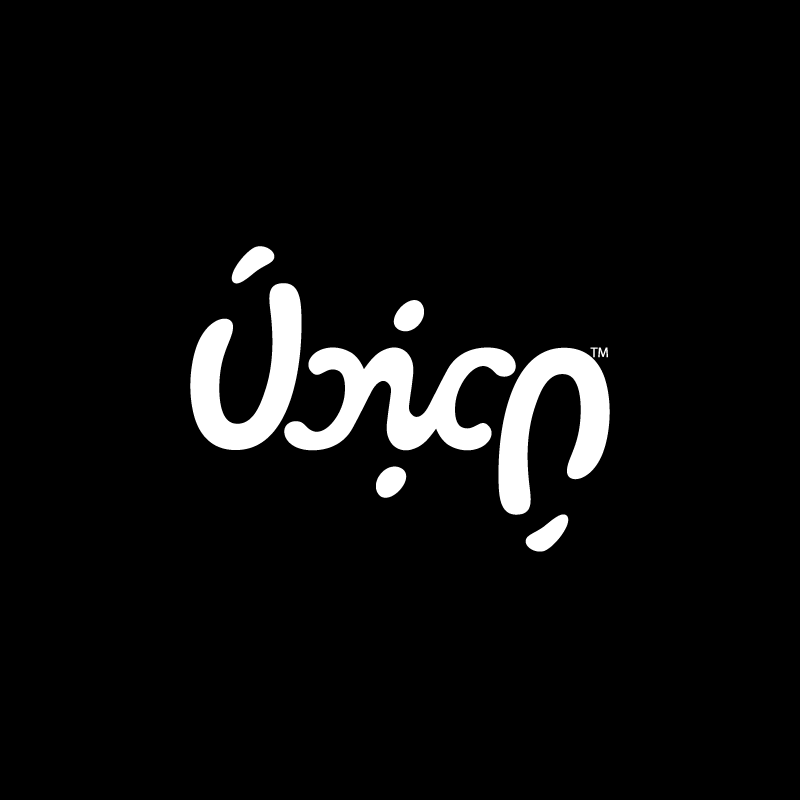
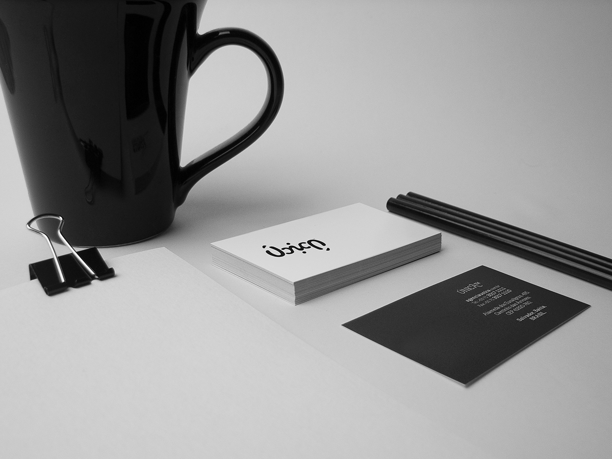
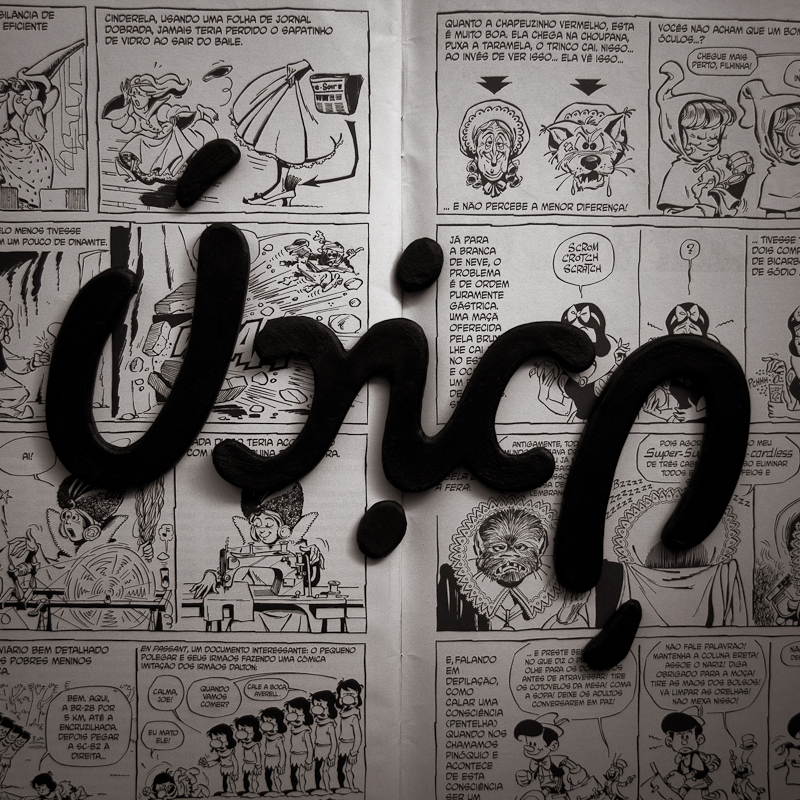
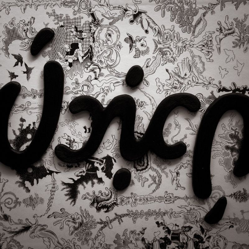
Visual identity developed for Única Agency.
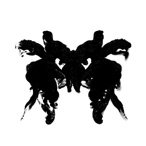
This proposal had as its starting point the concept currently used by the company - People who understand the people -, as well as its association to images used in popular Rorschach test, a technique developed in the early twentieth century by the Swiss psychiatrist Hermann Rorschach, which consists in the interpretation of ink spots arranged in a symmetrical board.
After analyzing the existing referrals, the research directed toward the production of a visual sign that could convey the same theory proposed by Rorschach, where a single image can have an infinite variety of interpretations, believing that each individual has a unique personality. When it comes to a communication office, nothing more coherent and functional than having a logo capable of communicate with any individual.
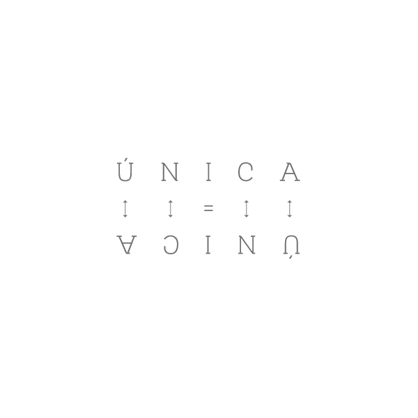
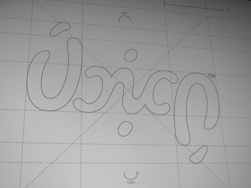
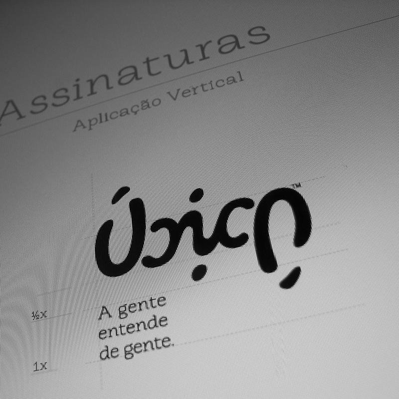
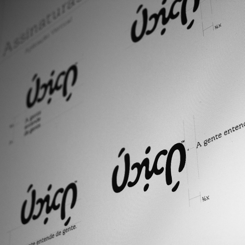
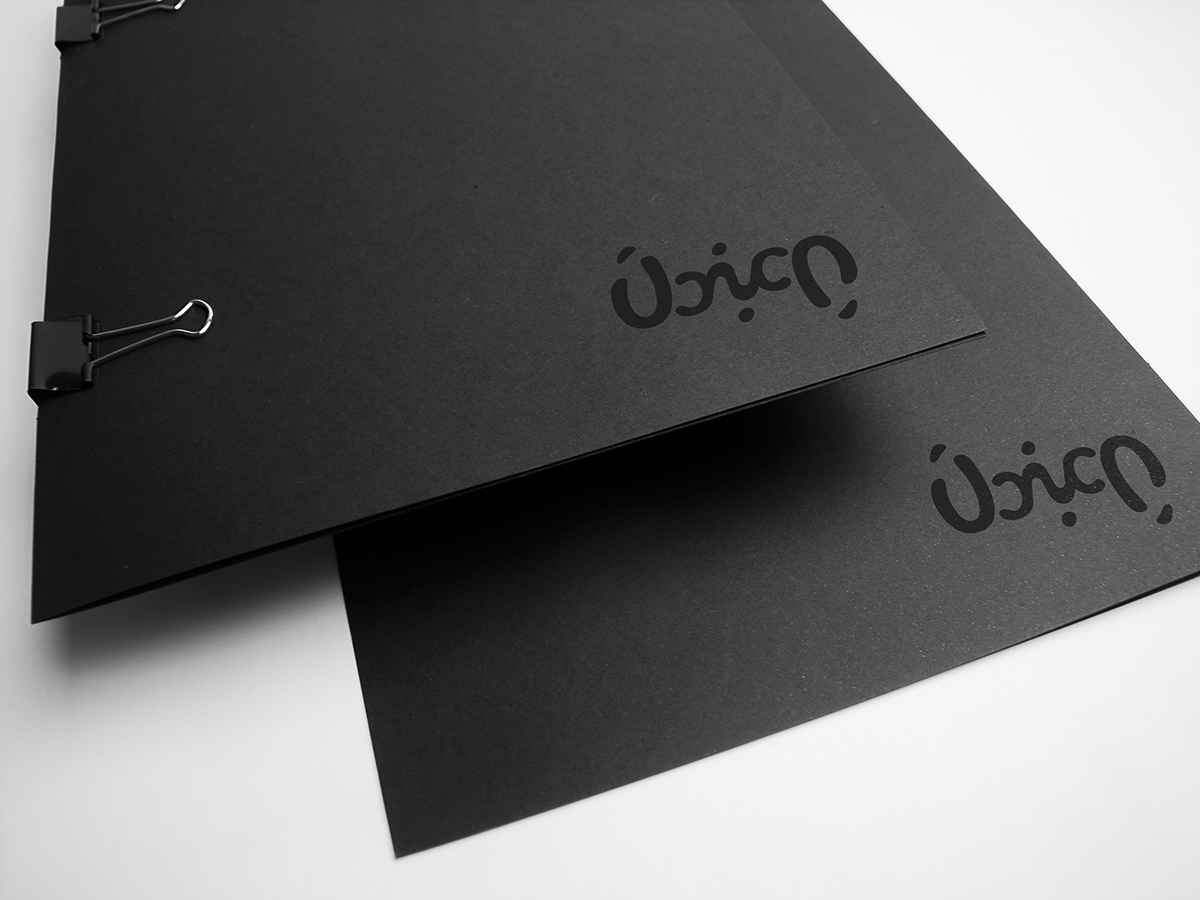
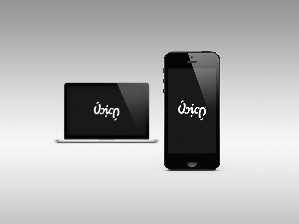
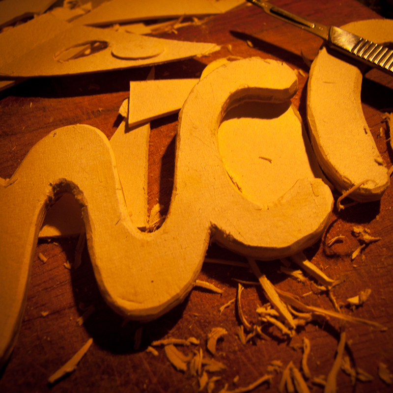
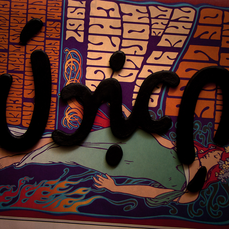
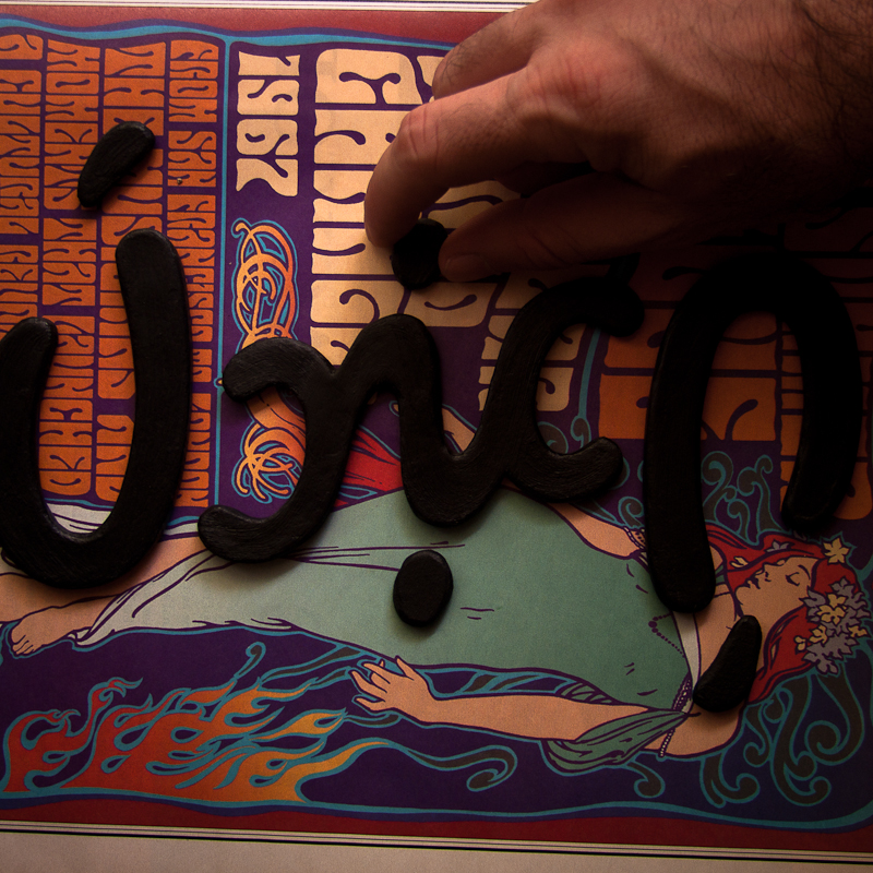
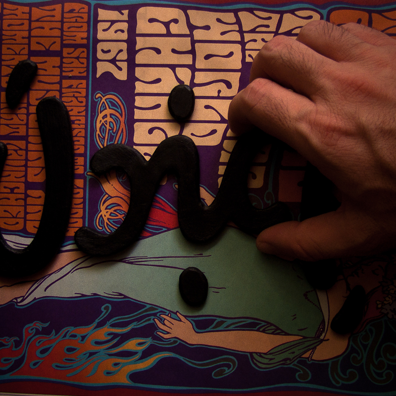
The association of this theory was aided by the fact that the word “Única” (which means “unique” in Portuguese) has five letters, with the 'i' as it central and the 'Ú' and 'A' on extremities. From this perception, it was noted that the company name could become an Ambigram, a legible typesetting even when rotated 180 °. That was another guiding point for the production of this logo.
The final creation was an Ambigram logo of organic and symmetrical shape that conveys the whole concept of constant pace and multiplicity of semiotic interpretations for the production of ideas experienced by the agency.
2012 © Todos os direitos reservados.