Pickup.ru
Corporate identity
Corporate identity
We have completed a comprehensive work for Pickup.ru — one of largest pickup training center in Russia. For the Pickup.ru we have created a system of visual identification, corporate identity and a website. Also, we have developed a creative and graphic design for another project team Pickup.ru — the educational system for girls Womanlove.

The trademark Pickup.ru combines several crusial symbols and metaphors that reflect the relationship between men and women.
Depending on the context the sign can be used in different ways, with preserving its recognition and unambiguous reading.

Various methods of treatment of women was reflected in the business document with clear lacquer.

Manual for training participants also performed in the trademark style — an illustrationon the cover tells about the different levels of relations between the sexes.

The main resource Pickup.ru — is a team of the project. So we have mde a photo session for the project’s trainers.
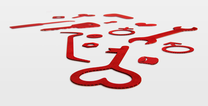
We have prepared special props for the shootings — with the help of laser we have cut out the necessary forms in a cardboard material, and then painted the color of the product in the company.
We have prepared special props for the shootings — with the help of laser we have cut out the necessary forms in a cardboard material, and then painted the color of the product in the company.