


Brief
To create the visual identity and language for the 2015 Leeds College of Art end of year Degree and Foundation show exhibitions.
Background
With an infinite amount of graduating creatives in the UK, this exhibition is focused on how the students of Leeds College of Art
are different from everyone else. Giving an insight into how LCA's graduating students have and will continue to challenge the
norm, creating innovative and eye catching artwork that continues to break the mould.
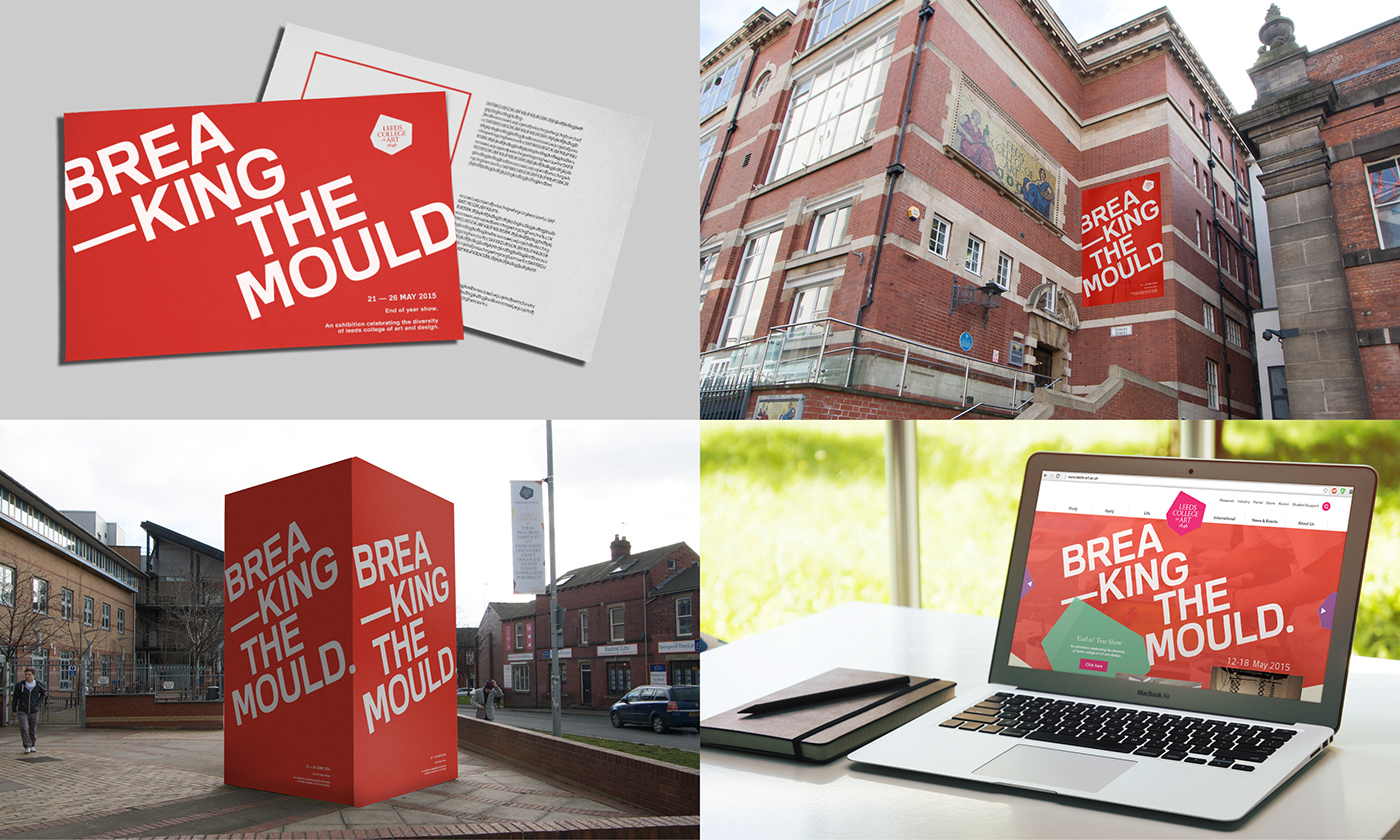
Stage 1 - Initial concept: Breaking The Mould
Breaking the Mould is an exhibition that aims to showcase the final year students from higher and further education.
The term breaking the mould is used to define the ideology of Leeds College of Art students breaking away from convention,
further more highlighting & celebrating each of the students individuality, their unconventional nature to design problems
and their progression as students in the institution.
This concept was then developed into three potential methods of delivery; Flat, Dissected & 3D. Each one of these directions
This concept was then developed into three potential methods of delivery; Flat, Dissected & 3D. Each one of these directions
explores the possibilities of developing the concept in different directions whilst focusing on the key idea of ‘Breaking The Mould.’

Flat
The Flat design concept is influenced by the use of bold typography against a strong colour which creates engaging high impact
visuals that draws attention, in addition to the placement and angle of the type which emphasises the idea that Leeds College of Art
and the students there are different, promoting it’s individuality. The bold type breaking off the spread also relates to this idea of
individuality and further emphasises the idea of 'Breaking The Mould'.
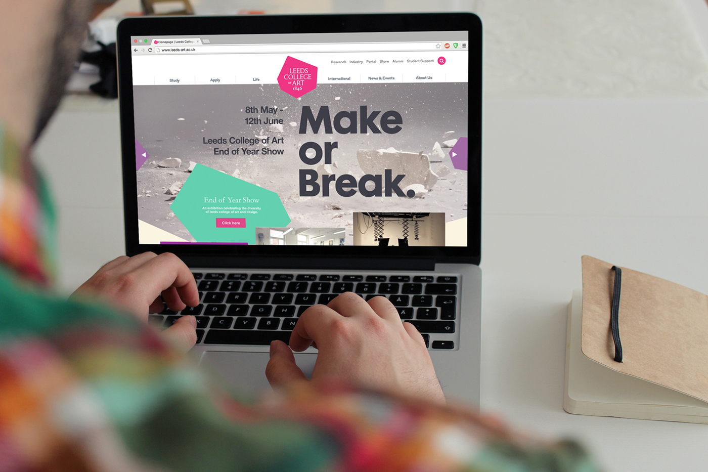
Deliverables
Postcard | Poster | Exterior Signage | Website Imagery
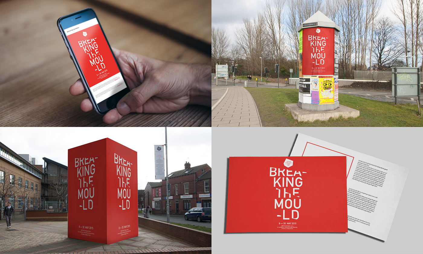
Dissected
The Dissected concept is influenced by cutting the type to create a broken aesthetic that shys away from it’s original form.
The Dissected concept is influenced by cutting the type to create a broken aesthetic that shys away from it’s original form.
Reinforcing the idea that Leeds College of Art and it's students are different, once again promoting it’s individuality. The
dissected type has a tactile nature which relates to the idea of creative courses not only producing work but also how it
changes and refines the student's way of thinking and practice as young creative professionals.
Deliverables
Private View E-Vite | Poster | Exterior Signage | Postcard
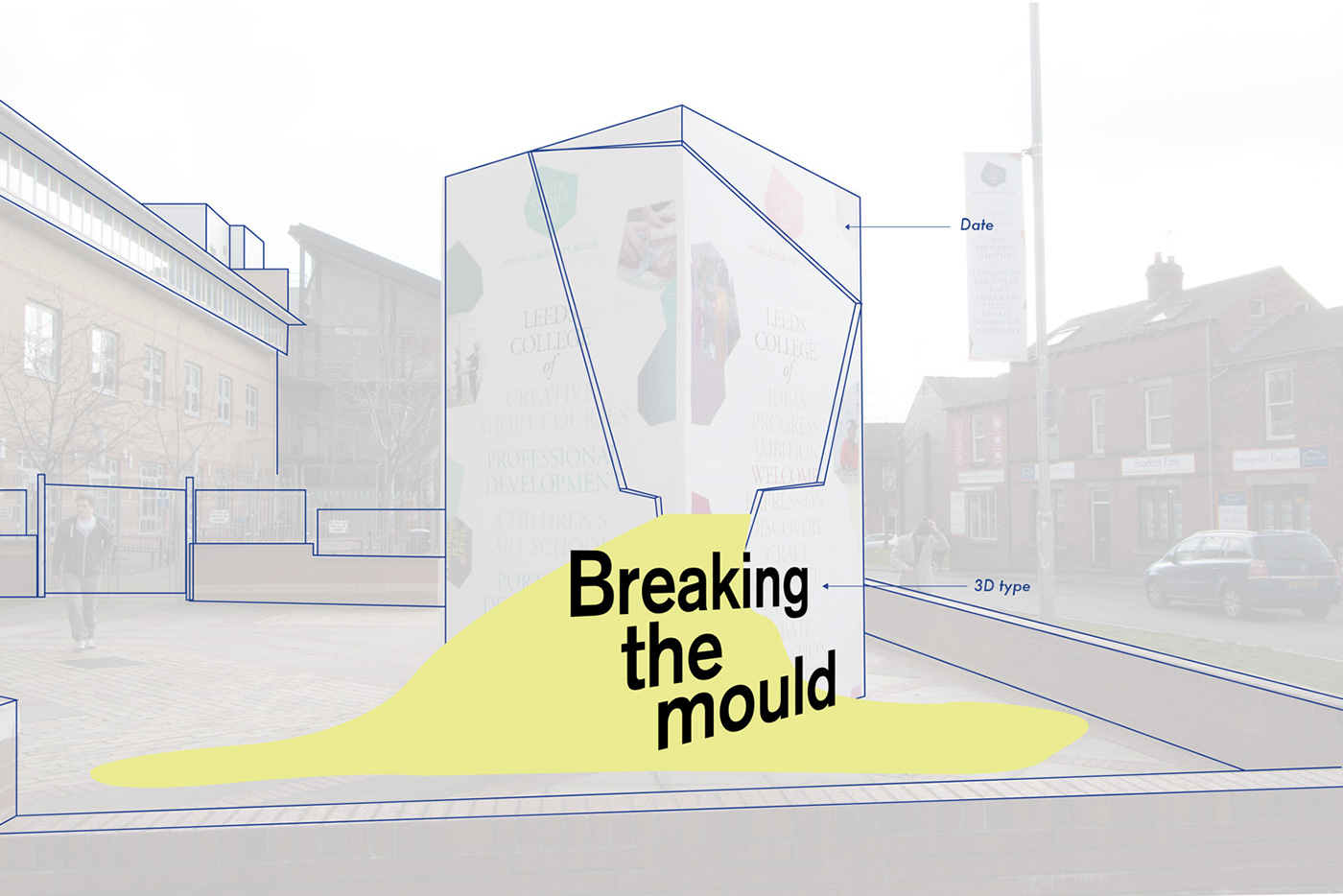
3D
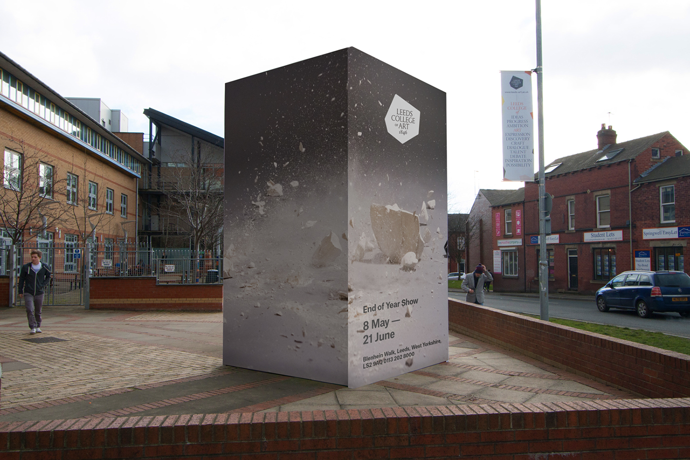
This approach at responding to the brief tackles the challenge of promoting the exhibition through the use of a 3D type installation
that will be photographed and used throughout the campaign, and would for the basis of the other deliverables. The installation
involves using the exterior signage block as 3D shape that is broken and would have content is flowing out of it. The overall colour
of the shape would be white but the content would be full of colour. Spilling out from this would be the name of the exhibition.
This visual representation of ‘Breaking The Mould’ depicts what the college is about, student centred, focused purely on the visual arts
andengaged with the creative and cultural industries. This also demonstrates the different courses at LCA as this idea uses mixed media.
Deliverables
As this was part of the initial pitch, the main deliverable was a mock up of the 3D type installation.
After impressing with the initial pitch we continued to the second stage, which involved meeting with Creative Director Lee from
Sheffield based design studio Peter & Paul to discuss how the initial concept could be developed further. This meeting involved a short
presentation and Q&A session. The feedback consisted of the name's accountablilty and that it left room for criticism, that not all the work
which would presented in the exhibition to be unconventional as stated. Another point being to move beyond digital design and to create
a more reflective approach to the new concept.
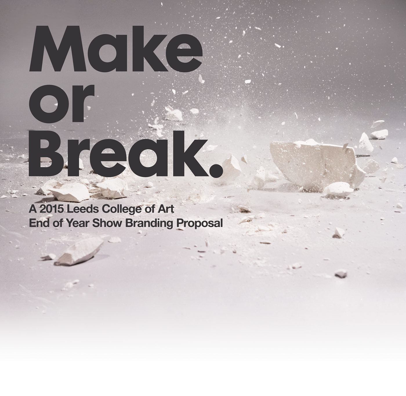
Stage 2 - Second Concept: Make or Break
This change of name is much more suitable, as it suggests what would be currently happening for the students of Leeds College of Art.
Acrylic
Laser cutting the name out into 3mm acrylic allowed for smashing and shattering. This serendipitous approach was one which was
Laser cutting the name out into 3mm acrylic allowed for smashing and shattering. This serendipitous approach was one which was
photographed through-out the various stages to produce the main body of imagery.
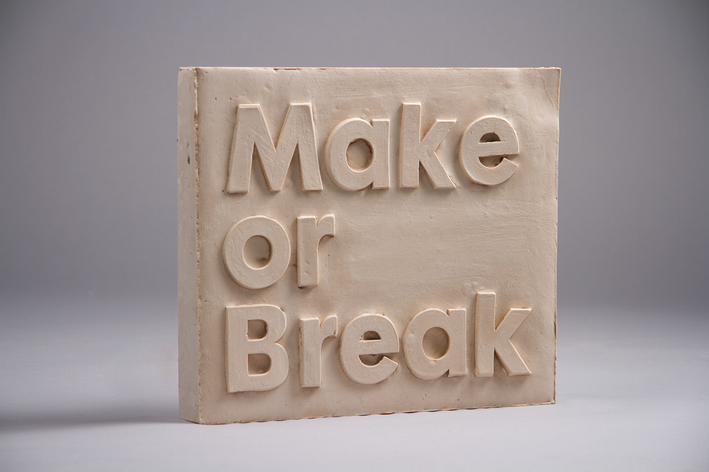
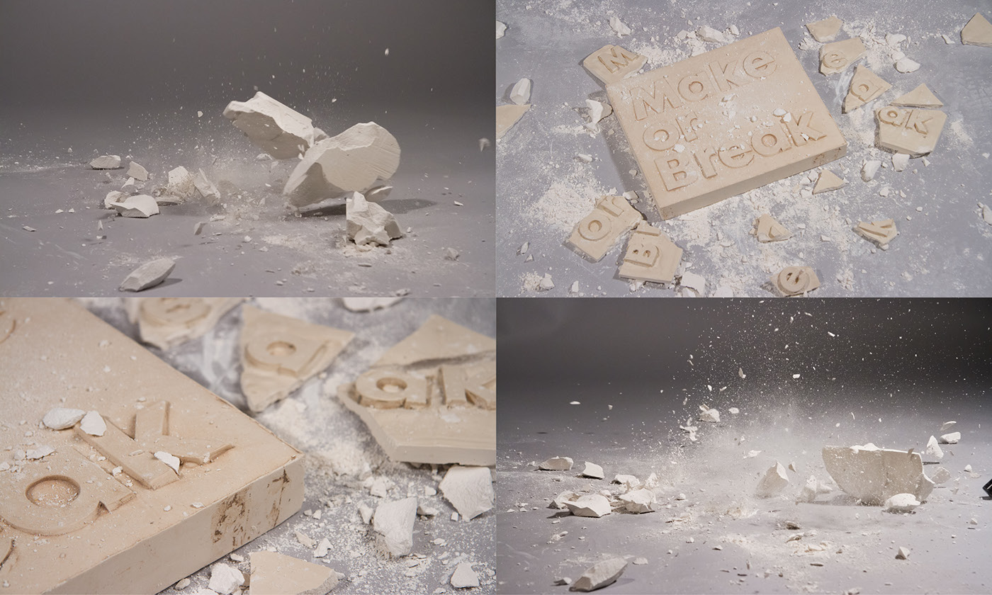
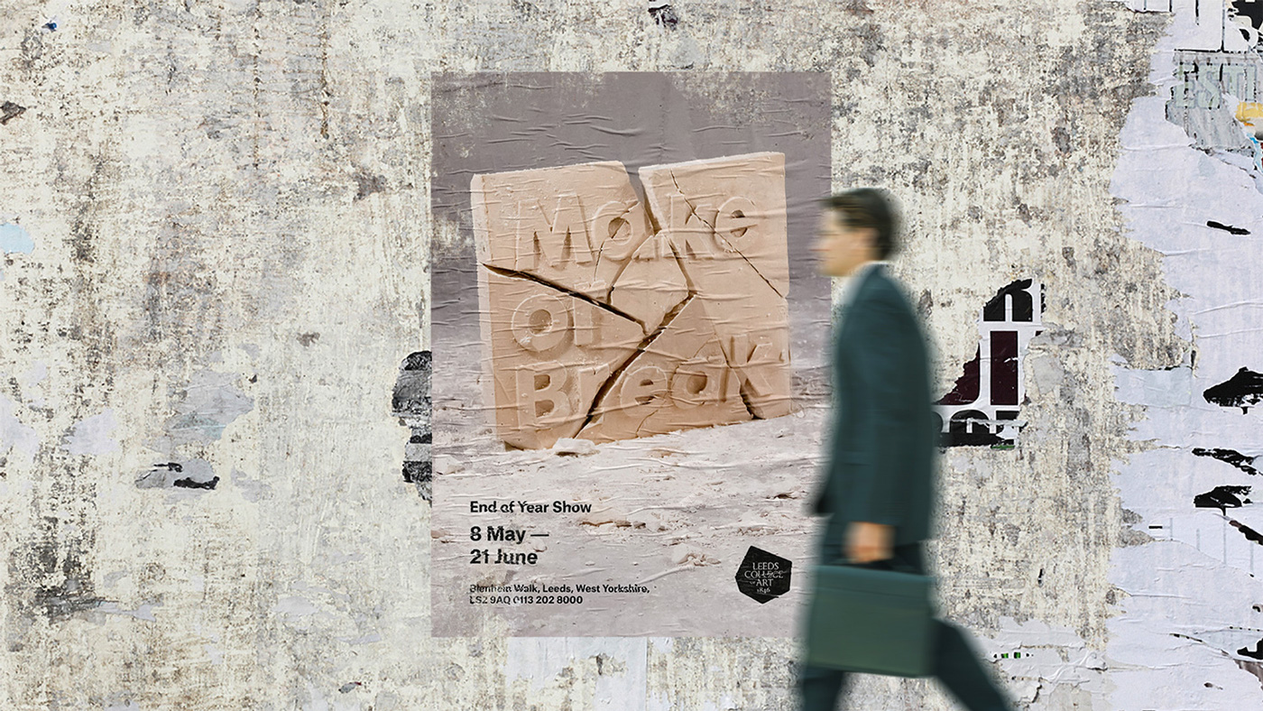
Plaster & Acrylic
Creating plaster casts of the letter forms in the College's sculpture studio allowed for the project to start to showcase LCA's multidisciplinary
facilities. With another serendipitous approach this time with the plaster, applying pressure to it until breaking point. The acrylic was used to
reinforce the type if the plaster was to become too illegible.

Glitch
A digital approach at visualsing the concept of 'Make or Break', using image glitching methods to distort and break up the words,
A digital approach at visualsing the concept of 'Make or Break', using image glitching methods to distort and break up the words,
this gives more possibilites for animation and can also be easily reproduced.

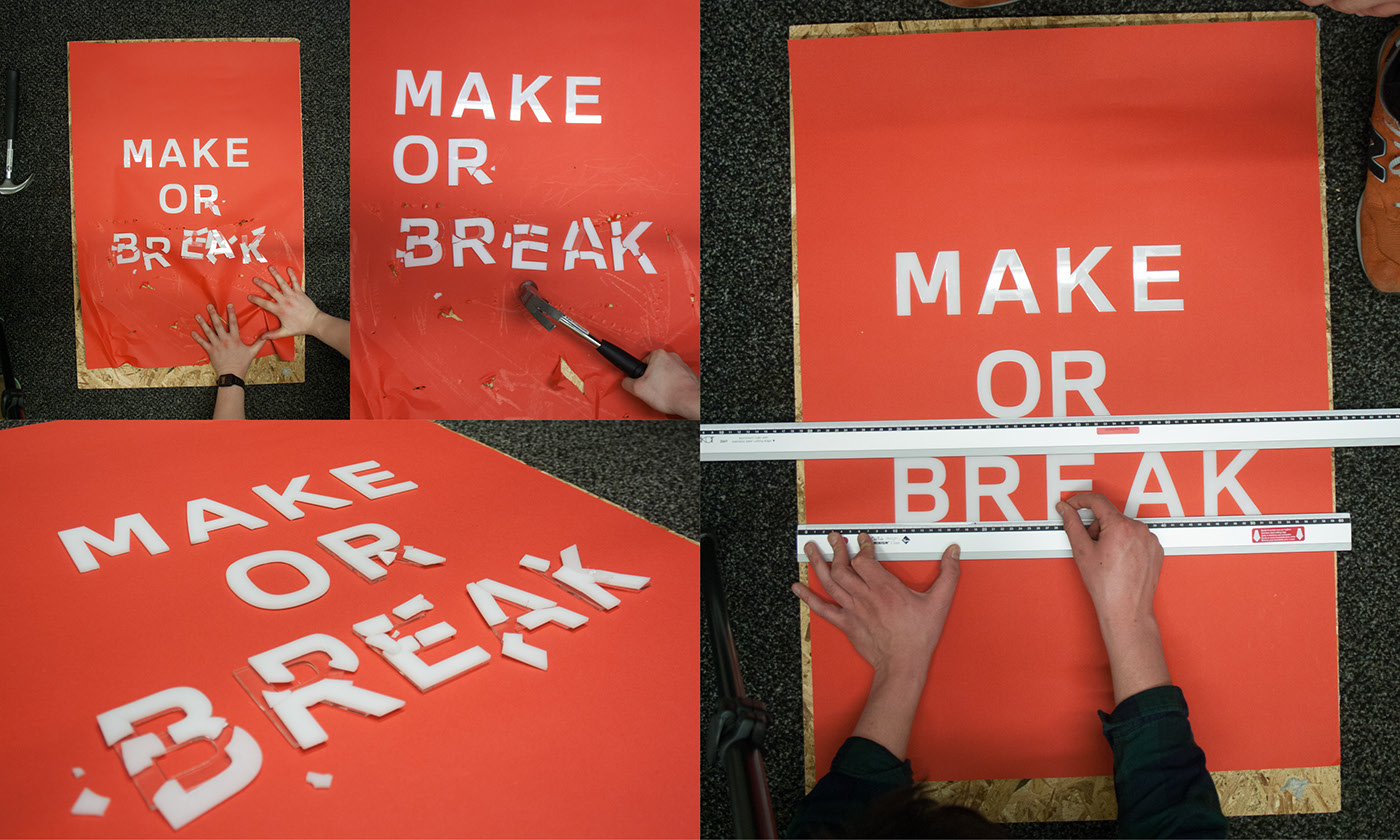
Stage 3 - Final Concept : Plaster Mould
With three approaches to the new name and concept of 'Make or Break', it was assessed that plaster typography had the most visually
striking delivery and could be pushed even further. The previous designs were to focussed soley on the 'Break' aspect and not enough
on the 'Make' which needed to be an element in the final delivery.
For the final concept areas for development have been responded to through hiring a photographer, with the change from individual
For the final concept areas for development have been responded to through hiring a photographer, with the change from individual
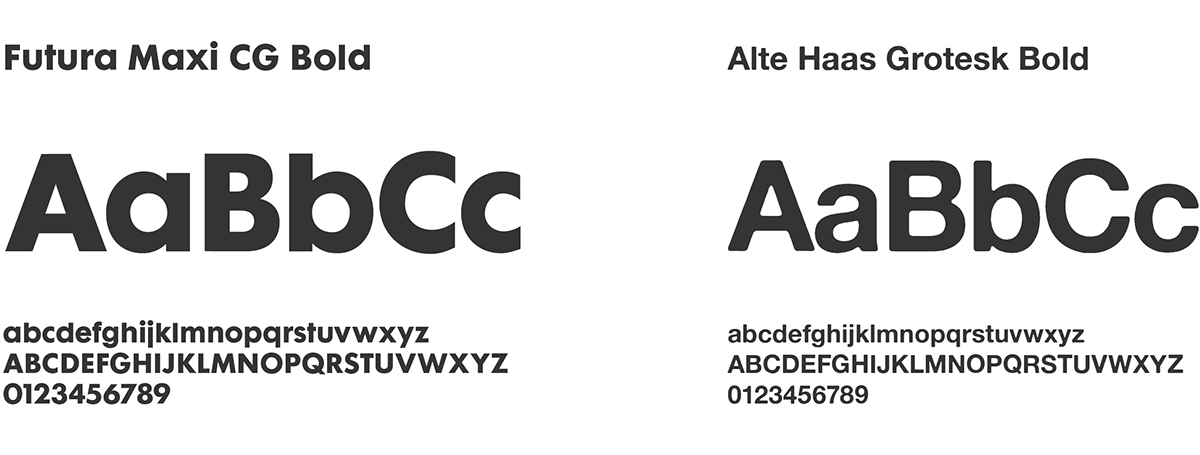
letters to a single block and a change to bolder a typeface created a stronger more simplified identity with less clutter.
Typefaces

Final deliverables
Exterior Signage | Way-Finding | Website Imagery | Poster | Private View E-Vite

Thank You for Viewing
Copyright © 2015
All Rights Reserved


