


Traditional – Modern
Short Publications
Short Publications
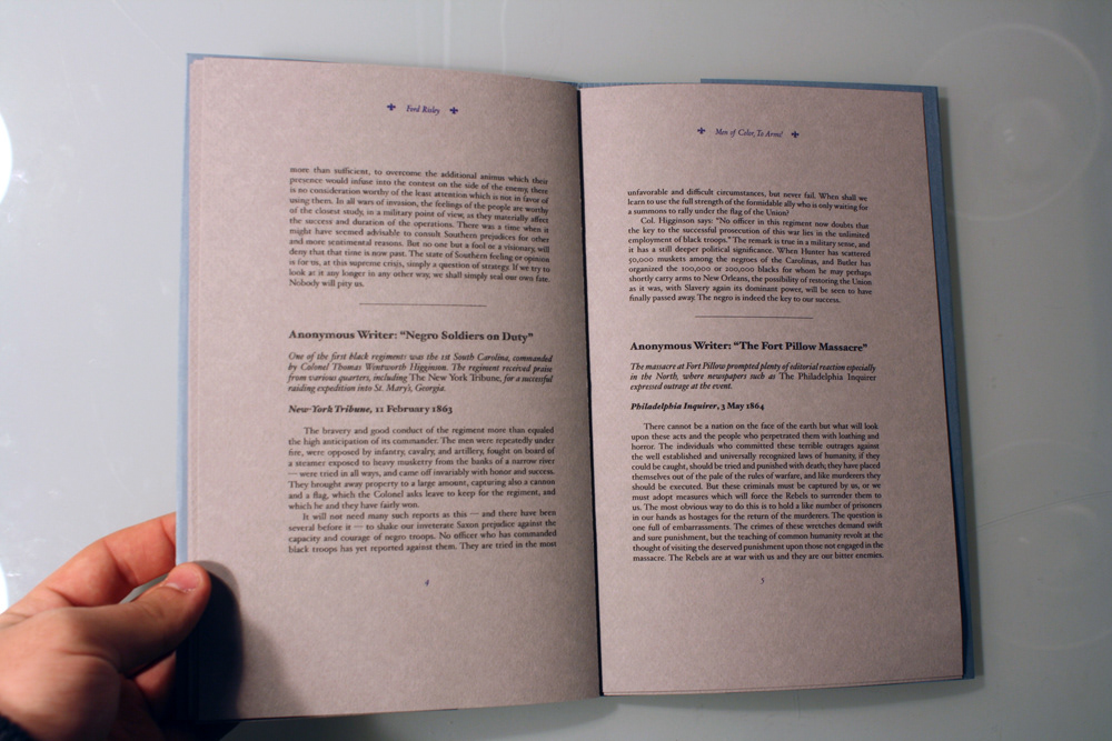
The following three publications were designed with the purpose of creating a contrast between the traditional publication standards of the 19th century with the more modern look of some publications nowadays. I started with a collection of texts on the Pillow Fort Massacre during the Civil War, focusing on the use of tight grid structures, limited use of images(namely fleurons), and typographical patterns. The next book moved to the more modern feel with changing grid structures, color type, and an experimental form of book binding. The file folder was inspired by the nature of both of the texts; I kept the original and combined it with a story from the 90s about the murder of a homosexual member of the Army. Finally, in the third text, the original Civil War text was dropped and the more recent story was combined with a fitting poem in a study on heavy use of full-bleed images, dynamic grid structures, and an emphasis on the contrast between large and small fonts usage.
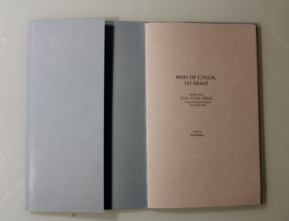
Saddle-stitched with a traditional gate fold on textured card stock. Typefaces used were Trajan Pro and Hoefler Std.


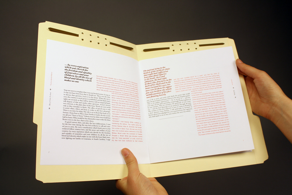
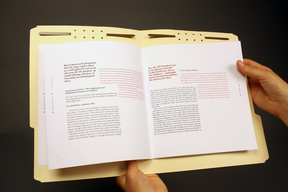
Also saddle-stitched on ivory card stock stitched into a file folder. Typefaces used were Hoefler Std again, but now adding the sharper feel of Grotesque.


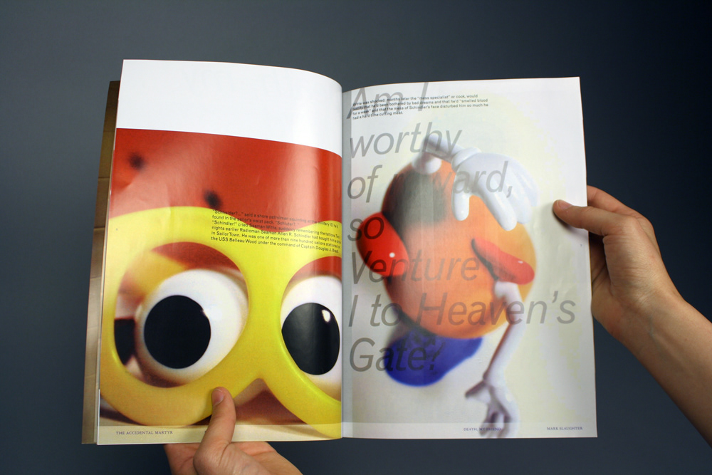

Perfect-bound with a nice glossy paper. Continuing with the use of Grotesque and adding in Franklin Gothic. Images of a deformed Mr. Potato Head were used as a metaphor for the brutal violence depicted throughout the text.


