


Hi Dear,
We are DPIGS and this
is our own branding project.
Since we are founded we’ve been in a journey through our world trying to redefine everyday our own path. so, now we are able to show you a complete re-branding for our studio, developed in a way to reflect our design vision and style.
Good design is unobtrusive
Products fulfilling a purpose are like tools. They are neither decorative objects nor works of art. Their design should therefore be both neutral and restrained, to leave room for the user’s
self-expression. - Dieter Rams, ten principles for good design
Since we are a fairly minimalist studio, there’s nothing much to say about this design,
it should be functional and speaks for itself.
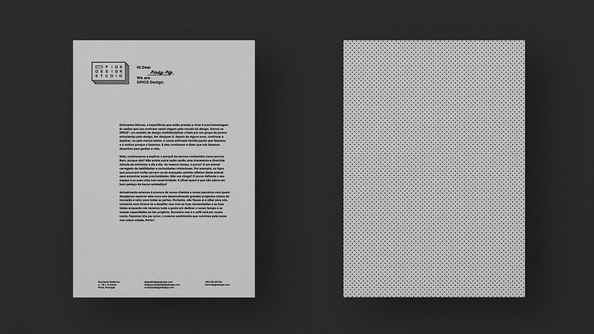
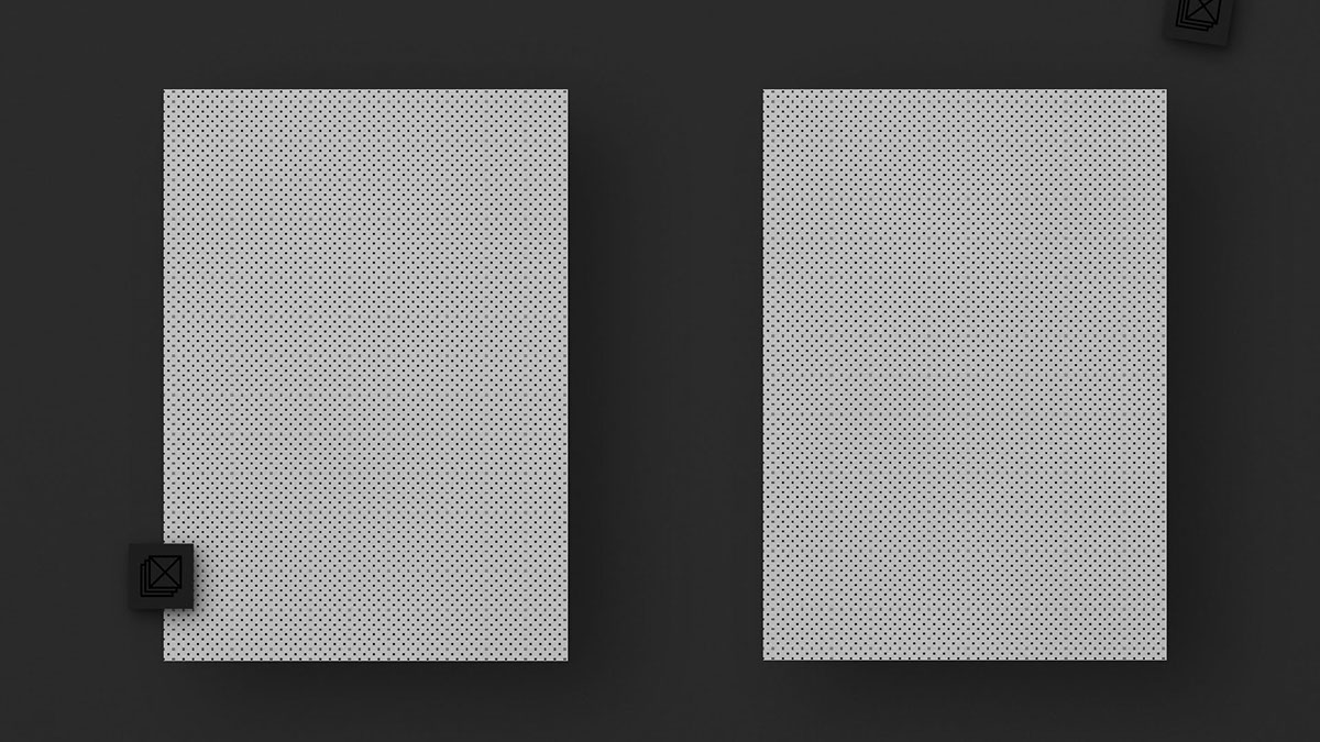
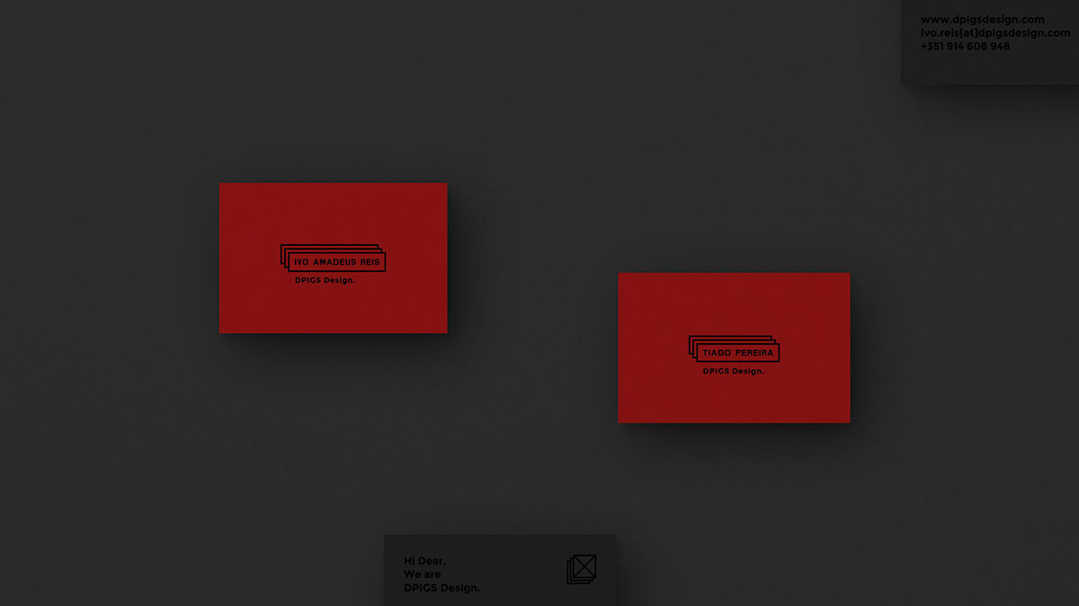
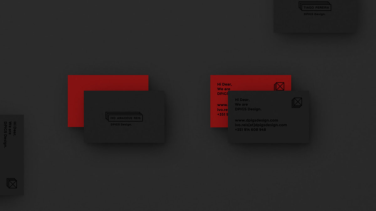
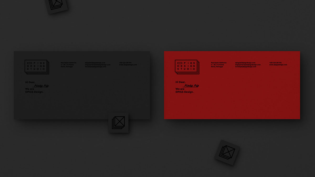
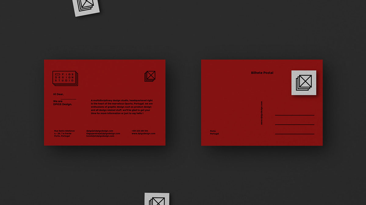
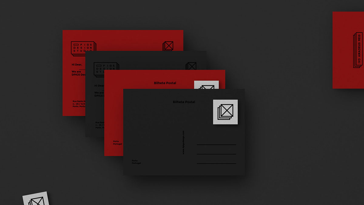
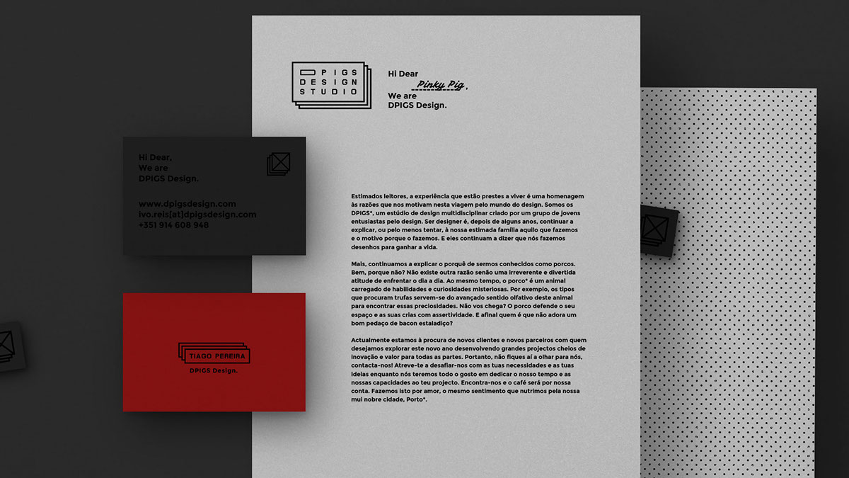
Either physically either digitally we just picked the most neat and unobtrusive color palette
for this project: black characters on red, white and grey surfaces.
Red which is our color;
White for everyday purposes;
Dark grey for stylish and smart approach.
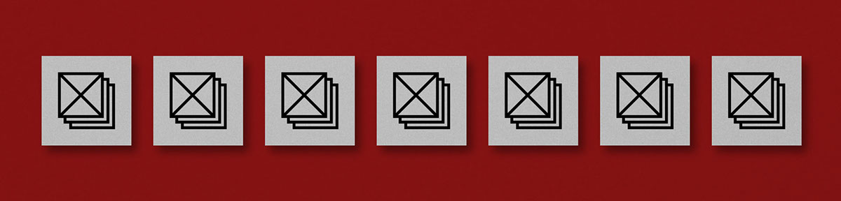
The characters are mostly boxes and type, always in black.
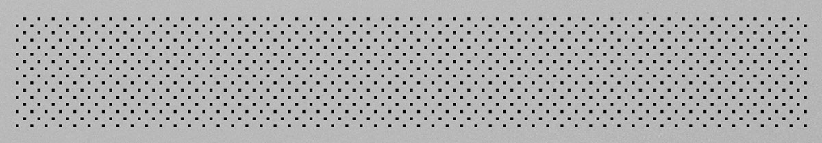
Also, in second plan, there is space to some noisy but neat patterns made with
basic geometric shapes such as triangles, squares, circles and hexagons.


Client: DPIGS Design (Self-initiated) //
Year: 2015 //
Art Direction: Ivo Amadeus Reis //
Design: DPIGS Design //
Year: 2015 //
Art Direction: Ivo Amadeus Reis //
Design: DPIGS Design //


