INTRODUCTION
Modoomed is a wearable fetus monitoring patch. Through the app, mothers can check their babies heartbeats, consult the dedicated doctor, receive customized pregnancy task such as exercise. It is a real product I did when I worked at Extantfuture. We had received over 2 million dollars investment. It is on sale now.
MY ROLE AS UI UX DESIGNER
As the only UI UX designer in company, I designed the visual identity, user interface from scratch. Product manager and I collaborated on product design and user experience design.
NOW ENJOY THE FINAL UI DESIGN FIRST
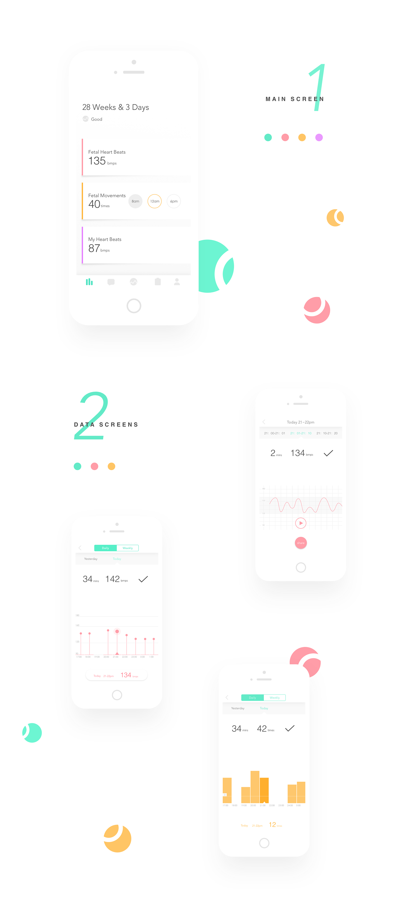
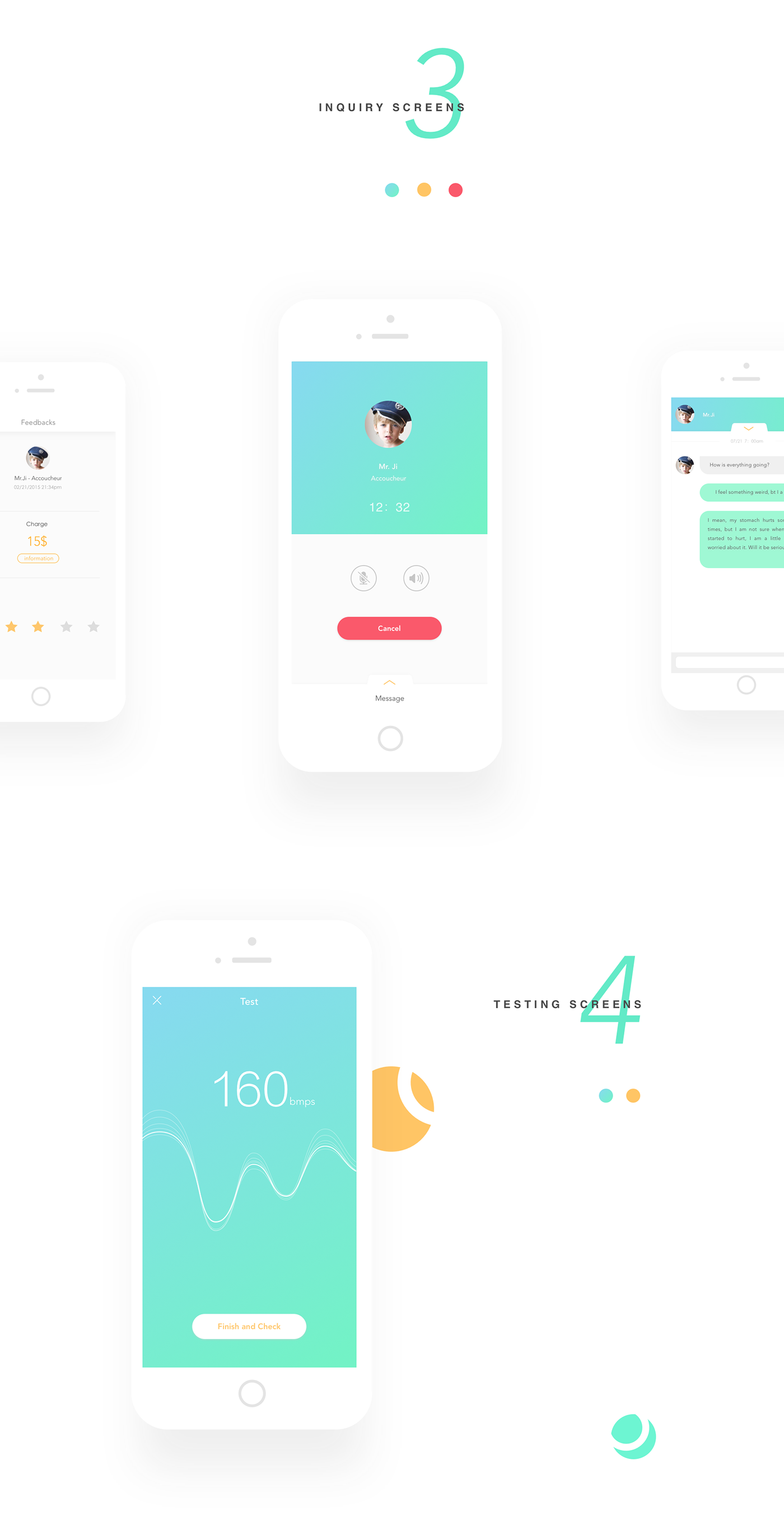
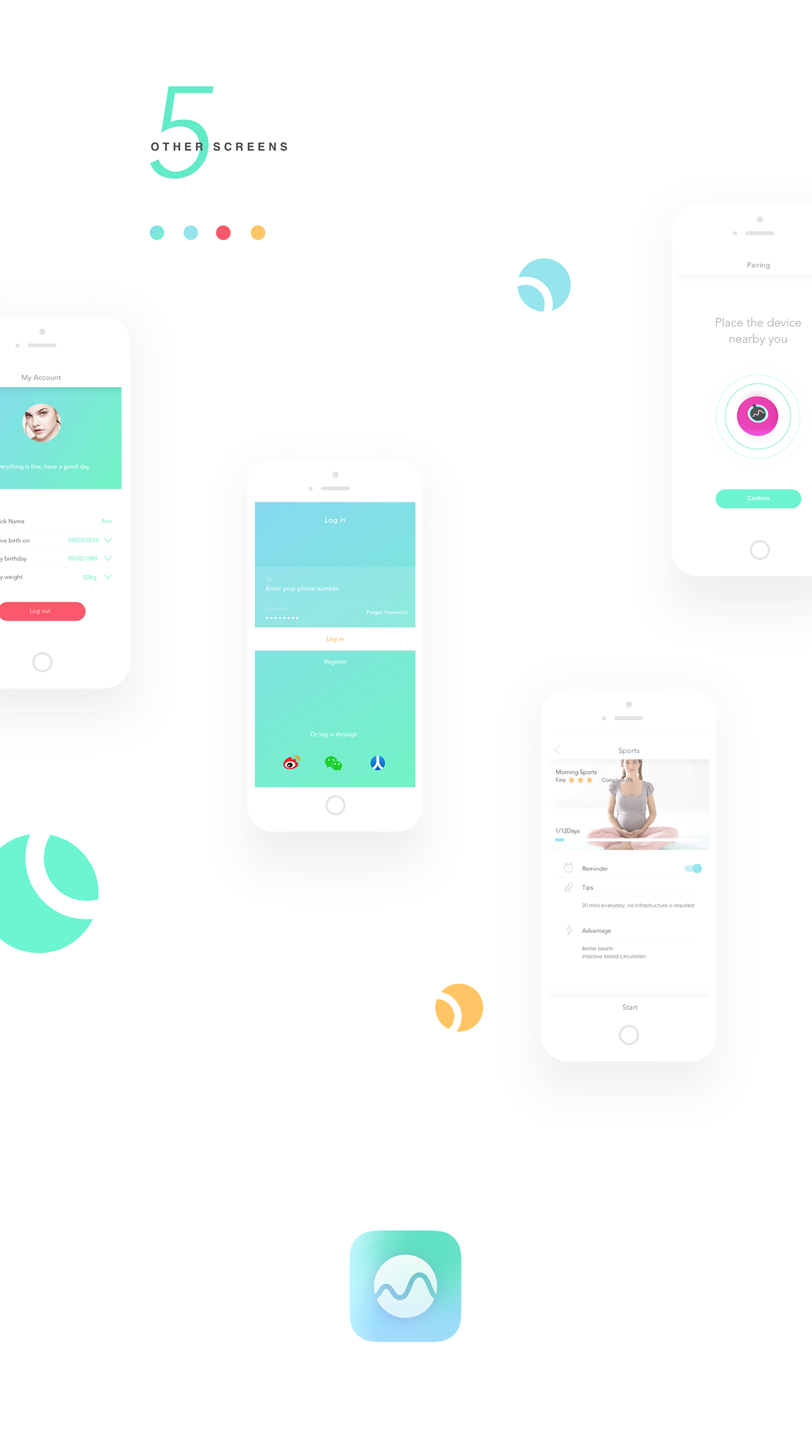
Please take a glimpse of the final user interface design shown below, then you can get a idea how the interfaces serve the 5 main functions. The functions include showing the fetal heartbeats fetal movements on main screen, showing the history data on data screen, inquiring doctor through inquiry screen, test the fetal heartbeats through test screen.
HERE IS THE STORY ABOUT UI UX DESIGN PROCESS
The story includes "visual identity design", "challenge in UI UX design", "hand over my work".
STORY 1 - VISUAL IDENTITY DESIGN
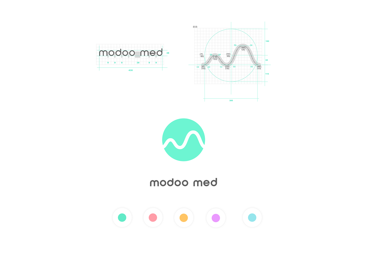
After several rounds of brainstorming, Product manager, CEO, and I finally decided on the key words which could represent Modoomed this product. They were friendly, safe, professional. Usually, to achieve "friendly", designers may choose bright color and organic shapes. But it could conflict with the word "professional". Consequently, I decided to use tiffany green as the main color and also left a lot of white space so that the color combination could look like professional and safe. To achieve friendly, I used curved shape negative space in logo but kept the round outline so that it's not over active.
STORY 2 - 4 MAIN CHALLENGES IN UI UX DESIGN
After CEO decided the main features of the application, each stakeholder expressed their own requirement to the features and design, I had to consider those constraints and maximize the user experience in design.
1. Since there were many features - data history, test using the hardware, doctor inquiry, task, registeration, hardware paring - included in this APP, the total number of interfaces was over 80. It was hard to comb the logic and relations among pages.
2. As the only one iOS developer, he had to finish the development work in 2 months. It meant I had less time to design.To reduce the developer’s burden, I should maximize the reusable components, and carefully design the layout so that iPhone4, iPhone iPhone6 could share one measurement.
3. There were many competitors, I have to distinguish modoomed from the competitors.
4. Investors required the entrances for doctor service and task service on home screen. It might weaken the data feature.
STORY 3 - CONQUER CHALLENGE 1 - FEATURE COMPLEXITY
To conquer the feature complexity issue for UX design, I and product manager worked on the high fidelity wireframe together. Since there are many features inside this application, we should consider all possible situations the user may face such as "no wifi", "no data", "device is out of battery", "emergency health issue - irregular baby heartbeat". Only by thoughtfully thinking through all possibilities, can we optimize the user experience. And then to improve the user experience design better, we conducted some user test. However, it turned out the hardware still had some technical problem such as could not detect the baby's heartbeat if the pregnant woman was overweight. Further user test was definitely necessary.
To conquer the feature complexity issue for UI design, I made following rules for user interface design guide. The official design guide documentation could not be shown here due to the privacy issue.
5 kinds of data - fetal movement, baby heartbeats, mother heartbeats, sleep quality, sport - would be presented on the application. User might feel hard to differentiate the data type. So I assigned each type of data a unique color.
Clickable areas had different levels of functions, in other words, there's a hierarchy of the inputs. some buttons lead the user to another page, some buttons do not. To help the user understand the hierarchy of inputs better, I borrowed some goodness of material design. Higher level buttons had shadows, lower level button did not.
Since a lot of information would be shown on the interface, I adopted minimal and flat design in data visualization and some visual elements. To harmonize the material design and flat design, I carefully assigned the ratio of those two design methods. Usually, top and bottom parts would adapt material design since they often served high level function.
STORY 4 - CONQUER CHALLENGE 2 - UI DELIEVERY
Usually, the screens for same feature could share some components, to reduce the developer’s burden, I tried my best to adapt similar layout for each screen and used color to make a distinction between different features. Also, this method achieved the design consistency. Below is part of the images I sent to the developer. The left side of below image pointed out the reusable components for data history feature.
Moreover, I used relative layout measurement method so that the measurement could suit for iPhone4, iPhone5,iPhone6,iPhone6 Plus. I sent the developer a final design of iPhone4 version in case he might messed up the layout on iPhone 4.
STORY 5 - HAND OVER MY WORK
I had to leave my job since I would go University of Washington learn Human Computer Interaction. To hand over my work better, I carefully set and named the folders. Readme texts were included in all sub folders, telling the new designer what content the folder had. And all files are named by purpose plus date. Moreover, I wrote down all my thoughts about our design in a file, and the collaboration methods and design process I did in another file.The new designer told me what I did helped her a lot to understand the design, take over the job and infuse into the team.


