
My Process for Designing Logos...
Logos are the face of a brand or company, and because of that it is very important that they communicate clearly what that company is all about. As a student I have had many opportunities to come up with company ideas and then logos for those companies. I have also more recently had the opportunity to design logos for some start-up and exsisting companies, and the experience I have had with that has helped me add a greater depth of refinement to my logo creative process. I've learned valuable skills about research, and getting to know the company in order to come up with a design that truly represents them. I've learned that it is rare to get it just right the first time, and that there is always room for improvement. Here is a walk through of my process as far as I have developed it...
First
I make sure that I have a clear understanding of the clients needs and the scope of the project. I ask a lot of questions and try and start getting a feel for the company as I gather the parameters of the logo project. Usually afterward I conduct my own visual audit of the company to see what sort of branding they already have in place, and what the general mood of the company is.
Second
I brainstorm and sketch a lot of ideas. Then I narrow them down to the best concepts and start refining some of the best ideas. As I refine more and more concepts get left behind and the strongest ideas start to show through. I focus on refining and eliminating untill I only have a few concepts to choose between.


Third
I start creating digital versions of the logos and playing with typography and spacing. At this point I am refining only 2-3 concepts and experimenting with the aspects of the concept to see which one is the strongest.
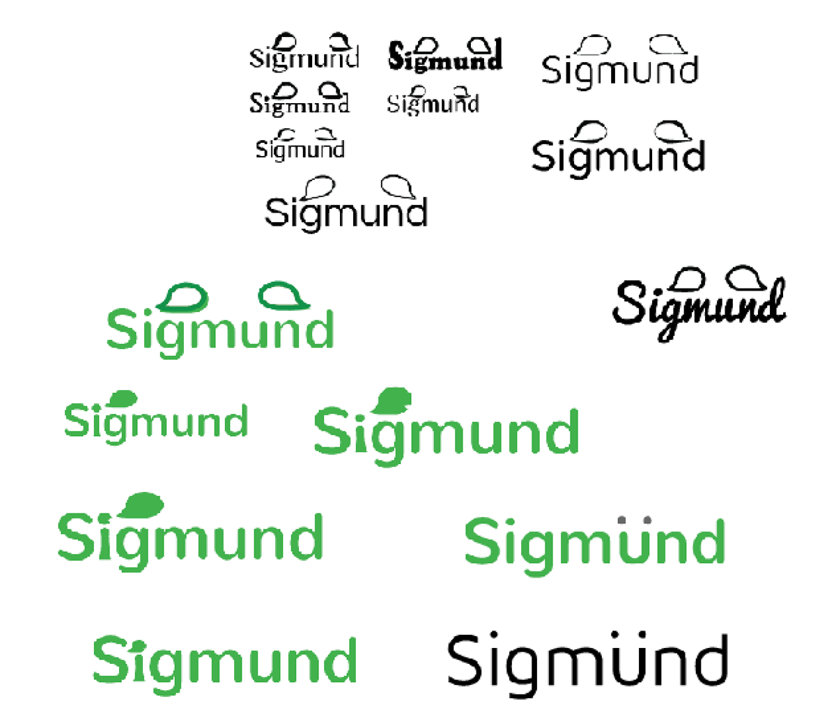

Fourth
I pick the strongest concept and work on refining it from there. I play with the visual aspects and finalyze color choices. Then I work on developing some visual style guidelines for how the logo can be used. I experiment with patterns and sizes to make sure the logo communicates well in different settings. Then I finalyze and present my work.


Here are some examples of other logos I have created...
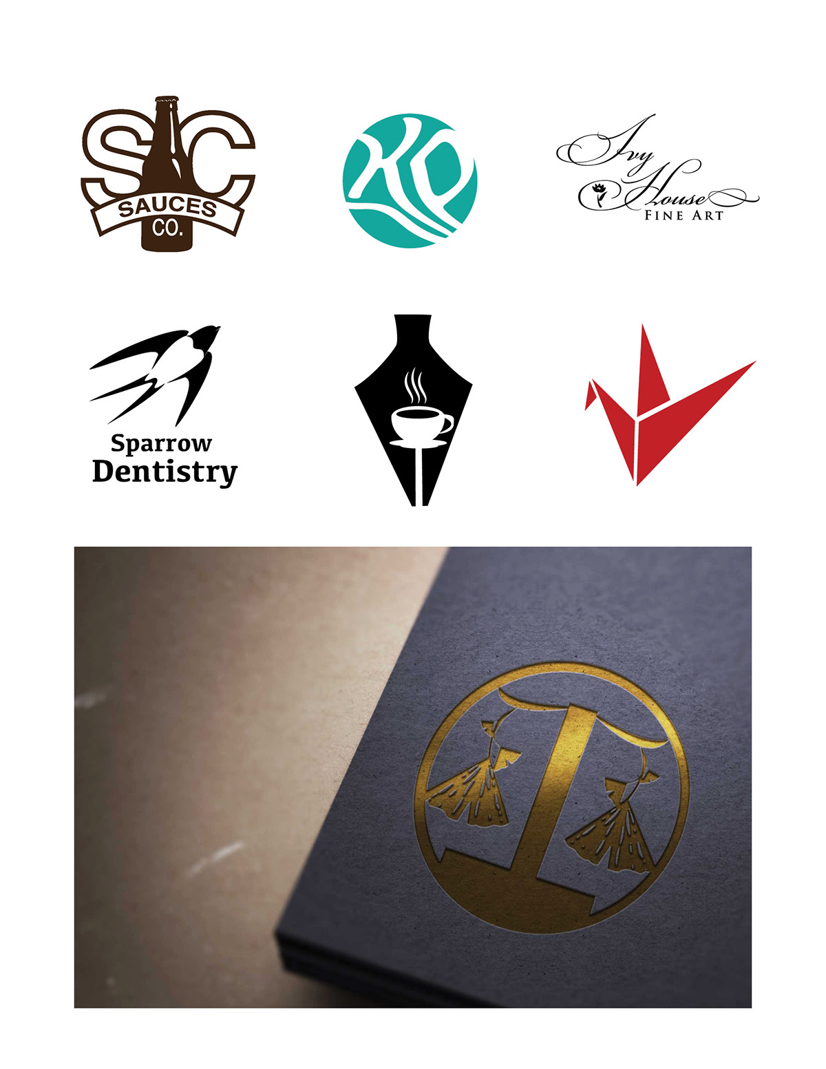
Ginko Law Firm- The challenge was to make a logo that showed the company symbol, a gingko leaf, and the purpose of the firm, which is practicing law. So after a lot of brainstorming I decided to combine the shape of the leaves with a balanced scale. It took a lot of adjusting to get it to look just right but eventually it got there.


