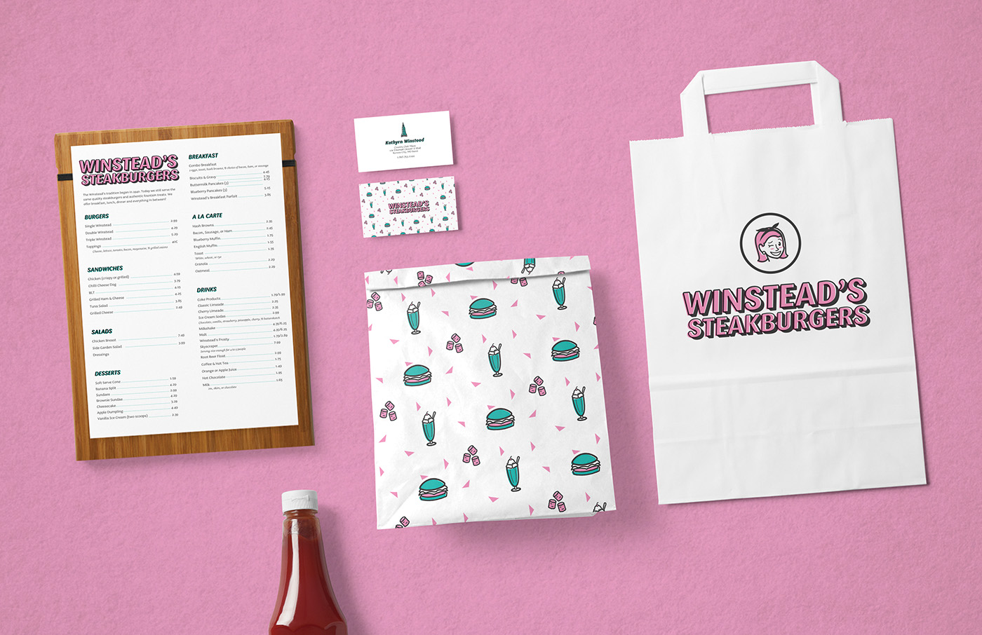
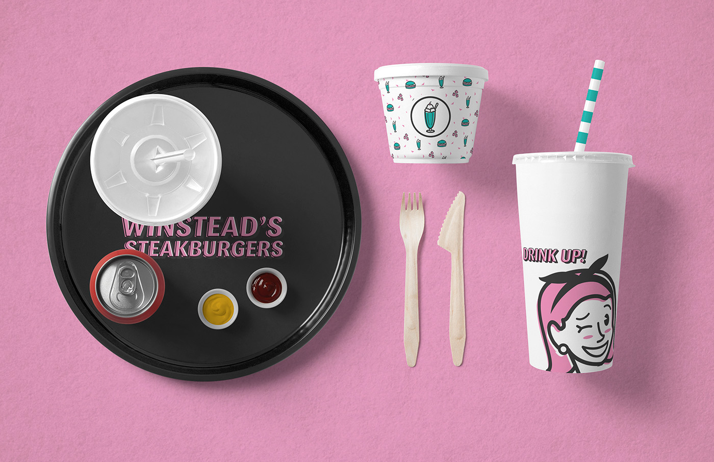
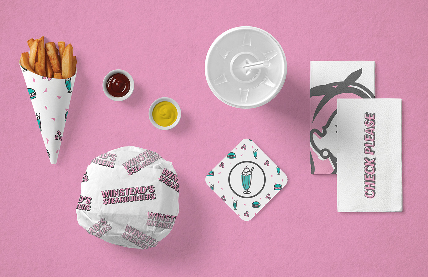
Winstead’s is an iconic restaurant housed in Kansas City. As a local chain, Winstead’s continues to be popular among locals for its famous steak burgers and retro diner environment. Winstead’s aesthetic feel is already established, using their iconic neon blue and pink color palette. Although there is use of fun retro signage and interior choices, Winstead’s current branding leaves a lot to be desired. Mismatching typefaces, uses of signage, and logos leaves the diner with a disconnected system.
The rebranding keeps the retro vibe and classic color palette while also giving Winstead’s a modern and approachable overhaul. Simulated overset printing gives the modern illustrations an old fashion style inspired by traditional printing methods. The brand’s female character was inspired by Kathryn Winstead, the founder of the original Winstead’s in 1936. Winstead’s is so iconic to Kansas City, that creating a versatile branding system was more than necessary. Each element of the branding is easily identifiable with Winstead’s specifically, creating an interchangeable system. Within the restaurant the logo is removed from all collateral, instead utilizing other graphic elements.


