

The brief
Collect data of your choosing for one week and throw it all in the mix. Combine your information and experiment with it so that you end up with a visually appealing infographic. Use at least sixteen different types of data. The infographic is to have unique graphic style and display a balanced composition. The visual elements used in the infographic must be related to the main theme of the data. Usage of text is allowed but limited. Words should be integrated in the composition and the typography should support the contents of the infographic.
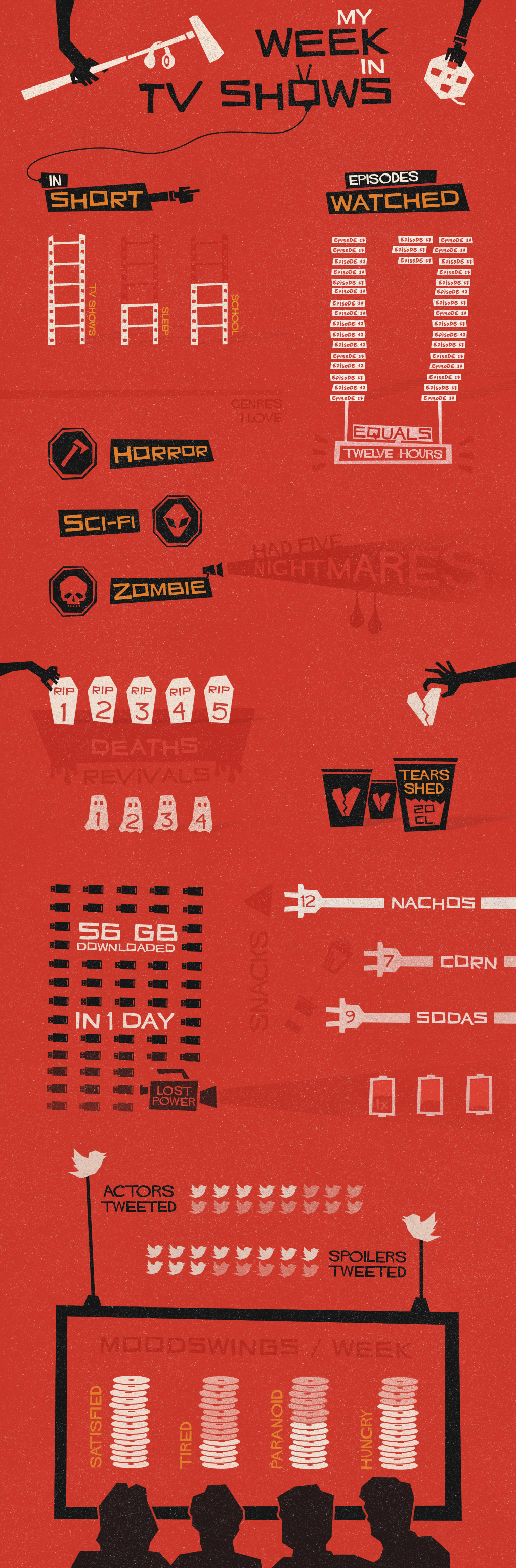
As I watch mostly horror and sci-fi, I decided to immerse myself in the world of Saul Bass who has a distinct graphic style.
The data
1. Overview.
My week: 30% school, 60% series, 10% sleep.
My week: 30% school, 60% series, 10% sleep.
2. Number of episodes watched.
17 episodes.
17 episodes.
3. Hours spent watching shows.
12 hours.
3. Genres watched.
Horror, Sci-fi, Zombie.
4. Number of nightmares.
5 nightmares.
5. Amount of tears shed.
20 cl.
6. Number of characters died.
7 characters died.
7. Number of characters that came back to life.
3 characters came back to life.
12 hours.
3. Genres watched.
Horror, Sci-fi, Zombie.
4. Number of nightmares.
5 nightmares.
5. Amount of tears shed.
20 cl.
6. Number of characters died.
7 characters died.
7. Number of characters that came back to life.
3 characters came back to life.
8. Amount of GB downloaded (legally, of course).
56 GB.
9. Snacks eaten.
Nachos, popcorn, sodas.
Nachos, popcorn, sodas.
10. Number of times battery died.
Once.
Once.
11. Number of actors I tweeted.
5 actors tweeted.
5 actors tweeted.
12. Number of spoilers I tweeted.
11 spoilers tweeted.
11 spoilers tweeted.
13. Exhaustion due to watching TV shows.
20%.
20%.
14. Number of times I was hungry.
60% of the time.
15. Number of times TV shows made me paranoid.
40% of the time.
16. Level of satisfaction.
100%.


