YCN SallyBeauty (2015 ENTRY)
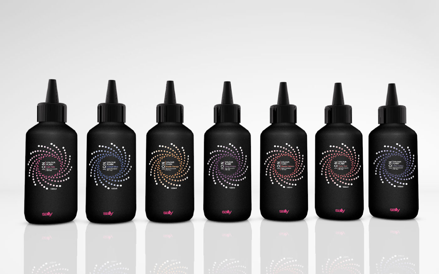
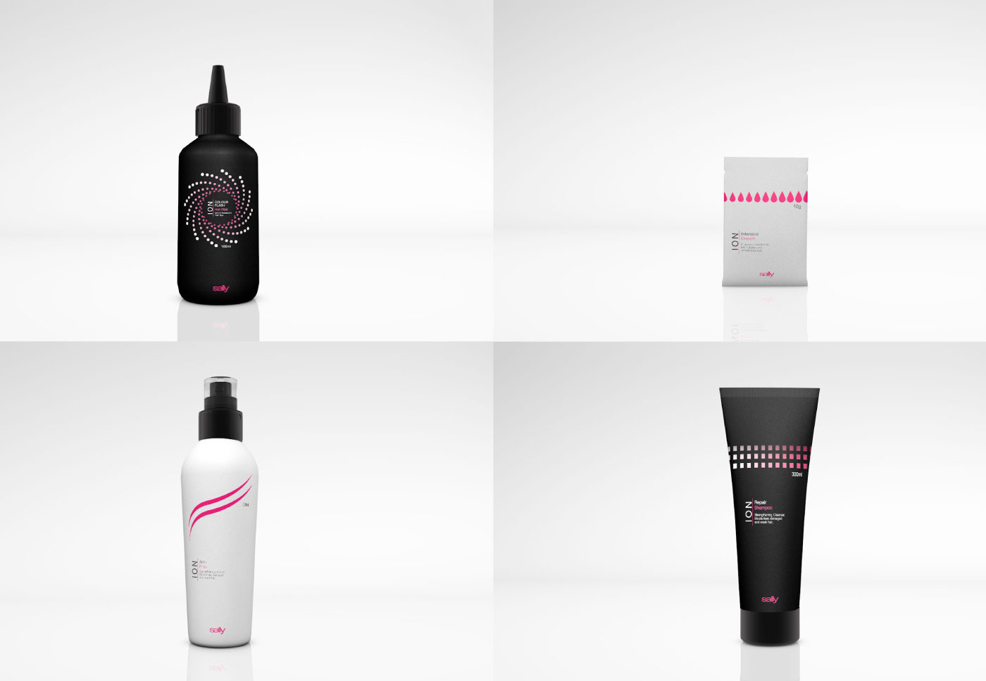
The brief was to redesign, repackage and relaunch the Ion range to both professional and retail audiences. The Ion range is a series of hair colouring and styling products which is marketed as 'affordable quality' and although most of the range had a degree of consistency, the packaging for the Ion Colour Flash range did not fit with the rest of the line-up. The packaging needed to be enticing and show credibility whilst appealing to it's target audience.
I designed the labels to have a consistent look, the pink gradation symbolized the increase in benefits and results from using the products and gives a feminine look whilst the black and white adds a clean, sophisticated feeling which is enticing for hair care products. The Colour Flash bottles had different colour gradations in order for customers to get an idea of the dye colour, the consistency was created in the 'flash', the typography layout and bottle colour.
The bottle designs where created to be easy to use, a matte texture would be easier to hold with wet hands and a nozzle on the Colour Flash hair dye bottles would help to get the roots as opposed to the previous flip cap bottle.