Since opening its first revolving sushi restaurant in Taiwan in 1996, Zensen Sushi express has evolved into a global franchise operating more than 300 restaurants and take out shops in Taiwan, mainland China, Hong Kong, Singapore and the United States. All the restaurants are based on the same "one price fits all" concept, where each plate coming directly from the chef via conveyor belt is charged at the same price, no matter what is served.
The “爭鮮” (Zensen) part of the brand's name is a play on words meaning “vying for freshness”, which sounds similar to the phrase "truly fresh". It emphasizes the company's efforts to providing fresh, healthy and delicious food by sourcing ingredients from countries like Norway, Thailand and Japan.
The “爭鮮” (Zensen) part of the brand's name is a play on words meaning “vying for freshness”, which sounds similar to the phrase "truly fresh". It emphasizes the company's efforts to providing fresh, healthy and delicious food by sourcing ingredients from countries like Norway, Thailand and Japan.
In late 2014, the company has announced a global logo contest as an attempt to reposition itself on the market as a family fast food chain that serves healthy meals to a wider demographic.
We noticed that the company was struggling to eastablish its own, unique brand identity: presence of a variety of colors and typefaces; different graphical treatments of the logo depending on the market and occassion; unclear iconography; completely different websites for every market; poor social media presence; cheerfull characters that act as mascots of the food chain, but in no way relate to the overall identity; etc. All these contributed to a general state of confusion, and an impression of great incoherence generally not associable to food chains of this scale. Acquiring a new logo would not have solved the issue of incoherence, neither it would have had any significant influence on the brand's repositioning. Instead of focusing on a single element, we decided to take the contest a step further and envision an overall image.
The mascots were identified as the only part of the current brand identity worth preserving, especially in the context of a potential appeal to a younger demographic. Their cheerfulness was made a key motif we followed throughout the whole new identity.

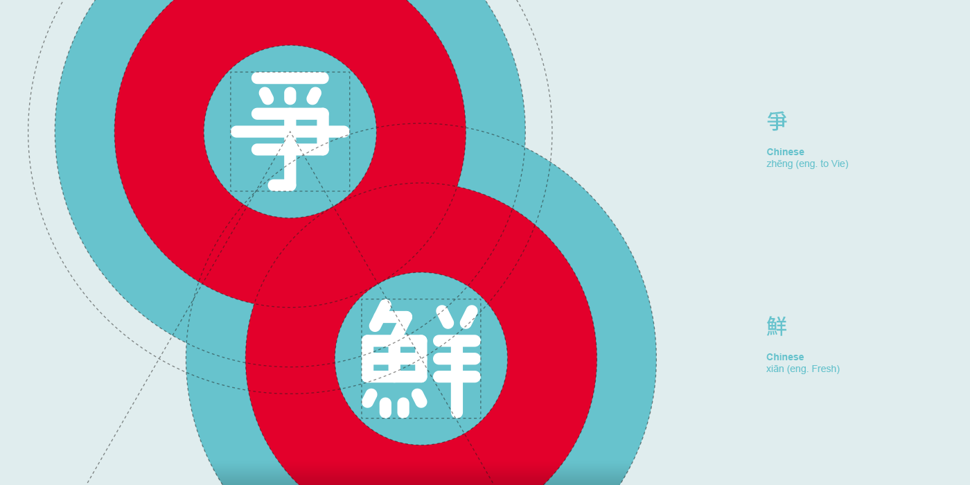
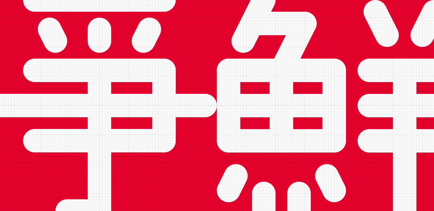
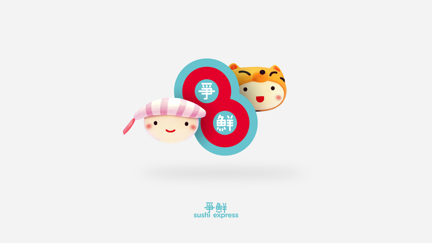
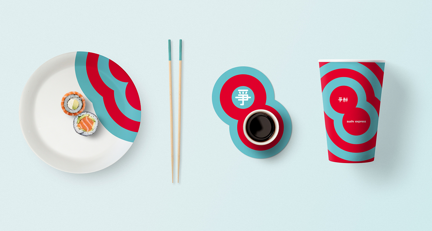
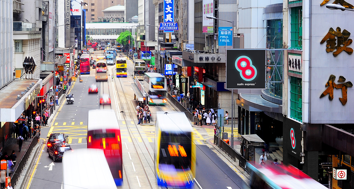
The new trademark was concieved as a combination of a symbol and logotype. The symbol is a unique statement of the company and represents it regardless of the market – retaining the same form, color and structure in any given situation. Having in mind the Chinese saying that “good things come in pairs”, we designed the symbol as a pair of sushi rolls put together and rotated to form a number 8, a number considered lucky in China. In order to emphasize the playfulness of the experience of eating sushi from a rotating conveyor belt table, we chose vibrant colors, and created custom "爭鮮" characters with rounded edges. While the symbol carries the uniqueness, the logotype is more generic, and being written in Gotham Rounded Bold it can easily be adjusted to individual market needs, which is demonstrated below (Left: Taiwan; mainland China; Hong Kong and Singapore markets. Middle: Western martkets. Right: potential Russian market).

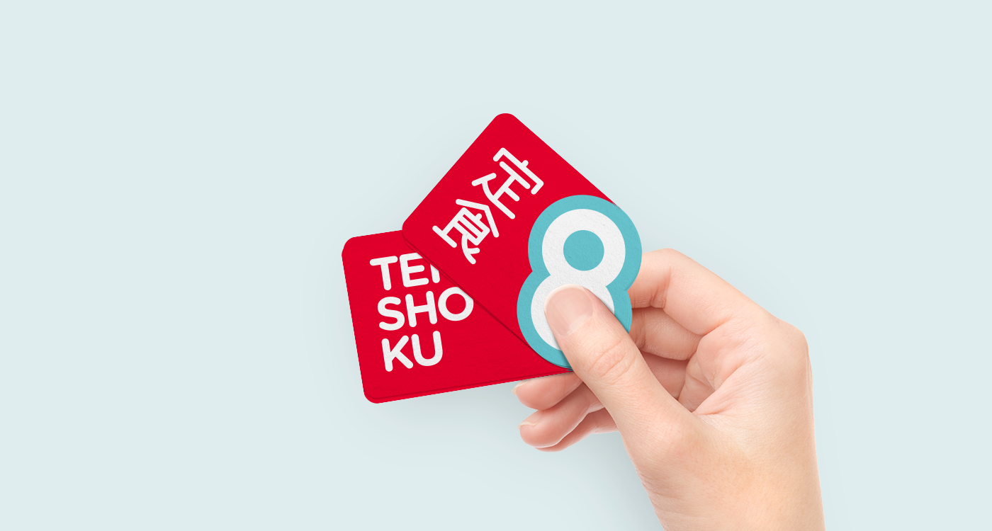
In 2007 Zensen Sushi Express Group launched a sub-brand of take out shops called Teishoku 8 (定食 8). Our proposal also included a logo for the take out shops, which takes the number 8 from the Zensen symbol and through a different arrangement of colors constitutes the new logo of Teishoku 8, strengthening the overall brand image even more.